Basic card
Example
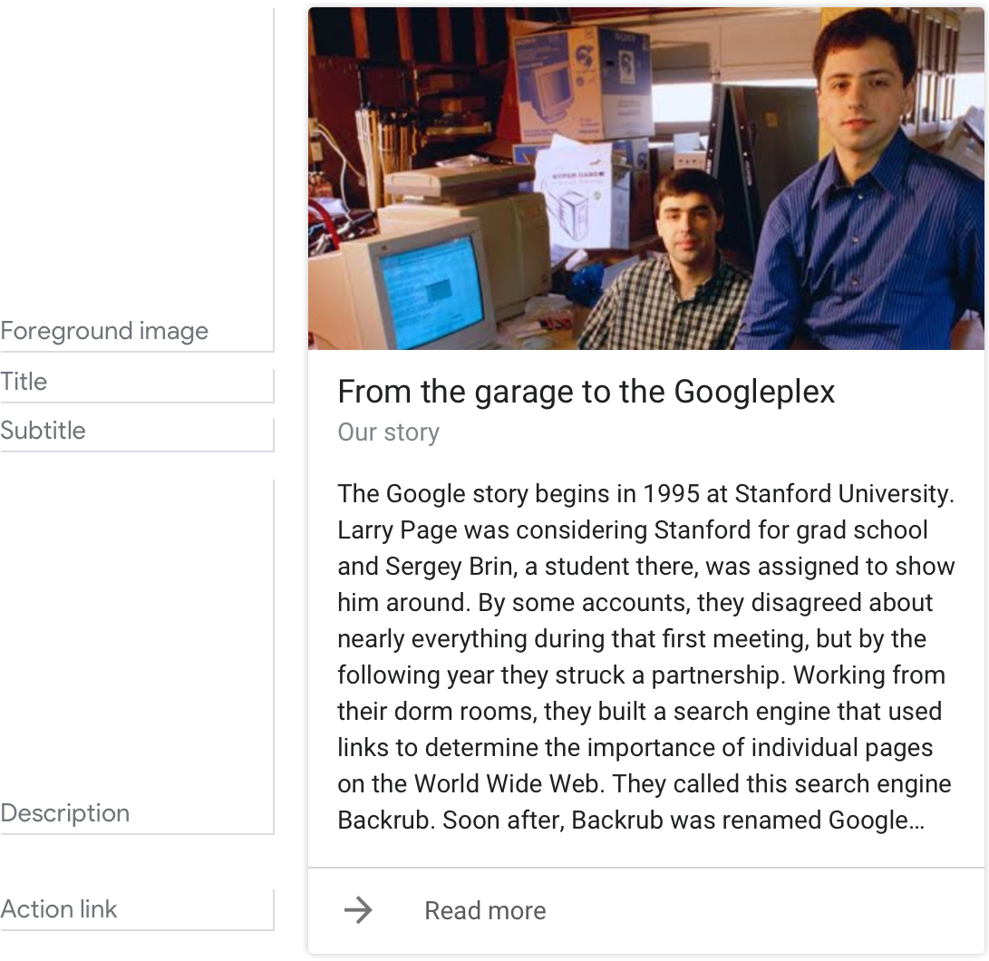
Here’s an example of what a basic card looks like when all required and optional fields are completed.
Requirements
This visual component currently supports customization.
| Field name | Required? | Restrictions/Customizations |
|---|---|---|
| Foreground image | Yes, required if there’s no description |
|
| Card background | No |
|
| Title | No |
|
| Subtitle | No |
|
|
Description (also called body or formatted text) |
Yes, required if there's no image |
|
| Action link | No |
|
Guidance
Summarize information for the user
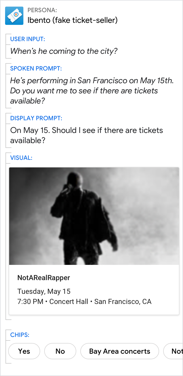
Do.
Summarize things like event details using a basic card. This allows users to scan it quickly for the information they want.
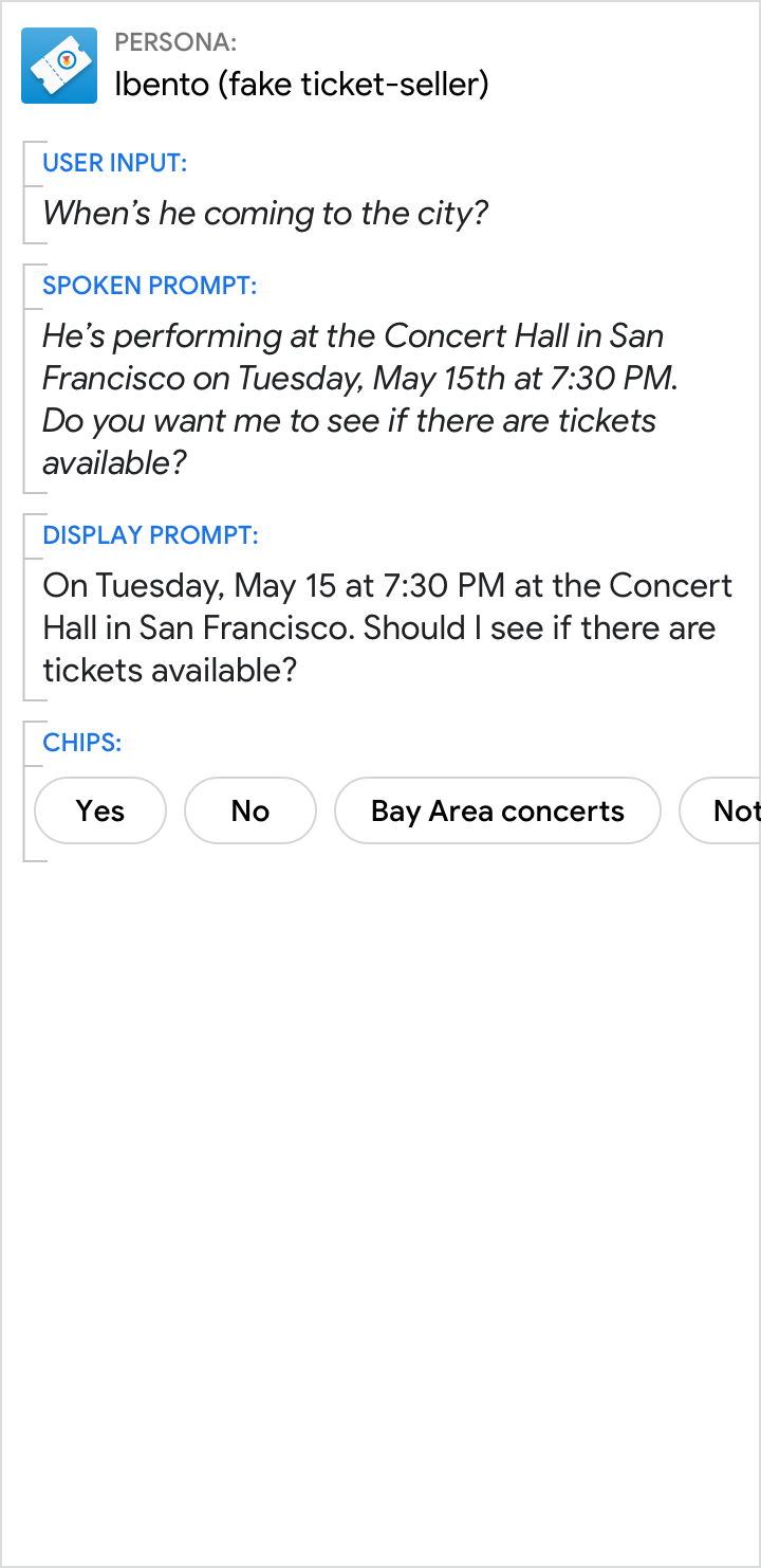
Don't.
It’s less efficient to present information like event details in the prompts.
Give the short answer in the prompts and the related details in the card
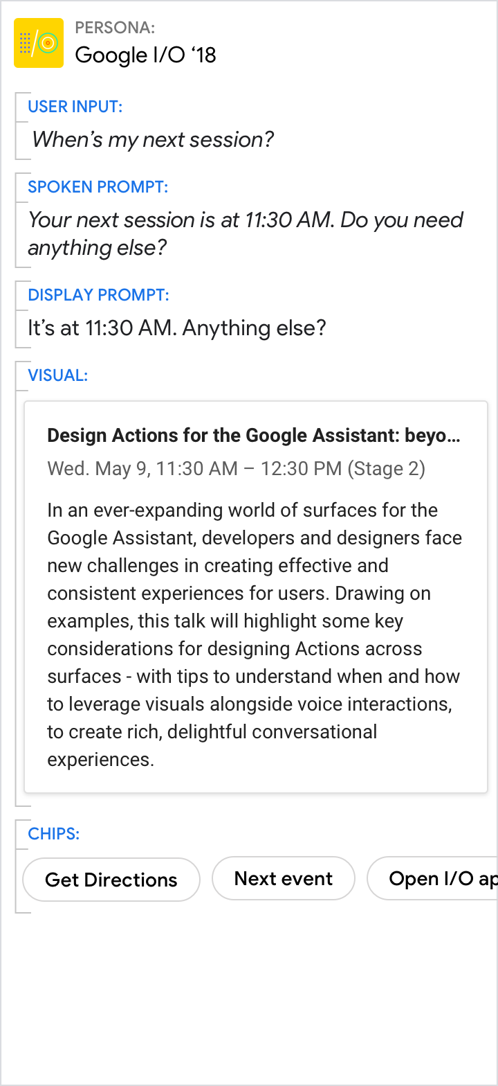
Do.
Use the spoken and display prompts to give the specific answer to the user’s directed question (11:30 AM in this example). Use the visuals for related details.
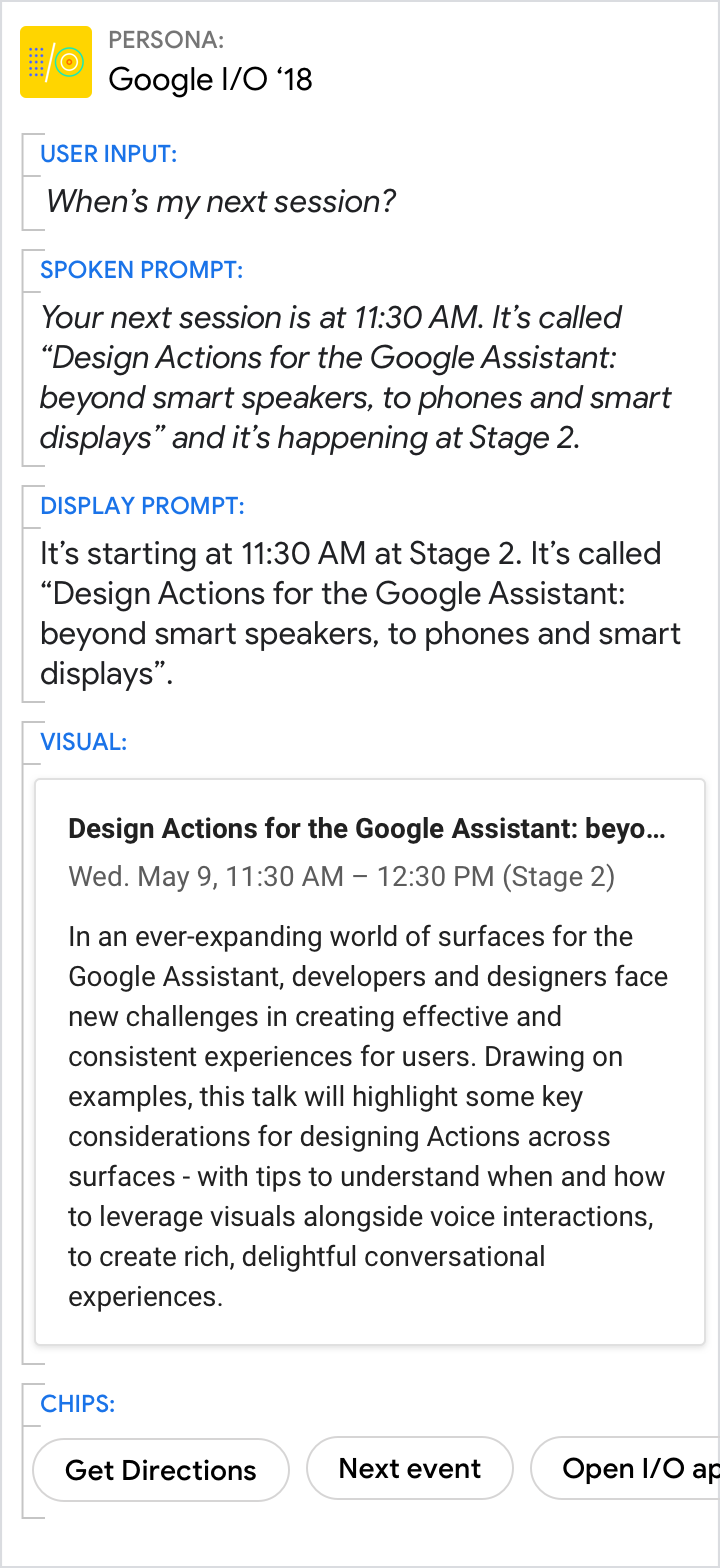
Don't.
Avoid redundancy between the spoken prompt, display prompt, and visuals.
A picture is worth a thousand words
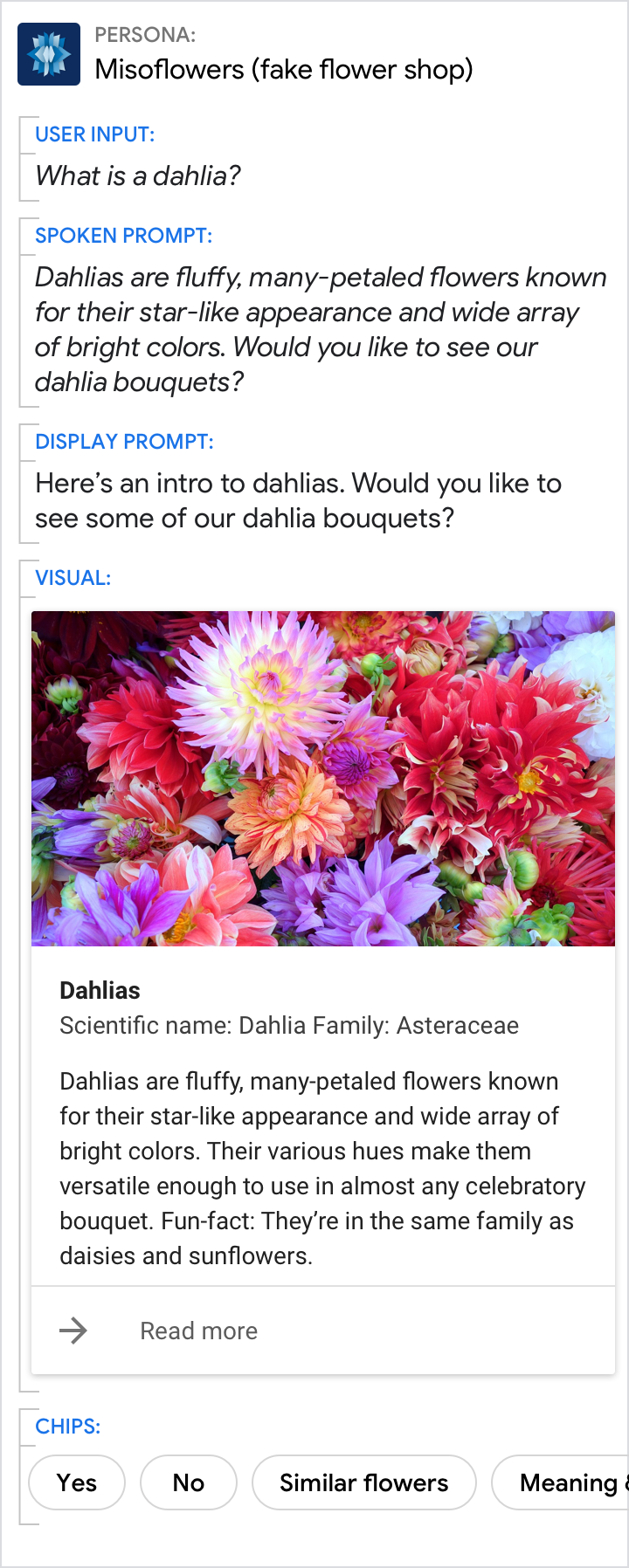
Do.
Sometimes an image is the best way to convey information to the user.
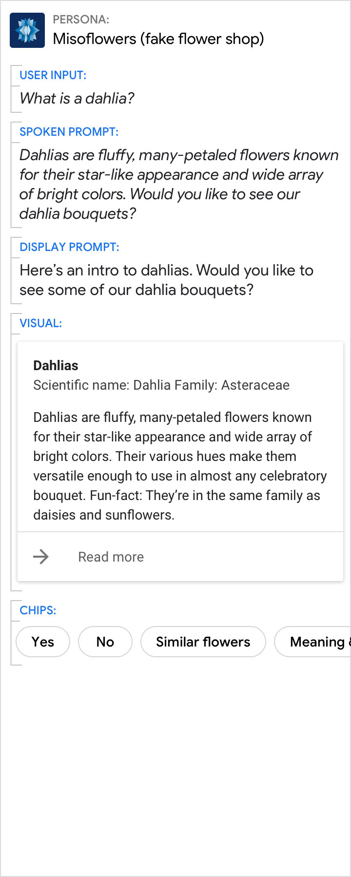
Don't.
Though the description is nice, a picture would have been better.
