Browsing carousel
Example
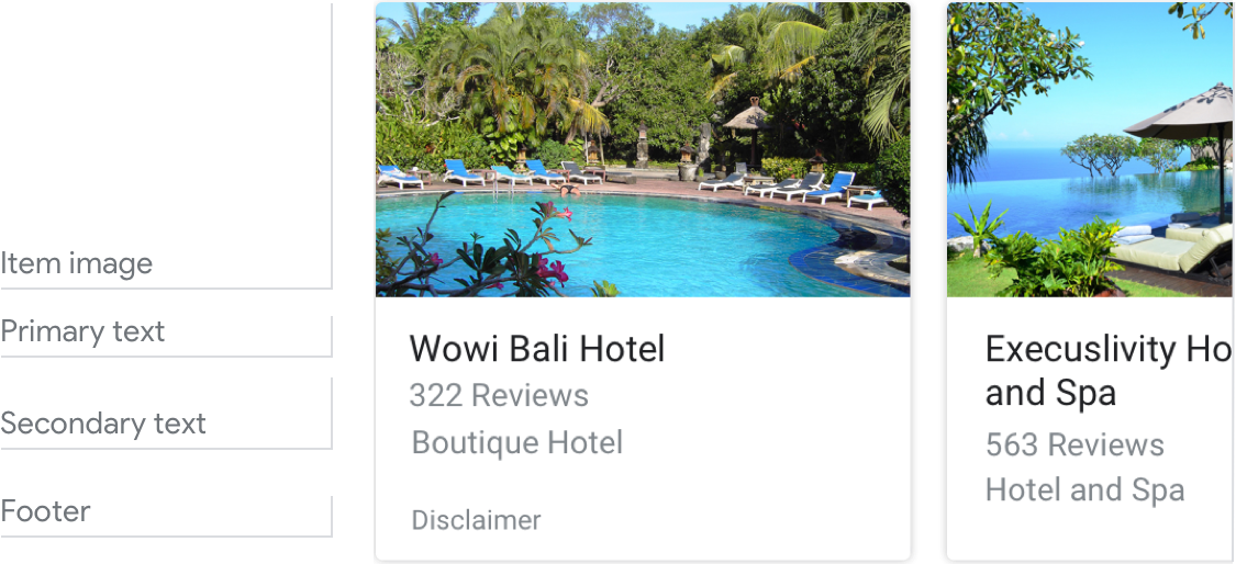
Here’s an example of what a browsing carousel looks like when all required and optional fields are completed.

Requirements
| Field name | Required? | Restrictions/Customizations |
|---|---|---|
| URL | Yes |
|
| Item image | No |
|
| Primary text | Yes |
|
|
Secondary text
Also called body or formatted text. |
No |
|
| Footer | No |
|
Number of items
- Maximum: 10
- Minimum: 2
Consistency
All items in a browsing carousel must include the same fields—e.g., if one item includes an image, then all items in the carousel must include images.
If all items link to AMP-enabled content, the user will be taken to an AMP browser with additional functionality. If any items link to non-AMP content, then all items will direct users to a web browser.
Interactivity
- Swipe: Slide the carousel to reveal different cards.
- Tap: Tapping an item opens a browser, displaying the linked page.
- The mic doesn't re-open when a browsing carousel is sent to the user.
Guidance
Browsing carousels are used for browsing and selecting from web content.
Browsing carousels take users out of the multimodal conversational interaction with your Action, so make this transition clear to users. They’ll no longer be talking/typing to your Action, but will instead be tapping/reading content from a web browser.
Be transparent
Make it clear to the user that they need to select an item by interacting with the screen. Set expectations that this will open a web page and take them out of the conversation.
The mic doesn't re-open when a browsing carousel is sent to the user, so don’t ask the user a question since you won’t hear their reply.

Do.
Let users know that selecting an item will take them outside of the Action.

Don't.
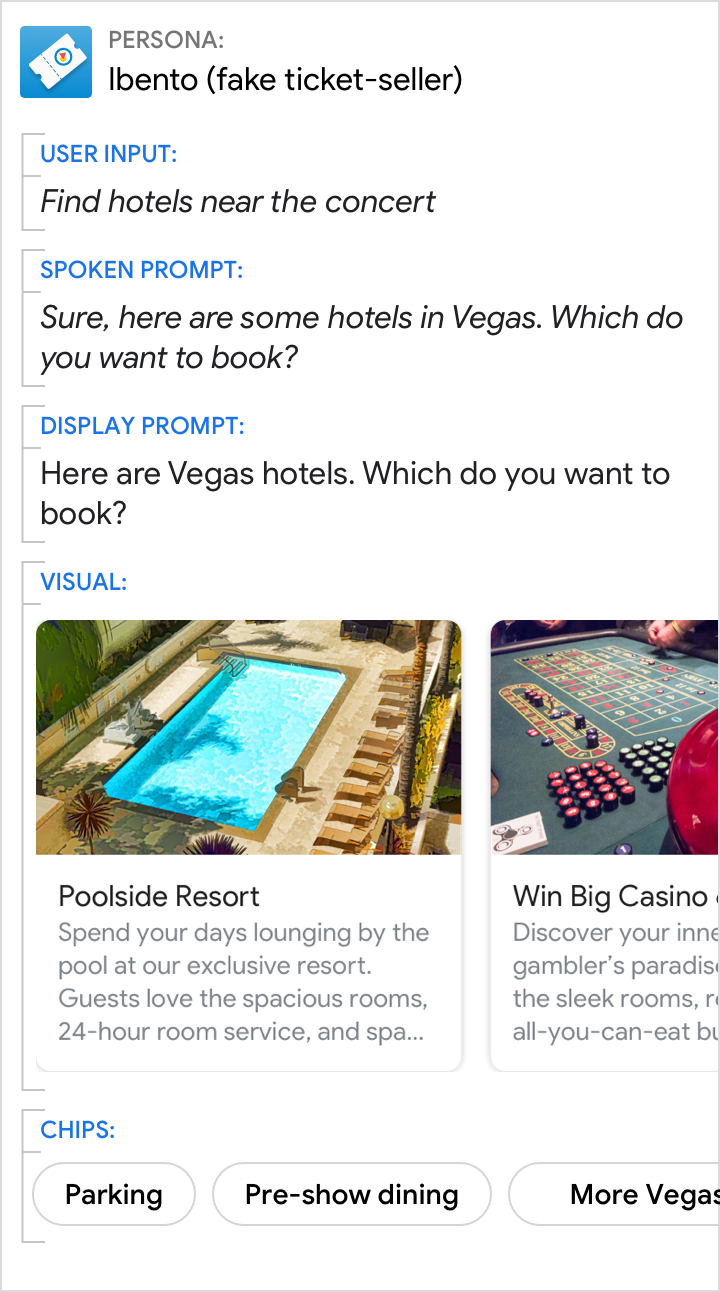
Don’t ask a question when the mic is closed, and don’t mislead users. Here, it isn’t clear to the user that if they select a hotel, they’ll no longer be talking to Ibento and will be taken to the hotel’s webpage.
