Carousel
Example
Here’s an example of what a carousel looks like when all required and optional fields are completed.
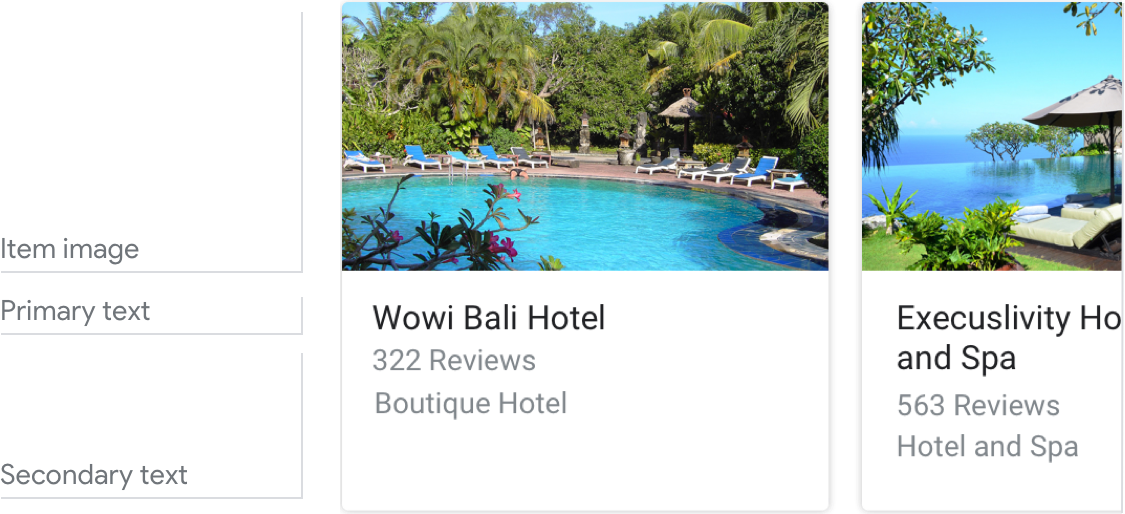
Requirements
This visual component currently supports customization.
| Field name | Required? | Restrictions/Customizations |
|---|---|---|
| Item image | No |
|
| Card background | No |
|
| Primary text | Yes |
|
|
Secondary text
Also called body or formatted text. |
No |
|
Number of items
- Maximum: 10
- Minimum: 2
Consistency
All items in a carousel must include the same fields—e.g., if one item includes an image, then all items in the carousel must include images.
Interactivity
- Swipe: Slide the carousel to reveal different cards.
- Tap: When users tap an item, the item’s title is accepted as the user input, starting the next turn in the dialog.
- Voice/Keyboard: Replying with the card title is the same as selecting that item.
Guidance
Carousels are mostly used for browsing and selecting among images.
Use carousels to help the user select from content that:
- can be most meaningfully browsed via scanning imagery (e.g., movie posters, album art, recipes, clothing)
- can be meaningfully blocked into rectangular chunks (e.g., tweets, news stories)
Use titles that are unique and conversation friendly.
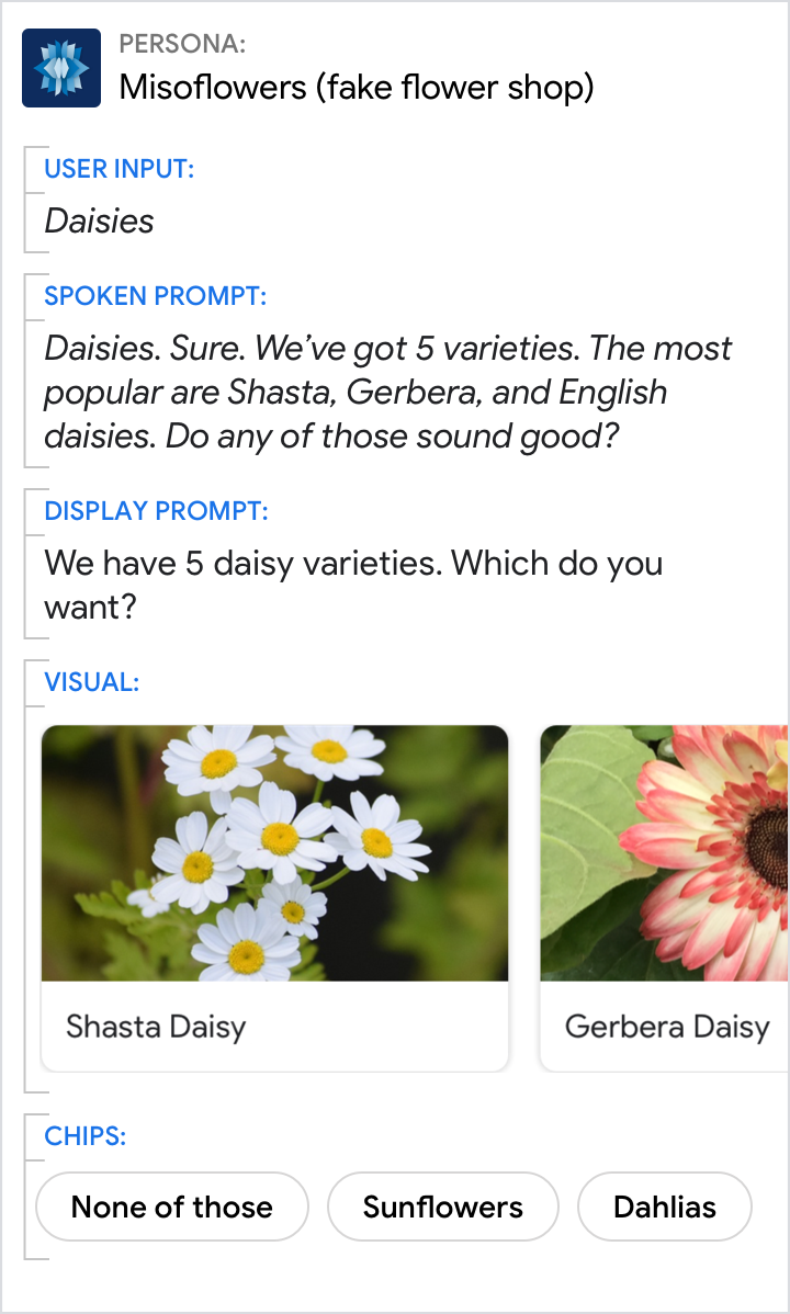
Do.
Each item title should be as short as possible while staying distinct from the other items.
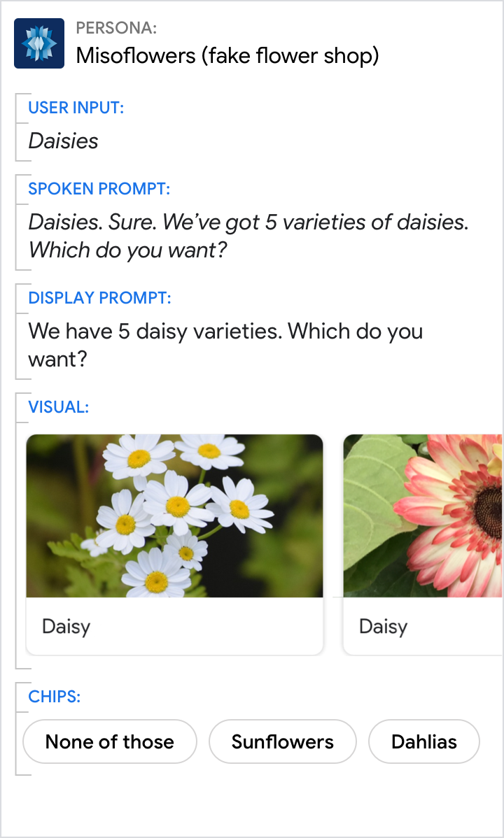
Don't.
Never use the same title for multiple items. And avoid titles that are very similar.
Introduce the carousel with a short overview.
- How many items are in the carousel (e.g., “There are 7 items on your wish list.”)
- Why these items were chosen (e.g., “Here are our most popular bouquets.”)
- Any selection criteria on for the items (e.g., “concerts this weekend”)
- What order the items are in (e.g., “starting with the most recent order” if reverse chronological)
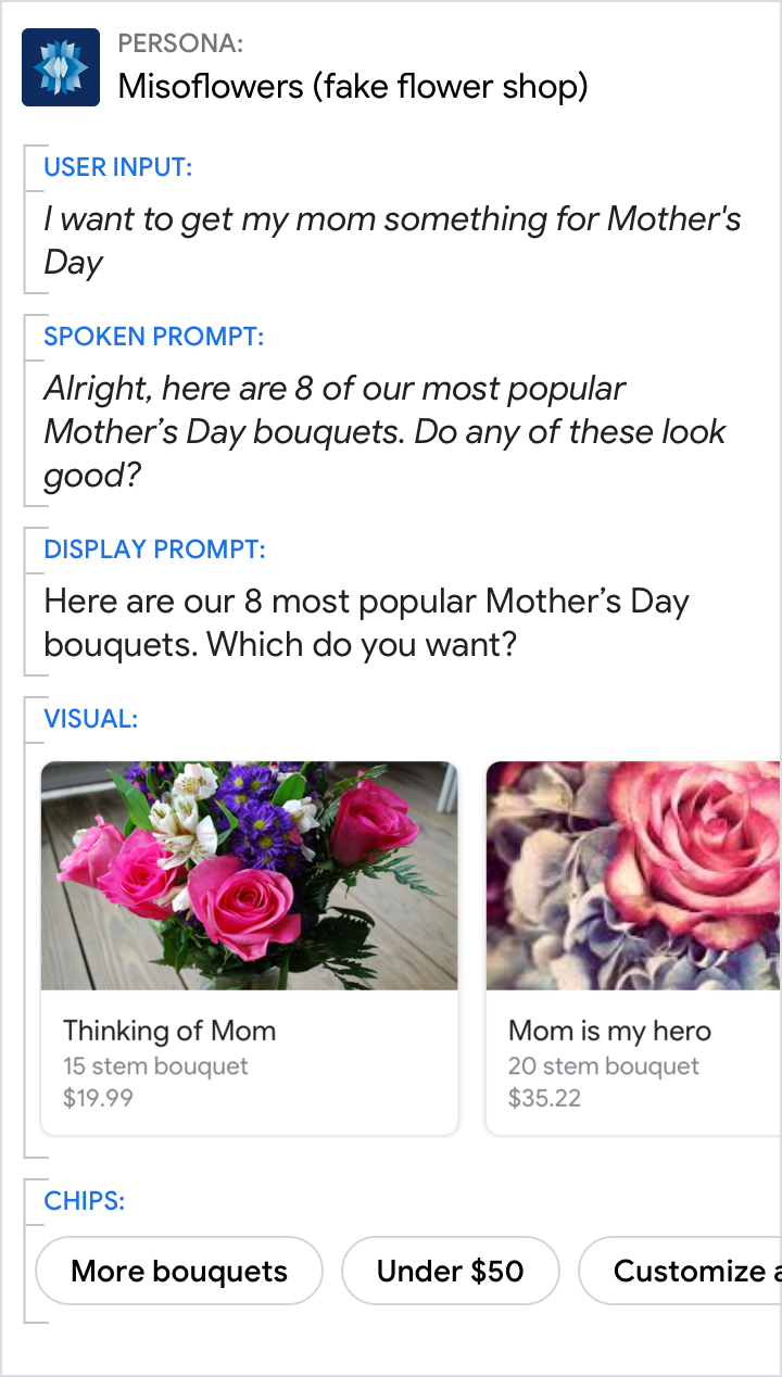
Do.
Let the user know why you’ve suggested these specific items.
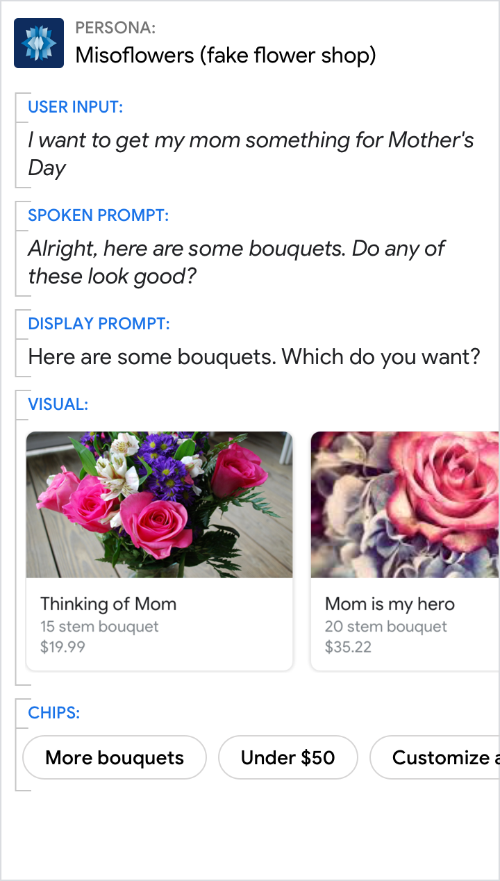
Don't.
Don’t leave the user wondering why your Action is showing these specific items.
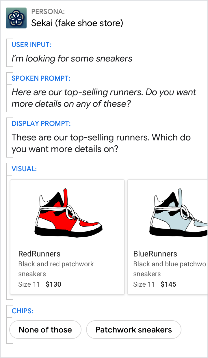
Do.
Make it clear to the user that they need to select something from the carousel. Here, the chips allow them to choose “none of these” or to refine the results (for example, by only showing “patchwork sneakers”).
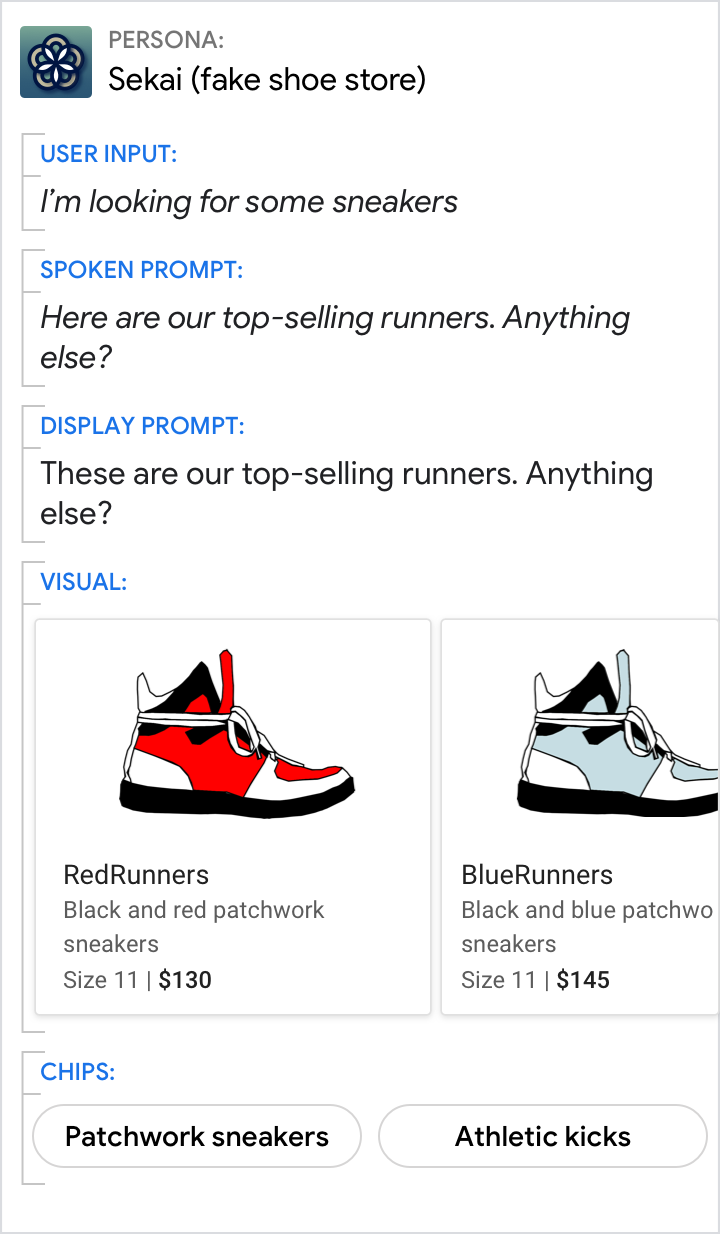
Don't.
Don’t simply show the user a carousel. Ask them a question in a way that makes it clear what happens if they choose an item.
