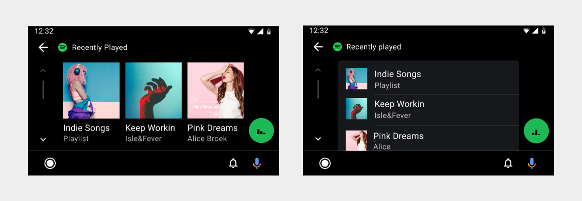
Browsing views provide lists or grids of content in popular categories for users to browse.
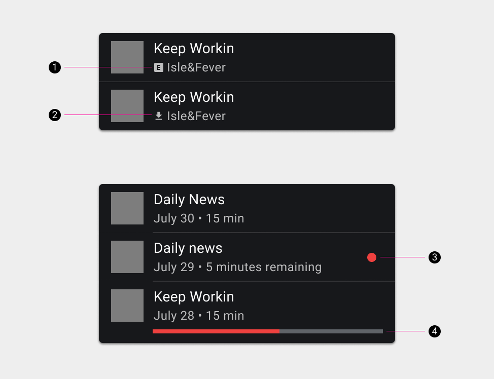
Within each browsing view, content can be presented either as a grid or as a list. Indicators can be used to identify content that is explicit, new, or in progress.
Selecting a content item in a grid or list either opens up a view of lower-level items (such as songs on an album) or plays the item. Selecting a playable item opens up the playback view.
List and grid views
Content can be presented in a grid view, a list view, or a combination of both in the same content space. Grid views are best when users rely primarily on images to make their selections. List views are best when users rely on reading text and viewing data to make their selections. Content can be organized into categories separated by subheaders.

Content indicators
Content indicators can be used to identify content in the following categories:
- Explicit
- Downloaded
- New
- In progress
