AI-generated Key Takeaways
-
Android Auto utilizes a black background for a consistent user experience across day and night themes, which complements car interiors.
-
The color palette for Android Auto's dark theme is primarily grayscale, with minimal and purposeful use of additional muted colors.
-
Different shades of gray are used to indicate elevation and hierarchy of UI elements on the true black background.
-
An accent color, currently a more saturated shade of blue, can be used sparingly to draw user focus.
-
Appropriate color contrast, with a minimum ratio of 4.5:1, is required between foreground and background elements for legibility while driving.
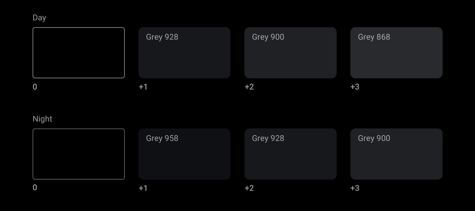
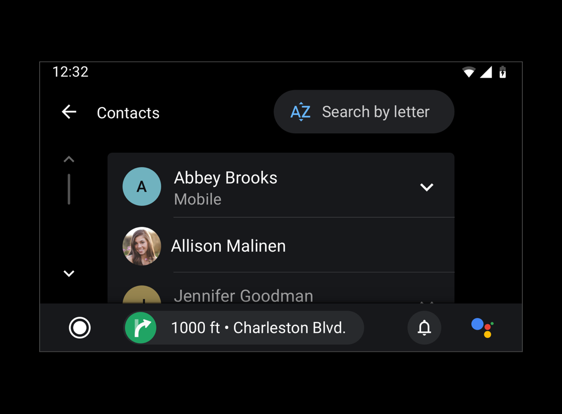
Android Auto places all content on a black background to create a more consistent user experience, with similar colors across day and night themes.
A black background typically works best inside cars, since car makers often use dark materials and colors for car interiors, dashboards, and UIs.
At a glance
- Use a black background to support both day and night driving
- Maintain a contrast ratio of at least 4.5:1 between the background and icons or text
- Use color minimally and purposefully
- Show elevation using different shades of gray
- Use transparency and opacity to guide visual focus
Palettes and Gradients
The dark theme for Android Auto uses a grayscale color palette. Any additional colors added to your UI should be muted in intensity, similar to the darker color variants from the Material Design color palettes.

Android Auto's grayscale palette
Using the Android Auto grayscale color palette, you can apply color to all elements, including text and icons.
This palette is designed to:
- Reflect each UI element's level of hierarchy with the provided range of shades
- Address all dark theme UI use cases
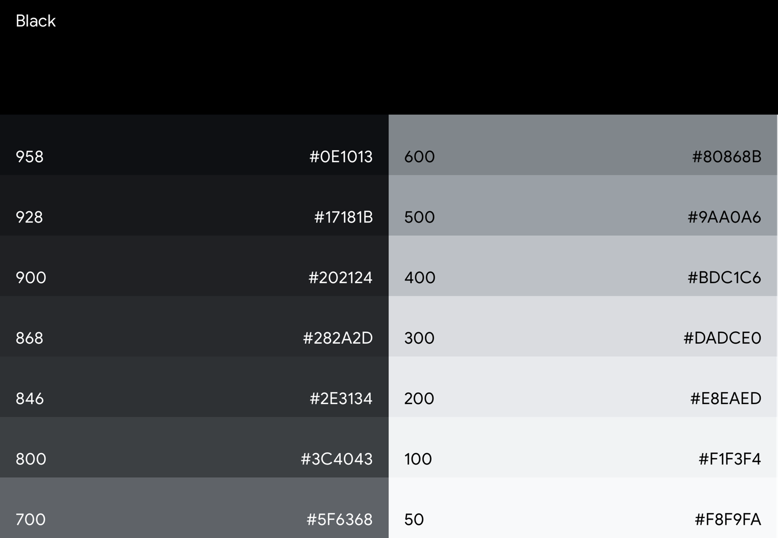
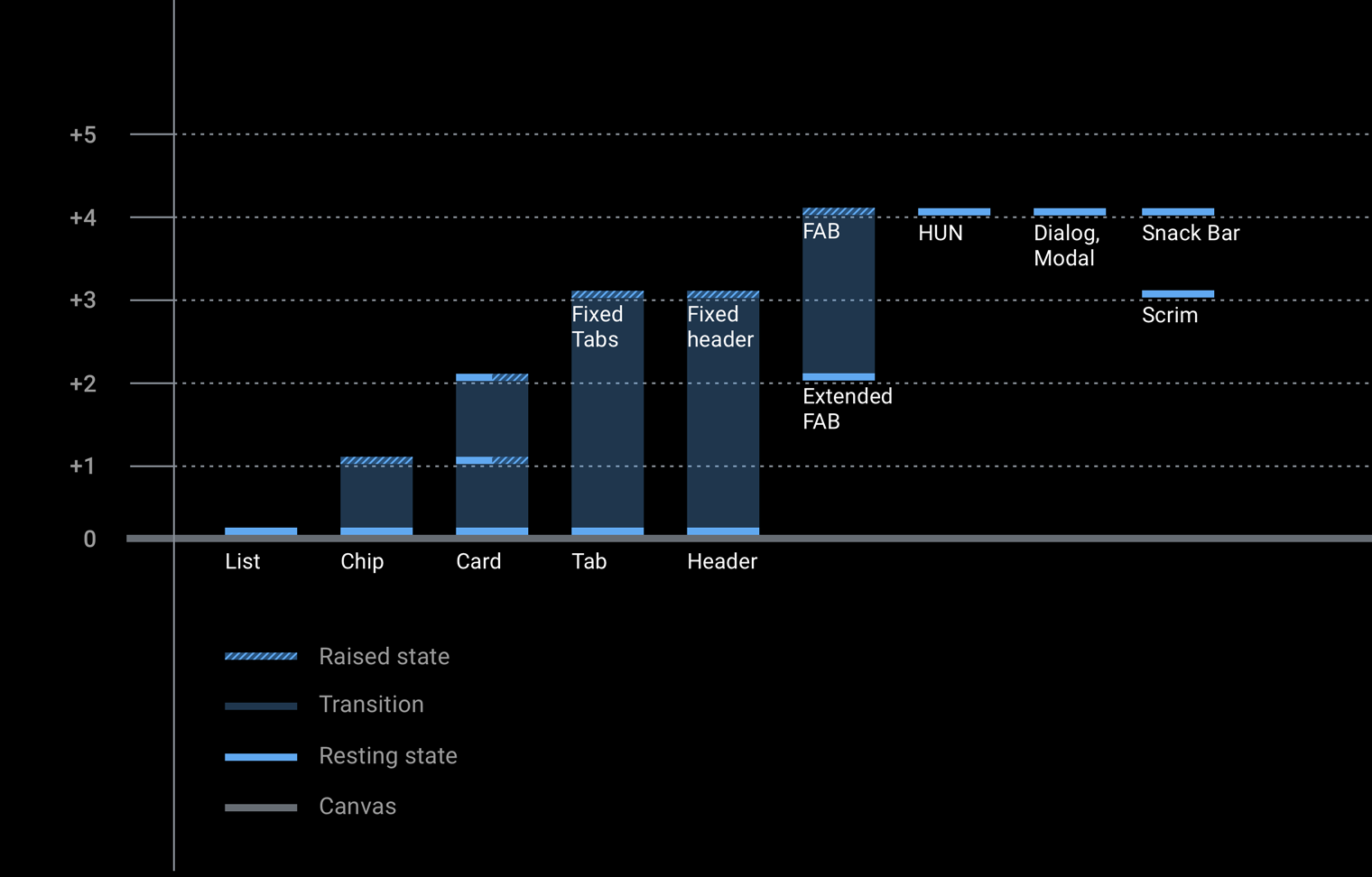
In Android Auto, a sense of depth is expressed using different shades of gray. Each shade represents a different level of elevation, where components with darker shades (such as the list component) have less elevation than components with lighter shades (such as floating action buttons).
All components are displayed on a true black background where shadows aren't visible. To provide sufficient contrast between these components, the Android Auto grayscale palette contains a wide range of grays. It's a more gradual progression of grays than Material Design's baseline color palette, as Material's shades below Gray 900 are too bright for the auto context.
Accent color
In addition to Android Auto's grayscale palette, an accent color can be used sparingly for purposes such as drawing user focus.
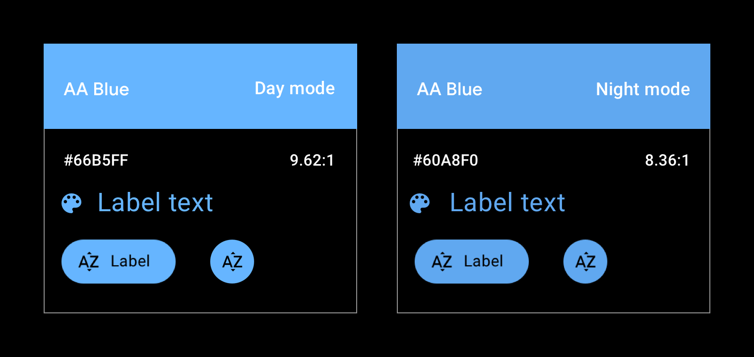
Currently, Android Auto has one official accent color, a shade of blue referred to in the support library as "car accent". This blue has increased saturation and vibrancy from the standard Google blue for better visibility on the UI's dark surface.
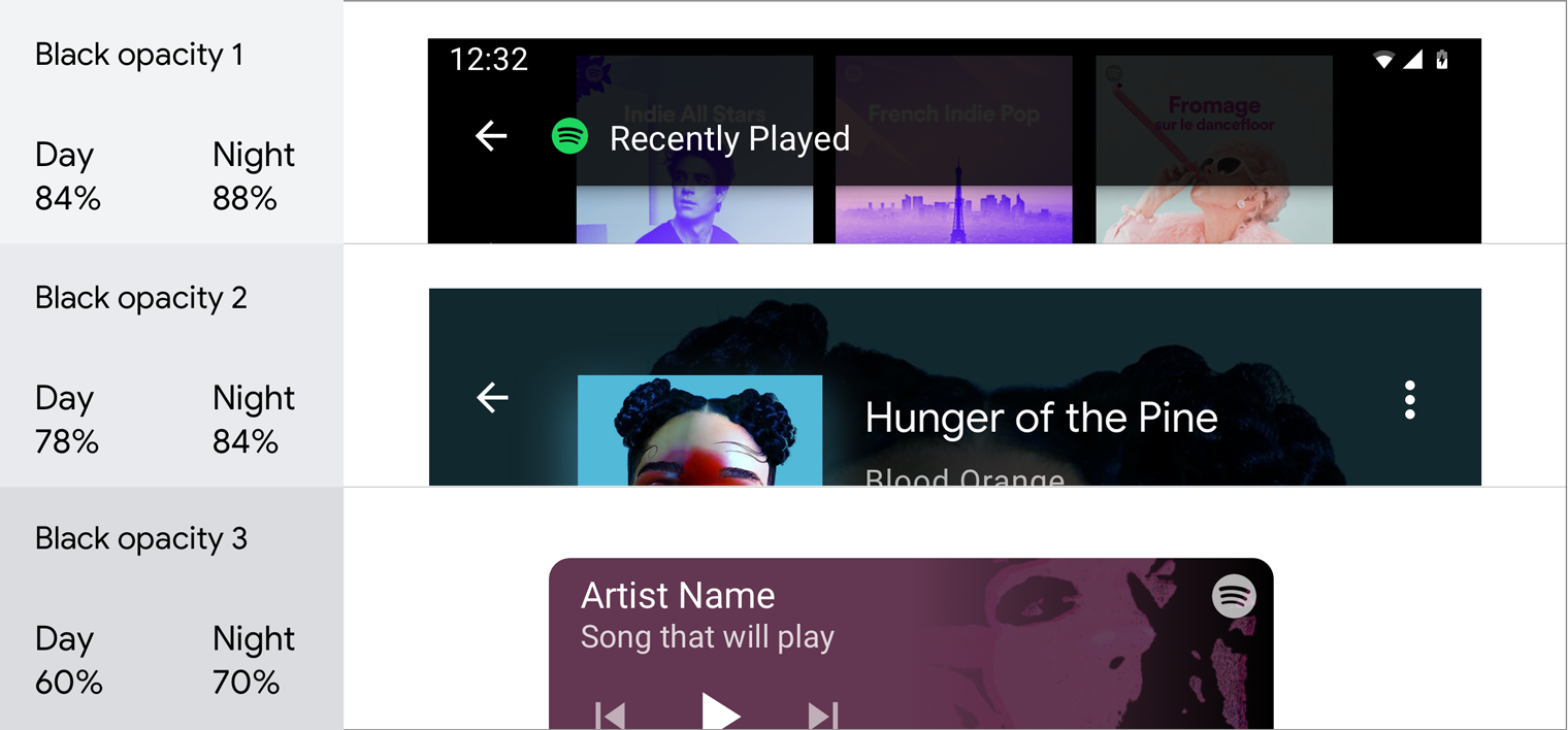
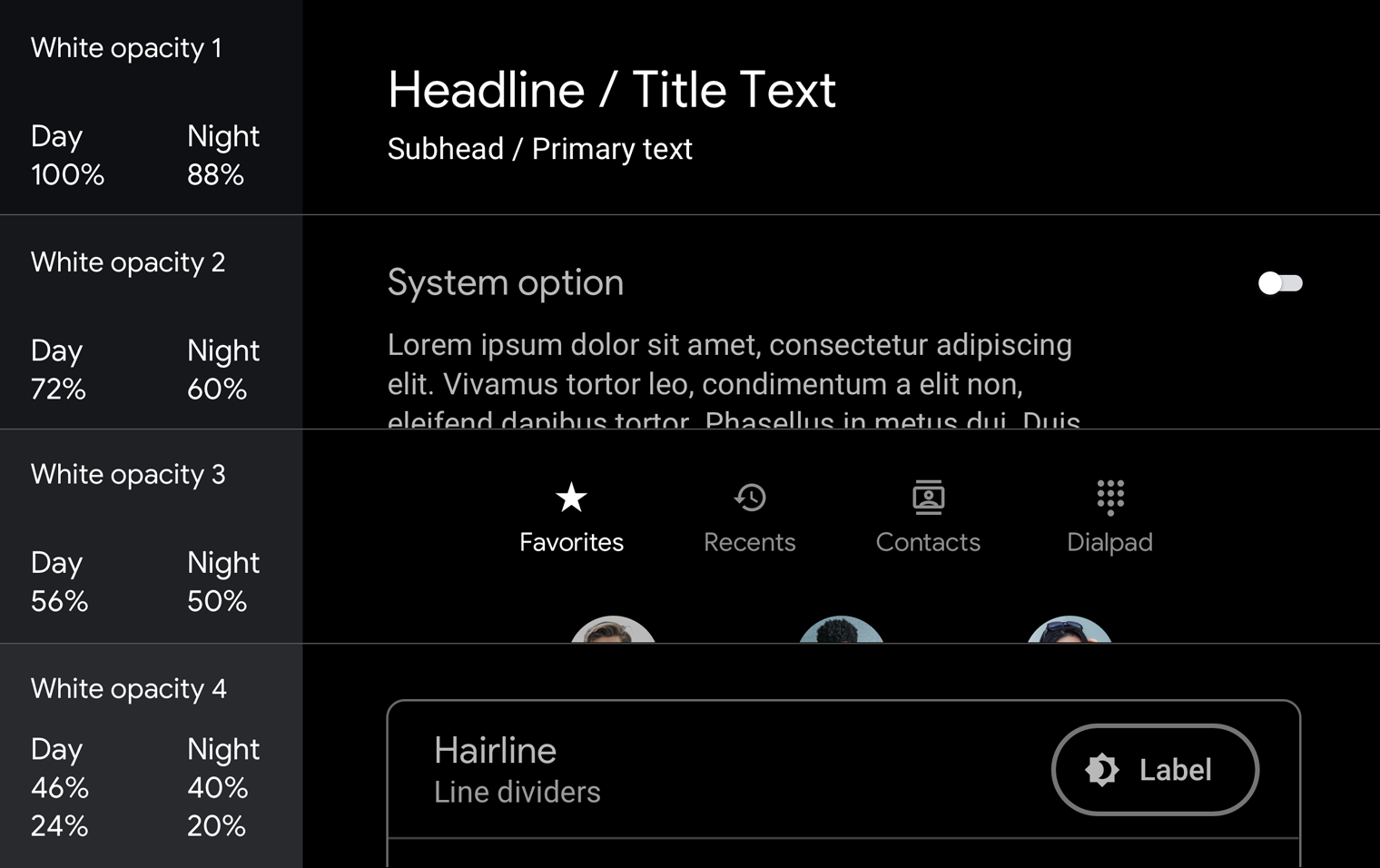
Opacity charts
The Material Design spatial model relies on varying degrees of opacity to convey a sense of depth in a UI. To use it effectively, choose an opacity level based on your use case.
Dark opacity values
The most common use case for semi-transparent dark surfaces is a scrim (also known as an "overlay").
White opacity values
Semi-transparent white values are mostly used for text, especially when the background is colored, instead of using solid gray.
For examples of how to use opacity in scrims and text hierarchies, see Guidance and examples.
Contrast
Appropriate color contrast helps drivers quickly interpret information and make decisions.
Minimum visual contrast between the foreground (text or icons) and background (colors, album art, etc.) is required for legibility while driving. App colors must meet the WCAG 2.0 Level AA Normal Text contrast requirements, which specify a contrast ratio of 4.5:1). Use a contrast checker, such as the WebAIM Color Contrast Checker, to ensure that your screens meet the contrast requirements.
For more details of how contrast ratios apply to specific UI elements, see Design for Driving guidelines.

Do
These icons follow the color contrast ratio recommendations and are more legible against their backgrounds
Don’t
These icons do not follow the color contrast ratio recommendations and are difficult to discern against their backgroundsGuidance and examples
The dark UI for Android Auto is clean and simple, with minimal use of color. In addition to using the appropriate colors, tones, and opacity values for UI elements (see Palettes and gradients), every use of color and varied opacity should have a purpose.
This section provides guidance and examples for applying opacity variations and color to achieve a variety of goals, including:
- Obscuring backgrounds
- Maintaining consistency
- Establishing a visual hierarchy that draws user focus to primary actions
- Distinguishing items in a list
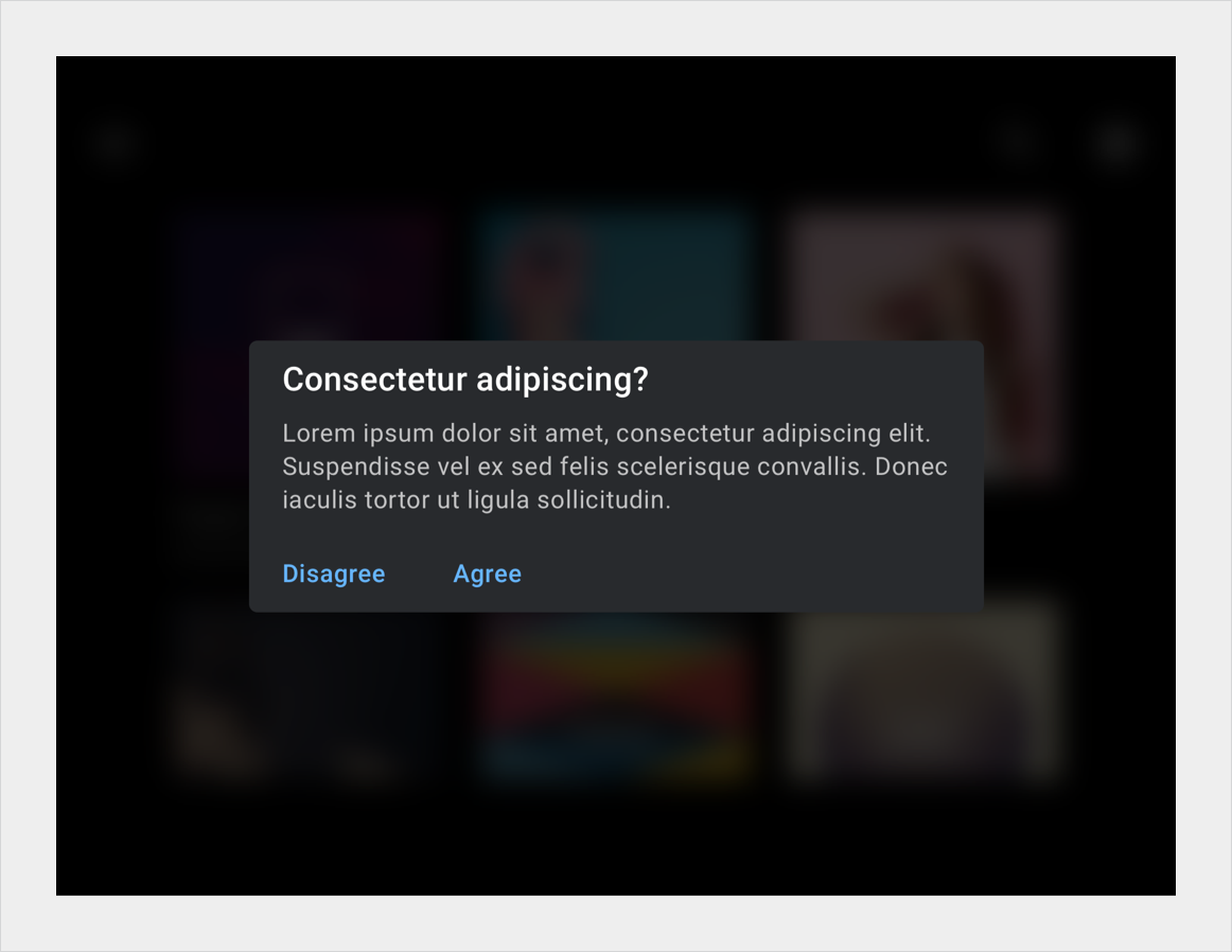
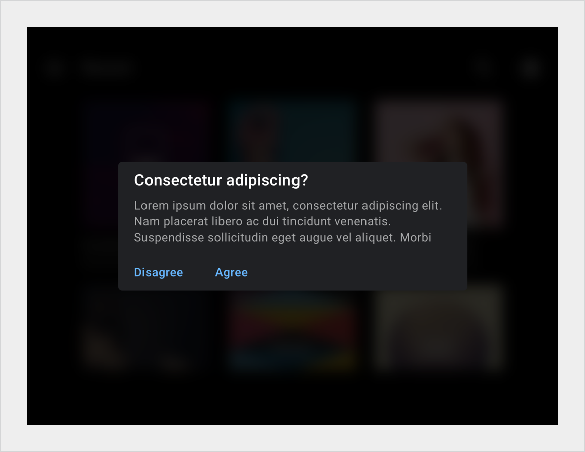
Obscuring backgrounds with scrims
Full-screen scrims (overlays) are used to cover backgrounds when high-priority content appears in the foreground, such as a dialog requiring the user to take an action. Partial scrims are used to draw attention to the transition of elements, such as the entrance of notifications.
Maintaining consistency with color
Color is a powerful cue for reinforcing the connection between key elements across user flows, such as all navigation-related elements being colored green. Such color continuity aids memory and recognition about which UI elements are connected and how they relate to one another. You can use it to create a coherent experience from screen to screen.
Do
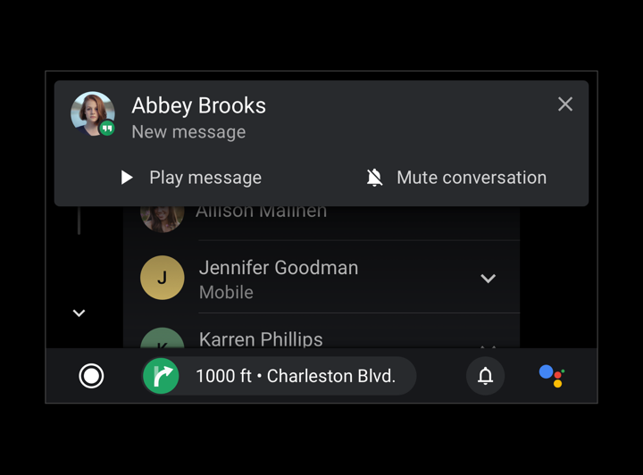
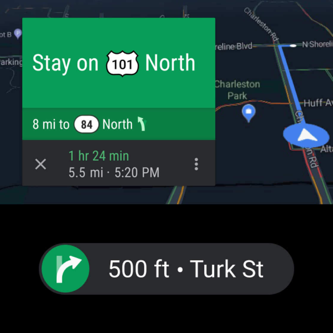
Maintain visual continuity by using the same color for an item across multiple views, such as the green color used for these turn-by-turn navigation views.
Do
Use color to visually connect related elements and functions, such as these red hang-up CTAs.
Do
Use the dominant color of album art or an app’s assigned color on related elements as a persistent visual affordance. This circle around the pause button is accented with Spotify green.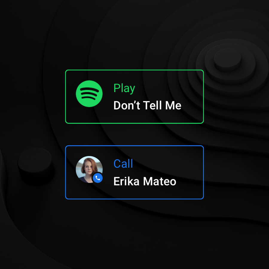
Don’t
Don’t use different colors to arbitrarily differentiate repeated components within a single screen. Be cautious about using colors when they don’t add value – as is the case with these colored outlines around the summary cards, which duplicate the color of the app icon.Establishing a visual hierarchy
A consistent and strong visual hierarchy can be created by coloring text using a range of white opacities. The opacity values of 88%, 72%, and 56% for white text contain just enough contrast to meet accessibility requirements while creating a comfortable reading environment on a dark background. Use a 96% opacity on all white text for night mode.
Do
Use different opacity and contrast values to maintain a visual hierarchy.
Don’t
Don’t overuse full opacity or contrast values by applying them to too many elements. A contrast in opacity values is needed to differentiate primary and secondary information.