Android Auto 的自适应响应 (AR) 框架可调整应用布局,以适应任何车载显示屏尺寸。
应用界面和功能(例如媒体浏览和播放操作)也会在与 Android Auto 兼容的汽车中自动调整,适用于从用户手机投射到的应用。
快览
- 布局会根据特定断点处的屏幕尺寸进行调整
- 以 8dp 为增量应用内边距
- 在较小的组件之间谨慎放置 12dp 的内边距
如何确定布局
Android Auto 的 AR 框架采用自适应设计和自适应设计:
- 左右外边距使用自适应设计(确切的屏幕尺寸决定布局)
- 使用自适应设计(屏幕高度和宽度的范围确定布局)
布局是使用称为“断点”的测量值确定的。断点是策略性定义的屏幕高度和宽度测量值,用于确定何时显示特定布局。对于每个断点范围,系统都会调整布局以适应屏幕尺寸和方向。
自适应
自适应设计使用断点来确定屏幕布局。对于定义的屏幕尺寸范围(例如宽度小于 1280dp 的屏幕尺寸),系统会显示特定布局。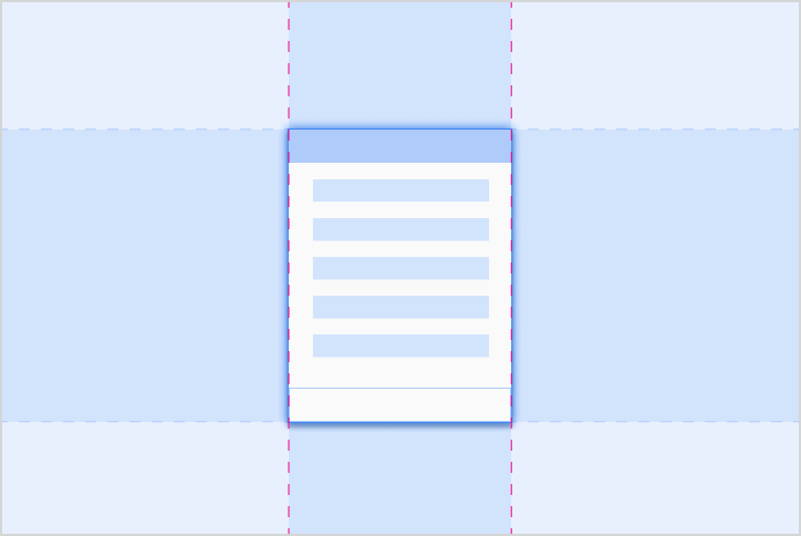
自适应
自适应设计能够以与确切屏幕尺寸成比例的方式调整布局。组件具有弹性区域,可以根据每个汽车的屏幕大小展开或缩小到适当的尺寸。自适应断点
Android Auto 依靠自适应断点来确定屏幕布局,根据应用窗口的大小(而非整个屏幕)计算得出。

自适应外边距
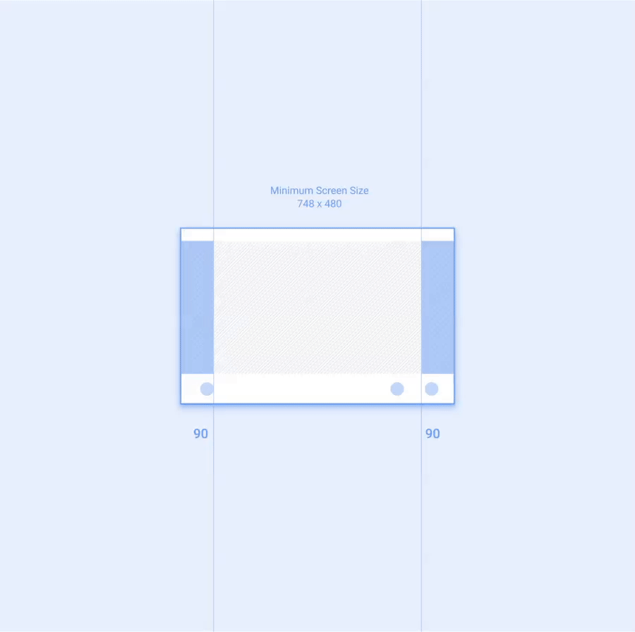
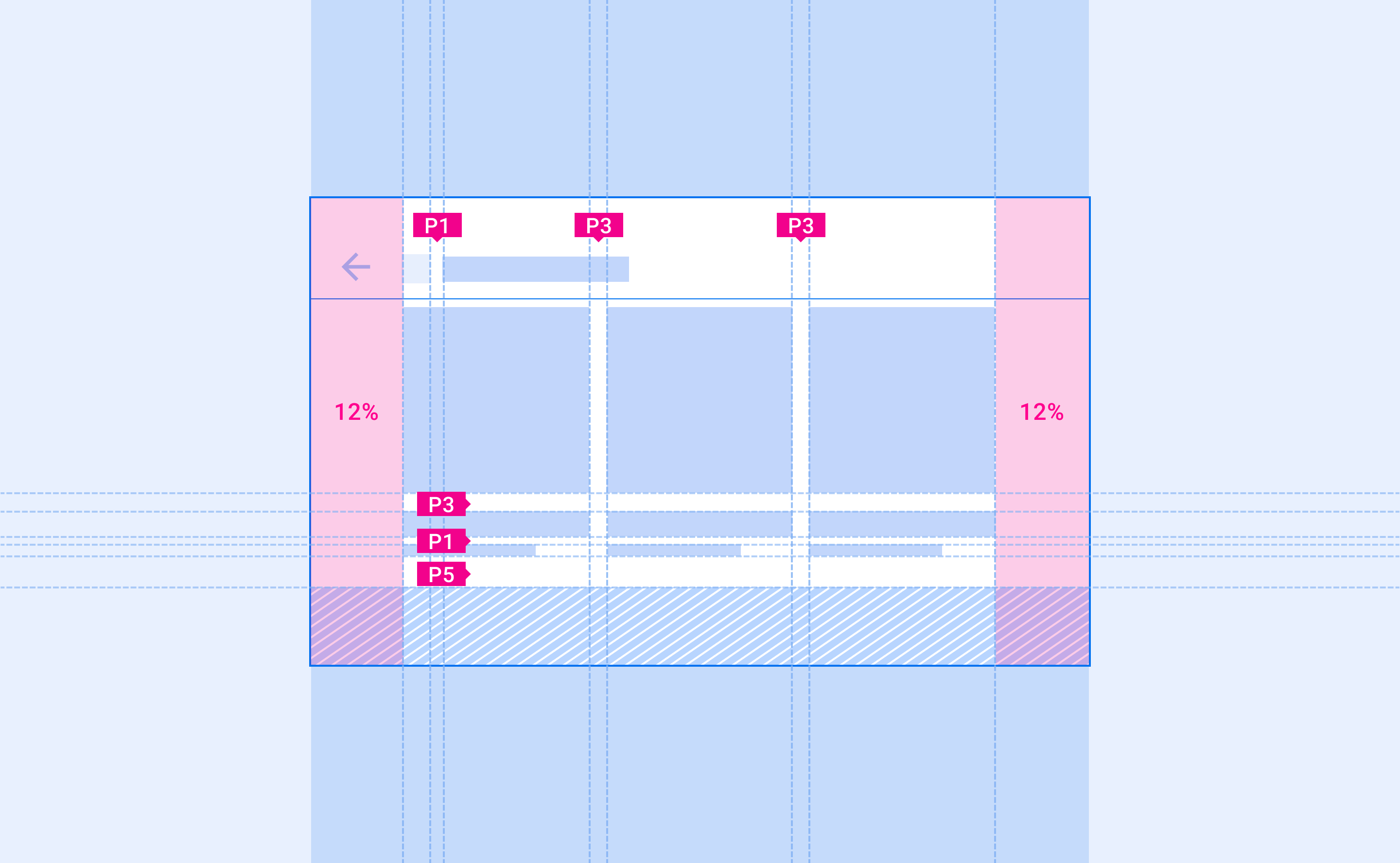
Android Auto 会根据整个车载显示屏的尺寸使用自适应外边距。左右外边距调整为屏幕宽度的 12%,且通常包含滚动条和导航控件。剩余的屏幕空间(称为应用画布)包含应用内容。
为了提供更多空间,在较小的屏幕上可以移除右侧外边距。此空间可用作辅助区域,以显示更多信息。
布局网格
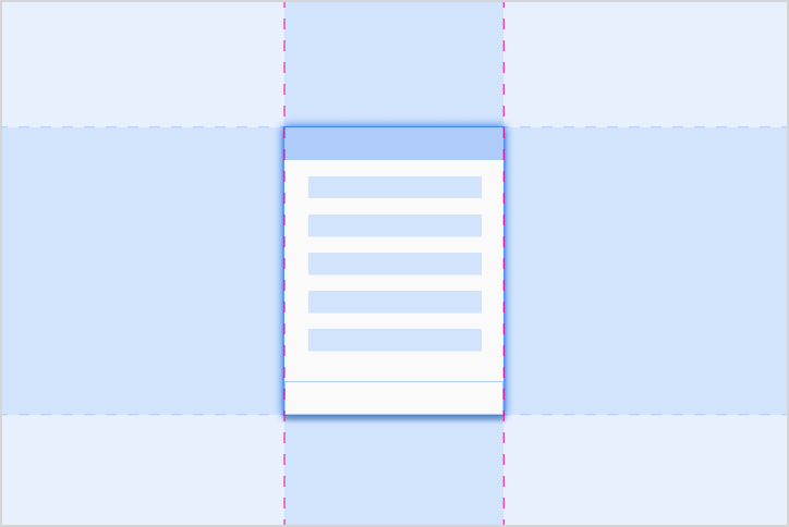
Android Auto 布局会沿着 8dp 网格对齐界面元素,并且一些较小的组件会与 4dp 网格对齐。
内边距
内边距是指界面元素之间的间距。Android Auto 内边距缩放以 8dp 的倍数应用,内边距尺寸上限为 96dp。此外,添加任何更大的内边距也应按 8dp 的倍数添加。
下表列出了 Auto 界面中显示的典型内边距值。大小增量按递增顺序列出,使用以字母“P”开头的标签进行标记:
| P0 | P1 | P2 | P3 | P4 | P5 | P6 | P7 | P8 |
|---|---|---|---|---|---|---|---|---|
| 4dp | 8dp | 12dp | 16dp | 24dp | 32dp | 48dp | 64dp | 96dp |
适用于较小组件的内边距
为了更好地对齐并留出足够的间距,较小的组件可以少用 12dp 的内边距。

框线
框线是一种衡量指标,通过显示元素和组件在布局中水平放置的位置(沿 x 轴)来组织界面。它们标有以字母“KL”开头的标签。
框线可以放置在布局中的任意位置。它们可用于表示任意两个垂直边缘(元素、组件或屏幕本身)之间的距离。组件和元素会将其左边缘或右边缘与最近的框线对齐。

使用框线测量
框线会根据屏幕宽度而变化,让界面元素能够始终如一地适应不同尺寸的屏幕尺寸。
对于各种屏幕尺寸(以标有“KL(n)”的标签表示),建议使用以下框线。它们按框线大小增加的顺序显示:
| KL(n) | 窄屏幕 (0-600dp) |
标准屏幕 (600-930dp) |
宽屏 (930-1280dp) |
超宽屏幕 (1280dp+) |
|---|---|---|---|---|
| KL0 | 16dp | 24dp | 24dp | 32dp |
| KL1 | 24dp | 32dp | 32dp | 48dp |
| KL2 | 96dp | 112dp | 112dp | 不适用 |
| KL3 | 112dp | 128dp | 128dp | 152dp |
| KL4 | 148dp | 168dp | 168dp | 不适用 |