AI-generated Key Takeaways
-
Use motion sparingly and only to inform drivers without distracting them.
-
Motion patterns are based on standard Material Design easing and apply to interactions like switching between apps or views, extending, minimizing, or disrupting actions.
-
Different motion patterns are recommended for specific interactions, such as crossfade for app switching and shared axis for switching between peer views.
-
Secondary actions that extend an existing action should appear as full-screen overlays with a vertical motion and scrim background.
-
Minimizing and expanding ongoing actions uses a fade-in transition when expanding and the reverse, quicker motion when minimizing.
Motion should appear sparingly in the driving context to express concepts, branding, and relationships between elements. It should only be used to help inform drivers without distracting their attention.
At a glance:
- Avoid distracting users with unnecessary motion
- Use motion to increase users’ understanding and build their proficiency
- Make your motion language flexible enough for all relevant hardware
- Use the recommended motion pattern for your situation
Motion patterns
To support a consistent user experience across all apps, specific motion patterns apply to the following interactions:
- Switching between apps
- Switching between peer views
- Extending an existing action
- Minimizing and expanding an action
- Disrupting an action
These motion patterns are based on standard easing, as described in Material Design, which places focus on a transition’s ending by speeding the transition up quickly, then slowing gradually.

Switching between apps
When switching between apps, use a crossfade transition, which fades one element into view while another element fades out. This transition depicts an exit from the current app while moving quickly into another one.

Example

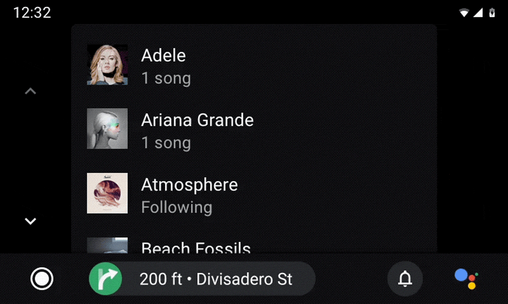
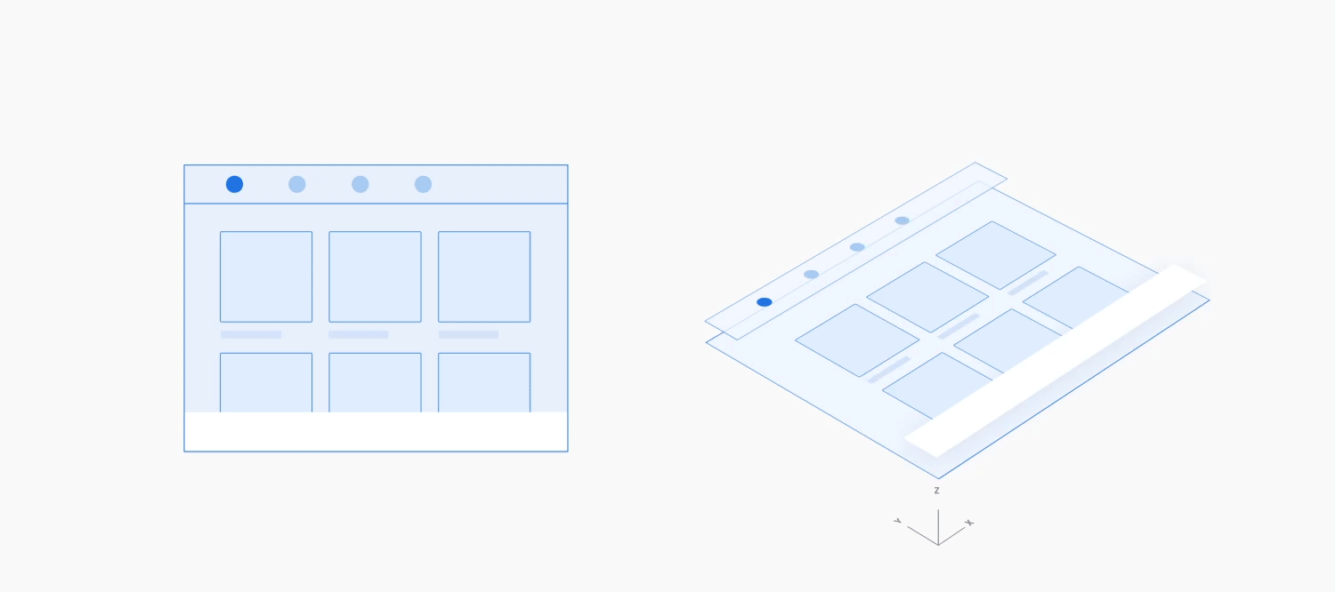
Switching between peer views
When switching between views at the same level of hierarchy in an app (also called peer views), such as tabs in an app bar or songs in a playlist, use a shared axis transition. This transition's horizontal, side-to-side movement reflects the state of staying at the same level within an app.
Example
Extending an existing action
When a user is in the process of viewing or taking an action and then takes a secondary, related action, that secondary action should be introduced with a vertical (either up or down) motion. This secondary action is displayed on a full-screen overlay, with a scrim background, in front of the primary action. The presence of the primary action through the scrim reinforces that the user is still in the midst of performing that action.
The secondary action is then closed in the reverse direction of the opening motion. This reverse motion should take less time than the original motion, since the action is done.

Example

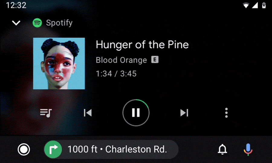
Minimizing and expanding an action
Ongoing actions can be minimized into a smaller format. This smaller format allows the user to multitask while the ongoing action runs in the background.
Expanding: When the user taps on a minimized action, it expands in size and fills the full screen, using a fade-in transition.
Minimizing: When minimizing an ongoing action, use the reverse of this motion. The minimizing motion should take less time than the expanding motion, since the user is leaving this action.

Example

Disrupting an action
When a short, optional action needs to appear suddenly in front of an ongoing action, it should slide (up or down) from the edge of the screen, with a partial scrim. Alternatively, it should fade into the middle of the screen, with a full scrim. Start the motion from the location closest to where you want the new action to appear.

Example