AI-generated Key Takeaways
-
Onscreen touch targets that are easily reachable reduce driver distraction.
-
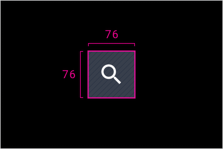
Android Auto's minimum touch-target size is 76 x 76dp, based on driver distance and accommodating quick taps.
-
Android Auto uses three different icon sizes: primary (44 x 44dp), secondary (36 x 36dp), and tertiary (24 x 24dp).
-
Touch targets cannot overlap and all elements within a touch target must be at the same elevation level.
-
Elements, including icons, should be centered within their touch target area.
Onscreen touch targets that are easily reachable reduce driver distraction.
At a glance:
- Minimum touch-target size is 76 x 76dp
- Center and enclose icons within touch targets
Icon sizes

Aligning icons and touch targets
Touch targets on car interfaces must be larger than those on phones and tablets, so that they are easier to glance at and tap. Android Auto's minimum touch-target size of 76 x 76dp is based on both the driver's distance from the head unit and the need to accommodate quick taps while driving.
Touch targets must meet the following requirements:
- Touch targets cannot overlap with other touch targets.
- All touch target elements must be placed at the same elevation level (or z-layer) as the touch target's action areas. This allows users to navigate through the UI using rotary input methods, such as rotary dials, which require placing all navigable elements on the same elevation level to be traversed.

Do
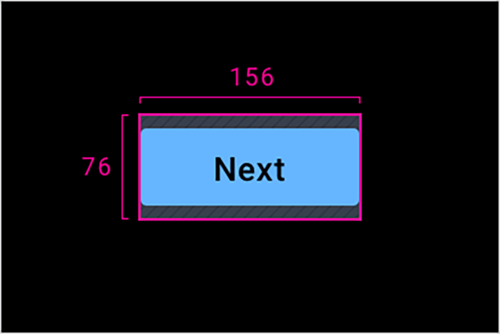
Keep touch-target sizes at or above the minimum requirement of 76 x 76dp.
Do
Center elements within the minimum touch target.
Don’t
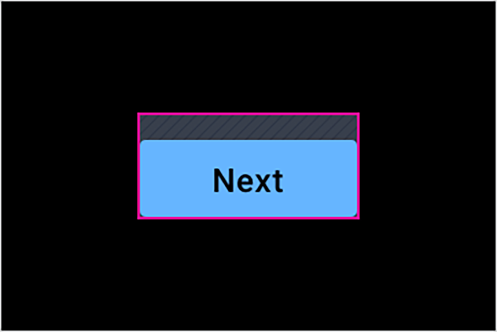
Don’t align an element to the edge of a touch target.
Don’t
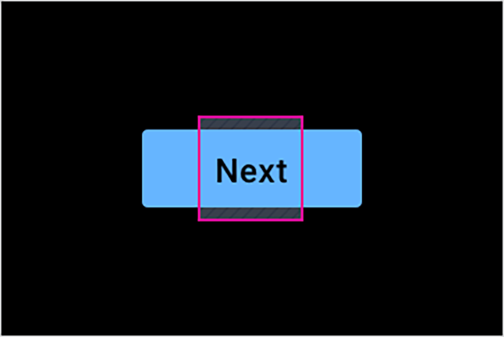
Don’t allow tappable elements to fall outside of a touch target. The touch target should extend as needed to accommodate the entire element.