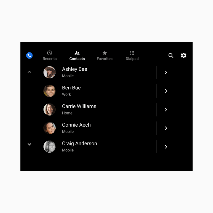
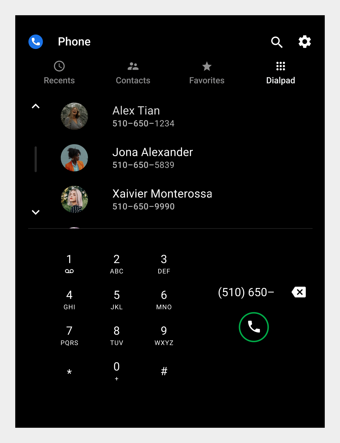
[null,null,["最后更新时间 (UTC):2025-07-25。"],[[["\u003cp\u003eDialer's main views include Browsable contacts, Dialpad, In-call, and App control, each with specific elements and functionalities for managing contacts and calls.\u003c/p\u003e\n"],["\u003cp\u003ePrimary navigation within the app is handled through tabs in the app bar for Recents, Contacts, Favorites, and Dialpad, allowing users to switch between different views.\u003c/p\u003e\n"],["\u003cp\u003eApp controls, accessible via icons on the app bar, provide access to search and settings functionalities through overlays that appear on top of the current view.\u003c/p\u003e\n"],["\u003cp\u003eThe browsable contact space displays contacts in a list or grid format, enabling users to scroll through them and navigate to detailed contact information.\u003c/p\u003e\n"],["\u003cp\u003eDialpad allows users to enter phone numbers, displays matching contacts as they type, and facilitates call placement, while the in-call status screen provides call information and controls.\u003c/p\u003e\n"]]],[],null,["# Spatial model\n\n\u003cbr /\u003e\n\nThis introduction to Dialer describes its main elements, the basic functions they provide, and the architecture that holds them together.\n\nDetailed descriptions are provided in other sections. For a guide to these sections, consult the [overview](/cars/design/automotive-os/apps/dialer/overview).\n\n*** ** * ** ***\n\nAnatomy\n-------\n\nThe Dialer UI includes 4 main types of views and various recurring elements, such as the app bar for providing primary navigation. These views and elements are described in the table below and shown in the sections that follow.\n\n| View type | Elements included | Displayed when... |\n|-------------------------------------------------------------------------|---------------------------------------------------------------------------------------------------|----------------------------------------------------------------------------------|\n| **Browsable contacts** (Recents, Contacts, Favorites, and detail views) | - App bar (or app header, in detail views) - Browsable contact space (list, grid, or detail view) | The user is browsing contact and call information or placing a call to a contact |\n| **Dialpad** | - App bar - Dialpad | The user is entering a phone number to place a call |\n| **In-call** | - In-call status screen - Control bar | A call is in progress |\n| **App control** (Search and Settings) | - App header - Search or settings overlay | The user is searching for a contact or adjusting app settings |\n\n### Browsable contact views\n\n1. App bar with primary navigation tabs and app controls \n2. Browsable contact space\n\nThis is the default arrangement of the app bar and contact space. Depending on screen dimensions, primary navigation and app controls may be stacked, rather than kept in a single horizontal bar.\n\n### Dialpad and in-call views\n\n1. Dialpad 1. In-call status screen \n2. Control bar\n\n### App-control views (Search and Settings)\n\n1. App header / search bar \n2. Search overlay 1. App header \n2. Settings overlay\n\n*** ** * ** ***\n\nPrimary navigation (app bar)\n----------------------------\n\nPrimary app bar navigation consists of exposed tabs:\nUsers can select the Recents, Contacts, or Favorites tabs on the app bar to navigate among these views of contacts. Users can also select Dialpad to place calls using the dialpad. Selecting a tab on the app bar replaces the current view with a different top-level app view\n\n*** ** * ** ***\n\nApp controls\n------------\n\nApp controls on the right side of the app bar provide access to in-app search and settings functions (represented by the magnifying-glass and gear icons, respectively). \nSelecting the Settings control (as shown here) on the app bar opens an overlay that allows users to modify app settings. The Search control brings up an overlay with a keyboard and search bar. Closing the search or settings overlays returns users to their prior location in the app. When an app control is selected, it opens an overlay on top of the browsable content, and the app bar changes to an app header\n\n*** ** * ** ***\n\nBrowsable content space\n-----------------------\n\nIn the browsable contact space, users can scroll vertically through contacts and navigate through z-space into individual contact details, down one level of hierarchy.\n\nBecause navigating through multiple levels increases the driver's cognitive load, in Dialer there are only two levels of contact: the primary level and contact details. \nThe top-level view of browsable contacts lets users select and call a contact -- or navigate down a level, as shown here, to view contact details Selecting a contact's link from a top-level contact view opens the next level down with more detail\n\n*** ** * ** ***\n\nDialpad\n-------\n\nUsers can select the Dialpad tab to display a dialpad for placing a call. If a partially entered number uniquely corresponds to a phone number in contacts, the match is displayed and the user can place a call without having to enter the full number. \nInitial view of the dialpad Dialpad with partially entered phone number, list of matching contacts, and call button\n\n*** ** * ** ***\n\nIn-call status screen and control bar\n-------------------------------------\n\nWhen a user places or answers a call within Dialer, the in-call status screen displays the contact name, call status or duration, and an in-call control bar for call management.\nWhen a call is placed but unanswered, the in-call status screen displays \"Calling...\" When a call is answered, the in-call status screen displays the call's duration"]]