AI-generated Key Takeaways
-
The Dialer UI is comprised of four main view types: Browsable contacts, Dialpad, In-call, and App control.
-
The app bar provides primary navigation through tabs for Recents, Contacts, Favorites, and Dialpad.
-
App controls on the app bar offer access to in-app search and settings functions.
-
The browsable content space allows users to navigate contacts with two levels of hierarchy: a primary level and contact details.
-
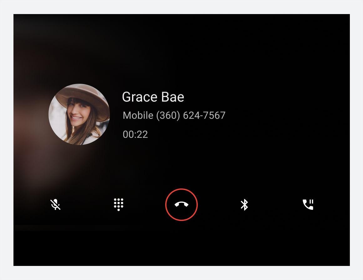
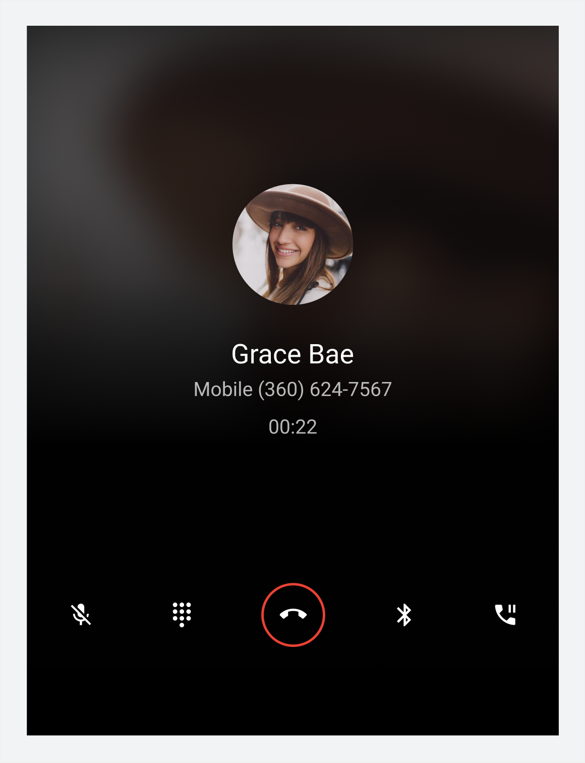
The in-call status screen and control bar display call information and management options when a call is in progress.
This introduction to Dialer describes its main elements, the basic functions they provide, and the architecture that holds them together.
Detailed descriptions are provided in other sections. For a guide to these sections, consult the overview.
Anatomy
The Dialer UI includes 4 main types of views and various recurring elements, such as the app bar for providing primary navigation. These views and elements are described in the table below and shown in the sections that follow.
| View type | Elements included | Displayed when... |
|---|---|---|
| Browsable contacts (Recents, Contacts, Favorites, and detail views) |
|
The user is browsing contact and call information or placing a call to a contact |
| Dialpad |
|
The user is entering a phone number to place a call |
| In-call |
|
A call is in progress |
| App control (Search and Settings) |
|
The user is searching for a contact or adjusting app settings |
Browsable contact views
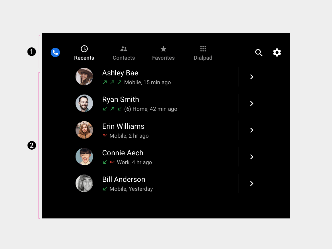
2. Browsable contact space
This is the default arrangement of the app bar and contact space. Depending on screen dimensions, primary navigation and app controls may be stacked, rather than kept in a single horizontal bar.
Dialpad and in-call views
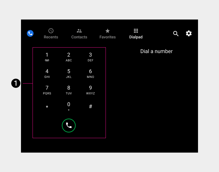
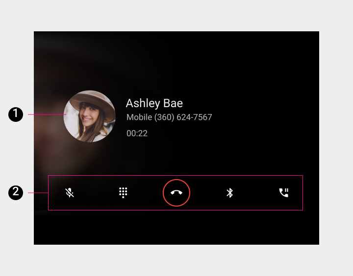
2. Control bar
App-control views (Search and Settings)
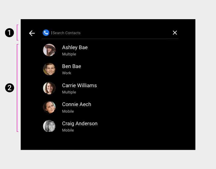
2. Search overlay
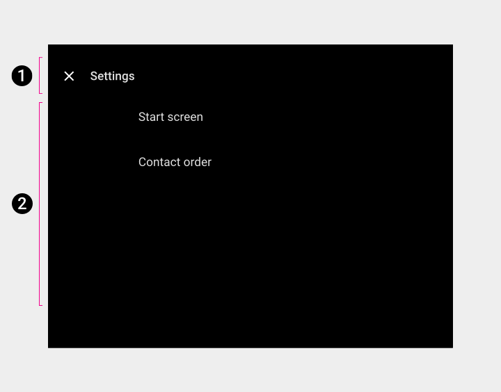
2. Settings overlay
Primary navigation (app bar)
Primary app bar navigation consists of exposed tabs:

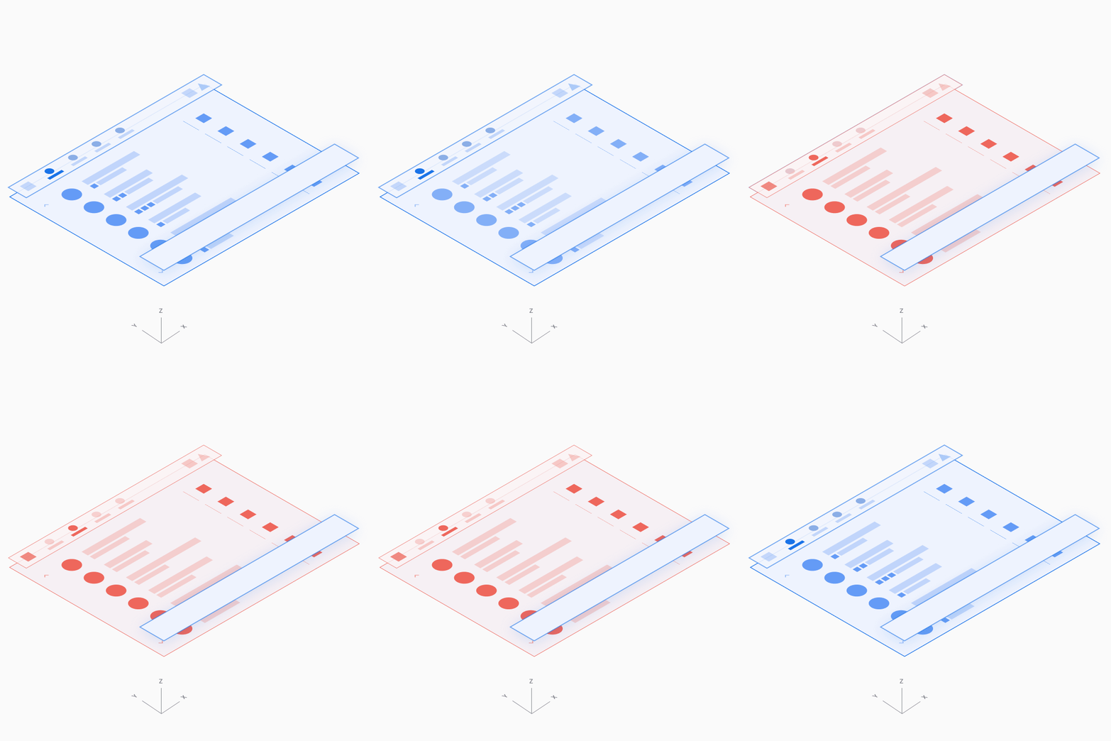
App controls
App controls on the right side of the app bar provide access to in-app search and settings functions (represented by the magnifying-glass and gear icons, respectively).
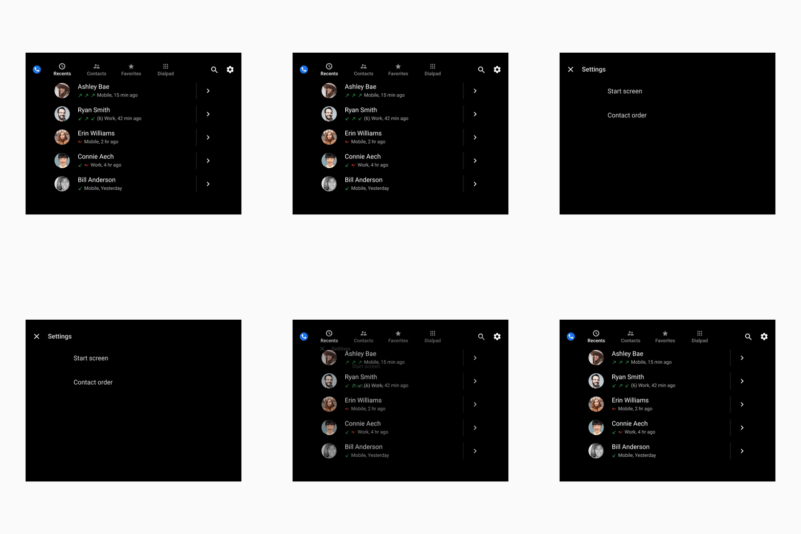
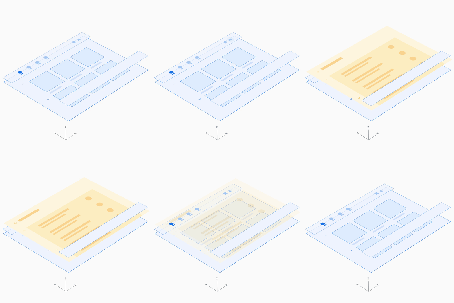
Browsable content space
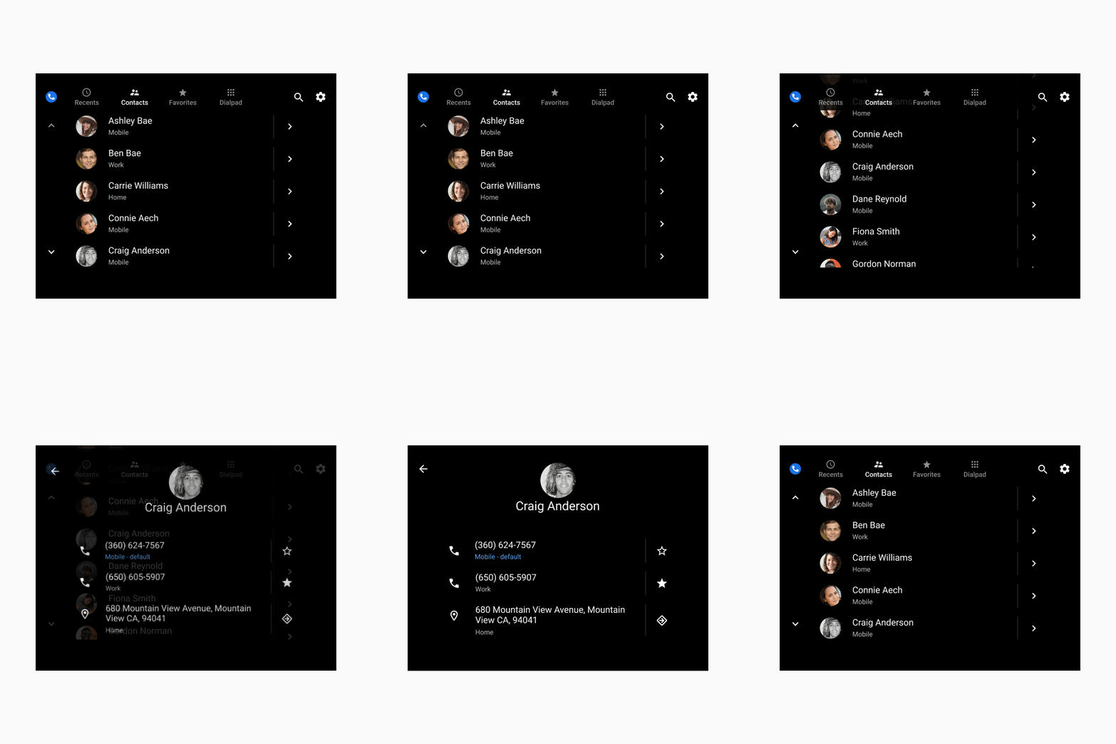
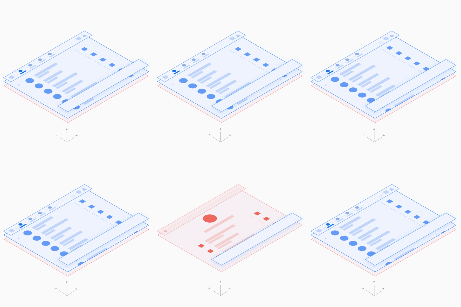
In the browsable contact space, users can scroll vertically through contacts and navigate through z-space into individual contact details, down one level of hierarchy.
Because navigating through multiple levels increases the driver’s cognitive load, in Dialer there are only two levels of contact: the primary level and contact details.
Dialpad
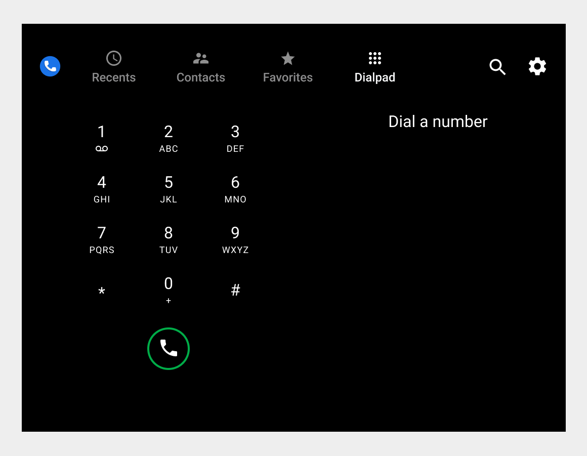
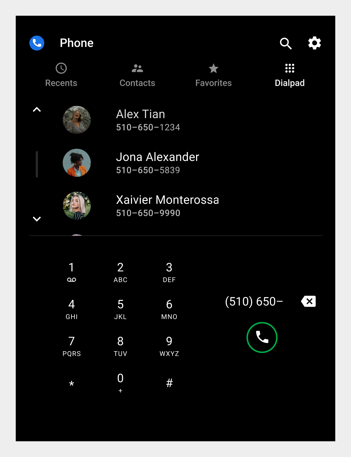
Users can select the Dialpad tab to display a dialpad for placing a call. If a partially entered number uniquely corresponds to a phone number in contacts, the match is displayed and the user can place a call without having to enter the full number.
In-call status screen and control bar
When a user places or answers a call within Dialer, the in-call status screen displays the contact name, call status or duration, and an in-call control bar for call management.
