AI-generated Key Takeaways
-
App settings should be simple, easy to navigate, and include only necessary preferences for in-car use.
-
Settings screens need to be designed for both portrait and landscape layouts.
-
Developers should declare a Settings activity in the app's manifest file to implement a settings function.
-
Ideally, all settings should be accessible from a single screen, avoiding the use of complex dialogs.
In addition to making some decisions about content access and sign-in for your app, you may need to design settings screens.
If you want to make your app settings available to users, you need to design a settings screen, plus screens for any error-handling that may be needed. To find out how users will access your app settings, visit Sign-in, settings & search.
As you design your settings flow, keep in mind the requirements and guidelines below.
Layout requirements
Currently, you need to design versions of your settings screens for both portrait and landscape layouts:
- A portrait-mode layout for the screen size used in the Volvo Polestar 2 (1068 x 1425dp; 1152 x 153px)
- A landscape-mode layout for the screen size used in Google's reference Automotive implementation (1075 x 806dp; 1024 x 768px)
You can use the emulator in Android Studio to see how your layouts look in these two implementations. You can also consult Layout for reference information about how car makers’ layouts are adapted to various screen sizes (keeping in mind that details such as margins and padding values may be changed by the car maker).
Settings example & guidelines
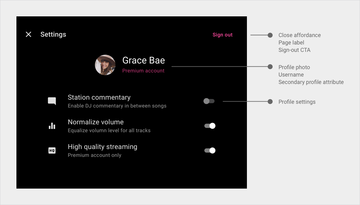
The app bar in the media app template includes an option for a Settings control, which users can select to bring up an overlay with your app settings screen.

Settings guidelines
In addition to these guidelines, be sure to consult the general style guidelines in Guidelines for custom screens.
| Requirement level | Guidelines |
|---|---|
| SHOULD |
App developers should:
|
Rationale:
- Design for cars: Keep in-car settings to the minimum required for that environment, and make them easy to find and use.
