AI-generated Key Takeaways
-
The control bar displays up to 5 controls in its unexpanded version and up to 5 additional controls when expanded via an overflow button.
-
In media apps, the control bar is commonly used for playback controls like Play/Pause, Previous, and Next.
-
The control bar's size and placement adapt to various screen widths and heights, including specific layouts for extra-wide, wide, standard-width, and short screens.
-
Styles for the control bar include specifications for icon color in day and night modes, as well as defined sizes for the control bar itself and primary icons.
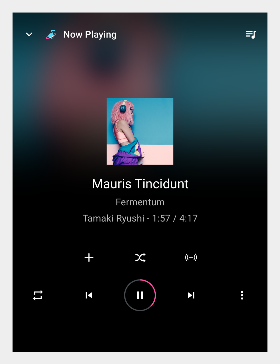
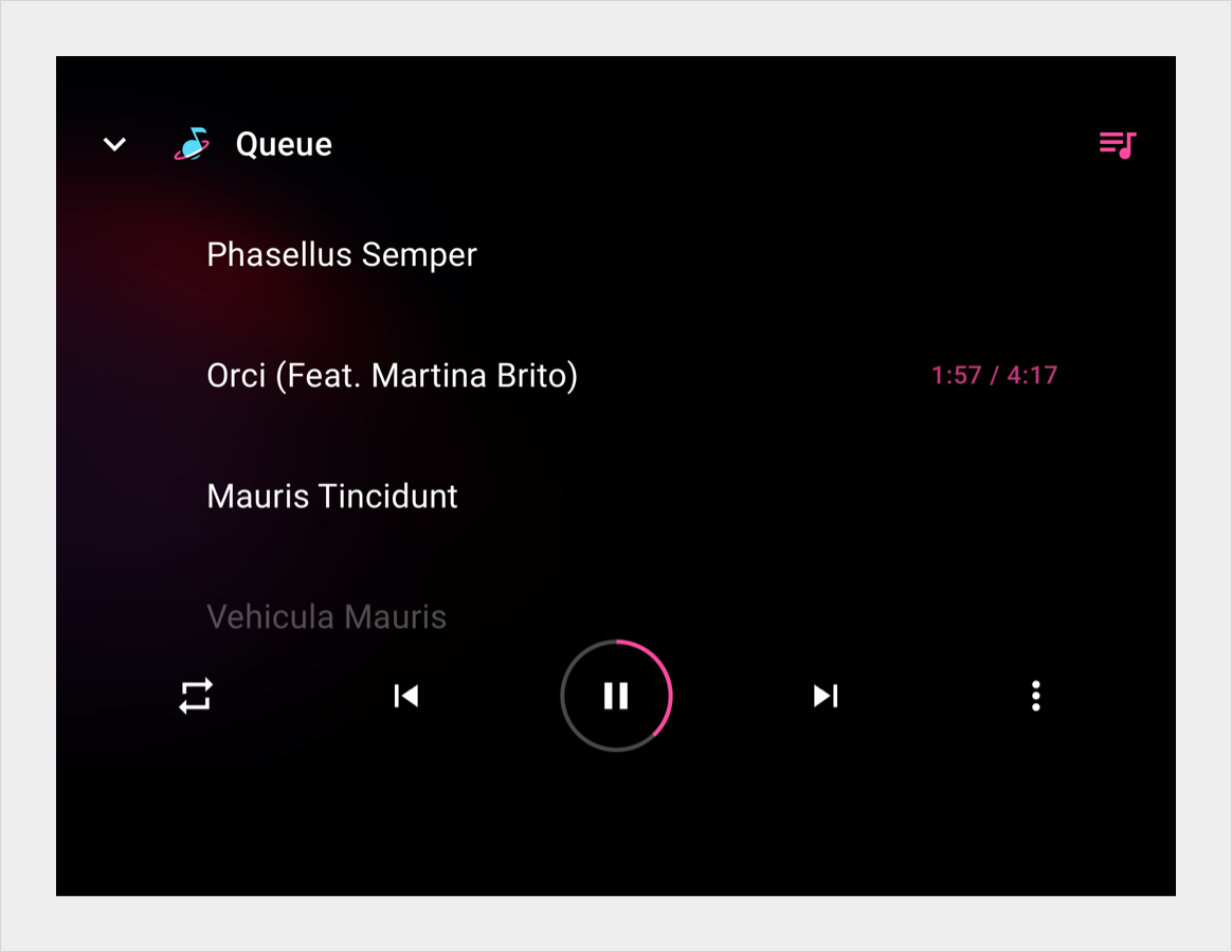
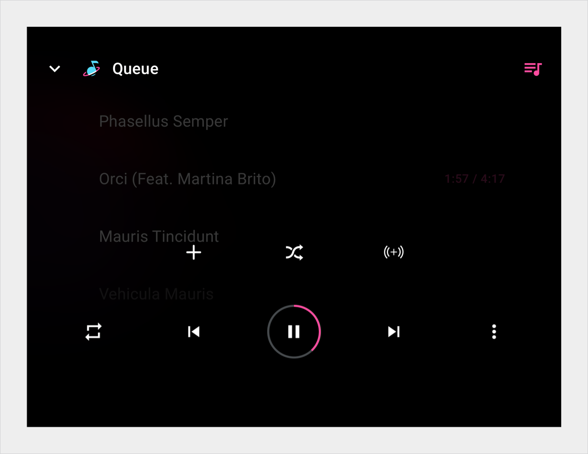
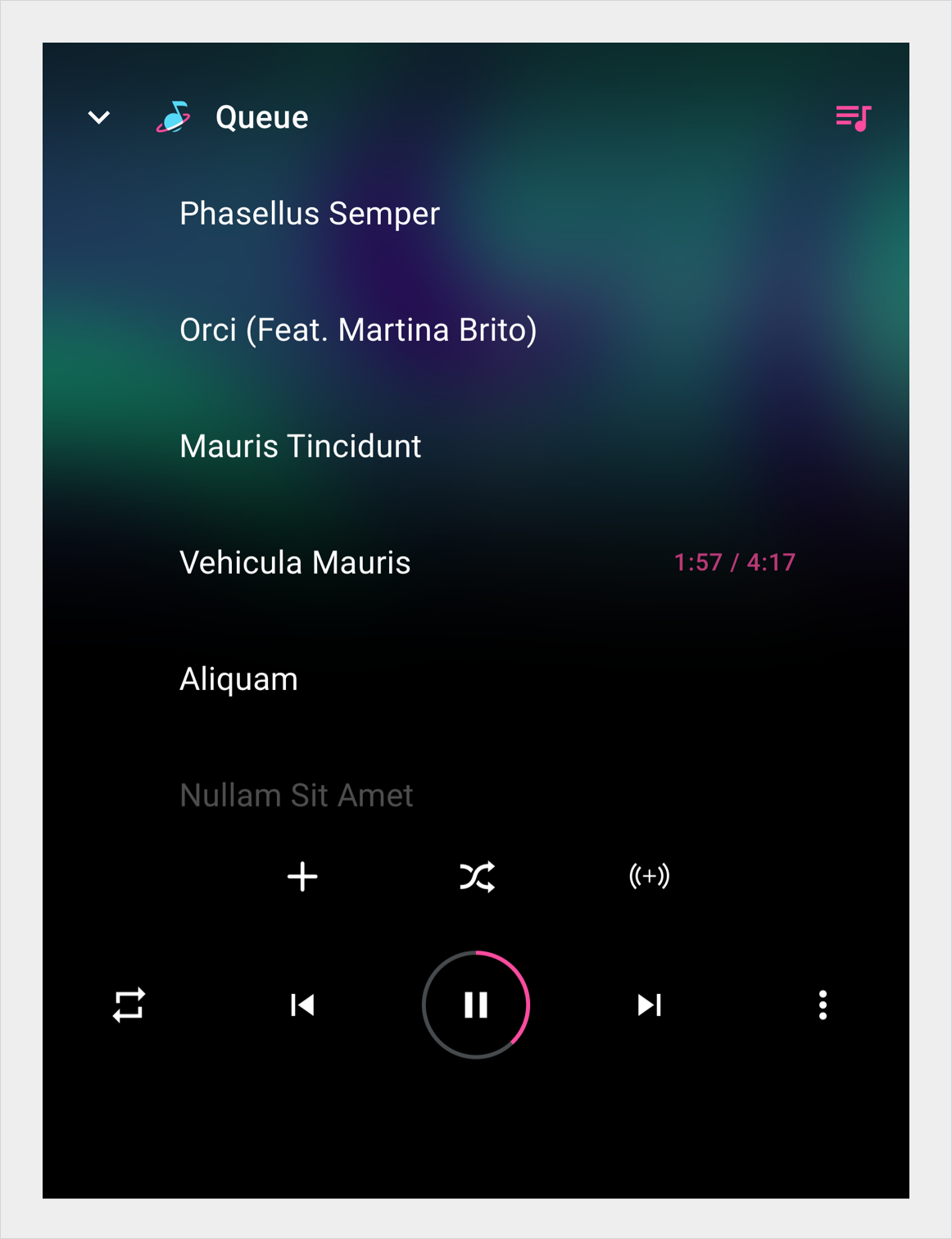
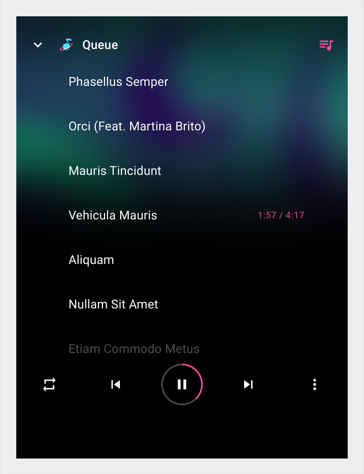
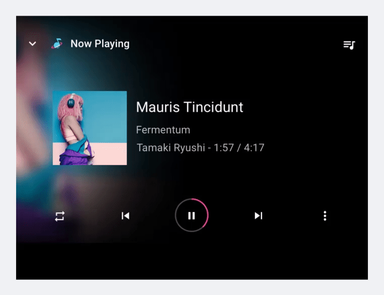
The control bar provides controls associated with a particular view. It displays up to 5 controls in its unexpanded version, and up to 5 additional controls when expanded.
In media apps, the control bar is used in the playback view for Play/Pause, Previous, Next, and other controls, including those for custom third-party actions.

Anatomy
The control bar has two formats: unexpanded and expanded. The unexpanded version can include up to 5 controls. In media apps,, one of these is Play/Pause.
When expanded, the control bar can include up to 5 additional controls in a second row. Users can select the overflow button to expand or collapse the control bar.
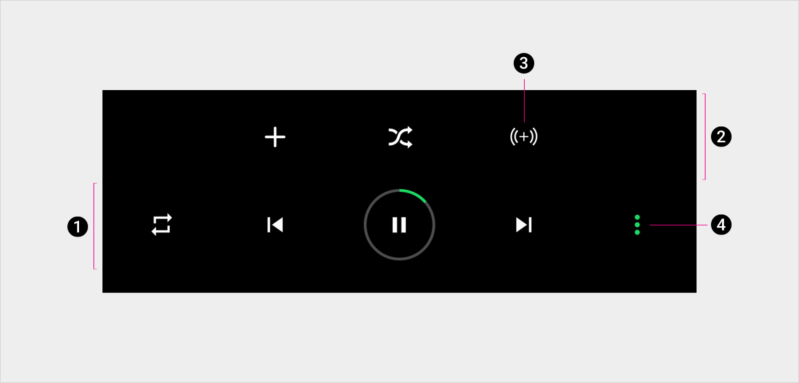
2. Expanded portion of action bar
3. One of the controls
4. Overflow button (expands and collapses control bar)
Specs
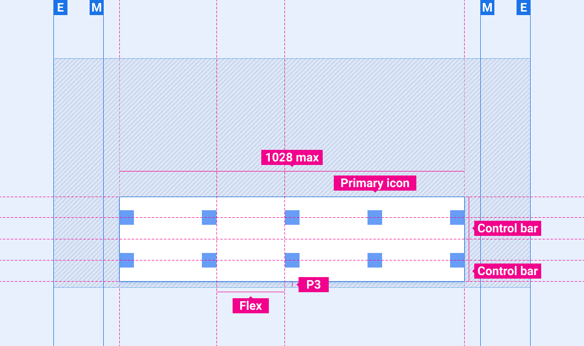
Control bar
Expanded control bar
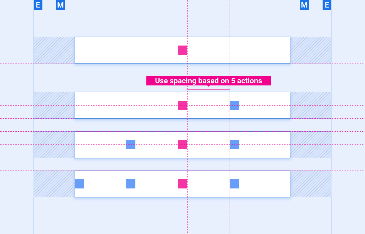
Placement of 1–4 controls on control bar with anchored center control
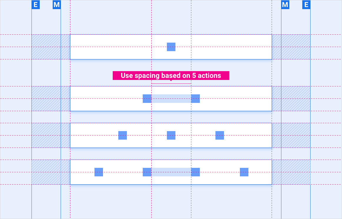
Placement of 1–4 controls on control bar with no anchored control
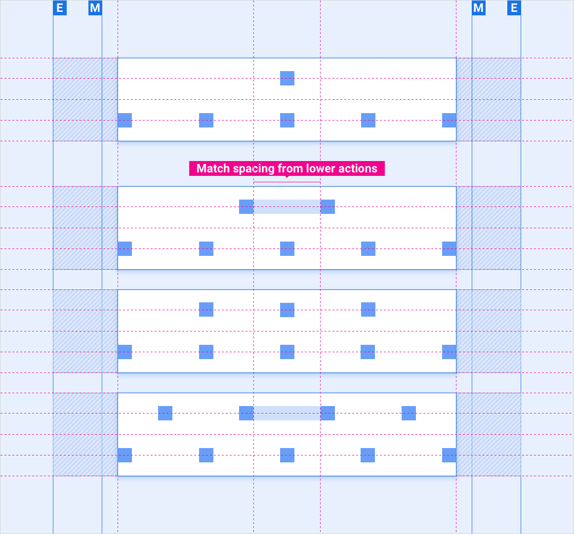
Placement of 6–9 controls on control bar
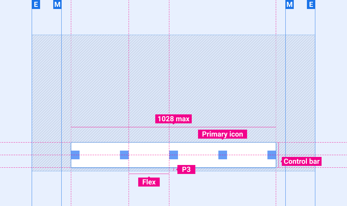
Scaling layouts
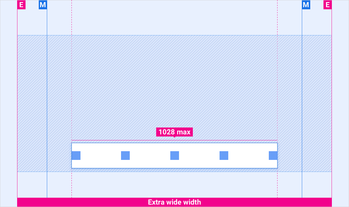
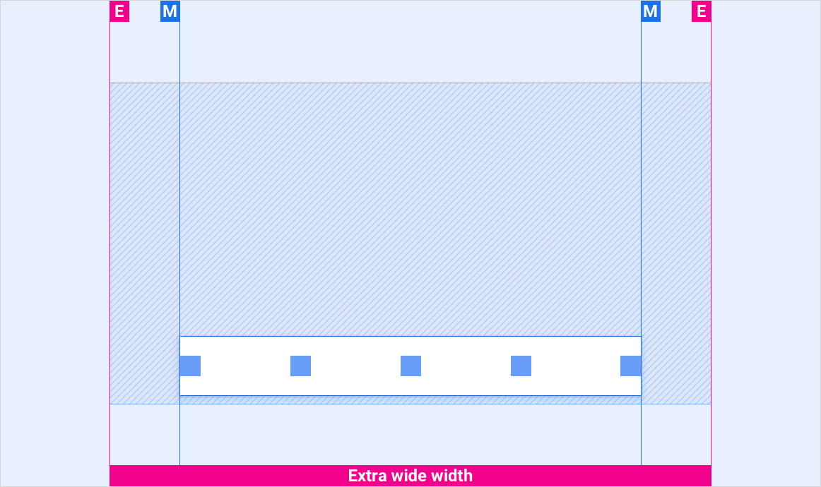
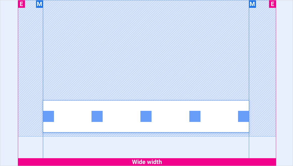
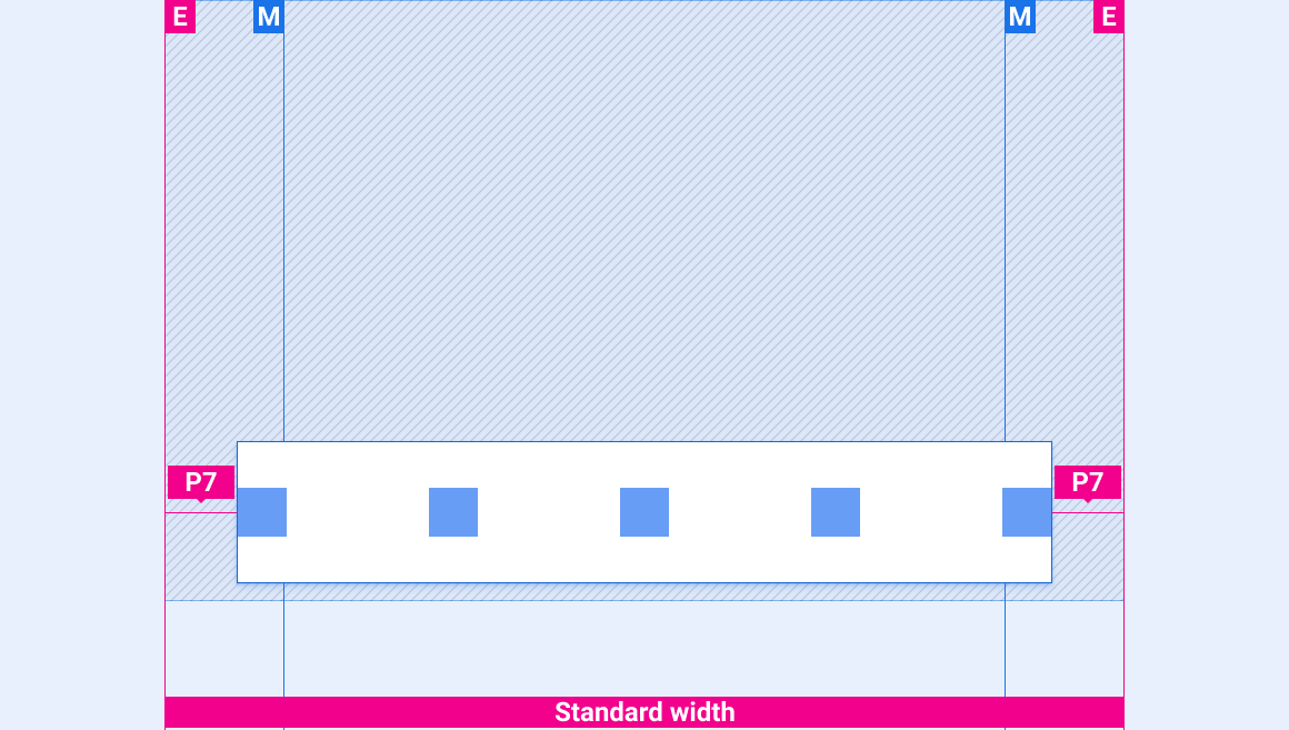
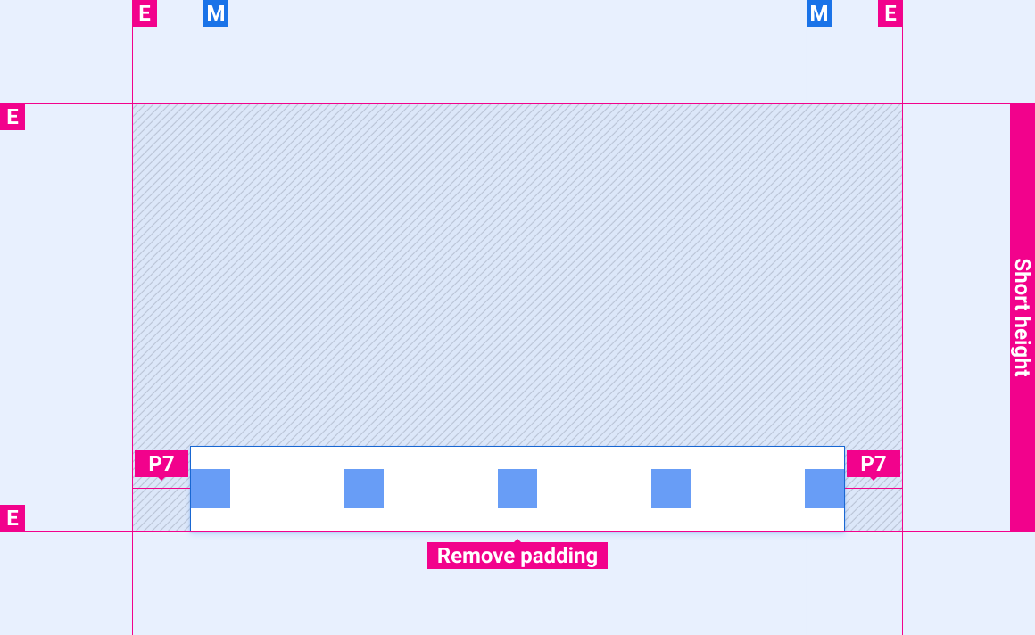
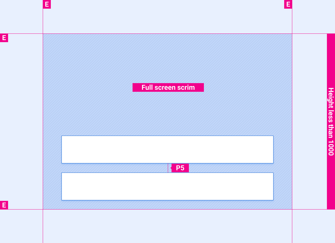
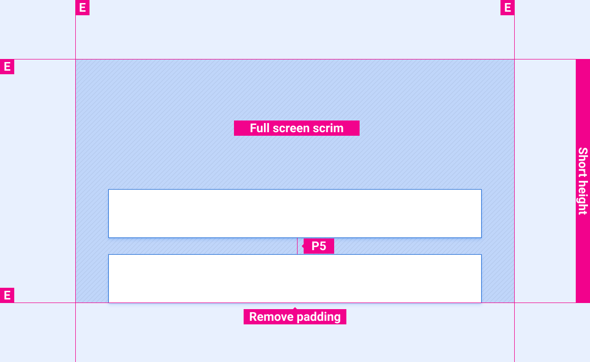
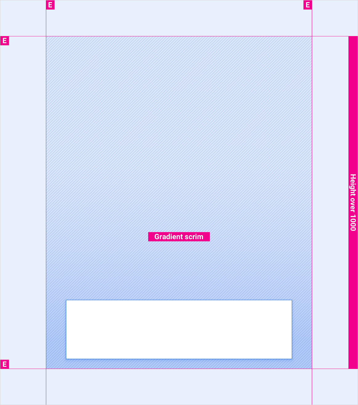
These reference layouts show how to adapt the control bar to accommodate screens of various widths and heights. (Width and height categories are defined in the Layout section.) Note that all pixel values are in rendered pixels, before any down-sampling or up-sampling occurs.
Extra-wide screens with more than 1028dp between margins
Extra-wide screens with less than 1028dp between margins
Wide screens
Standard-width screens
Short screens
Control bar expanded on screens shorter than 1000dp
Control bar expanded on short screens
Control bar expanded on screens taller than 1000dp
Styles
Color
| Element | Color(day mode) | Color (night mode) |
|---|---|---|
| Primary icons | White | White @ 88% |
| Full-screen scrim | Black @ 78% | Black @ 84% |
| Gradient scrim | TBD | TBD |
Sizing
| Element | Size (dp) |
|---|---|
| Control bar | 96 (short screens) / 128 (standard height and above) |
| Primary icon | 44 |
Examples