AI-generated Key Takeaways
-
The minimized control bar displays a minimal set of controls and metadata and opens a full-screen overlay with additional controls when selected.
-
The anatomy of the minimized control bar includes a content tile, metadata, and controls.
-
Specifications for the minimized control bar are provided, including considerations for text overflow.
-
Reference layouts demonstrate how the minimized control bar adapts to screens of various widths and heights.
-
Style guidelines cover typography, color, and sizing for elements within the minimized control bar.
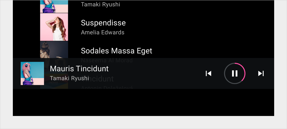
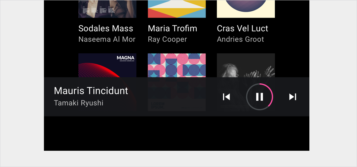
The minimized control bar is used to display a minimal set of controls and metadata. When selected, it opens up a full-screen overlay that includes a larger control bar with additional controls.
For example, the minimized control bar for media apps keeps a small set of playback controls and metadata available throughout the app when music is playing – and it can also open up a full-screen playback view.

Anatomy
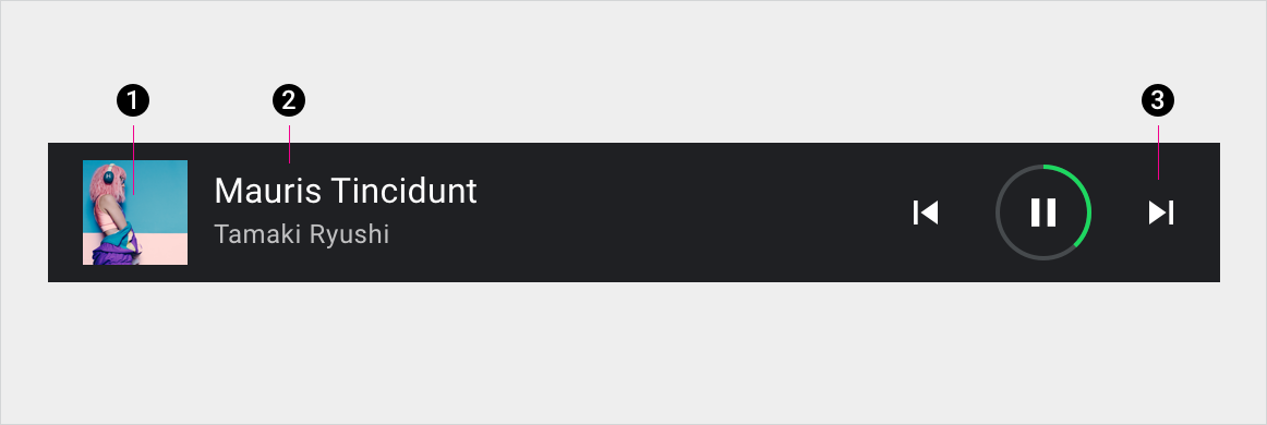
2. Metadata
3. Controls
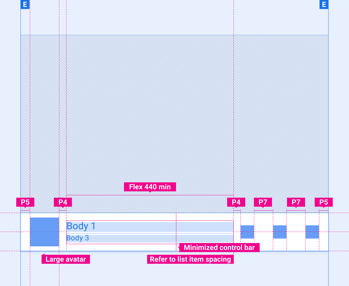
Specs
Minimized control bar
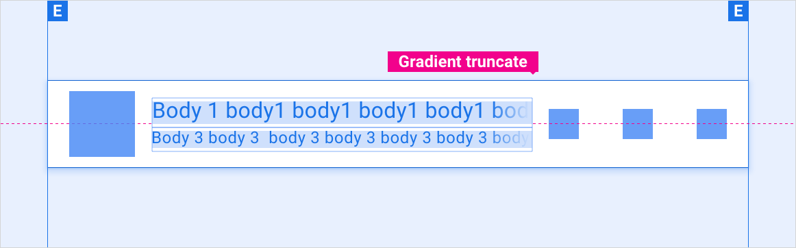
Minimized control bar with text overflow
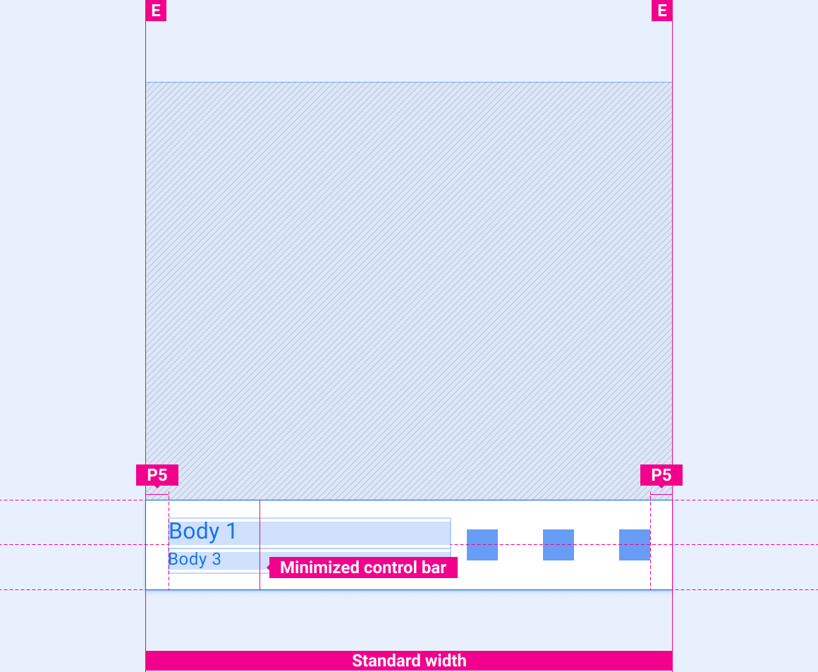
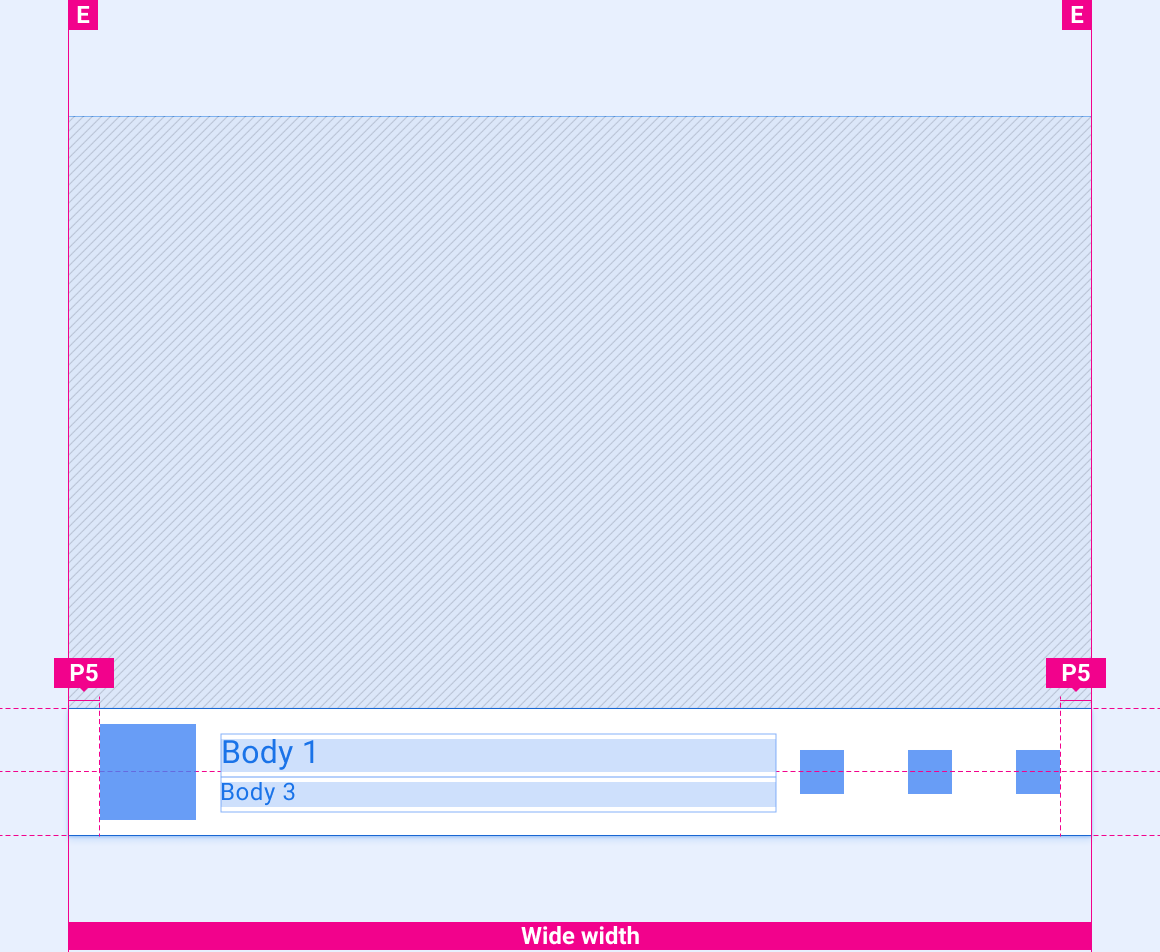
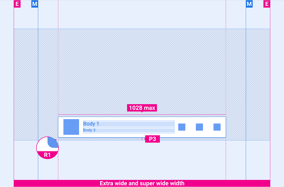
Scaling layouts
These reference layouts show how to adapt the minimized control bar to accommodate screens of various widths and heights. (Width and height categories are defined in the Layout section.) Note that all pixel values are in rendered pixels, before any down-sampling or up-sampling occurs.
Standard-width screens
Wide screens
Extra-wide and super-wide screens
Styles
Typography
| Type style | Typeface | Weight | Size (dp) |
|---|---|---|---|
| Body 1 | Roboto | Regular | 32 |
| Body 3 | Roboto | Regular | 24 |
Color
| Element | Color(day mode) | Color (night mode) |
|---|---|---|
| Primary type | White | White @ 88% |
| Secondary type | White @ 72% | White @ 60% |
| Icons | White | White @ 88% |
| Time-elapsed indicator | 3rd party accent | 3rd party accent |
| Time-remaining indicator | #464A4D | #464A4D |
| Background of minimized control bar | #0E1013 @ 84% | #0E1013 @ 88% |
| Gradient truncate | Black @ 0-100% in 10% of text space | Black @ 0-100% in 10% of text space |
Sizing
| Element | Size (dp) |
|---|---|
| Icons | 44 |
| Content tile | 96 |
| Progress indicator | 84 |
| Progress indicator track | 4 |
| Height of minimized control bar | 128 |
| Rounded corner radius (R1) | 4 |
Examples