AI-generated Key Takeaways
-
The Android Automotive OS color strategy prioritizes a dark theme built from black for consistency and hardware alignment, supporting both day and night driving modes.
-
A minimum contrast ratio of 4.5:1 between background and content like icons or text is crucial for readability and safety.
-
Color usage should be minimal and purposeful, primarily relying on a grayscale palette with the "car accent" blue used sparingly for highlights.
-
Transparency and opacity are utilized to create visual hierarchy, guide focus, and obscure backgrounds with scrims.
-
Visual consistency is maintained by using color strategically across different screens and elements, reinforcing memory and recognition.
The foundation of the Android Automotive OS color strategy is the idea of “building from black.” Basing interface colors on black makes for a more consistent user experience, with no drastic change between day and night themes.
Building from black also ensures better alignment with hardware, since dark materials are often used in car interiors and dashboards.
Guidance at a glance (TL;DR)
- Build your color choices from black to support both day and night driving
- Maintain a contrast ratio of at least 4.5:1 between background and icons or text
- Use color minimally, with purpose
- Show elevation via grayscale
- Use transparency and opacity to guide visual focus
Palettes and gradients
The dark theme of the Android Automotive OS interface is based on a grayscale palette. Ideally, any additional colors should be of reduced intensity, as in the dark variants of the colors in the Material Design palettes.
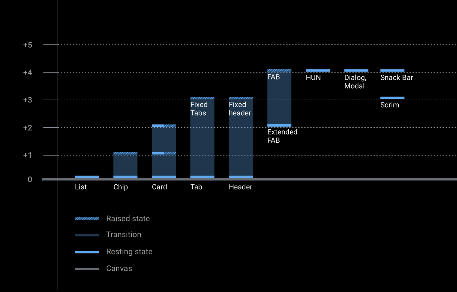
This section includes palette and opacity information, along with charts providing grayscale values for the elevation levels associated with each component.

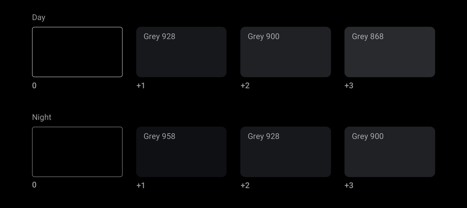
Android Automotive OS grayscale palette
The Android Automotive OS grayscale palette is used for elements such as text and icons, and it is designed to accommodate the unique requirements of the driving environment.
This palette needs to be diverse enough to:
- Cover all the different use cases of the dark theme UI
- Provide enough range to define hierarchy through tonal differences
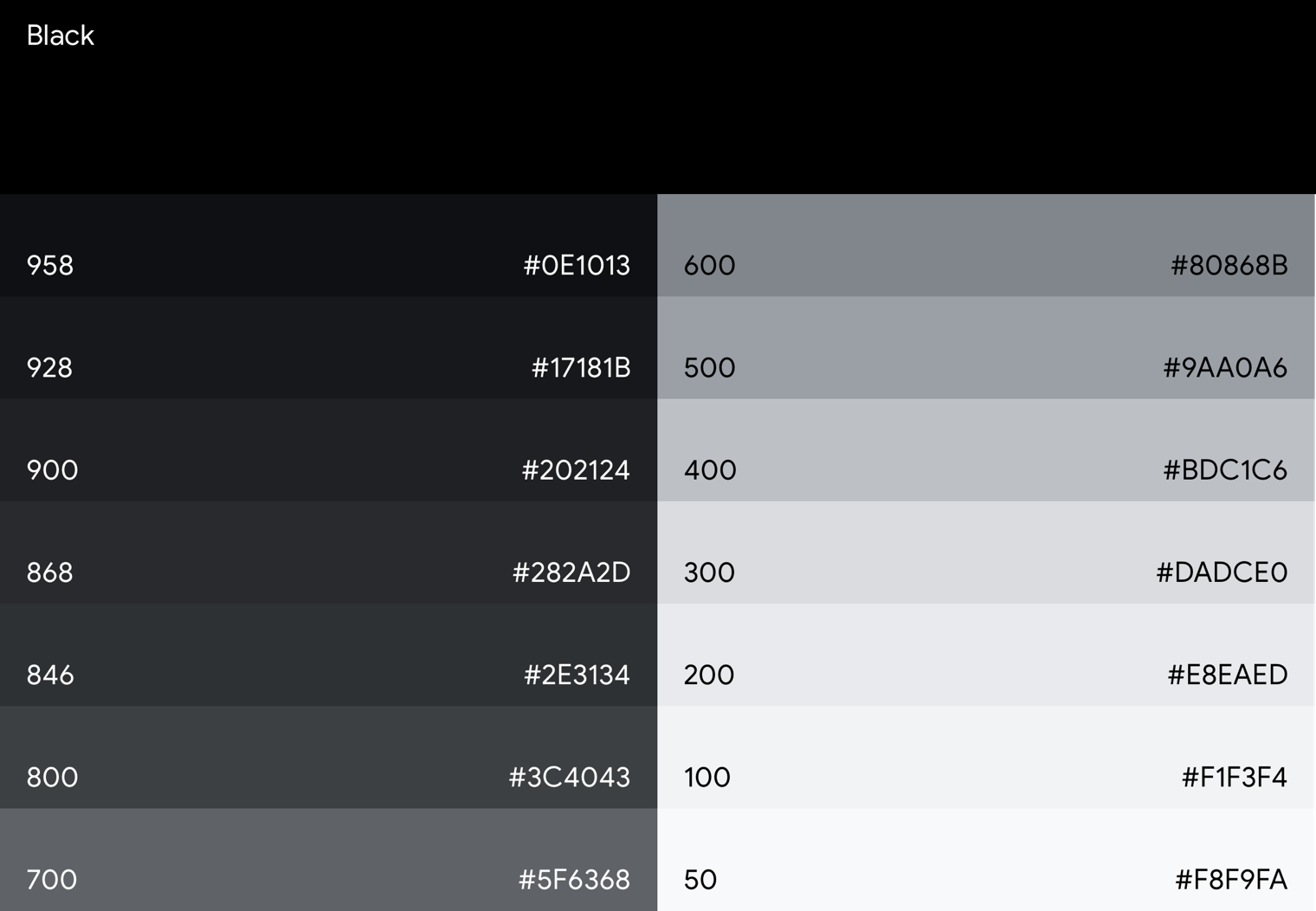
Tonal differences create the illusion of depth even on true black backgrounds where shadows are imperceptible. To provide sufficient tonal differences, the Android Automotive OS grayscale palette includes mid-greys. Material Design greys starting from Grey 900 approach brighter colors too quickly; a color two steps lighter would be Grey 700, which is too bright for the auto context.
Accent color
In addition to the grayscale palette at the core of the Android Automotive OS interface, other colors can be used sparingly for purposes such as drawing focus.
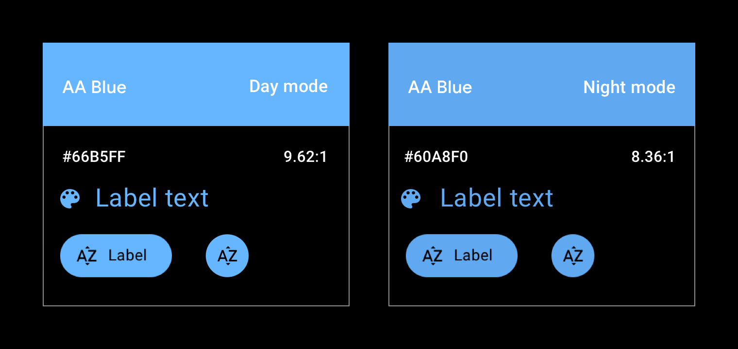
Currently, Android Automotive OS has one official accent color, a shade of blue referred to in the support library as "car accent". To increase saturation and vibrancy, this blue is shifted slightly from the standard Google blue. This shift helps the colors sit more comfortably on a dark surface.
Opacity-value charts
Transparency conveys a sense of depth and reinforces the Material Design spatial model. To use transparency effectively, choose dark or white opacity values based on your use case.
Dark opacity values
The most common use case for dark opacity values is to create scrims (overlays).
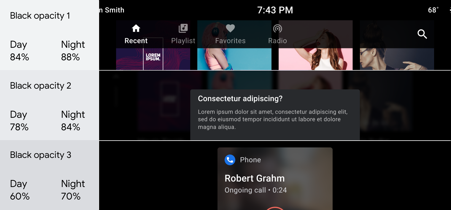
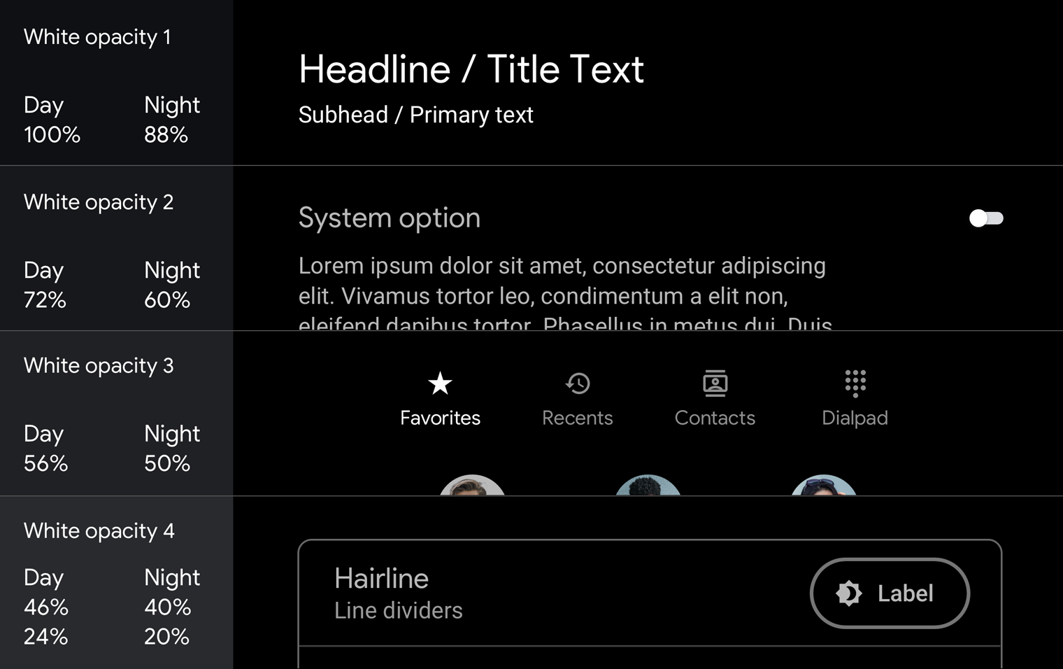
White opacity values
These values are mostly used on text. They are especially effective when the background is colored. Using solid grey on a dark, colored background looks too muddy.
For examples of how to use opacity in scrims and text hierarchies, see Guidance and examples.
Contrast
To meet basic Android Automotive OS safety guidelines, the contrast ratio between background and icons or text should be at least 4.5:1. For details of how contrast ratios apply to specific automotive UI elements, see Make content easy to read.
Do
Don’t
Guidance and examples
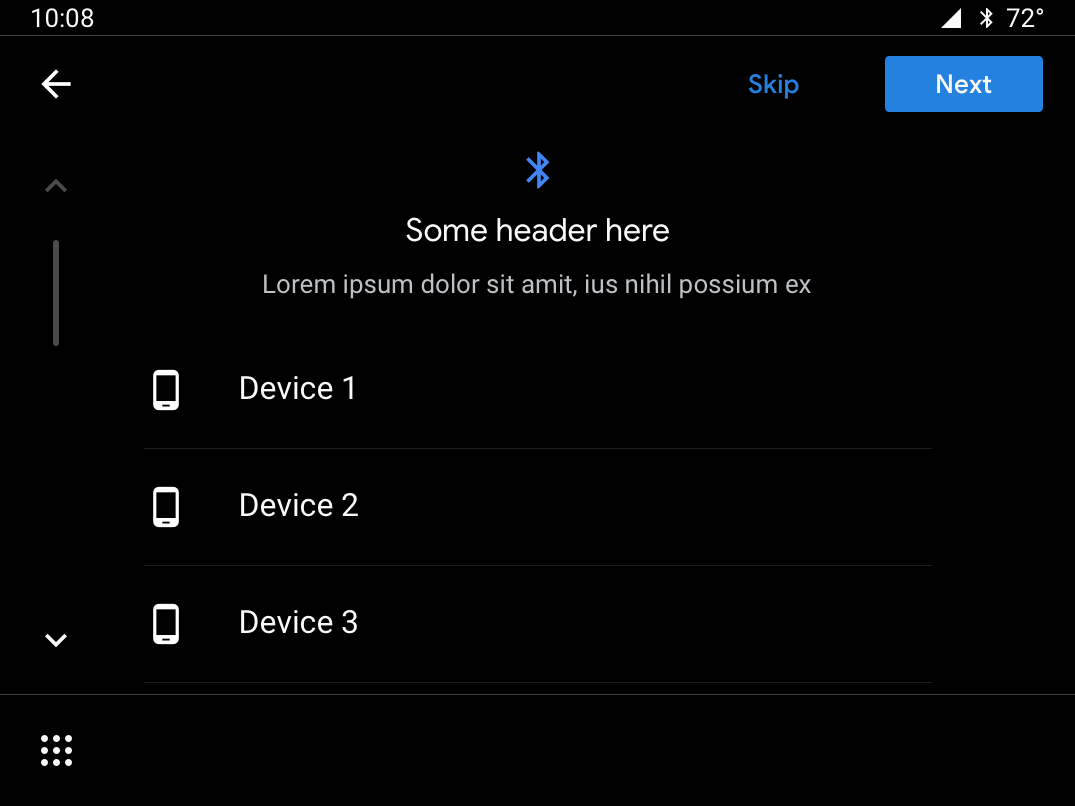
The Android Automotive OS dark UI is clean and simple, with minimal use of color. In addition to using the appropriate colors, tones, and opacity values for UI elements (see Palettes and gradients), it’s important to make sure every use of color and color gradients has a purpose.
This section provides guidance and examples for applying transparency, opacity, and color to achieve a variety of goals. These goals include:
- Obscuring backgrounds
- Maintaining consistency
- Establishing a visual hierarchy that draws user focus to primary actions.
- Distinguishing entities in a list
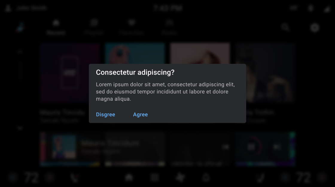
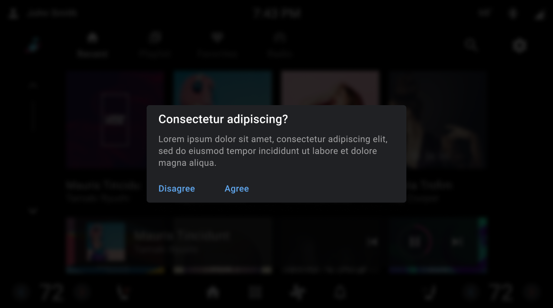
Obscuring backgrounds with scrims
Full-screen scrims (overlays) are used to cover backgrounds behind disruptive elements, such as dialogs that require users to take an action. Partial scrims are used to draw attention to the transition of elements such as notifications.


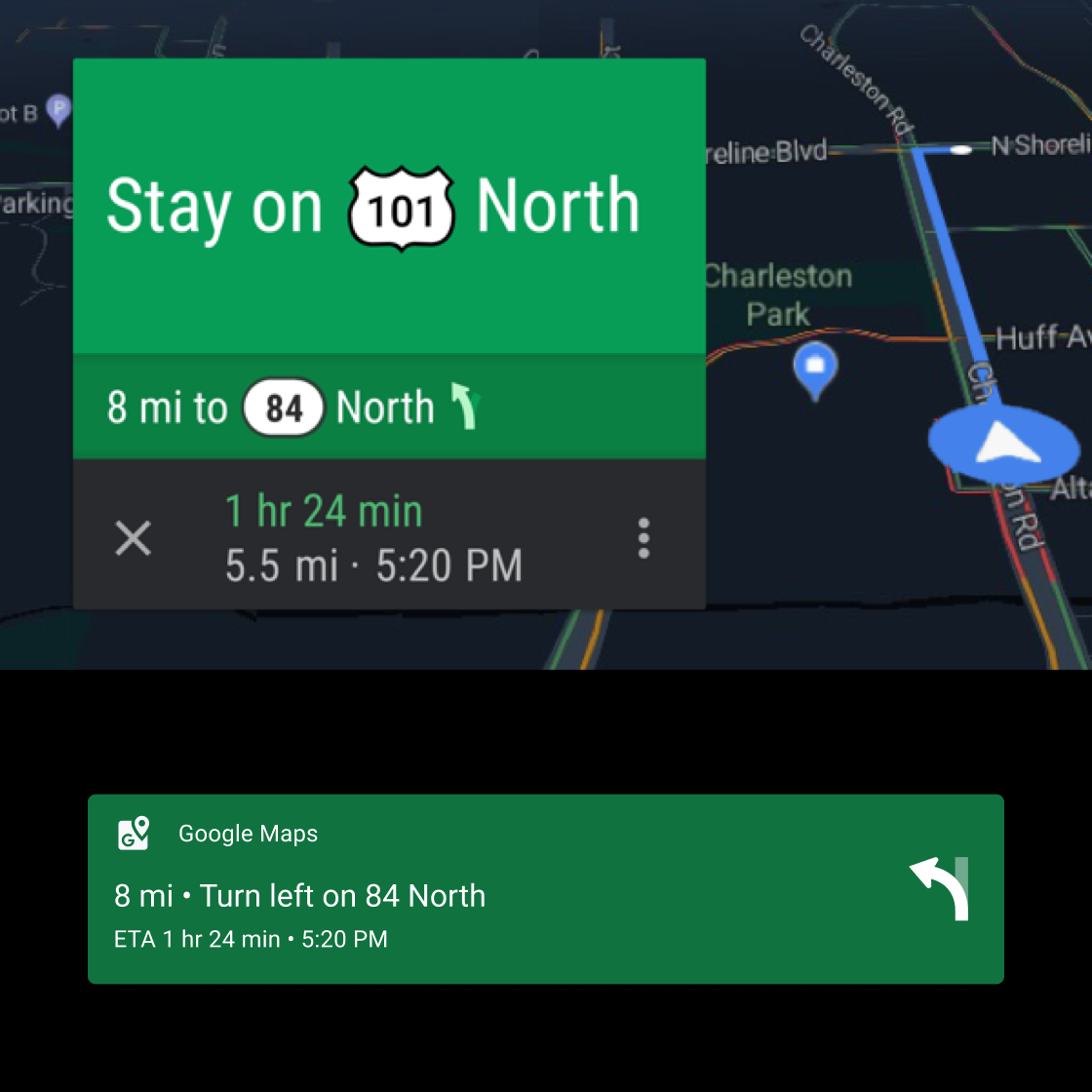
Maintaining consistency with color
Color is a powerful cue for reinforcing memory and recognition. Use it to create a coherent experience from screen to screen.
Do

Do

Do
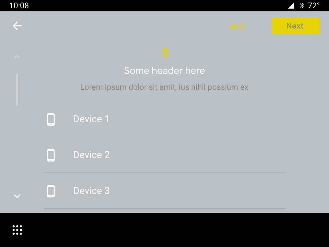
Don’t
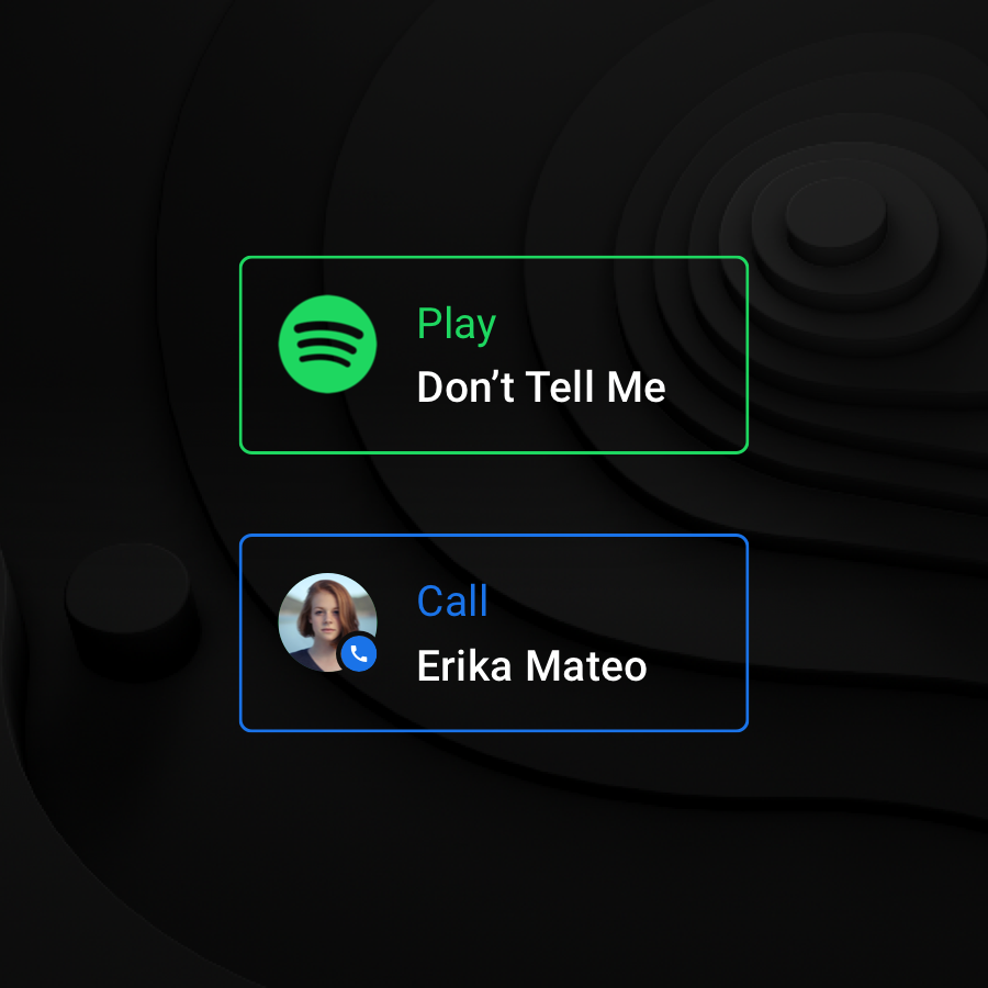
Establishing a visual hierarchy
Use the white opacity values to create a consistent and strong visual hierarchy. The opacity values of 88, 72, and 56 contain just enough contrast to meet accessibility requirements while creating a comfortable reading environment on a dark background. Use the 96% opacity on all whites for night mode.
Do
Don’t