本部分将介绍可针对各种屏幕尺寸进行缩放的屏幕布局的设计准则。
此处定义的内边距和框线值用在组件、媒体规范、通知中心规范和拨号器规范中。
指南一览 (TL:DR):
- 根据适当的屏幕尺寸类别确定布局
- 使用 8dp 网格对齐
- 将外边距宽度设置为应用工作空间的 12%
- 在外边距中放置滚动条和导航辅助控件
- 使用内边距实现元素之间的固定间距
关键布局概念
- 应用工作空间:在计入汽车制造商和系统界面功能占用的屏幕空间后,应用可使用的屏幕区域
- 屏幕尺寸类别:由 4 个屏幕宽度范围(标准、宽、超宽和超宽)和 3 个屏幕高度范围(短、标准和高)组成,其中“屏幕”是指应用的工作空间,而不是整个屏幕的边缘
- 内边距:一组间距值,用于指定布局中元素与组件之间的固定垂直和水平间距
- 框线:一组可变宽度的间距值(由宽度类别确定),用于表示外边距或组件边缘与布局中的某个元素之间的水平空间
- 柔性区域:组件的一部分,有时会指定最小值或最大值,可缩放以适应屏幕尺寸
应用工作空间
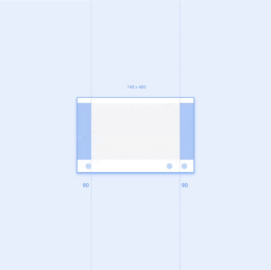
应用的工作空间是指在扣除汽车制造商和系统界面功能占用的屏幕空间之后剩余的可用屏幕区域。应用工作空间应包含左右外边距,以及应用画布,即应用的主要内容区域。
每个外边距应等于应用工作空间宽度的 12%。外边距通常包含应用的滚动条和导航功能。
屏幕尺寸
参考规范布局与一组基于应用工作空间的宽度和高度的屏幕尺寸类别相对应。
在这些指南的规范中,这些类别都通过名称来指代。例如,“宽”是指介于 930dp 到 1279dp 之间的所有屏幕宽度。
屏幕尺寸类别会影响以下方面的建议:
- 组件和元素中的框线间距
- 缩放组件弹性区域
- 何时隐藏或显示可选元素,例如最小化的控件栏上的专辑封面
宽度类别
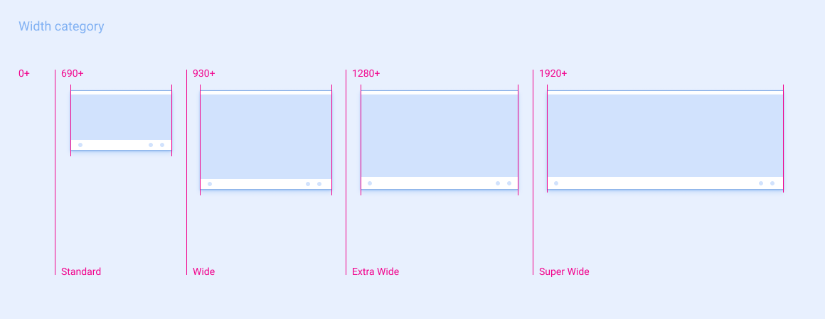
| 标准 | 宽 | 超宽 | 超宽 | |
|---|---|---|---|---|
| 屏幕宽度范围 | 690 - 929dp | 930 - 1279dp | 1280 - 1919dp | ≥ 1920dp |
身高类别
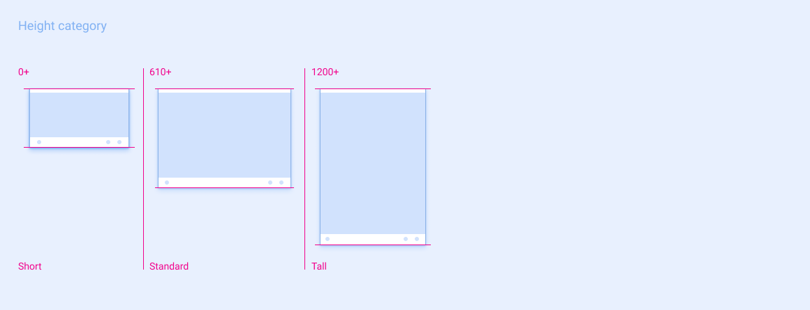
| 简洁版 | 标准 | 长 | |
|---|---|---|---|
| 屏幕高度范围 | 0 - 609dp | 610 - 1199dp | ≥ 1200dp |
间距
参考规范布局采用 8dp 网格进行构建。在实践中,这意味着规范中的界面组件和元素的间距为 8dp 的倍数。
间距有两种类型:
内边距,用于固定宽度和固定高度的间距
框线(用于可变宽度间距)
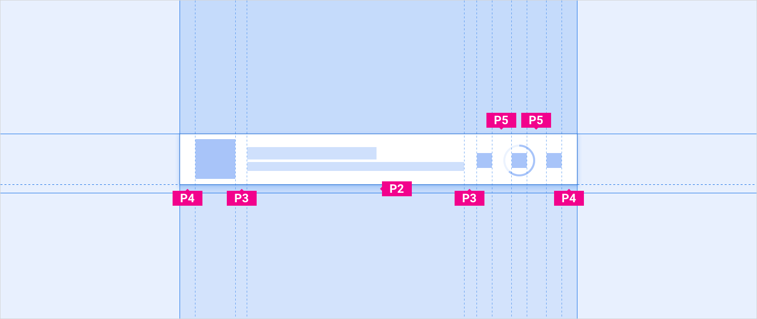
内边距
内边距可在参考规范布局中的组件之间建立固定宽度和固定高度的间距。它还可以规定组件内元素之间的固定间距,例如拨号键盘组件上相邻数字目标之间的间距。一般而言,两个元素之间的关系越小,它们之间的内边距就越窄。
有 9 个填充值,指定为 P0 - P8。
以下是内边距值及其对应的尺寸:
| P0 | P1 | P2 | P3 | P4 | P5 | P6 | P7 | P8 |
|---|---|---|---|---|---|---|---|---|
| 4dp | 8dp | 12dp | 16dp | 24dp | 32dp | 48dp | 64dp | 96dp |
与根据屏幕宽度类别更改间距值的keylines不同,内边距值保持不变。例如,P1 始终为 8dp。不过,在某些情况下,在适用于不同屏幕尺寸的参考规范布局中,一组特定组件或元素之间的距离可能具有不同的内边距值。例如,建议的网格项之间的垂直间距为 P4(适用于短屏幕)和 P5(适用于标准屏幕和高屏幕)。
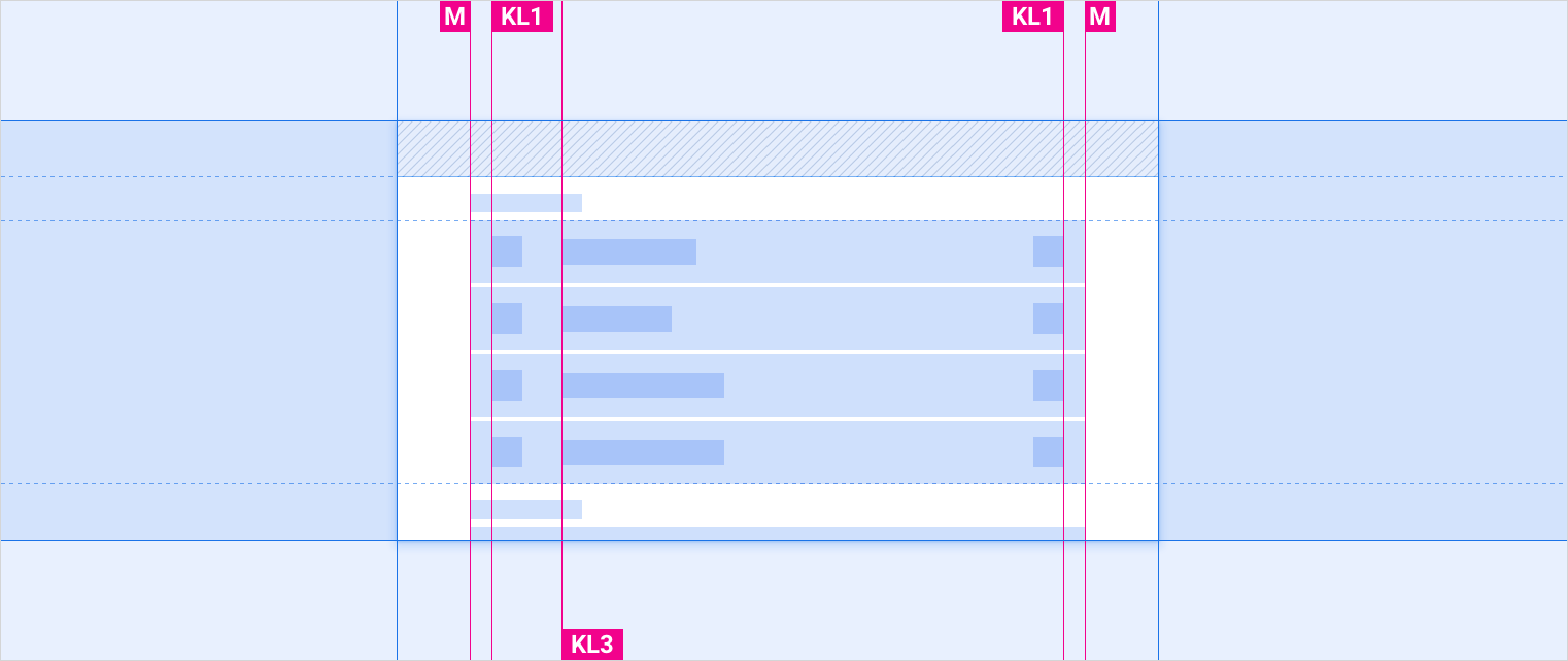
框线
框线会指定元素距离组件最近的外边距或边缘有多远,而不是在参考规范中指明元素之间的内边距。框线会根据屏幕宽度更改值。它们提供了一种便利的方式来将布局缩放到不同的屏幕尺寸,同时保持元素比例的水平间距。
有 5 条框线,标示为 KL0 到 KL4。
以下是每种屏幕宽度的框线值:
| 屏幕宽度 | 标准 | 宽 | 超宽 | 超宽 |
|---|---|---|---|---|
| KL0 | 16dp | 24dp | 24dp | 32dp |
| KL1 | 24dp | 32dp | 32dp | 48dp |
| KL2 | 96dp | 112dp | 112dp | 112dp |
| KL3 | 112dp | 128dp | 128dp | 152dp |
| KL4 | 148dp | 168dp | 168dp | 168dp |
扩缩策略
参考规范布局提供了有关将应用缩放到不同屏幕尺寸的指南。为帮助实现平滑缩放,规范通常包括:
- 弹性区域:这是汽车制造商应根据其特定屏幕尺寸展开或收起的组件的一部分
- 为弹性区域建议的最小和最大宽度(可选),以防止将组件缩放到不理想的尺寸
- 框线:用于保持元素的水平间距(根据屏幕宽度类别以不同方式缩放)
- 内边距,用于指定组件和元素之间的固定间距
(可选)某些规范指定根据屏幕宽度隐藏还是显示特定元素。
示例 1:最小化控件栏
最小化控件栏是一个组件示例,参考规范布局建议在较小的屏幕尺寸下调整组件宽度并隐藏非基本元素。
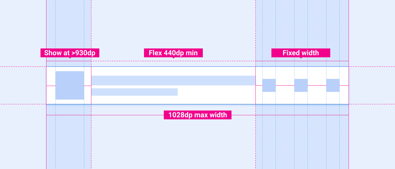
最小化控件栏的规范包括 2 条缩放准则:
- 左侧的方形元素(通常用于专辑封面)只应在屏幕宽度等于或大于 930dp 时显示,并且
- 中间的弹性宽度部分绝不应小于 440dp,并且可针对较宽的屏幕放大,前提是整个组件宽度不超过 1028dp。
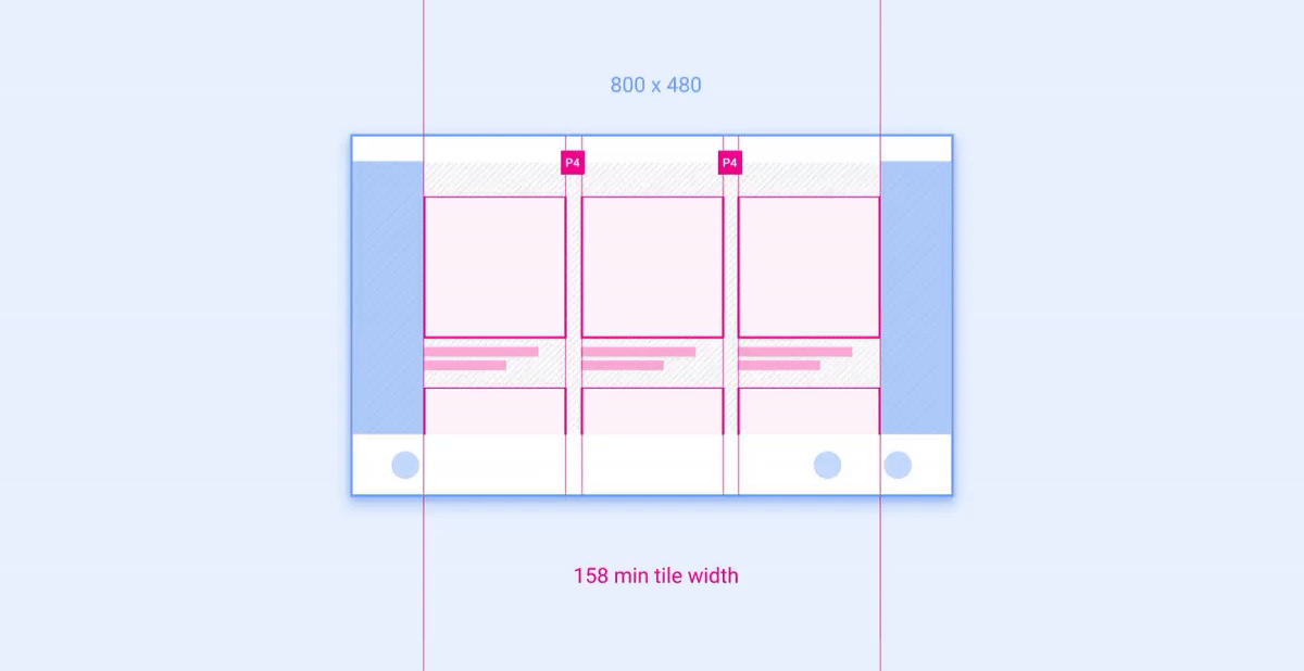
示例 2:网格
网格是布局中可按列和行放置并调整其大小的组件示例。
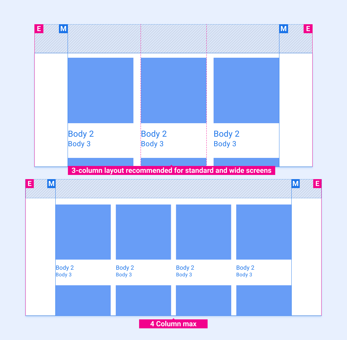
建议的列数(在较窄的屏幕上为 3 个,在较宽的屏幕上为 4 个)取决于屏幕尺寸。只要网格大小不小于建议的最小宽度,就可以在一个屏幕类别中调整列宽和行高。 下面的动画展示了如何按照参考布局中的建议将网格缩放到更宽和更窄的屏幕。