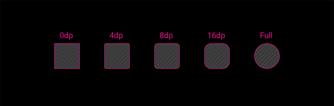
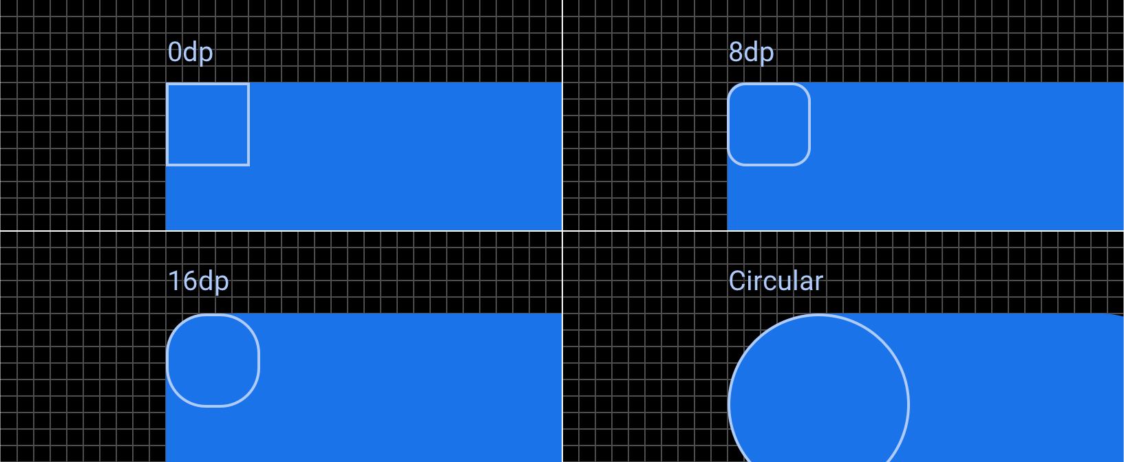
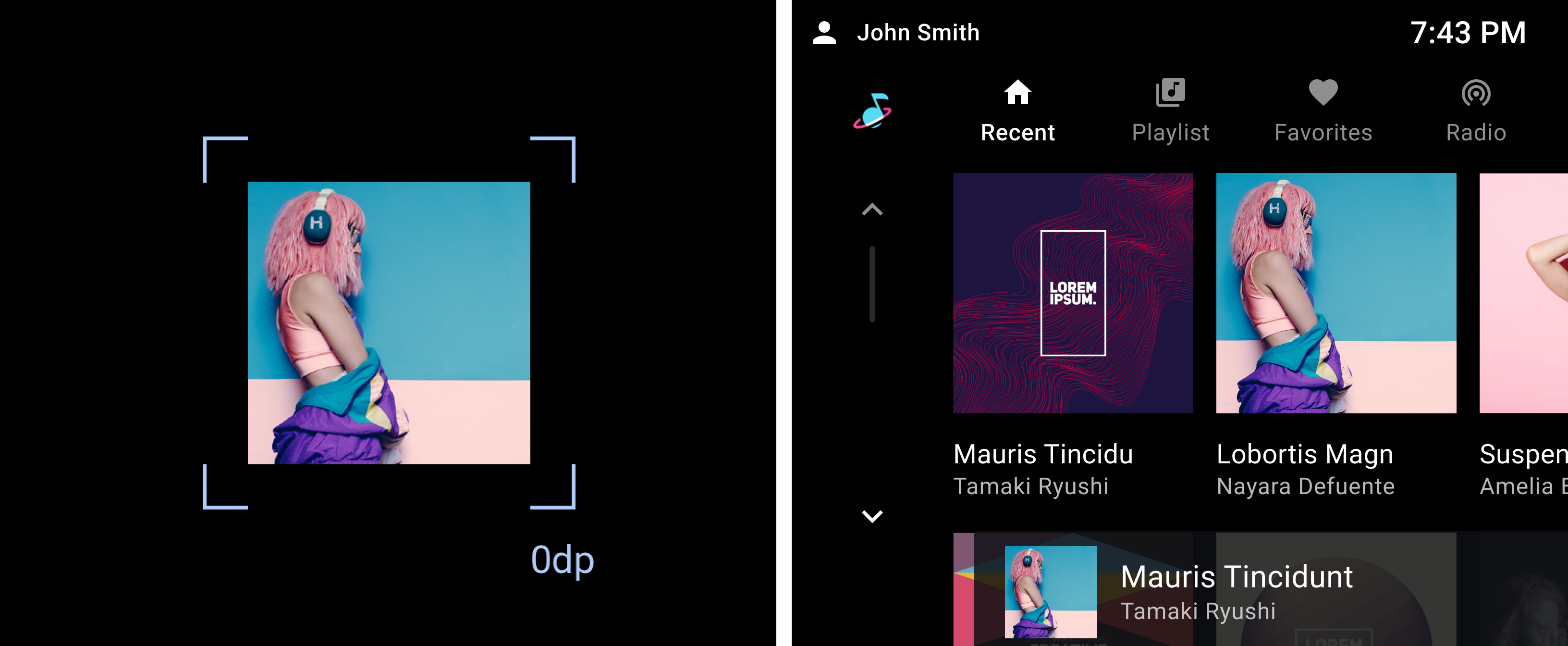
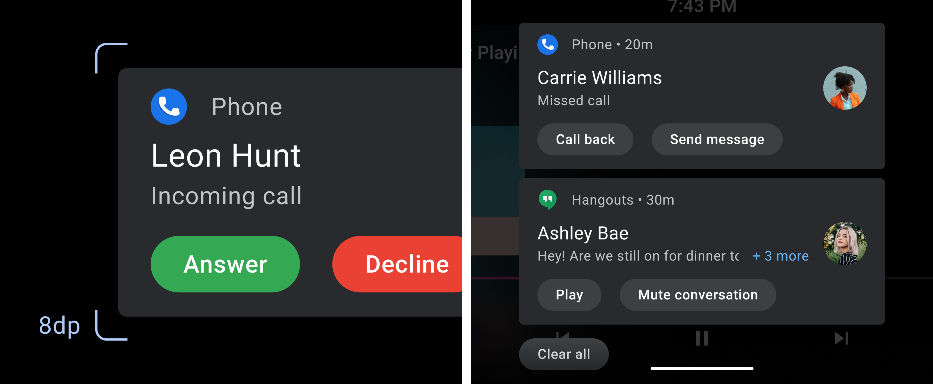
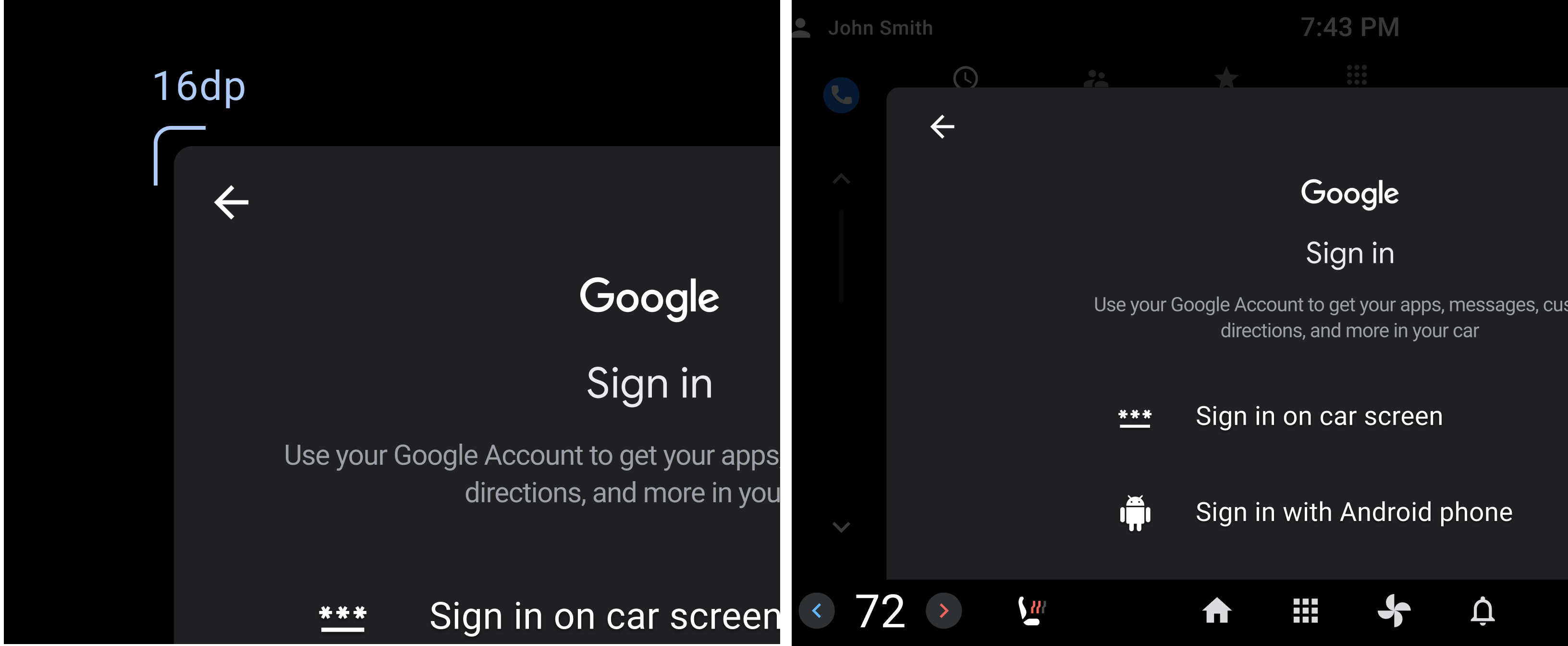
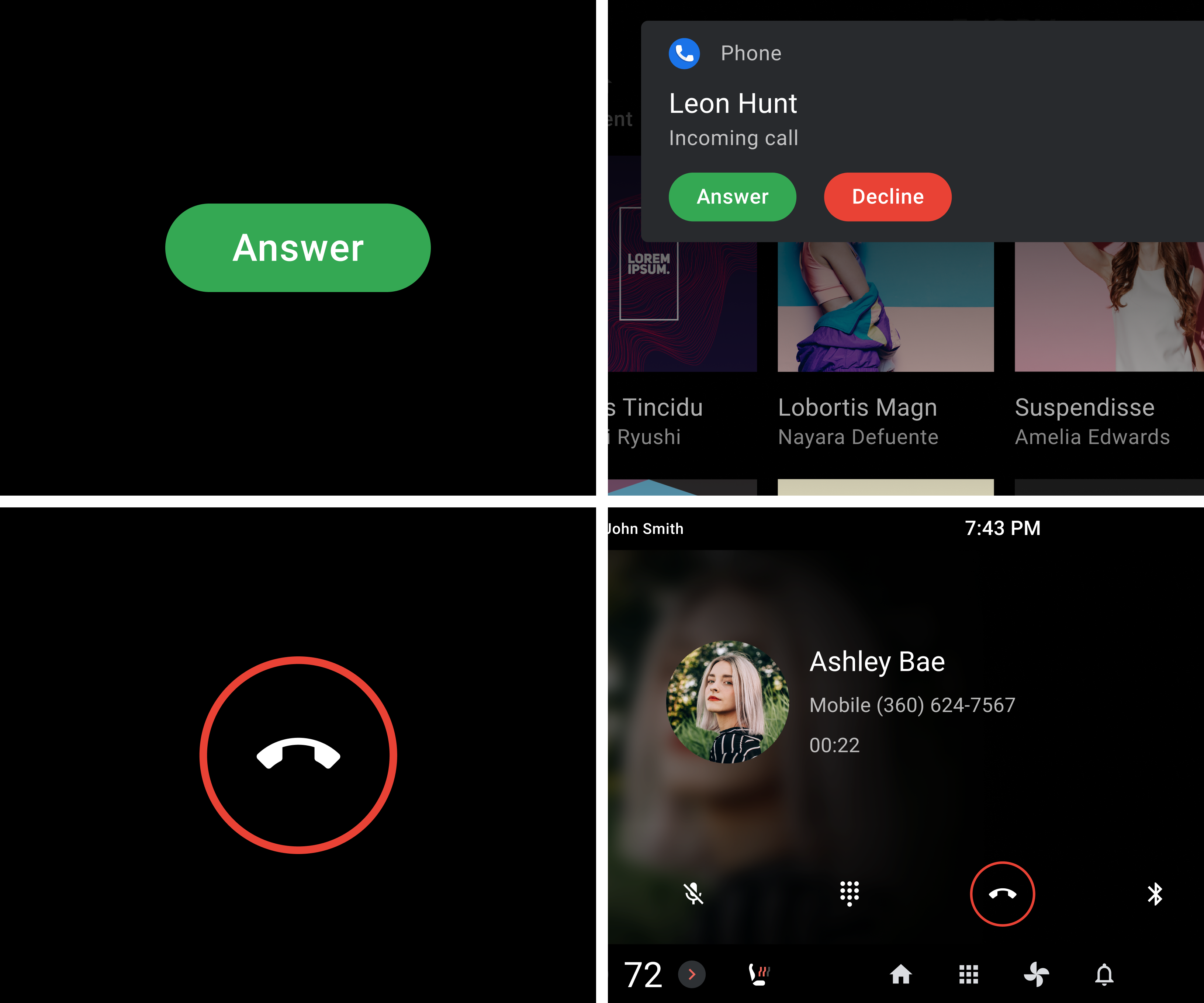
[null,null,["最后更新时间 (UTC):2025-07-25。"],[[["\u003cp\u003eUse rounded corners with higher radius (e.g., 16dp, circular) for primary actions and important components like FABs and chips to draw user attention.\u003c/p\u003e\n"],["\u003cp\u003eUse less rounded or square corners (e.g., 0dp, 8dp) for lower-emphasis elements such as toolbars, lists, or background cards.\u003c/p\u003e\n"],["\u003cp\u003eAndroid Automotive provides a range of corner radius values (0dp, 4dp, 8dp, 16dp, Full) to create visual hierarchy and guide user focus.\u003c/p\u003e\n"],["\u003cp\u003e8dp is the default corner radius for rounded shapes and is suitable for low-emphasis interactive elements like cards and containers.\u003c/p\u003e\n"],["\u003cp\u003eImages typically use 0dp corners unless they need to be highlighted or are within a rounded container.\u003c/p\u003e\n"]]],[],null,["# Shapes\n\n\u003cbr /\u003e\n\nShapes help to emphasize the importance of some screen elements relative to others.\n\n**Guidance at a glance (TL;DR):** \n- Use more-rounded corners (higher corner radius) for primary actions and components\n- Use squarer, less-rounded corners (lower corner radius) for low-emphasis elements\n\n*** ** * ** ***\n\nCorner radius values\n--------------------\n\nAndroid for Cars provides a set of corner radius values intended to emphasize the importance of various screen elements relative to others.\n\n| R0 | R1 | R2 | R3 | R4 |\n|-----|-----|-----|------|------|\n| 0dp | 4dp | 8dp | 16dp | Full |\n\n| **Note:** Even though app layouts are structured on an 8dp grid, a radius size of 4dp is provided to help with shaping elements in smaller components. This value should be used sparingly, since it is not a multiple of 8dp.\n\n*** ** * ** ***\n\nUsing rounding for emphasis\n---------------------------\n\nRounded and square-cornered shapes in Android Automotive create a visual hierarchy that draws user attention to higher-emphasis elements. Higher-emphasis elements have corners that are more rounded, with a larger corner radius. Lower-emphasis elements have corners that are less round, with a smaller corner radius.\nExamples of four levels of corner radius, from lowest (0dp = square) to highest (circular)\n\n#### 0dp --- Baseline\n\nUse 0dp (square) corners for baseline elements that don't need any extra emphasis. Basic layout structures such as toolbars or lists should use 0dp corners. Images should also have 0dp corners, unless they are masked by a rounded container (such as a card) or are in a selected state.\nThe album covers in the grid at right don't need any extra emphasis relative to each other or to the other elements shown, so they have 0dp corners (detail shown at left)\n\n#### 8dp --- Low emphasis\n\n8dp is the default corner radius for rounded shapes. Use this shape to indicate low-emphasis interactive elements, such as cards and containers.\nThe notification card shown here uses the default 8dp corner radius (shown at left), giving it less emphasis than the action buttons on the card (as shown at right), which are more important\n\n#### 16dp --- Medium Emphasis\n\nUse a 16dp corner radius for components with medium emphasis, including interactive elements and expandable components.\nHere, a 16dp corner radius is used to provide medium emphasis for a bottom sheet, which is temporarily more important than the current content on screen\n\n#### Circular --- High Emphasis\n\nCircular shapes have a greater visual impact against mostly rectilinear shapes. They should be reserved for high-emphasis components, such as FABs, Chips, and widgets.\nFully rounded corners and circular shapes are used here to give maximum emphasis to the FAB at bottom left, the action buttons at top right, the FAB at bottom left"]]