يساعد النمط الطباعي في تحديد التسلسل الهرمي لمعلومات واجهة المستخدم ووظيفتها. يمكن أن تؤثر خيارات أسلوب الخط أيضًا بشكل كبير في الوضوح، وهو اعتبار مهم للقيادة.
إرشادات سريعة (TL:DR):
- استخدام العرض والنص والنص الفرعي من المقياس الطباعي لنظام التشغيل Android Automotive
- الحد الأدنى لحجم النص الأساسي هو 24 بكسل مستقل الكثافة، ويمكنك الاحتفاظ بأحجام النص الفرعي للحصول على معلومات غير مهمة.
- استخدام شبكة من 4 وحدات بكسل مستقلة الكثافة للمحاذاة
- تطبيق سمات النمط لإنشاء تأثيرات (دعم العرض الهرمي، تركيز الانتباه)
- استخدِم سُمك الخطوط المتوسطة باعتدال وتجنَّب الخط الغامق
مراجع المقياس والشبكة
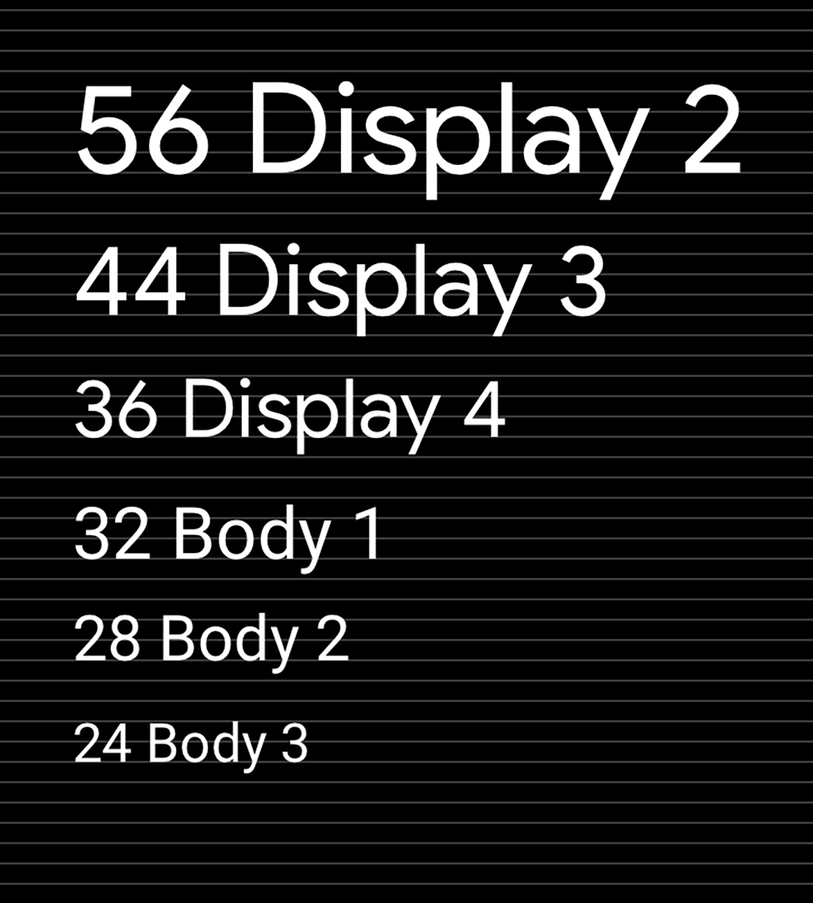
استخدِم المقياس الطباعي لنظام التشغيل Android Automotive وشبكة التنضيد لضمان الحصول على مظهر متّسق ونص سريع في مجموعة من المستويات لنص العرض والنص الأساسي والنص الفرعي.
المقياس الطباعي لنظام التشغيل Android Automotive
يعرض هذا المقياس الخطوط وأحجامها وارتفاعات الأسطر المُستخدَمة في المستويات التسعة التلقائية للنص المعروض والنص الأساسي والنص الفرعي المستخدَم في نظام التشغيل Android Automotive. الحدّ الأدنى لحجم النوع لنظام التشغيل Android Automotive هو 24 وحدة بكسل مستقلة الكثافة. إنّ الأحجام التي تقلّ عن 24 بكسل مستقل الكثافة لا يمكن فهمها بسرعة، ويجب استخدامها باعتدال في السياق التلقائي. يتم حجز أحجام النصوص الفرعية بشكل أفضل للمعلومات غير الحاسمة أو الثالثة مثل محتوى شريط الحالة.

شبكة الكتابة ومرجع المرجع
يساعد الحفاظ على المقياس والإيقاع الرأسي استنادًا إلى شبكة 4dp في الاتساق والتسلسل الهرمي المرئي.
الإرشادات والأمثلة
يمكن أن يساعدك تطبيق المقياس والنمط على خيارات الطباعة في ما يلي:
- جعل كل النص مقروءًا
- تحويل التسلسل الهرمي المرئي بين عناصر النص
- تركيز الانتباه في أهم الأماكن
يتكون كل نمط من مجموعة من القيم المحددة بواسطة المقياس والسمات الإضافية. تتضمن هذه السمات قيم كثافة الخط واللون ودرجة التعتيم، ويمكن إضافتها إلى أي حجم نوع لإنشاء التأثير المطلوب، مثل تركيز الانتباه.

أمثلة
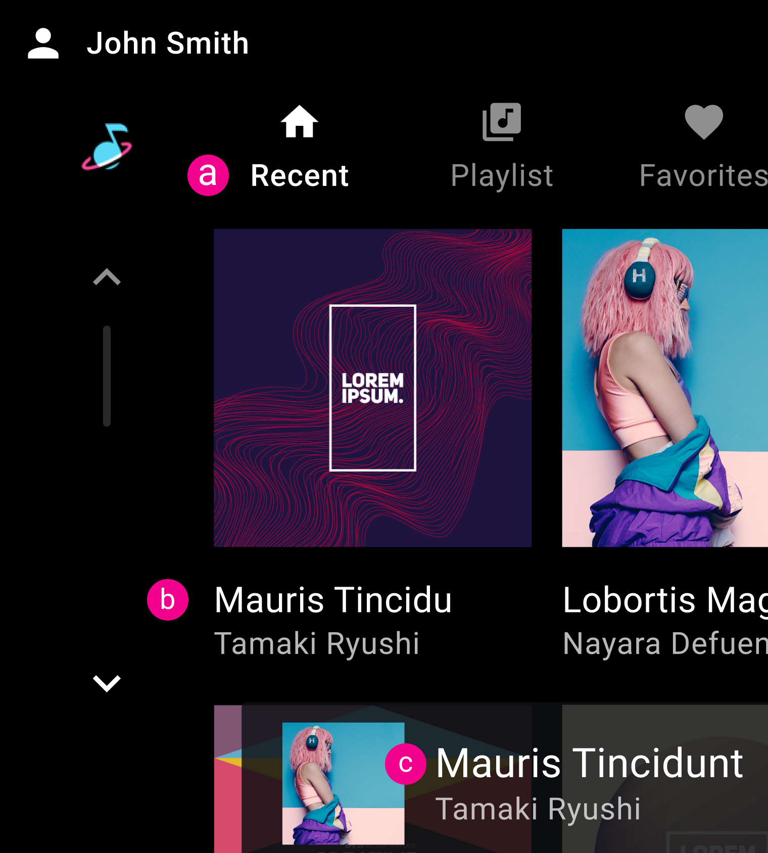
ب- النص الأساسي 2
ج: النص الأساسي 1
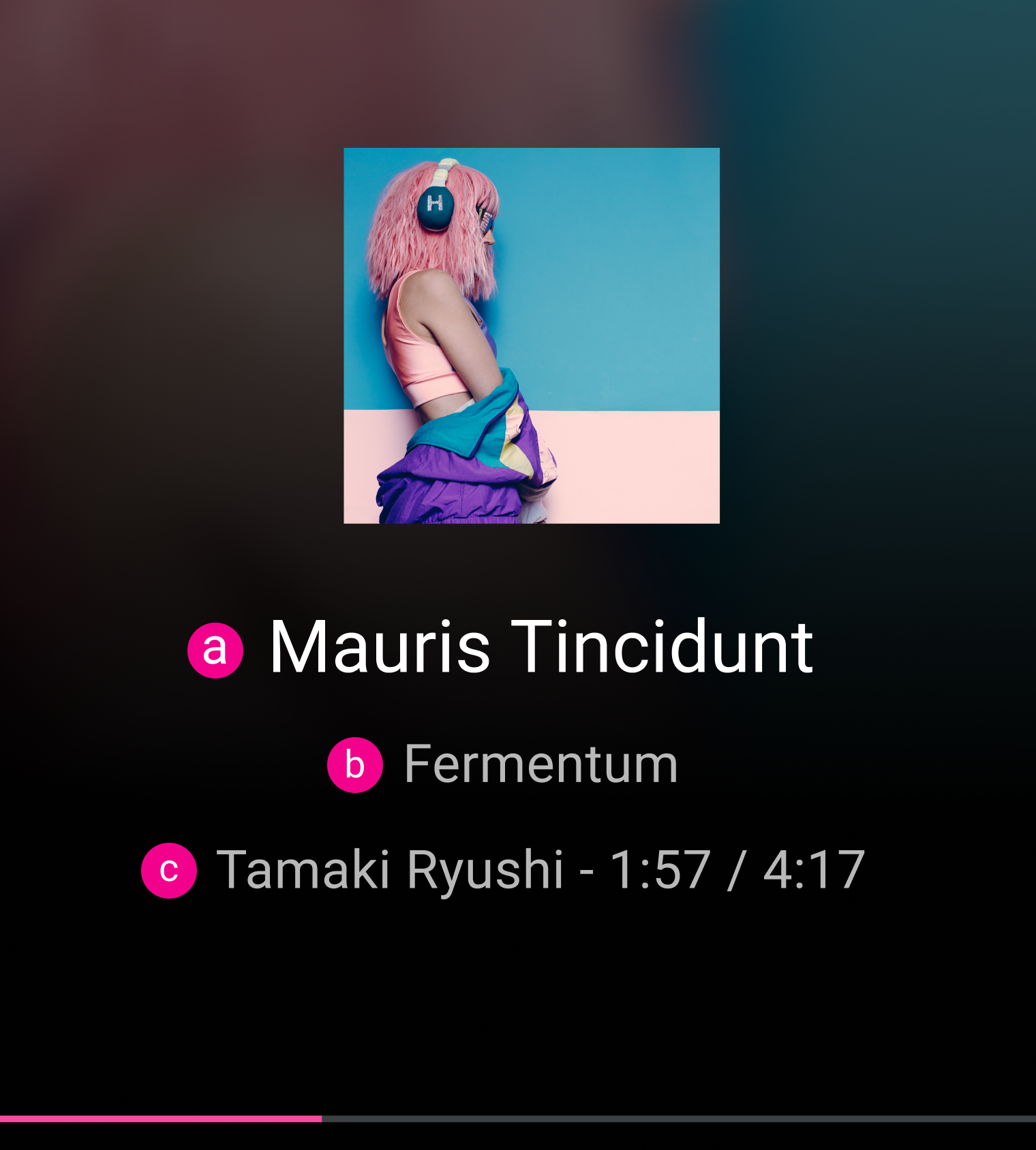
ب- النص الأساسي 1
ج: النص الأساسي 1

ما يجب فعله

إجراءات غير مسموح بها