排版样式有助于定义界面的信息层次结构和功能。字体排版也会极大地影响易读性,而这对于行车而言是一项重要的考虑因素。
指南一览 (TL:DR):
- 使用 Android Automotive OS 排版缩放中的显示内容、正文和辅助文本
- 正文文本大小下限为 24dp - 将辅助文本大小留给非关键信息
- 使用 4dp 网格进行对齐
- 应用样式属性以创建特效(支持层次结构、焦点)
- 谨慎使用中等粗细的字体,并避免使用粗体
比例和网格引用
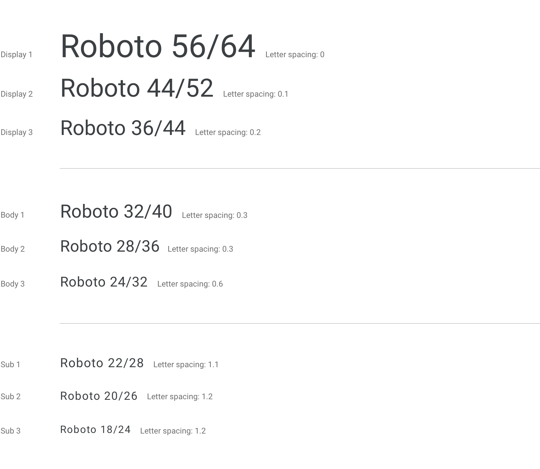
使用 Android Automotive OS 排版缩放和排版网格来确保显示文本、正文文本和辅助文本在不同级别上保持一致的外观和一目了然的文本。
Android Automotive OS 排版缩放
此缩放比例显示了 Android Automotive OS 中使用的 9 个默认显示文本、正文文本和辅助文本所用的字体、字体大小和行高。Android Automotive OS 的最小类型大小为 24dp。低于 24dp 的尺寸不容易一目了然,因此在自动使用场景中应谨慎使用。辅助文本大小最适合用于非关键性或第三级信息(例如状态栏内容)。
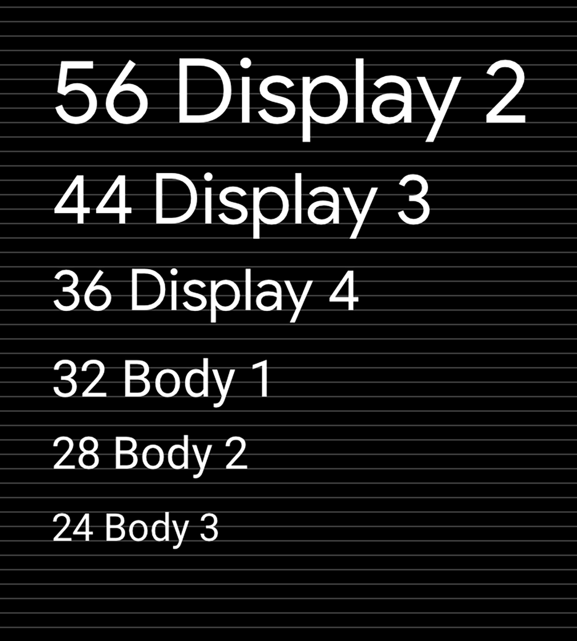
排版网格和基准参考
保持基于 4dp 网格的缩放和垂直节奏有助于实现一致性和视觉层次结构。
指南和示例
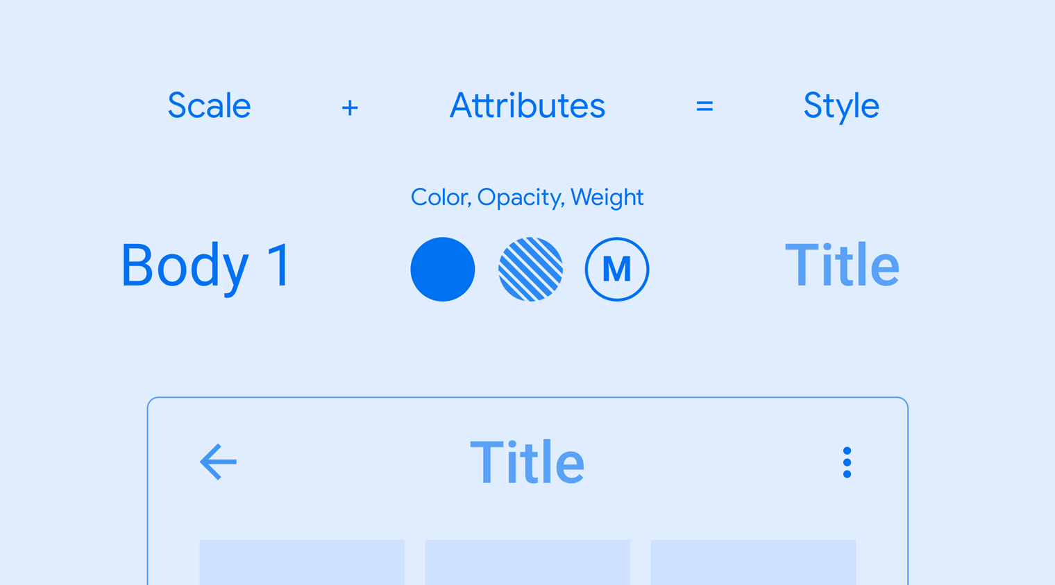
将比例和样式应用于您的排版选项可以帮助您:
- 确保所有文字清晰可辨
- 传达文本元素之间的视觉层次结构
- 将注意力集中在最重要的位置
每种样式都包含一组由 scale 和其他属性定义的值。这些属性包括字体粗细、颜色和不透明度值。您可以为任何字号添加这些属性,以打造所需的效果,例如集中注意力。
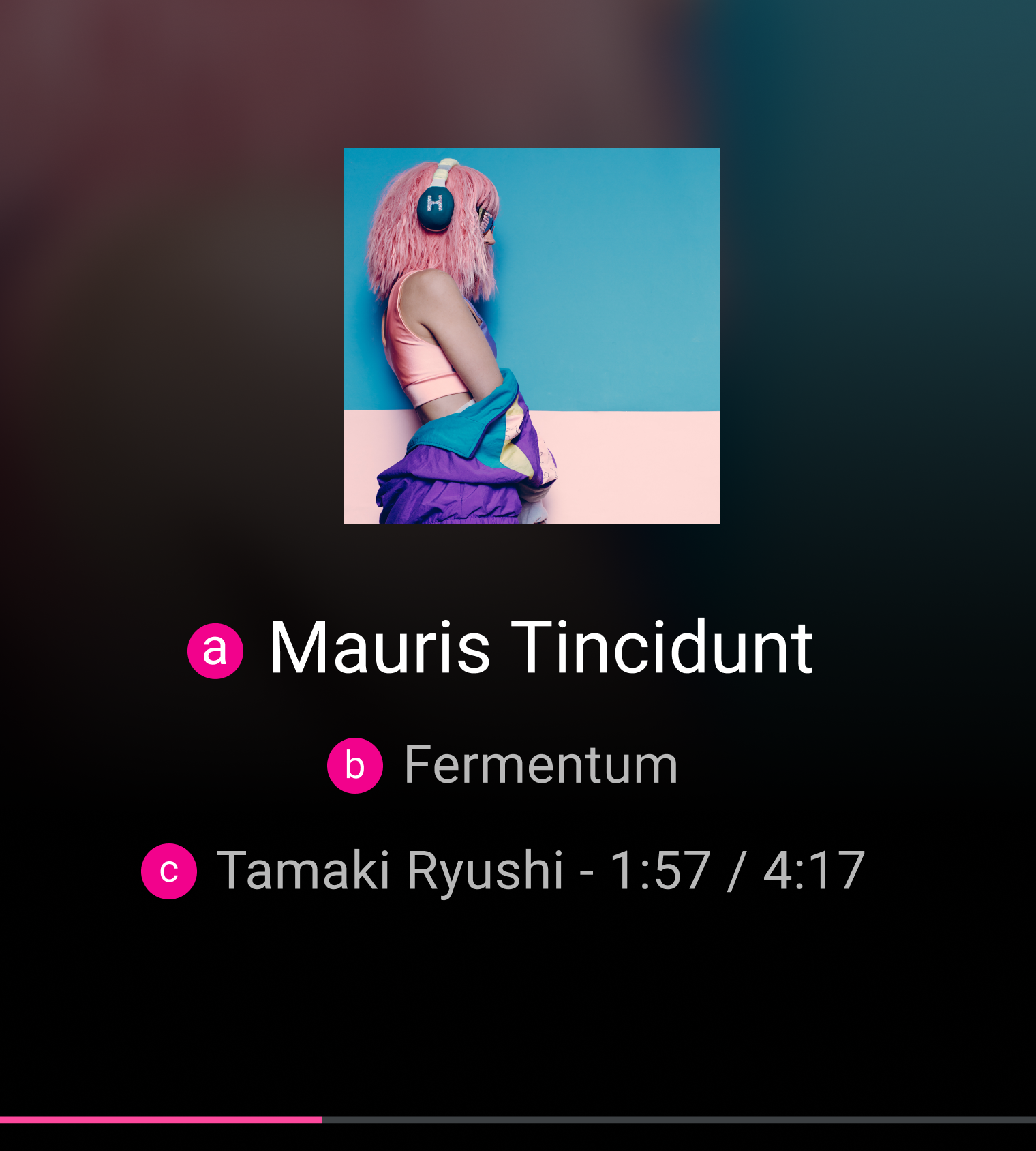
示例
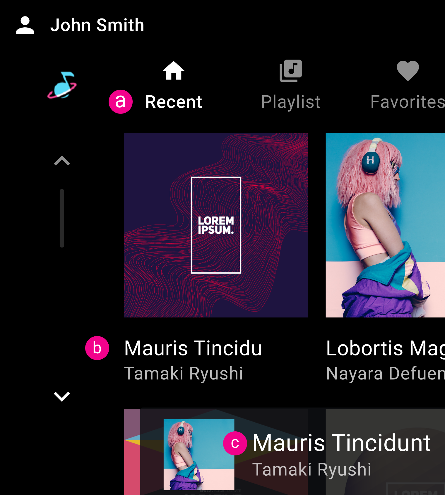
b. 正文 2
c. 正文 1
b. 正文 1
c. 正文 1
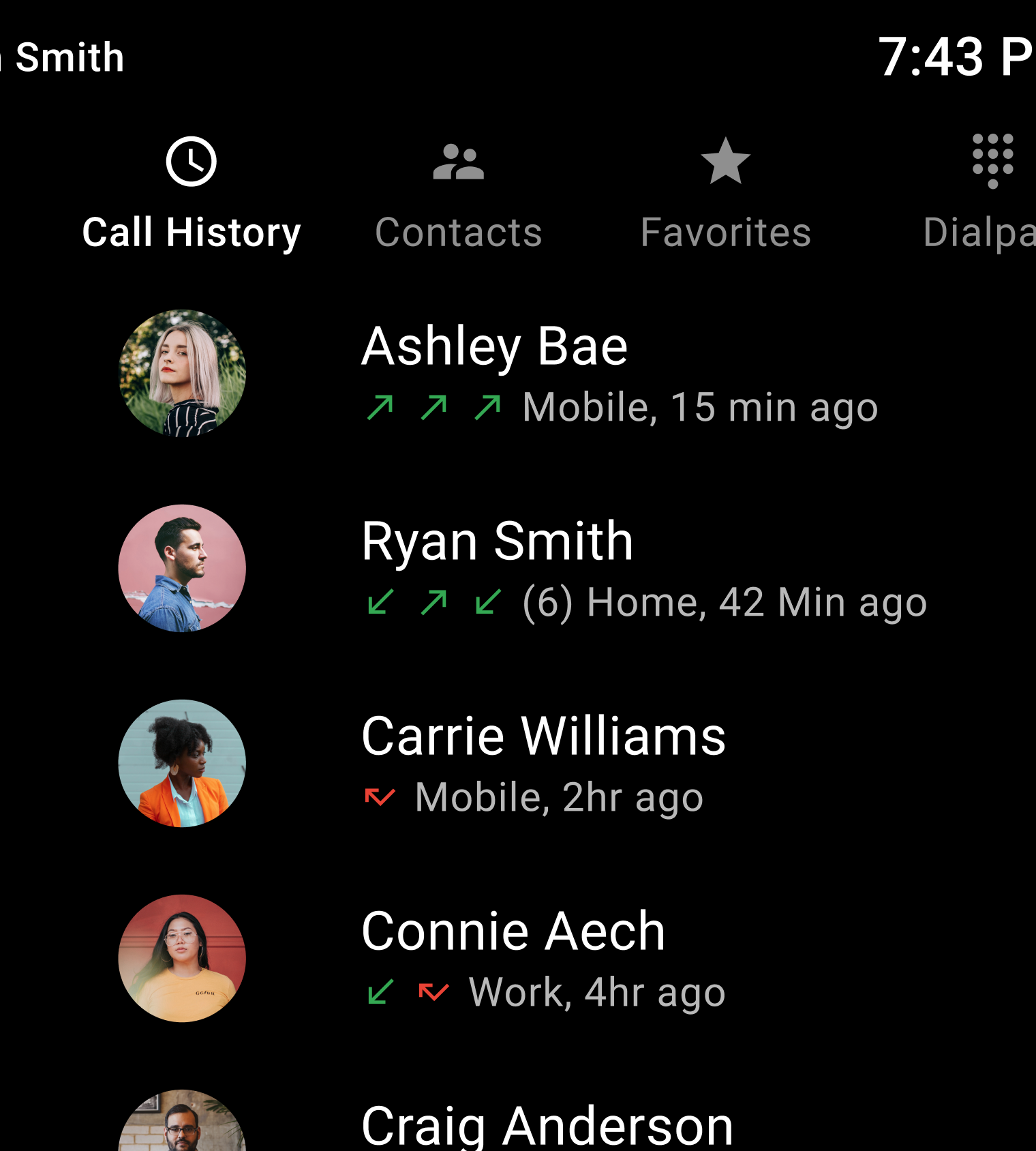
正确做法
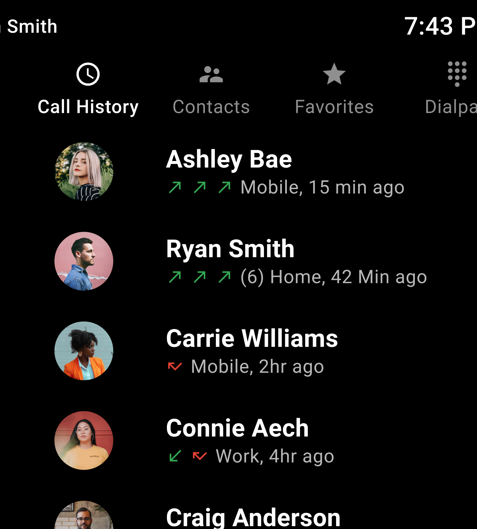
错误做法