Penataan gaya tipografi membantu menentukan fungsi dan hierarki informasi UI. Pilihan tipografi juga sangat memengaruhi keterbacaan, yang merupakan pertimbangan penting saat berkendara.
Panduan sekilas (TL:DR):
- Menggunakan tampilan, isi, dan subteks dari skala tipografi Android Automotive OS
- Ukuran teks isi minimum adalah 24 dp – mencadangkan ukuran subteks untuk informasi non-krusial
- Menggunakan petak 4 dp untuk perataan
- Menerapkan atribut gaya untuk membuat efek (hierarki dukungan, perhatian fokus)
- Gunakan ketebalan font sedang seperlunya – dan hindari tebal
Referensi skala dan petak
Gunakan skala tipografi dan petak penyusunan huruf Android Automotive OS untuk memastikan tampilan yang konsisten dan teks yang mudah dilihat di berbagai level untuk teks tampilan, teks isi, dan subteks.
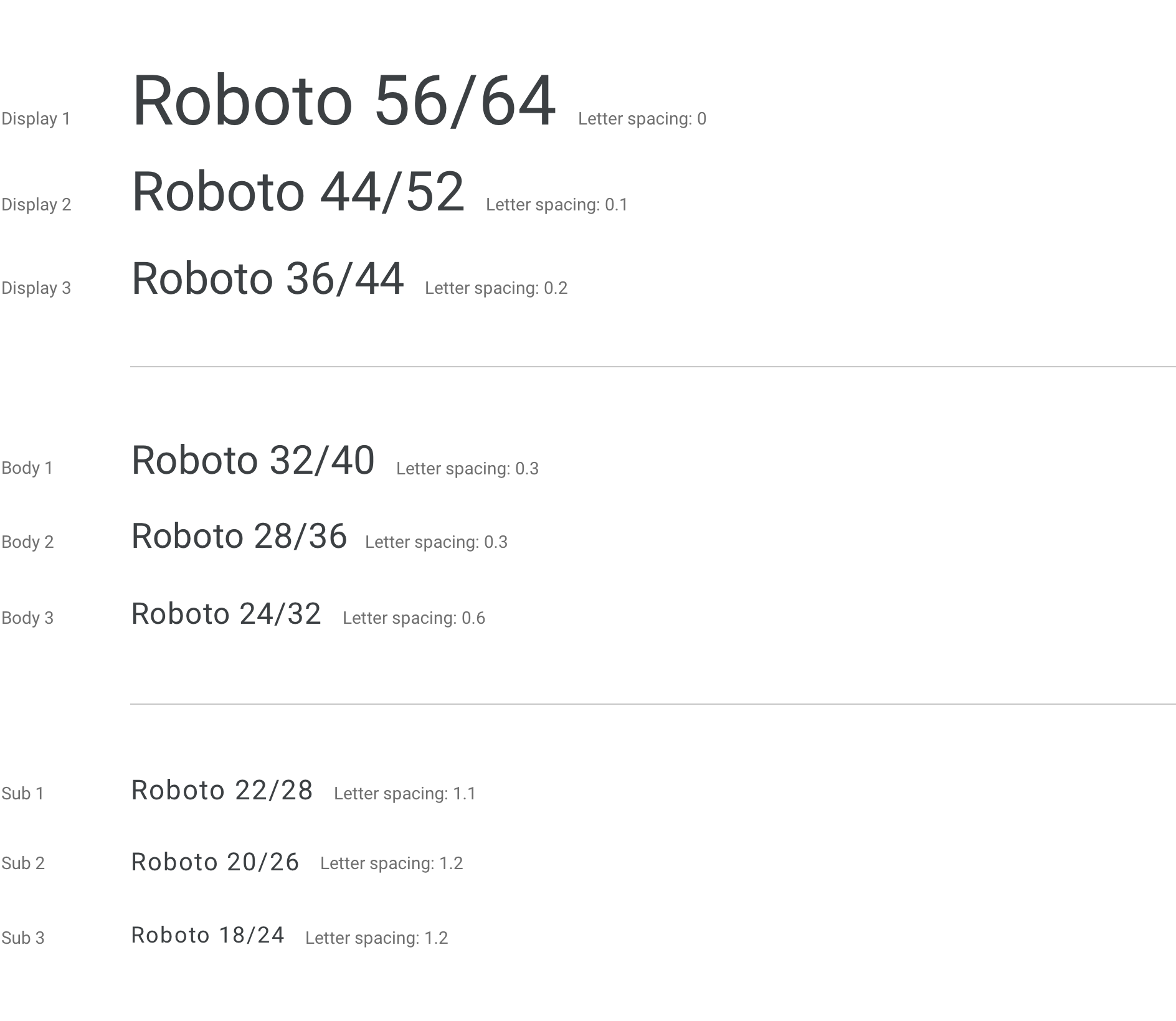
Skala tipografi Android Automotive OS
Skala ini menunjukkan font, ukuran font, dan tinggi baris yang digunakan untuk sembilan level default teks tampilan, teks isi, dan subteks yang digunakan di Android Automotive OS. Ukuran jenis minimum untuk Android Automotive OS adalah 24dp. Ukuran di bawah 24dp tidak mudah dilihat dan harus digunakan seperlunya dalam konteks otomatis. Ukuran subteks sebaiknya disimpan untuk informasi non-krusial atau tersier seperti konten status bar.
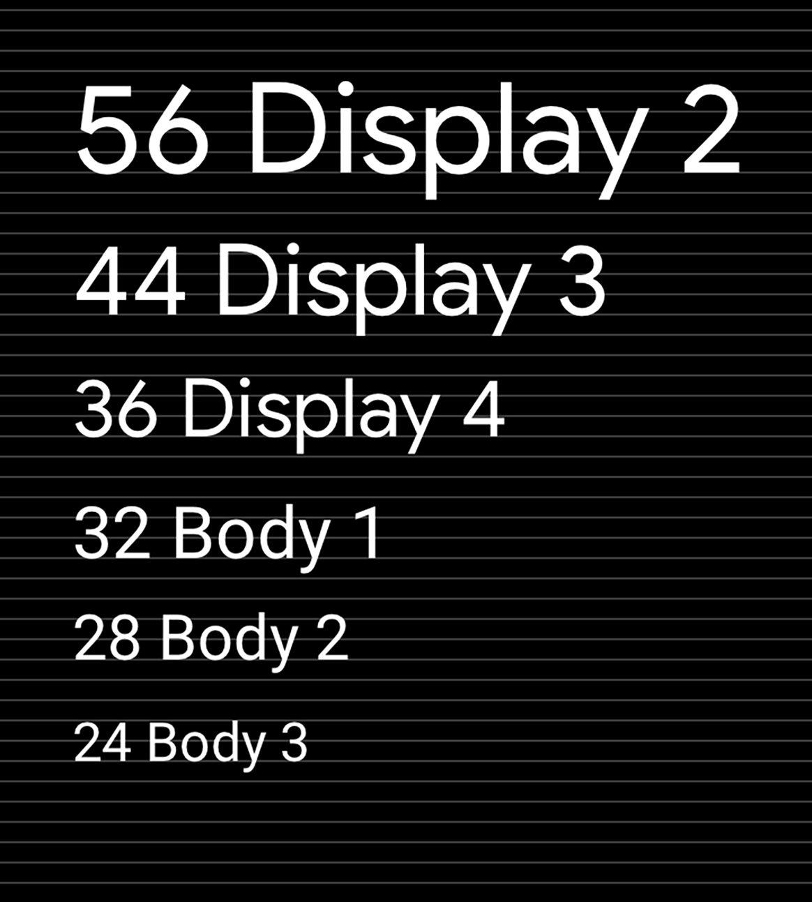
{i>Typesetting grid<i} dan referensi dasar pengukuran
Mempertahankan skala dan ritme vertikal berdasarkan petak 4 dp akan membantu konsistensi dan hierarki visual.
Panduan dan contoh
Menerapkan skala dan gaya pada pilihan tipografi Anda dapat membantu Anda:
- Pastikan semua teks dapat dibaca
- Menyampaikan hierarki visual di antara elemen teks
- Fokuskan perhatian di tempat yang paling penting
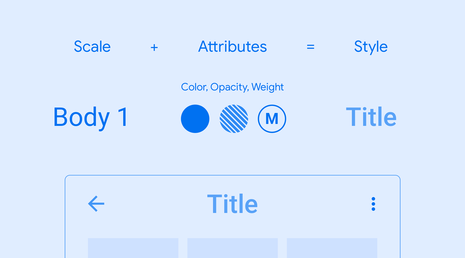
Setiap gaya terdiri dari serangkaian nilai yang didefinisikan oleh skala dan atribut tambahan. Atribut ini mencakup nilai ketebalan, warna, dan opasitas font, serta dapat ditambahkan ke ukuran jenis apa pun untuk membuat efek yang diinginkan, seperti memfokuskan perhatian.
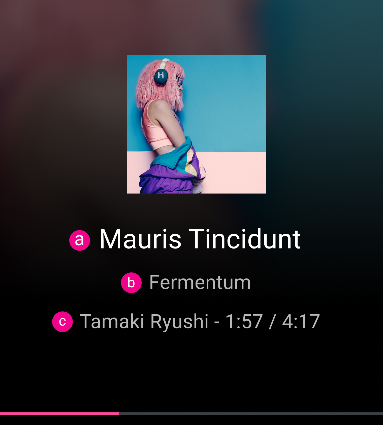
Contoh
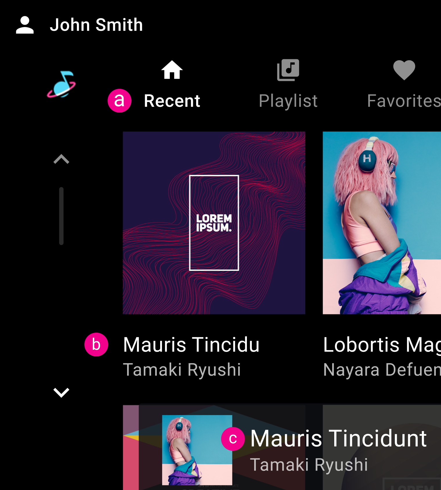
b. Isi 2
c. Isi 1
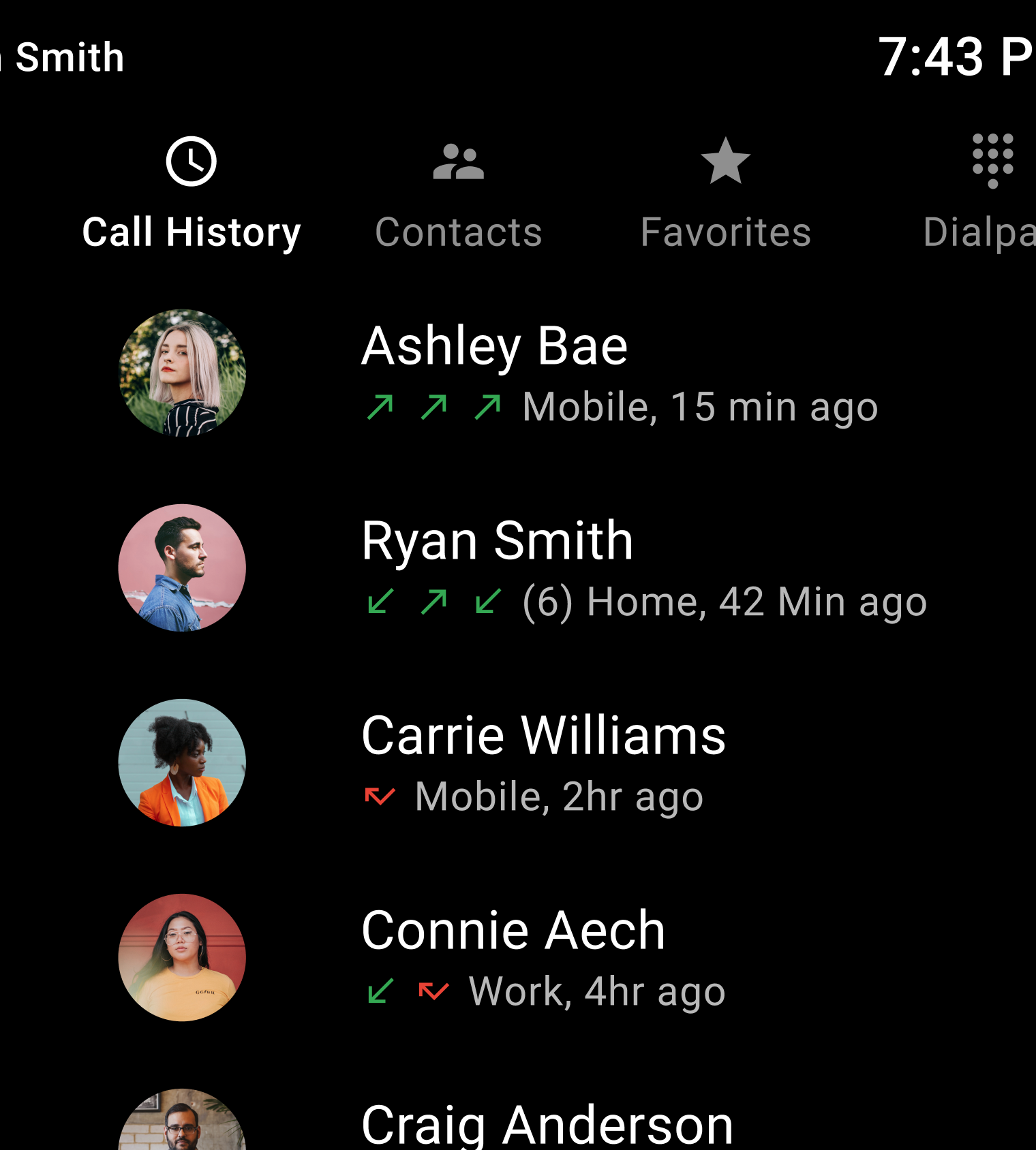
b. Isi 1
c. Isi 1
Lakukan
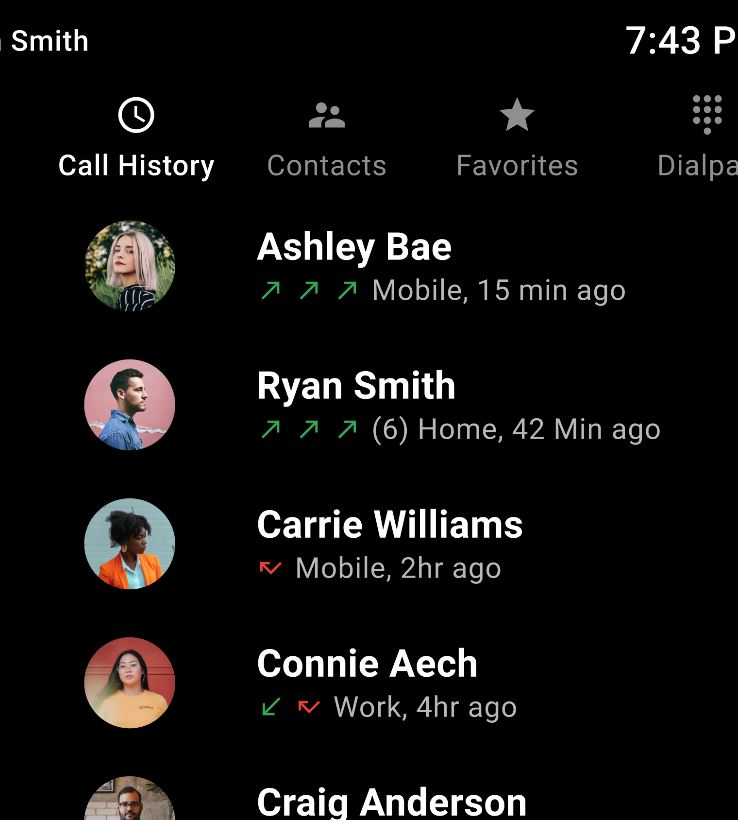
Larangan