AI-generated Key Takeaways
-
Typographic styling in a UI helps define information hierarchy and function, significantly impacting legibility for driving.
-
Use the Android Automotive OS typographic scale including display, body, and subtext, ensuring a minimum body text size of 24dp with subtext reserved for non-crucial information.
-
Maintain consistency and visual hierarchy by aligning text on a 4dp grid.
-
Apply style attributes like font weight, color, and opacity to create effects that support hierarchy and focus attention.
-
Use medium font weights sparingly to emphasize important text and avoid bold font weights due to their lower legibility.
Typographic styling helps define a UI’s information hierarchy and function. Typography choices can also greatly affect legibility, which is an important consideration for driving.
Guidance at a glance (TL:DR):
- Use display, body, and subtext from the Android Automotive OS typographic scale
- Minimum body text size is 24dp – reserve subtext sizes for non-crucial information
- Use a 4-dp grid for alignment
- Apply style attributes to create effects (support hierarchy, focus attention)
- Use medium font weights sparingly – and avoid bold
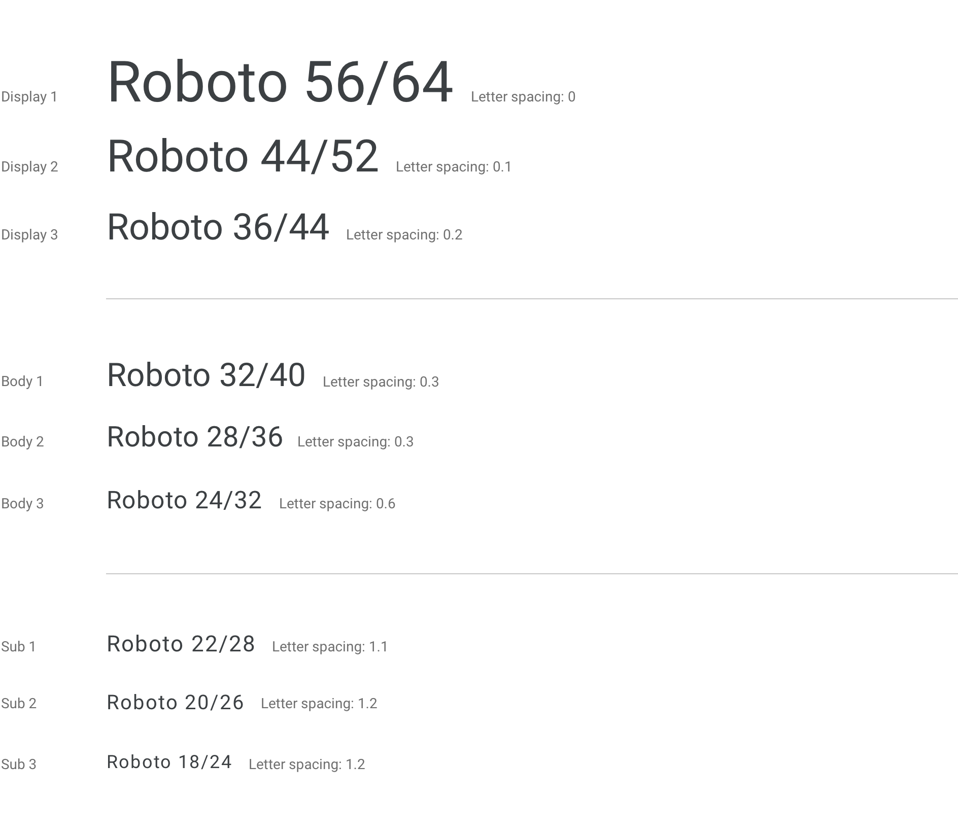
Scale and grid references
Use the Android Automotive OS typographic scale and typesetting grid to ensure a consistent look and glanceable text at a range of levels for display text, body text, and subtext.
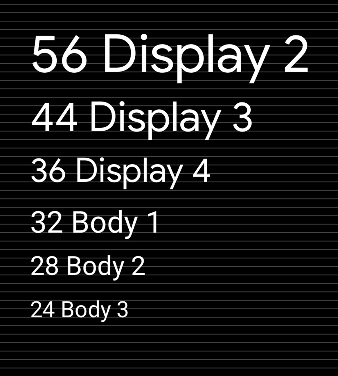
Android Automotive OS typographic scale
This scale shows the fonts, font sizes, and line heights used for the nine default levels of display text, body text, and subtext used in Android Automotive OS. The minimum type size for Android Automotive OS is 24dp. Sizes below 24dp are not easily glanceable and should be used sparingly in the auto context. Subtext sizes are best reserved for non-crucial or tertiary information such as status bar content.
Typesetting grid and baseline reference
Maintaining the scale and vertical rhythm based on a 4dp grid helps with consistency and visual hierarchy.
Guidance and examples
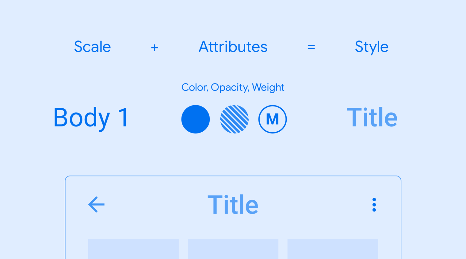
Applying scale and style to your typographic choices can help you:
- Keep all text legible
- Convey a visual hierarchy among text elements
- Focus attention in the most important spots
Each style consists of a set of values defined by the scale and additional attributes. These attributes include font weight, color, and opacity values, and they can be added to any type size to create a desired effect, such as focusing attention.
Examples
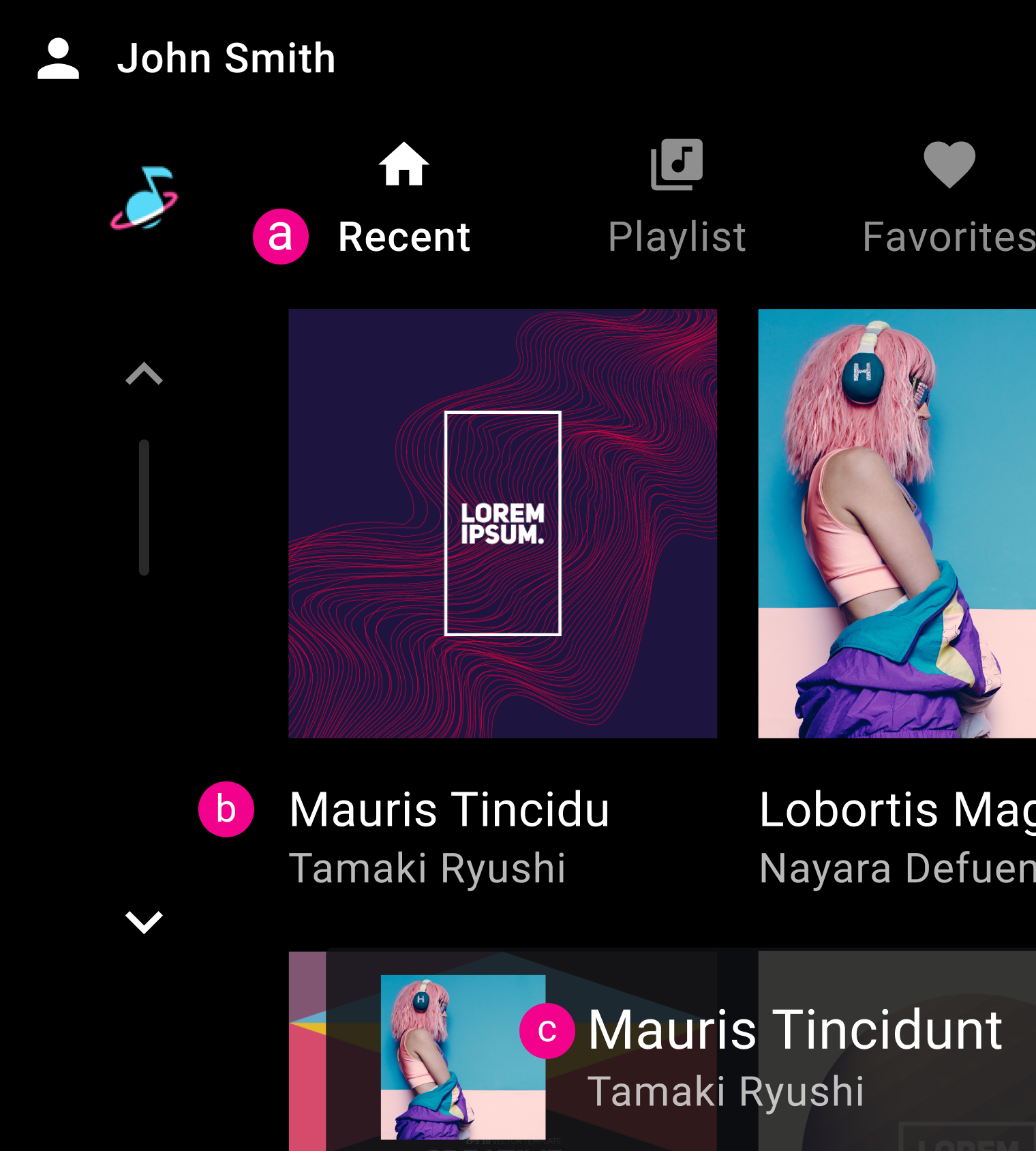
b. Body 2
c. Body 1

b. Body 1
c. Body 1

Do

Don’t