Page Summary
-
Statistical analysis and machine learning models can be misleading if data limitations, biases, and the distinction between correlation and causation are not carefully considered.
-
Uncertainty should always be quantified, and potential confounding factors must be identified and controlled for accurate results.
-
Avoid using percentages with negative numbers and be mindful of potential nonlinear relationships in data.
-
Correlations do not imply causation, and extrapolating them can be risky; thoroughly evaluate the type of correlation and its usefulness for decision-making.
-
Interpolation creates fictional data points and may miss crucial fluctuations, while high-degree polynomial interpolation can lead to inaccurate predictions at data edges.
"All models are wrong but some are useful." — George Box, 1978
Though powerful, statistical techniques have their limitations. Understanding these limitations can help a researcher avoid gaffes and inaccurate claims, like BF Skinner's assertion that Shakespeare did not use alliteration more than randomness would predict. (Skinner's study was underpowered.1)
Uncertainty and error bars
It's important to specify uncertainty in your analysis. It's equally important to quantify the uncertainty in other people's analyses. Data points that appear to plot a trend on a graph, but have overlapping error bars, may not indicate any pattern at all. Uncertainty may also be too high to draw useful conclusions from a particular study or statistical test. If a research study requires lot-level accuracy, a geospatial dataset with +/- 500 m of uncertainty has too much uncertainty to be usable.
Alternatively, uncertainty levels may be useful during decision-making processes. Data supporting a particular water treatment with 20% uncertainty in the results may lead to a recommendation for the implementation of that water treatment with continued monitoring of the program to address that uncertainty.
Bayesian neural networks can quantify uncertainty by predicting distributions of values instead of single values.
Irrelevance
As discussed in the introduction, there's always at least a small gap between data and reality. The shrewd ML practitioner should establish whether the dataset is relevant to the question being asked.
Huff describes an early public opinion study that found that white Americans' answers to the question of how easy it was for Black Americans to make a good living were directly and inversely related to their level of sympathy toward Black Americans. As racial animus increased, responses about expected economic opportunities became more and more optimistic. This could have been misunderstood as a sign of progress. However, the study could show nothing about the actual economic opportunities available to Black Americans at the time, and was not suited for drawing conclusions about the reality of the job market—only the opinions of the survey respondents. The collected data was in fact irrelevant to the state of the job market.2
You could train a model on survey data like that described above, where the output actually measures optimism rather than opportunity. But because predicted opportunities are irrelevant to actual opportunities, if you claimed the model was predicting actual opportunities, you would be misrepresenting what the model predicts.
Confounds
A confounding variable, confound, or cofactor is a variable not under study that influences the variables that are under study and may distort the results. For example, consider an ML model that predicts mortality rates for an input country based on public health policy features. Suppose that median age is not a feature. Further suppose that some countries have an older population than others. By ignoring the confounding variable of median age, this model might predict faulty mortality rates.
In the United States, race is often strongly correlated with socioeconomic class, though only race, and not class, is recorded with mortality data. Class-related confounds, like access to healthcare, nutrition, hazardous work, and secure housing, may have a stronger influence on mortality rates than race, but be neglected because they are not included in the datasets.3 Identifying and controlling for these confounds is critical for building useful models and drawing meaningful and accurate conclusions.
If a model is trained on existing mortality data, which includes race but not class, it may predict mortality based on race, even if class is a stronger predictor of mortality. This could lead to inaccurate assumptions about causality and inaccurate predictions about patient mortality. ML practitioners should ask if confounds exist in their data, as well as what meaningful variables might be missing from their dataset.
In 1985, the Nurses' Health Study, an observational cohort study from Harvard Medical School and Harvard School of Public Health, found that cohort members taking estrogen replacement therapy had a lower incidence of heart attacks compared to members of the cohort who never took estrogen. As a result, doctors prescribed estrogen to their menopausal and postmenopausal patients for decades, until a clinical study in 2002 identified health risks created by long-term estrogen therapy. The practice of prescribing estrogen to post-menopausal women stopped, but not before causing an estimated tens of thousands of premature deaths.
Multiple confounds could have caused the association. Epidemiologists found that women who take hormone replacement therapy, compared to women who don't, tend to be thinner, more educated, wealthier, more conscious of their health, and more likely to exercise. In different studies, education and wealth were found to reduce the risk of heart disease. Those effects would have confounded the apparent correlation between estrogen therapy and heart attacks.4
Percentages with negative numbers
Avoid using percentages when negative numbers are present,5 as all kinds of meaningful gains and losses can be obscured. Assume, for the sake of simple math, that the restaurant industry has 2 million jobs. If the industry loses 1 million of those jobs in late March of 2020, experiences no net change for ten months, and gains 900,000 jobs back in early February 2021, a year-over-year comparison in early March 2021 would suggest only a 5% loss of restaurant jobs. Assuming no other changes, a year-over-year comparison at the end of April 2021 would suggest a 90% increase in restaurant jobs, which is a very different picture of reality.
Prefer actual numbers, normalized as appropriate. See Working with Numerical Data for more.
Post-hoc fallacy and unusable correlations
The post-hoc fallacy is the assumption that, because event A was followed by event B, event A caused event B. Put more simply, it's assuming a cause-and-effect relationship where one does not exist. Even more simply: correlations don't prove causation.
In addition to a clear cause-and-effect relationship, correlations can also arise from:
- Pure chance (see Tyler Vigen's Spurious correlations for illustrations, including a strong correlation between the divorce rate in Maine and margarine consumption).
- A real relationship between two variables, though it remains unclear which variable is causative and which one is affected.
- A third, separate cause that influences both variables, though the correlated variables are unrelated to each other. Global inflation, for example, can raise the prices of both yachts and celery.6
It's also risky to extrapolate a correlation past the existing data. Huff points out that some rain will improve crops, but too much rain will damage them; the relationship between rain and crop outcomes is nonlinear.7 (See the next two sections for more about nonlinear relationships.) Jones notes that the world is full of unpredictable events, like war and famine, that subject future forecasts of time series data to tremendous amounts of uncertainty.8
Furthermore, even a genuine correlation based on cause and effect may not be helpful for making decisions. Huff gives, as an example, the correlation between marriageability and college education in the 1950s. Women who went to college were less likely to marry, but it could have been the case that women who went to college were less inclined to marry to begin with. If that was the case, a college education didn't change their likelihood of getting married.9
If an analysis detects correlation between two variables in a dataset, ask:
- What kind of correlation is it: cause-and-effect, spurious, unknown relationship, or caused by a third variable?
- How risky is extrapolation from the data? Every model prediction on data not in the training dataset is, in effect, interpolation or extrapolation from the data.
- Can the correlation be used to make useful decisions? For example, optimism could be strongly correlated with increasing wages, but sentiment analysis of some large corpus of text data, such as social media posts by users in a particular country, wouldn't be useful to predict increases in wages in that country.
When training a model, ML practitioners generally look for features that are strongly correlated with the label. If the relationship between the features and the label is not well understood, this could lead to the problems described in this section, including models based on spurious correlations and models that assume historical trends will continue in the future, when in fact they don't.
The linear bias
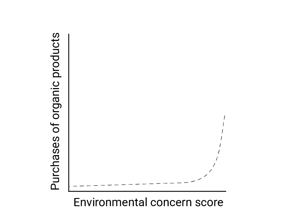
In "Linear Thinking in a Nonlinear World," Bart de Langhe, Stefano Puntoni, and Richard Larrick describe linear bias as the human brain's tendency to expect and look for linear relationships, although many phenomena are nonlinear. The relationship between human attitudes and behavior, for example, is a convex curve and not a line. In a 2007 Journal of Consumer Policy paper cited by de Langhe et al., Jenny van Doorn et al. modeled the relationship between survey respondents' concern about the environment and the respondents' purchases of organic products. Those with the most extreme concerns about the environment bought more organic products, but there was very little difference between all other respondents.
When designing models or studies, consider the possibility of nonlinear relationships. Because A/B testing may miss nonlinear relationships, consider also testing a third, intermediate condition, C. Also consider whether initial behavior that appears linear will continue to be linear, or whether future data might show more logarithmic or other nonlinear behavior.
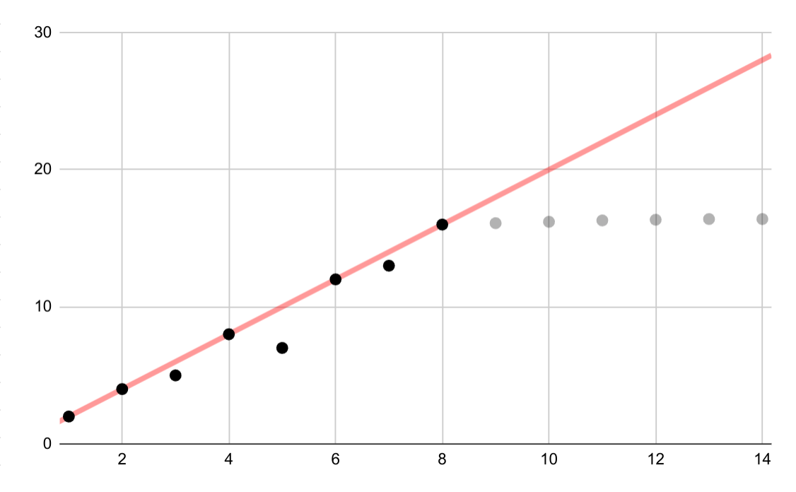
This hypothetical example shows an erroneous linear fit for logarithmic data. If only the first few data points were available, it would be both tempting and incorrect to assume an ongoing linear relationship between variables.
Linear interpolation
Examine any interpolation between data points, because interpolation introduces fictional points, and the intervals between real measurements may contain meaningful fluctuations. As an example, consider the following visualization of four data points connected with linear interpolations:

Then consider this example of fluctuations between data points that are erased by a linear interpolation:
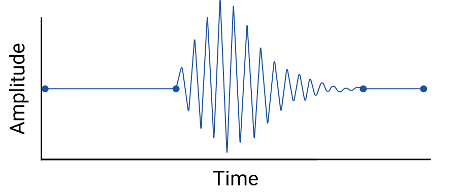
The example is contrived because seismographs collect continuous data, and so this earthquake wouldn't be missed. But it is useful for illustrating the assumptions made by interpolations, and the real phenomena that data practitioners might miss.
Runge's phenomenon
Runge's phenomenon, also known as the "polynomial wiggle," is a problem at the opposite end of the spectrum from linear interpolation and linear bias. When fitting a polynomial interpolation to data, it's possible to use a polynomial with too high a degree (degree, or order, being the highest exponent in the polynomial equation). This produces odd oscillations at the edges. For example, applying a polynomial interpolation of degree 11, meaning that the highest-order term in the polynomial equation has \(x^{11}\), to roughly linear data, results in remarkably bad predictions at the beginning and end of the range of data:
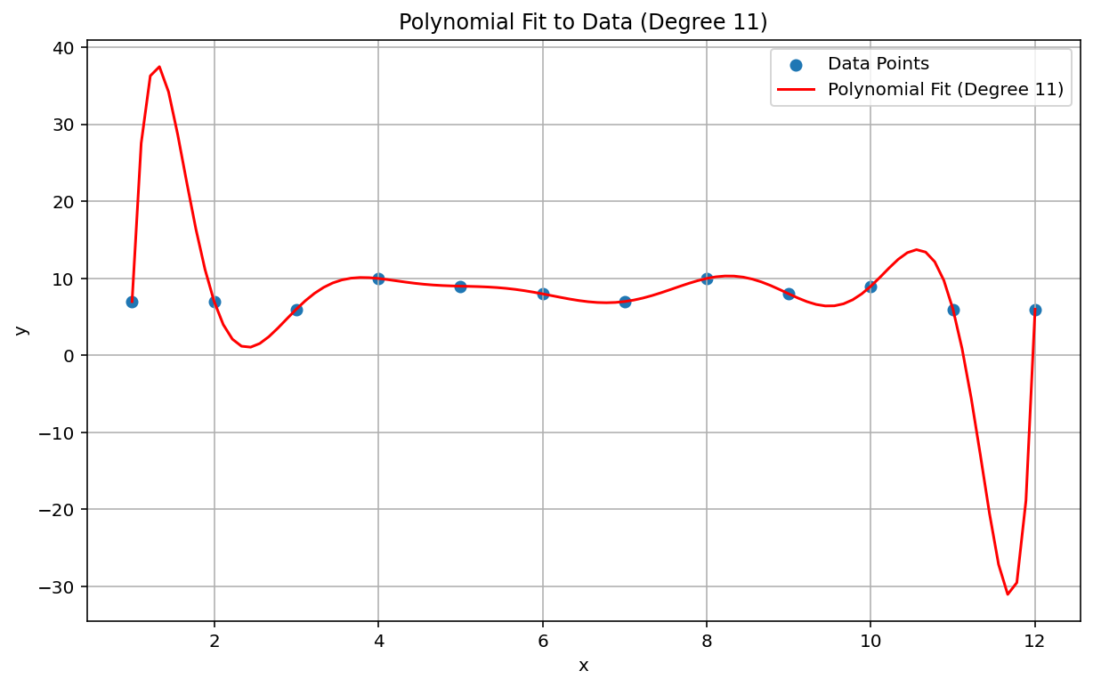
In the ML context, an analogous phenomenon is overfitting.
Statistical failures to detect
Sometimes a statistical test may be too underpowered to detect a small effect. Low power in statistical analysis means a low chance of correctly identifying true events, and therefore a high chance of false negatives. Katherine Button et al. wrote in Nature: "When studies in a given field are designed with a power of 20%, it means that if there are 100 genuine non-null effects to be discovered in that field, these studies are expected to discover only 20 of them." Increasing sample size can sometimes help, as can careful study design.
An analogous situation in ML is the problem of classification and the choice of a classification threshold. A choice of higher threshold results in fewer false positives and more false negatives, while a lower threshold results in more false positives and fewer false negatives.
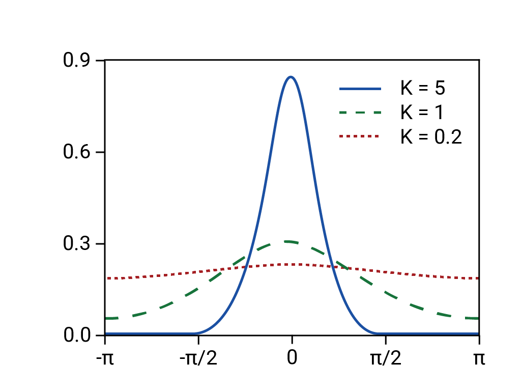
In addition to issues with statistical power, since correlation is designed to detect linear relationships, nonlinear correlations between variables can be missed. Similarly, variables can be related to each other but not statistically correlated. Variables can also be negatively correlated but completely unrelated, in what is known as Berkson's paradox or Berkson's fallacy. The classic example of Berkson's fallacy is the spurious negative correlation between any risk factor and severe disease when looking at a hospital inpatient population (as compared to the general population), which arises from the selection process (a condition severe enough to require hospital admission).
Consider whether any of these situations apply.
Outdated models and invalid assumptions
Even good models can degrade over time because behavior (and the world, for that matter) may change. Netflix's early predictive models had to be retired as their customer base changed from young, tech-savvy users to the general population.10
Models can also contain silent and inaccurate assumptions that may remain hidden until the model's catastrophic failure, as in the 2008 market crash. The financial industry's Value at Risk (VaR) models claimed to precisely estimate the maximum loss on any trader's portfolio, say a maximum loss of $100,000 expected 99% of the time. But in the abnormal conditions of the crash, a portfolio with an expected maximum loss of $100,000 sometimes lost $1,000,000 or more.
The VaR models were based on faulty assumptions, including the following:
- Past market changes are predictive of future market changes.
- A normal (thin-tailed, and therefore predictable) distribution was underlying the predicted returns.
In fact, the underlying distribution was fat-tailed, "wild," or fractal, meaning that there was a much higher risk of long-tail, extreme, and supposedly rare events than a normal distribution would predict. The fat-tailed nature of the real distribution was well known, but not acted upon. What was less well known was how complex and tightly coupled various phenomena were, including computer-based trading with automated selloffs.11
Aggregation issues
Data that is aggregated, which includes most demographic and epidemiological data, is subject to a particular set of traps. Simpson's paradox, or the amalgamation paradox, occurs in aggregated data where apparent trends disappear or reverse when the data is aggregated at a different level, due to confounding factors and misunderstood causal relationships.
The ecological fallacy involves erroneously extrapolating information about a population at one aggregation level to another aggregation level, where the claim may not be valid. A disease that afflicts 40% of agricultural workers in one province may not be present at the same prevalence in the greater population. It is also very likely that there will be isolated farms or agricultural towns in that province that are not experiencing a similarly high prevalence of that disease. To assume a 40% prevalence in those less-affected places as well would be fallacious.
The modifiable areal unit problem (MAUP) is a well-known problem in geospatial data, described by Stan Openshaw in 1984 in CATMOG 38. Depending on the shapes and sizes of the areas used to aggregate data, a geospatial data practitioner can establish almost any correlation between variables in the data. Drawing voting districts that favor one party or another is an example of MAUP.
All of these situations involve inappropriate extrapolation from one aggregation level to another. Different levels of analysis may require different aggregations or even entirely different datasets.12
Note that census, demographic, and epidemiological data are usually aggregated by zones for privacy reasons, and that these zones are often arbitrary, which is to say, not based on meaningful real-world boundaries. When working with these types of data, ML practitioners should check whether model performance and predictions change depending on the size and shape of the zones selected or the level of aggregation, and if so, whether model predictions are affected by one of these aggregation issues.
References
Button, Katharine et al. "Power failure: why small sample size undermines the reliability of neuroscience." Nature Reviews Neuroscience vol 14 (2013), 365–376. DOI: https://doi.org/10.1038/nrn3475
Cairo, Alberto. How Charts Lie: Getting Smarter about Visual Information. NY: W.W. Norton, 2019.
Davenport, Thomas H. "A Predictive Analytics Primer." In HBR Guide to Data Analytics Basics for Managers (Boston: HBR Press, 2018) 81-86.
De Langhe, Bart, Stefano Puntoni, and Richard Larrick. "Linear Thinking in a Nonlinear World." In HBR Guide to Data Analytics Basics for Managers (Boston: HBR Press, 2018) 131-154.
Ellenberg, Jordan. How Not to Be Wrong: The Power of Mathematical Thinking. NY: Penguin, 2014.
Huff, Darrell. How to Lie with Statistics. NY: W.W. Norton, 1954.
Jones, Ben. Avoiding Data Pitfalls. Hoboken, NJ: Wiley, 2020.
Openshaw, Stan. "The Modifiable Areal Unit Problem," CATMOG 38 (Norwich, England: Geo Books 1984) 37.
The Risks of Financial Modeling: VaR and the Economic Meltdown, 111th Congress (2009) (testimonies of Nassim N. Taleb and Richard Bookstaber).
Ritter, David. "When to Act on a Correlation, and When Not To." In HBR Guide to Data Analytics Basics for Managers (Boston: HBR Press, 2018) 103-109.
Tulchinsky, Theodore H. and Elena A. Varavikova. "Chapter 3: Measuring, Monitoring, and Evaluating the Health of a Population" in The New Public Health, 3rd ed. San Diego: Academic Press, 2014, pp 91-147. DOI: https://doi.org/10.1016/B978-0-12-415766-8.00003-3.
Van Doorn, Jenny, Peter C. Verhoef, and Tammo H. A. Bijmolt. "The importance of non-linear relationships between attitude and behaviour in policy research." Journal of Consumer Policy 30 (2007) 75–90. DOI: https://doi.org/10.1007/s10603-007-9028-3
Image reference
Based on "Von Mises Distribution." Rainald62, 2018. Source
-
Ellenberg 125. ↩
-
Huff 77-79. Huff cites Princeton's Office of Public Opinion Research, but he may have been thinking of the April 1944 report by the National Opinion Research Center at the University of Denver. ↩
-
Tulchinsky and Varavikova. ↩
-
Gary Taubes, Do We Really Know What Makes Us Healthy?" in The New York Times Magazine, Sep 16, 2007. ↩
-
Ellenberg 78. ↩
-
Huff 91-92. ↩
-
Huff 93. ↩
-
Jones 157-167. ↩
-
Huff 95. ↩
-
Davenport 84. ↩
-
See the Congressional testimony of Nassim N. Taleb and Richard Bookstaber in The Risks of Financial Modeling: VaR and the Economic Meltdown, 111th Congress (2009) 11-67. ↩
-
Cairo 155, 162. ↩