Page Summary
-
Charts and graphs can be misleading if not created and interpreted carefully, considering context, audience, and purpose.
-
Data visualizations consist of scaffolding (titles, axes, labels) and content (visual encoding of data like length, position, color).
-
Misleading visualizations can arise from manipulated baselines, aspect ratios, 3D effects, and inappropriate color choices.
-
Strive for clarity and honesty in data visualization, providing sufficient information without overwhelming the viewer.
-
Consider data literacy of the audience and potential misinterpretations due to visual design choices when creating or reviewing visualizations.
Charts, graphs, and maps are compelling and persuasive tools for communicating insight and information. They are also, when badly or maliciously deployed, sources of confusion, misinformation, and untruth.
Charts as art rather than science
ML practitioners often visualize potential training datasets to understand their usefulness for models, as well as model outputs to understand performance.
Always ask about the intended context, audience and purpose of a data visualization, whether you are creating or reading one. These three factors are key to graphical communication. The same chart can be useful and insightful, or misleading and exaggerated, in different contexts.1 The intended viewer, and the viewer's level of graph and data literacy, will vary. Design can help or hinder. For example, breathtakingly beautiful charts can be too convoluted to clearly communicate information.
There are no hard and fast rules for how to make a perfect chart, only guidelines and best practices. Visualizing data is as much an art as a science. But when visualizing data, strive, above all, for clarity and honesty. Provide enough information to communicate clearly and accurately, and not so much information that it overwhelms the viewer.
Scaffolding, content, and misleading moves
Alberto Cairo, in How Charts Lie, splits data visualizations into two parts: scaffolding and content.
A chart's scaffolding includes titles, axes, legends, labels, and the source of the data, if given.
Content includes the visual encoding of the data and any short textual annotations. Methods for visually encoding data commonly include:
- length, as in bar charts
- position, as in scatterplots
- proportional angles, areas, and arcs in pie charts
- color and hue
- more rarely, width and thickness2
All of these elements can be used to mislead. Starting a bar chart at a nonzero baseline, or truncating the longest bars, can create inaccurate perceptions, even if the intent was to save space. See Sarah Leo's essay on data visualization mistakes in the Economist for some examples.
An inappropriate aspect ratio can make a small change seem very large, or a large change seem very small. Cairo suggests picking an aspect ratio that matches the proportional change being depicted, say 3:1 for a 30% change, but also advises close attention to context, because there are many important exceptions to the rule. Relatively tiny fluctuations in average global temperature, say a rise of 2C out of 100C, for example, are highly significant and will be understated in a chart with a 50:1 aspect ratio.3
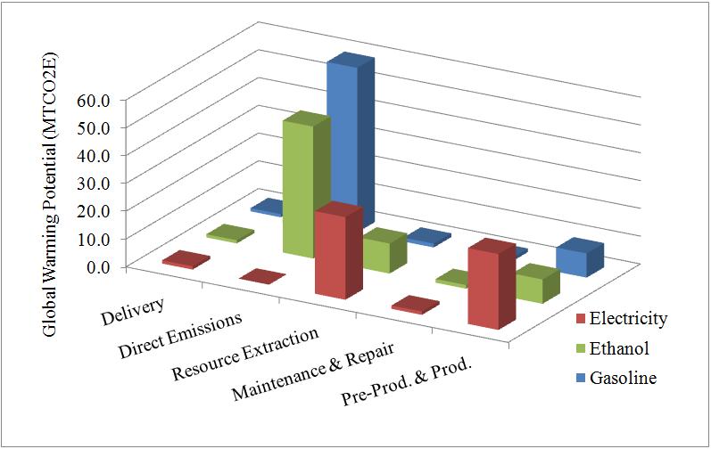
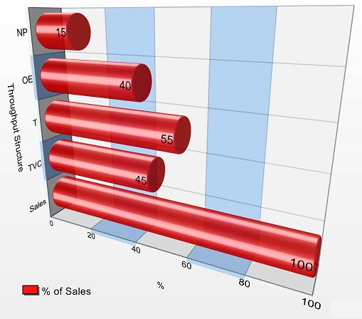
Using 3D rotations of charts and other 3D effects for visual impact, rather than for representing 3D data, is very likely to mislead. So are depictions of 3D objects that substitute for bars in bar charts. If the data is encoded by length only, as with a standard bar chart, the reader may interpret the proportionally larger object as having a greater volume, and therefore a higher value, than appropriate.4 Designers who use 2D representations of data, like bubbles, and encode data by radius or diameter rather than by area, will also create misleading proportions.5 2D representations like pie charts can make it difficult to compare segments against each other. Pie charts also imply that all segments add up to a whole, which may or may not be the case.
Color is its own subject. In general:
- Use 6 or fewer color divisions, since that is the limit of what most people can handle without confusion.
- Avoid a wide selection of spectral hues, because different people order them differently.6
- If possible, select shades of a single hue, which is more distinguishable in grayscale.
- Be aware of different types of color blindness.
References
Cairo, Alberto. How Charts Lie: Getting Smarter about Visual Information. NY: W.W. Norton, 2019.
Huff, Darrell. How to Lie with Statistics. NY: W.W. Norton, 1954.
Monmonier, Mark. How to Lie with Maps, 3rd ed. Chicago: U of Chicago P, 2018.
Image references
"Chart of an example of Throughput Accounting structure." TAUser, 2008. GNU FDL. Source
"GWP (MTCO2E) for all vehicle types over life cycle." B2.Team.Leader, 2006. Source