> [!WARNING]
> This product or feature is Experimental (pre-GA). Pre-GA products and features might have limited support, and changes to pre-GA products and features might not be compatible with other pre-GA versions. Pre-GA Offerings are covered by the [Google
> Maps Platform Service Specific Terms](https://cloud.google.com/maps-platform/terms/maps-service-terms). For more information, see the [launch stage descriptions](https://developers.google.com/maps/launch-stages.md.txt).
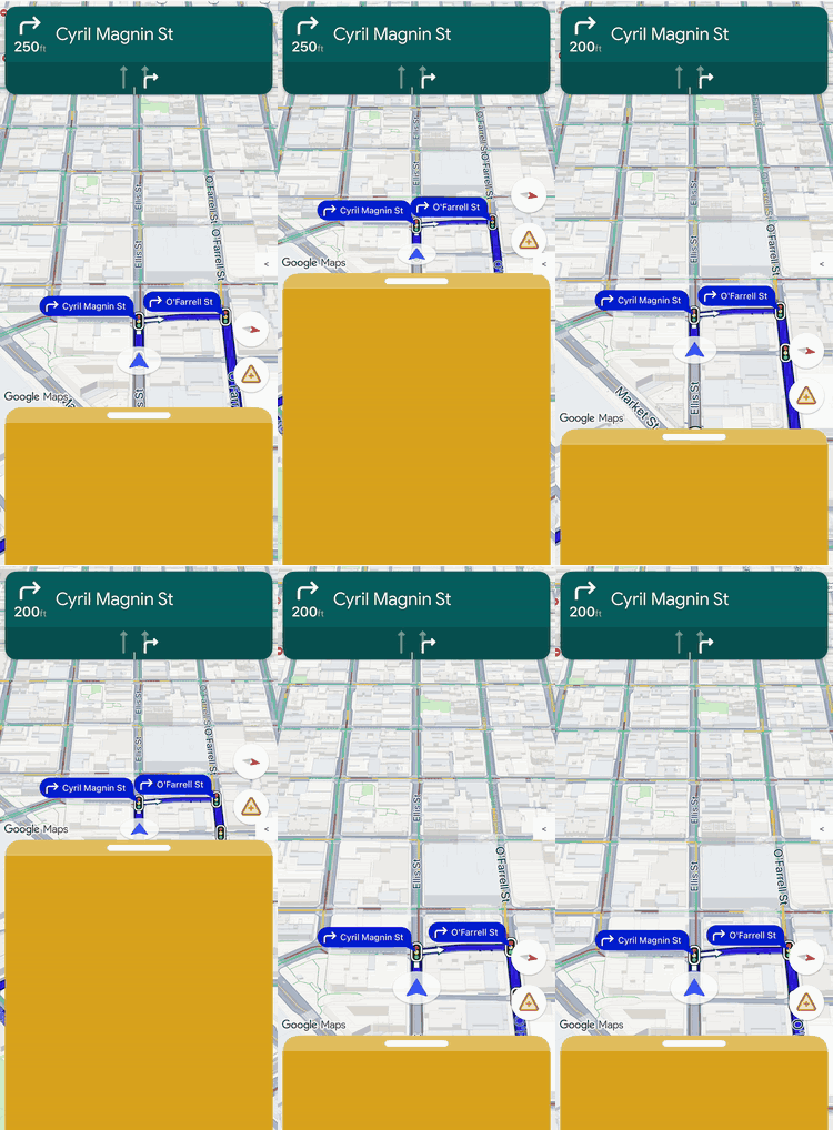
Note: This document uses Swift naming conventions for classes, protocols, and APIs.
Use layout customization to control the view hierarchy and screen placement for
both Google-provided views and your own custom business views.
Instead of adding custom views into predefined layout slots, implement
a layout delegate to manage the layout for the entire screen. During navigation
state transitions, your layout delegate receives the Google-provided
components, such as the turn card, ETA card, and buttons. Position these
elements alongside your own custom content using standard iOS Auto Layout constraints.
Use this framework to position custom business information---such as order status
or pickup instructions---precisely on the screen while preventing your views from
overlapping.
## How layout customization works
Layout customization uses a delegation design pattern. Instead of automatically
drawing or positioning UI components on the screen, the SDK passes them directly
to a custom class that you write: the layout delegate.
To customize your layout, create a class that conforms to the `NavigationLayoutDelegate` protocol and pass an instance to the `setLayoutDelegate(_:)` method of your `GMSMapView`. Whenever the navigation state transitions---such as moving from the base map into active turn-by-turn guidance---the SDK executes the callback methods on your delegate and provides the UI components available for that specific state.
To provide a seamless, integrated user experience, this framework establishes a
clear separation of responsibility between your app and the SDK. Use the
layout delegate to customize the following:
- **Build the view hierarchy:** Choose exactly which Google components and custom business views to add to the screen for each UI state.
- **Position every element:** Set precise screen anchors, margins, and layout placement. Avoid applying custom width or height constraints to Google components because Google components calculate their own internal dimensions.
- **Frame the base map:** Define the visible boundaries of the map camera using the coordinates of the viewport component.
- **Layer the screen:** Decide whether custom views float above, below, or alongside Google's built-in controls.
Meanwhile, you can't customize the following Google components with the layout
delegate:
- **Component dimensions:** The size and internal dimensions of Google-provided components, which the SDK calculates automatically.
- **Trigger conditions:** When dynamic alerts or prompts appear based on real-time route data.
### Implementation principles
When writing a layout delegate, keep the following rules in mind to prevent
layout bugs or runtime crashes:
- **The default is an empty screen:** Google-provided components only appear if your delegate explicitly adds them to the view hierarchy and positions them.
- **Legacy APIs aren't supported:** Properties and methods that control the legacy slot-based layout model won't be supported and might not behave as expected when a custom delegate is active.
- **Don't modify internal view structures:** Don't traverse or modify the view hierarchies of Google-provided components (such as the turn card or ETA card). Because these internal view hierarchies are underlying implementation details, they're subject to change across SDK releases. Modifying them can cause your layout to break during future SDK updates.
### Legacy API compatibility
For reliable layout behavior when using a custom layout delegate, avoid using
the following legacy slot-based APIs, which are
planned for deprecation. To migrate an existing app, replace your
usage of these APIs with code in your custom layout delegate:
#### Show legacy slot-based APIs
| Legacy API | Layout Delegate replacement |
|---|---|
| `isNavigationHeaderEnabled` | Read the `turnCard` view in `startGuidance(navMap:newState:oldState:)`. |
| `isNavigationFooterEnabled` | Read the `etaCard` view in `startGuidance(navMap:newState:oldState:)`. |
| `isNavigationTripProgressBarEnabled` | Read the `tripProgressBar` view in `startGuidance(navMap:newState:oldState:)`. |
| `isNavigationReportIncidentButtonEnabled` | Locate the `.reporting` button in the `buttons` array. |
| `setHeaderAccessoryView(_:)` and `invalidateLayout(forAccessoryView:)` | Add your own view to the layout and anchor it to the `turnCard`. |
| `padding` and `paddingAdjustmentBehavior` | Position the `viewport` view to frame the camera. |
| `navigationHeaderLayoutGuide` | Anchor your custom views directly to the `turnCard`. |
| `navigationFooterLayoutGuide` | Anchor your custom views directly to the `etaCard`. |
| `bottomTrailingButtonsLayoutGuide` | Anchor your buttons directly to the `etaCard` or container guides. |
| `bottomTrailingButtonsAlternateLayoutGuide` | Anchor your buttons directly to the `.reporting` button or `wideMode` constraints. |
| `navigatorWillPresentPrompt(_:)` and `navigatorDidDismissPrompt(_:)` | Rely on your `NavigationLayoutDelegate` prompt callbacks, such as `showPrompt(navMap:newPrompt:)`. |
While a custom layout delegate is set, the legacy layout guides (such as
`navigationHeaderLayoutGuide` or
`bottomTrailingButtonsLayoutGuide`) and the header accessory view
methods have no effect. Anchor your views to the Google-provided views
instead.
The `compassButton` property of `GMSUISettings` still
controls the compass while the navigation UI is disabled. While navigation is
enabled, your delegate decides whether to show the compass from the
`buttons` array.
## Essentials checklist
Follow these essential steps and requirements to implement your layout delegate
successfully:
- **Set the delegate before you enable navigation:** Call
`setLayoutDelegate(_:)` on your `GMSMapView` before
you enable navigation with `isNavigationEnabled` or
`enableNavigation(with:)`. The method throws an error if
navigation is already enabled or if you created the map view for a
CarPlay screen. The map view keeps a strong reference to your delegate. To
restore the built-in layout, pass `nil` while navigation is
disabled.
```swift
// Set the layout delegate before you enable navigation.
do {
try mapView.setLayoutDelegate(MyLayoutDelegate())
} catch {
print("Couldn't set the layout delegate: \(error)")
}
mapView.isNavigationEnabled = true
```
- **Attach mandatory views:** You must add the Google logo
(`googleLogo`) and the Viewport (`viewport`) to your layout
container in all navigation states.
- **Respect fixed dimensions:** The SDK determines the
dimensions for several Google-provided components. Don't apply custom width
or height constraints to the following elements:
- Turn card
- ETA card
- Incoming prompts
- Google logo
- Speed widget
- **Add elements as subviews:** Add the Google-provided views
directly as subviews to your custom container view or to the
`GMSMapView` itself.
- **Align using layout guides:** Google-provided views include
built-in visual margins. To line up your custom elements perfectly with
Google-provided components, constrain your views to the
`layoutMarginsGuide` property of the Google view.
- **Clean up on state exit:** In
`stopGuidance(navMap:newState:oldState:)`, remove the active
guidance views and deactivate their constraints before you restore your
navigation-ready layout. In
`disableNavigationUI(navMap:oldState:)`, remove all the views
and layout guides that you added, including any prompt on the screen. This
prevents views from one state from overlapping the next.
- **Own accessibility and right-to-left support:**
Google-provided views meet accessibility standards, but your delegate is
responsible for the accessibility of the overall layout. To support
right-to-left languages, use leading and trailing anchors instead of left
and right anchors.
- **Avoid legacy layout APIs:** Don't use legacy
layout-modifying properties on `GMSUISettings` or legacy layout
guides on `GMSMapView` while a custom delegate is active. The SDK
might ignore these legacy calls when a custom delegate is attached.
## UI states and Google components
When a navigation state transition occurs, the SDK passes a read-only
`NavigationUIState` object to your delegate callback. This object bundles the current
layout configuration flags with the Google components (for example, `UIView` instances) that
you need to render the screen.
The layout delegate manages the view hierarchy across four operational states.
The following state diagram illustrates how the SDK transitions between
navigation states and which callback methods it executes on your delegate:
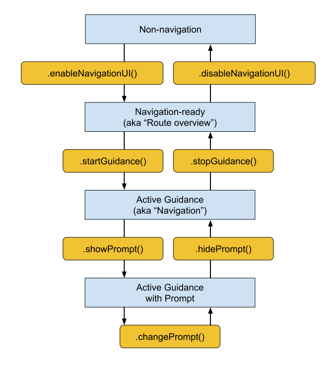
The specific Google components provided to your delegate depend on the current
phase of the navigation lifecycle.
### Required components (all navigation states)
Regardless of the current navigation phase, you must include, position, and keep
the following Google components visible in your view hierarchy:
- **Google Logo (`googleLogo`):** This component displays the mandatory
Google Maps logo. If the **Re-center** button is enabled, the logo
automatically transforms into this button when the driver scrolls the map
away from their vehicle. As a result, your placement of the logo dictates
where the **Re-center** button appears. It's recommended to place the logo
in the lower-leading corner of your layout to match standard map UI
expectations.
- **Viewport (`viewport`):** An invisible `UIView` that
defines the camera's framing boundaries. Your placement of the viewport
dictates exactly where the SDK centers the vehicle chevron and draws the
active route line. Position the viewport so it covers the open, unobscured
area of your screen, safely avoiding opaque overlays like custom bottom
sheets.
### Navigation-ready components
During the navigation-ready state, the UI remains minimal to keep the focus on
the base map. Your `NavigationReadyUIState` object provides access to the following:
- **buttons:** An array of floating action views configured for the base map (typically just the Compass button). Because Google might add or reorder buttons in future SDK releases, avoid relying on fixed array indexes. Instead, iterate through the array, read each button's type by comparing its `type` property to `NavigationButtonKnownType.compass`, and extract the physical view by calling its `view` property. Note that the exact buttons in this array differ from those available during active guidance.
### Active guidance components
When turn-by-turn guidance begins, the SDK unlocks the full suite of navigation
controls. Your `ActiveGuidanceUIState` object provides access to the following Google
components:
- **`turnCard`:** The primary header banner displaying upcoming
maneuver directions, distance measurements, and lane guidance. Place it at
the top of your layout to establish a familiar navigation hierarchy and
anchor your custom views around it.
- **`etaCard`:** The footer banner displaying the estimated arrival
time, remaining journey time, and remaining distance to the destination.
Place it along the bottom edge of your screen, or integrate its coordinates
with your custom task-management sheets.
- **`tripProgressBar`:** A vertical progress bar that shows the driver
how far they've traveled along the current route. Unlike legacy layouts
that fixed this strictly to the map edge, you have total freedom to anchor
it anywhere---for example, along a side edge of your custom container.
- **`speedWidget`:** A floating control for the speedometer and
posted speed limits. Depending on your API settings
(the `shouldDisplaySpeedometer` and
`shouldDisplaySpeedLimit` properties of `GMSMapView`) and data
availability, this view dynamically resizes between four visual states at
runtime (displaying nothing, the current speed only, the speed limit only,
or both readings). Because the widget can shift between these sizes without
notice, always anchor surrounding views using constraints so your layout
automatically adapts to prevent spatial overlaps.
- **`buttons`:** An expanded array of floating action views for the active guidance state (typically including both the Compass and the Incident Reporting button). Just as in the navigation-ready state, you can locate and extract individual button views by filtering the array by `type` (`.compass` or `.reporting`) and extracting the physical view using its `view` property. You can then position them independently, or add them to a `GMSNavigationHidingStackView`. This stack view arranges the buttons vertically and, when space runs out, hides them starting from the end of its `arrangedSubviews` array. Don't set `isHidden` on the views that it manages.
Tip: Best practice for camera framing. The turn card's view has a fixed height based on `NavigationStyleValues.headerNominalHeight`, which is tall enough for any turn card content. To keep camera framing stable, constrain the top of `viewport` directly to the bottom edge of `turnCard`, as shown in the [example implementation](https://developers.google.com/maps/documentation/navigation/ios-sdk/customize-layout.md.txt#example).
### Dynamic prompt components
Prompts, such as incident alerts or safety camera warnings, trigger
independently during active guidance.
When a prompt is ready to be displayed, the SDK calls your delegate's
`showPrompt(navMap:newPrompt:)` callback and passes a `newPrompt` view directly. Your delegate is responsible for smoothly positioning
this prompt over your layout (typically anchored to the bottom edge of your
map container).
Because the incoming prompt covers the lower portion of the screen, you must
update your layout to prevent the prompt from overlapping the viewport, the
Google logo, or any bottom-aligned buttons.
Your delegate also controls how prompts enter and leave the screen. For
details, see [Customizing prompts](https://developers.google.com/maps/documentation/navigation/ios-sdk/customize-layout.md.txt#customizing-prompts).
## Handling screen size and wide mode
To handle changes in map dimensions and screen orientation, the layout delegate
uses the following features:
- **View resizing:** Adjusts your layout whenever the physical size of the map
changes.
- **Wide mode:** Swaps to a wide-format layout variant when the map is wide
enough.
### Responding to view resizing
Split-screen layouts, container sliders, and device rotation commonly trigger the `sizeChanged(navMap:newState:)` callback. Use this callback to make general responsive adjustments to your custom UI. Implement `sizeChanged(navMap:newState:)` to reposition custom elements for a new screen aspect ratio, apply your own custom width or height breakpoints, and detect when a resize event toggles wide mode to safely swap layout variants.
### Understanding wide mode
Wide mode activates when the map container is wide enough to display UI
components side-by-side.
Read the `wideMode` boolean from the state object to reposition your custom
UI elements and keep the center of the map clear for the driver. Because
Google-provided components like the turn card and ETA card automatically shrink
and reshape in wide mode, reading this boolean ensures your layout adapts at
the exact same moment that the Google components update.
Consider the following examples for positioning your layout components in
standard and wide modes:
- **Standard portrait mode:** Position the turn card at the top of the screen
and the ETA card at the bottom.
- **Wide mode:** Keep the turn card and the ETA card along
the leading edge of the screen, with the turn card at the top and the ETA
card at the bottom. Placing either card away from the leading edge results
in undefined behavior. You can place the viewport and your own content
anywhere; a common choice is the trailing side of the cards.
### Checking wide mode during state transitions
If your layout supports a wide-mode variation, evaluate the `wideMode`
boolean inside every state transition callback, rather than relying only on
`sizeChanged(navMap:newState:)`.
Check the state object during callbacks like `enableNavigationUI(navMap:newState:)` and `startGuidance(navMap:newState:oldState:)` to handle initial app launches in landscape orientation. This approach ensures that your layout evaluates the wide mode state and activates the correct standard or wide layout variant the moment a new navigation state begins.
## Aligning to Google styling
To help your custom views match the spacing of Google-provided components, the
SDK provides the `NavigationStyleValues` class. Its class properties return
measurements in points.
For example, to place a custom button in the top corner of the screen opposite
the turn card, use `NavigationStyleValues.headerTopPadding` as the button's top
margin. The button then lines up with the top edge of the turn card.
The following measurements are available:
- `NavigationStyleValues.buttonHorizontalPadding`
- `NavigationStyleValues.buttonVerticalPadding`
- `NavigationStyleValues.defaultCornerRadius`
- `NavigationStyleValues.elementHorizontalPadding`
- `NavigationStyleValues.headerFooterHorizontalPadding`
- `NavigationStyleValues.headerNominalHeight`
- `NavigationStyleValues.headerTopPadding`
Google-provided views also include built-in margins. When you stack two
Google-provided views, constrain one to the other's `layoutMarginsGuide` so that
their margins don't add up. For example, to place the speed widget above the
ETA card, constrain the bottom anchor of `speedWidget` to
`etaCard.layoutMarginsGuide.topAnchor`.
## Customizing prompts
Your layout delegate controls how prompts enter and leave the screen, and which
of their corners are rounded.
### Animating prompts
The SDK doesn't animate prompts for you. Your delegate decides how each prompt
appears and disappears:
- In `showPrompt(navMap:newPrompt:)`, add the prompt to the map view at a starting position, and then animate it into place. For example, start the prompt just below the visible area, or behind a bottom sheet with its top edge aligned to the top of the sheet.
- In `hidePrompt(navMap:oldPrompt:)`, animate the prompt out of view, and then remove it from its superview when the animation finishes.
- In `changePrompt(navMap:newPrompt:oldPrompt:)`, run your hide and show animations at the same time to replace one prompt with another.
The [example implementation](https://developers.google.com/maps/documentation/navigation/ios-sdk/customize-layout.md.txt#example) uses this approach.
To turn off prompts for traffic, better routes, and incidents, set the
`shouldDisplayPrompts` property of `GMSNavigator` to `false`.
### Rounding prompt corners
Prompts conform to the `NavigationRoundedCornerView` protocol, so you can choose
which of their corners are rounded. By default, a prompt rounds only its top
corners, which suits a prompt that's anchored to the bottom edge of the screen.
If you place a prompt above other content, such as a bottom sheet, round all
four corners:
```swift
newPrompt.roundedCorners = [
.layerMinXMinYCorner, .layerMaxXMinYCorner,
.layerMinXMaxYCorner, .layerMaxXMaxYCorner,
]
```
## Example: Constraint-based layout implementation
The following example shows a basic layout delegate that uses Auto Layout
constraints to position the turn card, ETA card, buttons, Google logo, and
viewport. It also slides prompts on and off the screen. To keep the example
short, it doesn't handle wide mode, the speed widget, or the trip progress bar,
so it suits apps that support portrait orientation only.
```swift
import GoogleNavigation
import UIKit
/// A layout delegate that positions the essential navigation UI elements: the
/// turn card, ETA card, buttons, Google logo, and viewport. It also slides
/// prompts on and off the screen.
@MainActor
final class BasicLayoutDelegate: NSObject, NavigationLayoutDelegate {
/// How long prompts take to slide on or off the screen, in seconds.
private static let promptAnimationDuration: TimeInterval = 0.4
/// The views and constraints for one navigation state.
@MainActor
private final class StateElements {
let buttonStack = GMSNavigationHidingStackView(
position: .bottom, alignment: .trailing)
var constraints: [NSLayoutConstraint] = []
private unowned let navMap: GMSMapView
private let buttons: [UIView]
private let topLevelViews: [UIView]
init(
navMap: GMSMapView, buttons: [NavigationUIButton],
topLevelViews: [UIView]
) {
self.navMap = navMap
self.buttons = buttons.map { $0.view }
self.topLevelViews = topLevelViews
}
/// Adds the views to the map view, and then activates the constraints.
func activate() {
topLevelViews.forEach { navMap.addSubview($0) }
buttonStack.arrangedSubviews = buttons
navMap.addSubview(buttonStack)
NSLayoutConstraint.activate(constraints)
}
/// Deactivates the constraints, and then removes the views.
func deactivate() {
NSLayoutConstraint.deactivate(constraints)
buttonStack.removeFromSuperview()
buttonStack.arrangedSubviews = []
topLevelViews.forEach { $0.removeFromSuperview() }
}
}
private var navigationReadyElements: StateElements?
private var activeGuidanceElements: StateElements?
private var currentPrompt: NavigationPromptView?
private var promptBottomConstraint: NSLayoutConstraint?
/// Constraints that apply in both the navigation-ready and active guidance
/// states.
private var sharedConstraints: [NSLayoutConstraint] = []
/// Marks the bottom of the map content area. The guide stays above the ETA
/// card and above any prompt that's on the screen.
private let mapContentsBottomGuide = UILayoutGuide()
// MARK: - Navigation-ready state
func enableNavigationUI(
navMap: GMSMapView, newState: NavigationReadyUIState
) {
let safeArea = navMap.safeAreaLayoutGuide
let bottomGuide = mapContentsBottomGuide
navMap.addLayoutGuide(bottomGuide)
// Keep the guide at the bottom of the safe area unless a higher-priority
// constraint pushes it up.
let lowPriorityBottom = bottomGuide.bottomAnchor.constraint(
equalTo: safeArea.bottomAnchor)
lowPriorityBottom.priority = .defaultLow
sharedConstraints = [
bottomGuide.heightAnchor.constraint(equalToConstant: 0),
lowPriorityBottom,
]
let logo = newState.googleLogo
let viewport = newState.viewport
let elements = StateElements(
navMap: navMap, buttons: newState.buttons,
topLevelViews: [logo, viewport])
let buttonStack = elements.buttonStack
elements.constraints = sharedConstraints + [
buttonStack.trailingAnchor.constraint(equalTo: safeArea.trailingAnchor),
buttonStack.topAnchor.constraint(equalTo: safeArea.topAnchor),
buttonStack.bottomAnchor.constraint(equalTo: bottomGuide.topAnchor),
logo.leadingAnchor.constraint(equalTo: safeArea.leadingAnchor),
logo.bottomAnchor.constraint(equalTo: bottomGuide.topAnchor),
viewport.leadingAnchor.constraint(equalTo: safeArea.leadingAnchor),
viewport.trailingAnchor.constraint(equalTo: safeArea.trailingAnchor),
viewport.topAnchor.constraint(equalTo: safeArea.topAnchor),
viewport.bottomAnchor.constraint(equalTo: bottomGuide.topAnchor),
]
elements.activate()
navigationReadyElements = elements
}
func disableNavigationUI(
navMap: GMSMapView, oldState: NavigationReadyUIState
) {
currentPrompt?.removeFromSuperview()
currentPrompt = nil
promptBottomConstraint = nil
navigationReadyElements?.deactivate()
navigationReadyElements = nil
navMap.removeLayoutGuide(mapContentsBottomGuide)
}
// MARK: - Active guidance state
func startGuidance(
navMap: GMSMapView, newState: ActiveGuidanceUIState,
oldState: NavigationReadyUIState
) {
navigationReadyElements?.deactivate()
let safeArea = navMap.safeAreaLayoutGuide
let bottomGuide = mapContentsBottomGuide
let turnCard = newState.turnCard
let etaCard = newState.etaCard
let logo = newState.googleLogo
let viewport = newState.viewport
let elements = StateElements(
navMap: navMap, buttons: newState.buttons,
topLevelViews: [turnCard, etaCard, viewport, logo])
let buttonStack = elements.buttonStack
elements.constraints = sharedConstraints + [
turnCard.leadingAnchor.constraint(equalTo: safeArea.leadingAnchor),
turnCard.topAnchor.constraint(equalTo: navMap.topAnchor),
etaCard.leadingAnchor.constraint(equalTo: navMap.leadingAnchor),
etaCard.bottomAnchor.constraint(equalTo: navMap.bottomAnchor),
bottomGuide.bottomAnchor.constraint(
lessThanOrEqualTo: etaCard.topAnchor),
buttonStack.trailingAnchor.constraint(equalTo: safeArea.trailingAnchor),
buttonStack.topAnchor.constraint(equalTo: turnCard.bottomAnchor),
buttonStack.bottomAnchor.constraint(equalTo: bottomGuide.topAnchor),
logo.leadingAnchor.constraint(equalTo: safeArea.leadingAnchor),
logo.bottomAnchor.constraint(equalTo: bottomGuide.topAnchor),
// Frame the camera in the open area below the turn card.
viewport.leadingAnchor.constraint(equalTo: safeArea.leadingAnchor),
viewport.trailingAnchor.constraint(equalTo: safeArea.trailingAnchor),
viewport.topAnchor.constraint(equalTo: turnCard.bottomAnchor),
viewport.bottomAnchor.constraint(equalTo: bottomGuide.topAnchor),
]
elements.activate()
activeGuidanceElements = elements
}
func stopGuidance(
navMap: GMSMapView, newState: NavigationReadyUIState,
oldState: ActiveGuidanceUIState
) {
activeGuidanceElements?.deactivate()
activeGuidanceElements = nil
navigationReadyElements?.activate()
}
// MARK: - Prompts
func showPrompt(navMap: GMSMapView, newPrompt: NavigationPromptView) {
navMap.addSubview(newPrompt)
currentPrompt = newPrompt
// Start with the prompt just below the bottom edge of the map view.
let bottomConstraint = newPrompt.bottomAnchor.constraint(
equalTo: navMap.bottomAnchor, constant: newPrompt.bounds.height)
promptBottomConstraint = bottomConstraint
NSLayoutConstraint.activate([
bottomConstraint,
newPrompt.leadingAnchor.constraint(
equalTo: navMap.safeAreaLayoutGuide.leadingAnchor),
// Keep the map content above the prompt.
mapContentsBottomGuide.bottomAnchor.constraint(
lessThanOrEqualTo: newPrompt.topAnchor),
])
// Lay out the prompt in its starting position, and then slide it up.
navMap.layoutIfNeeded()
UIView.animate(withDuration: Self.promptAnimationDuration) {
bottomConstraint.constant = 0
navMap.layoutIfNeeded()
}
}
func hidePrompt(navMap: GMSMapView, oldPrompt: NavigationPromptView) {
guard let bottomConstraint = promptBottomConstraint else { return }
promptBottomConstraint = nil
currentPrompt = nil
// Slide the prompt down, and then remove it.
UIView.animate(withDuration: Self.promptAnimationDuration) {
bottomConstraint.constant = oldPrompt.bounds.height
navMap.layoutIfNeeded()
} completion: { _ in
oldPrompt.removeFromSuperview()
}
}
func changePrompt(
navMap: GMSMapView, newPrompt: NavigationPromptView,
oldPrompt: NavigationPromptView
) {
// Slide the old prompt out and the new prompt in at the same time.
hidePrompt(navMap: navMap, oldPrompt: oldPrompt)
showPrompt(navMap: navMap, newPrompt: newPrompt)
}
}
```
To use the delegate, set it on your map view before you enable navigation, as
described in the [Essentials checklist](https://developers.google.com/maps/documentation/navigation/ios-sdk/customize-layout.md.txt#essentials_checklist).
## Limitations and known issues
Layout customization doesn't apply to CarPlay, which uses fixed layout
templates. If you call `setLayoutDelegate(_:)` on a map view that you create for
a CarPlay screen, the method throws an error.
For issues that affect specific SDK versions, see
[Known issues](https://developers.google.com/maps/documentation/navigation/ios-sdk/release-notes.md.txt#known_issues)
in the release notes.