Select platform: [Android](https://developers.google.com/maps/documentation/places/android-sdk/places-ui-kit-custom-styling.md.txt "View this page for the Android platform docs.") [iOS](https://developers.google.com/maps/documentation/places/ios-sdk/places-ui-kit-custom-styling.md.txt "View this page for the iOS platform docs.") [JavaScript](https://developers.google.com/maps/documentation/javascript/places-ui-kit/custom-styling.md.txt "View this page for the JavaScript platform docs.")
# Customizeable style properties
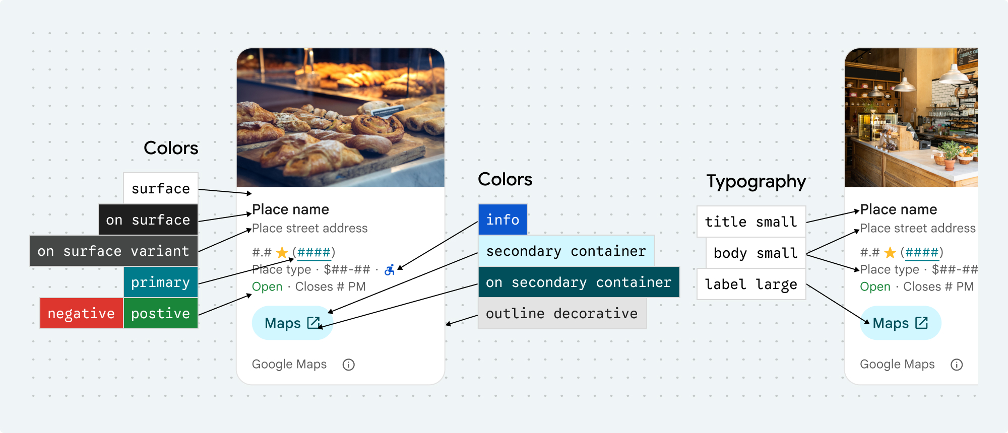
[](https://developers.google.com/static/maps/documentation/places/images/place-details-visual-customization.jpg) Visual customization examples
You can customize the colors, typography, spacing, borders, and corners of these Places UI kit components and non-UI kit features:
- [Place Details component](https://developers.google.com/maps/documentation/places/android-sdk/place-details-ui-kit.md.txt)
- [Place Search component](https://developers.google.com/maps/documentation/places/android-sdk/place-search-ui-kit.md.txt)
- [Basic Place Autocomplete component](https://developers.google.com/maps/documentation/places/android-sdk/basic-place-autocomplete-ui-kit.md.txt)
- [Non-UI Kit Place Autocomplete widget](https://developers.google.com/maps/documentation/places/android-sdk/place-autocomplete.md.txt)
Places UI kit offers a design system approach to visual customization roughly based on [Material Design](https://m3.material.io) (with some Google-Maps-specific modifications). See Material Design's reference for [Color](https://m3.material.io/styles/color/overview) and [Typography](https://m3.material.io/styles/typography/overview). By default, the style adheres to the Google Maps visual design language.
Use the [Customization tool](https://developers.google.com/maps/documentation/places/android-sdk/places-ui-kit-customization-tool.md.txt) to visualize custom configurations in a Places UI Kit element. The **Code** tab provides configurations in HTML/CSS, Kotlin/XML, and Swift.
> [!IMPORTANT]
> **Important:** When making visual modifications, you must adhere to the [Google Maps attribution requirements](https://developers.google.com/maps/documentation/places/android-sdk/places-ui-kit-attr-req).
When instantiating a fragment, you can specify a theme that overrides any of the default style attributes. Any theme attributes that are not overridden use the default styles.
```
```
> [!IMPORTANT]
> **Important:** The Places UI Kit provides a dark theme by default, so you may need to customize both dark and light themes. To create a dark theme, add an entry for the colors in `values-night/colors.xml`
## Customization tool
Use this tool to visualize custom configurations in a Places UI Kit element. The **Code** tab provides configurations in HTML/CSS, Kotlin/XML, and Swift.
## Style properties
You can customize the following styles:
| Theme attribute | Usage |
| Color ||
|---|---|
| `placesColorSurface` | Container and dialog background |
| `placesColorOutlineDecorative` | Container border |
| `placesColorPrimary` | Links, loading indicator, overview icons |
| `placesColorOnSurface` | Headings, dialog content |
| `placesColorOnSurfaceVariant` | Place information |
| `placesColorSecondaryContainer` | Button background |
| `placesColorOnSecondaryContainer` | Button text and icon |
| `placesColorNeutralContainer` | Review date badge, loading placeholder shapes |
| `placesColorOnNeutralContainer` | Review date, loading error |
| `placesColorPositiveContainer` | Available EV charger badge |
| `placesColorOnPositiveContainer` | Available EV charger badge content |
| `placesColorPositive` | Place "Open" now label |
| `placesColorNegative` | Place "Closed" now label |
| `placesColorInfo` | Accessible entrance icon |
| `placesColorButtonBorder` | Open in maps and OK buttons |
| | |
| `placesTextAppearanceBodySmall` | Place information |
| `placesTextAppearanceBodyMedium` | Place information, dialog content |
| `placesTextAppearanceLabelMedium` | Badge content |
| `placesTextAppearanceLabelLarge` | Button content |
| `placesTextAppearanceHeadlineMedium` | Dialog headings |
| `placesTextAppearanceDisplaySmall` | Place name |
| `placesTextAppearanceTitleSmall` | Place name |
| | |
| `placesSpacingExtraSmall` | |
| `placesSpacingSmall` | |
| `placesSpacingMedium` | |
| `placesSpacingLarge` | |
| `placesSpacingExtraLarge` | |
| `placesSpacingTwoExtraLarge` | |
| | |
| `placesBorderWidth` | Container |
| `placesBorderWidthButton` | |
| | |
| `placesCornerRadius` | Container |
| `placesCornerRadiusButton` | Open in Maps and OK buttons (excludes round icon button) |
| `placesCornerRadiusThumbnail` | Place thumbnail image |
| `placesCornerRadiusCollageOuter` | Media collage |
| `placesCornerRadiusCard` | Place card, User review card |
| `placesCornerRadiusDialog` | Google Maps disclosure dialog |
| | |
| `placesColorAttributionLightTheme` | Light theme Google Maps attribution and disclosure button (enums for white, gray, and black) |
| `placesColorAttributionDarkTheme` | Dark theme Google Maps attribution and disclosure button (enums for white, gray, and black) |
### Attribution colors
[](https://developers.google.com/static/maps/documentation/places/images/place-details-attribution.jpg) Attribution
[Google Maps' terms of service](https://cloud.google.com/maps-platform/terms) require you to use one of three brand colors for the Google Maps attribution. This attribution must be visible and accessible when customization changes have been made.
We offer 3 brand colors to choose from that can be independently set for light and dark themes:
- Light theme: `placesColorAttributionLight` with enum values for white, gray, and black.
- Dark theme: `placesColorAttributionDark` with enum valuesfor white, gray, and black.
### Examples
This code sample shows how to create a theme that overrides the default style attributes. Any theme attributes that are not overridden use the default styles.
```
```
#### Full examples for each component
- [Place Details component styling example](https://developers.google.com/maps/documentation/places/android-sdk/place-details-ui-kit.md.txt#create-a-theme).
- [Place Search component styling example](https://developers.google.com/maps/documentation/places/android-sdk/place-search-ui-kit.md.txt#customize-the-theme_1).
- [Basic Place Autocomplete component styling example](https://developers.google.com/maps/documentation/places/android-sdk/basic-place-autocomplete-ui-kit.md.txt#example).
- [Place Autocomplete widget styling example](https://developers.google.com/maps/documentation/places/android-sdk/place-autocomplete.md.txt#new_examples).