In this unit, you learn how to create accessible visuals that use a mix of text and visual elements, rather than relying on visual cues to convey information.
Why visual indicators are insufficient
Visual cues like color, shape, and pattern can be effective tools for communicating information. However, to ensure that content is accessible to a wide audience, don't rely exclusively on the visual elements, such as the following:
- colors
- patterns
- images
- font styling
- directional words (for example, "top-right corner")
Instead, use a mix of these visual elements and accompany them with descriptive text to convey information. It is also important to provide text descriptions or alternative text when using images, diagrams, or other diagrams.
Users with visual impairments, including color blindness, may not fully perceive certain visual cues. Incorporating a mix of visual elements with accompanying descriptive text helps ensure that the intended meaning is conveyed to everyone, regardless of their ability to perceive the visuals. This approach can also help eliminate ambiguity that might arise if the meaning or purpose of a color or shape is not clear to everyone.
Examples
The following examples help illustrate why it's important not to rely only on color to communicate information, and how you can use text, color, and symbols to enhance the accessibility of your visuals.
Don't rely on color alone
The following example of comma usage, adapted from the Google developer documentation style guide, relies only on color (red and green) to communicate important information, thus excluding anyone who is color blind or otherwise visually impaired.
In this example, the red sentences use commas incorrectly, and the green sentences use commas correctly:
- The libraries make feed creation easier, and they ensure that only valid feeds are produced.
- The libraries make feed creation easier and they ensure that only valid feeds are produced.
- Type your ID and click OK.
- Type your ID, and click OK.
Some color-blind users can't distinguish between the red text and the green text, so they'd be unable to tell from the previous example alone which example is correct. The only distinguishing factor in this example is the color, so people who either can't see the text or can't distinguish between the colors wouldn't be able to tell which is the correct example.
Use text, color, and symbols for better accessibility
The following example uses the red "thumbs down" and the green "thumbs up" symbols in addition to text. This change makes it so the text would be clear even if you removed all color and other visual indicators.
Recommended: The libraries make feed creation easier, and they ensure that only valid feeds are produced.
Not recommended: The libraries make feed creation easier and they ensure that only valid feeds are produced.
Recommended: Type your ID and click OK.
Not recommended: Type your ID, and click OK.
The use of color with the thumbs up and thumbs down symbols could be a useful visual reference for people who can see them. For people who can't see or distinguish between the visual cues, providing descriptive text (in this case, "Not recommended" and "Recommended") is helpful.
Exercise: Fix a diagram
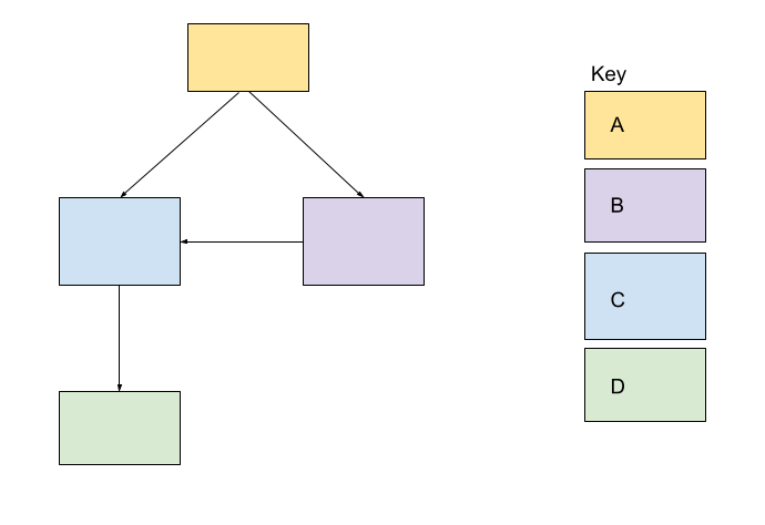
Next, think about how you could edit the following diagram to make it more accessible.

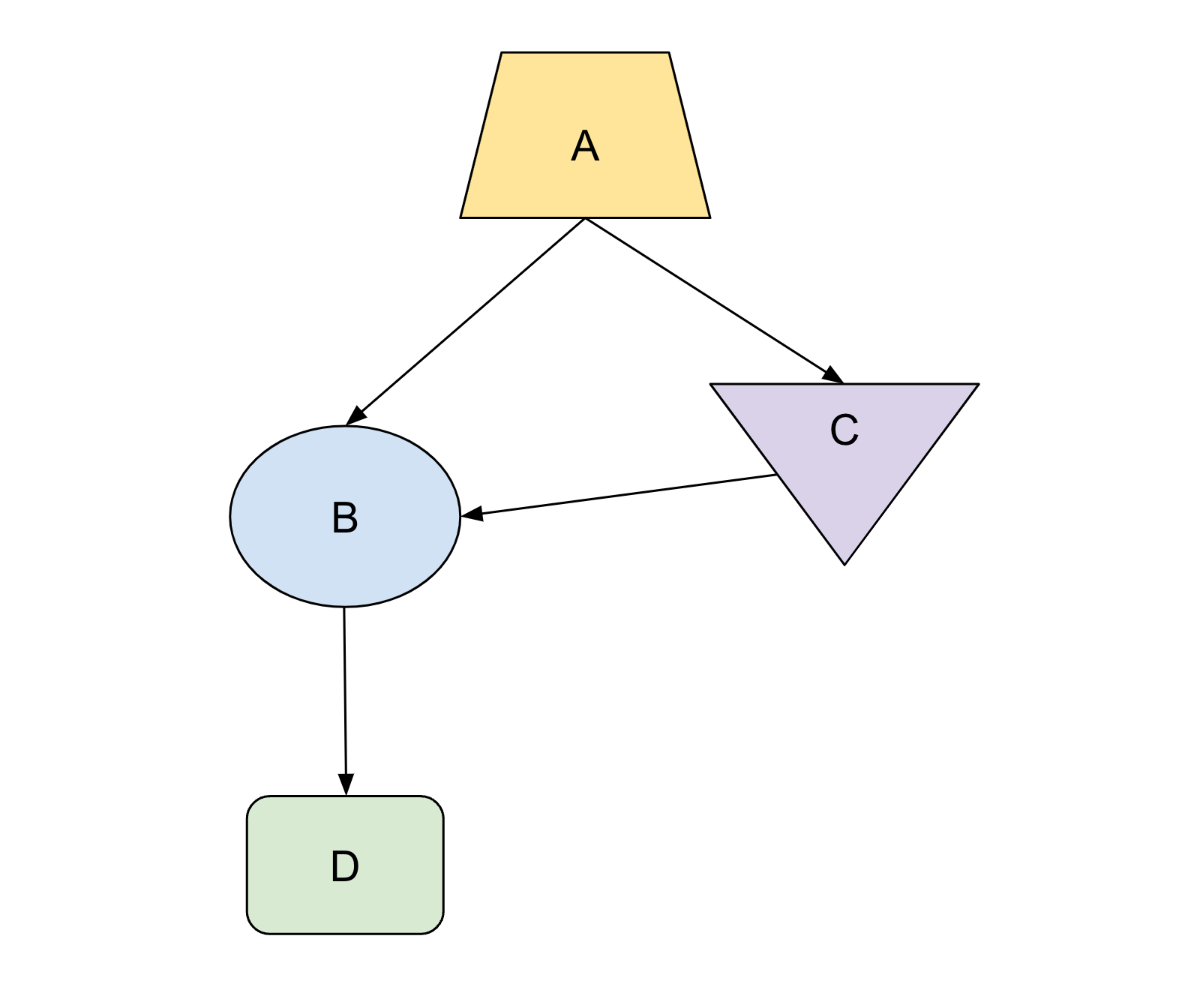
This diagram uses rectangles of different colors to represent categories. Because the diagram relies solely on color to differentiate categories, it presents accessibility challenges. To make the diagram more accessible, consider incorporating design elements such as different shapes, line weights, patterns, or text labels to clearly differentiate the categories.
Next unit: Edit for accessibility

