

Bersama-sama membuat web yang lebih baik
Kami ingin membantu Anda membuat situs yang menarik, mudah diakses, cepat, dan aman yang berfungsi lintas browser, dan untuk semua pengguna Anda. Situs ini adalah tempat kami menyediakan konten untuk membantu Anda dalam perjalanan tersebut, yang ditulis oleh anggota tim Chrome dan pakar eksternal.
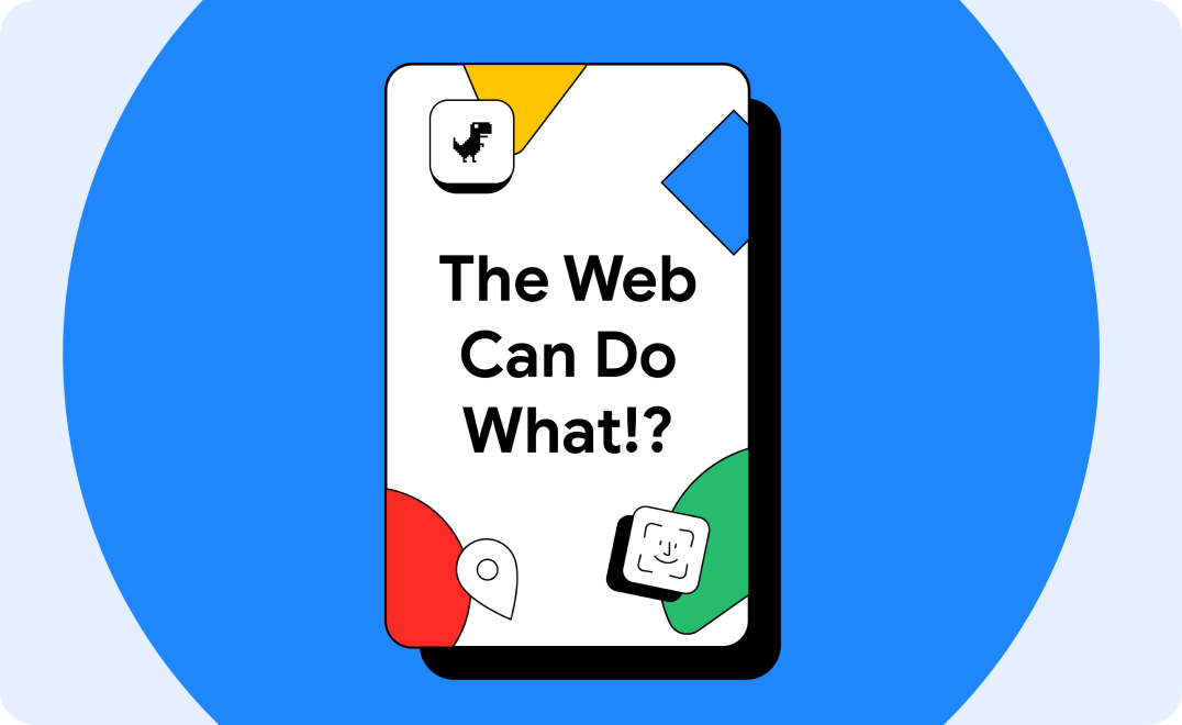
Pelajari cara teknologi web modern dapat membantu Anda meraih kesuksesan
Pelajari kasus penggunaan yang telah dibuat jauh lebih mudah dengan teknologi web baru yang inovatif.
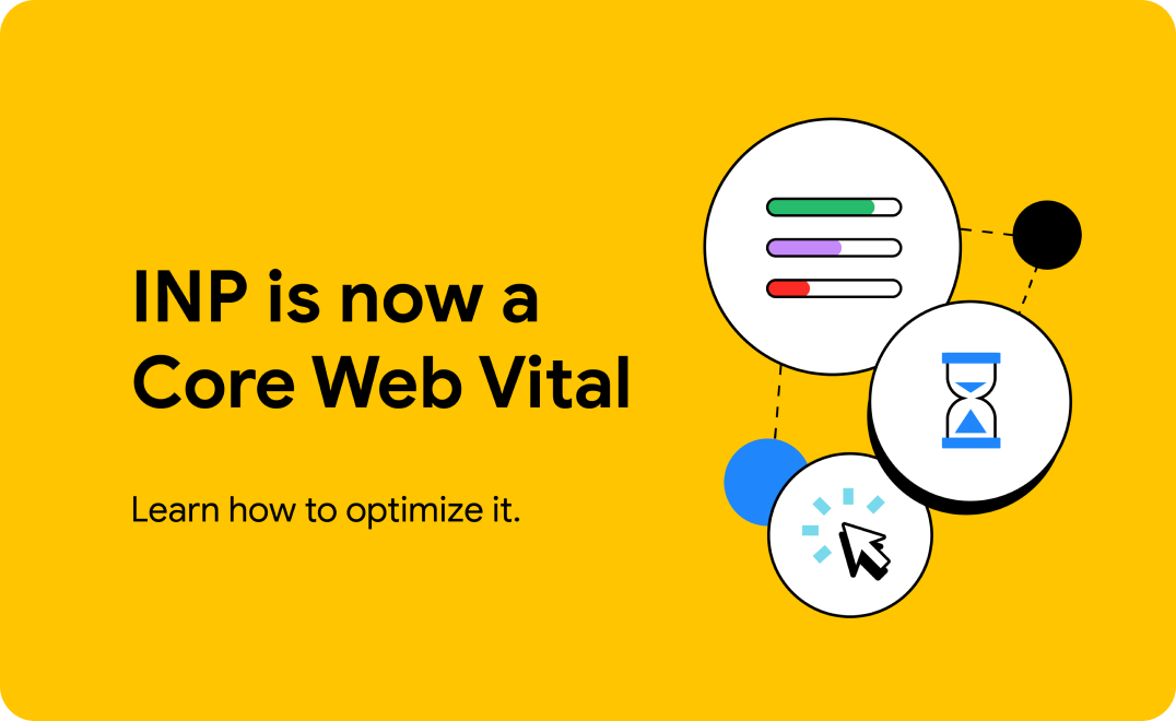
Cara baru untuk mengukur tingkat respons interaksi
Mulai ukur dan optimalkan performa Interaction to Next Paint (INP) situs Anda. Metrik ini secara resmi menjadi metrik Core Web Vitals pada 12 Maret.
Apa yang baru?
Memperkenalkan Baseline
Di Google I/O 2023, kami mengumumkan Dasar pengukuran, mempelajari lebih lanjut inisiatif ini dan alasan mengapa ini penting.

Baru menggunakan platform web di bulan Januari.
Temukan beberapa fitur menarik yang tersedia di browser web stabil dan beta selama Januari 2024.
Podcast CSS
Ikuti Una Kravets dan Adam Argyle, advokat developer dari Google, yang dengan senang hati menguraikan aspek-aspek kompleks dari CSS menjadi beberapa episode yang membingungkan dari podcast ini.
Desain UI dan CSS
Pelajari kiat dan teknik terbaru untuk digunakan dalam pekerjaan Anda, sekarang juga.
Menyesuaikan tipografi dengan preferensi pengguna menggunakan CSS
Sesuaikan {i>font
Ruang warna dan fungsi CSS baru di semua mesin utama
Semua mesin utama kini mendukung ruang dan fungsi warna CSS yang baru. Cari tahu bagaimana mereka bisa membuat desain Anda lebih hidup.
Apa itu peta sumber?
Meningkatkan pengalaman proses debug web dengan peta sumber.
Subgrid CSS
Subgrid sekarang dapat dioperasikan di ketiga mesin utama. Cari tahu cara menggunakannya.
Core Web Vitals
Buat situs dan aplikasi yang lebih cepat dengan memahami Data Web Inti dan metrik lainnya.
Interaction to Next Paint menjadi Core Web Vital pada 12 Maret
Interaction to Next Paint akan resmi menjadi Core Web Vital dan akan menggantikan Penundaan Input Pertama pada 12 Maret.
Cara mengoptimalkan INP
Pelajari cara mengoptimalkan metrik Interaction to Next Paint.
Rekomendasi Data Web Inti teratas kami untuk tahun 2023
Kumpulan praktik terbaik untuk mengoptimalkan performa Data Web Inti situs berdasarkan kondisi web pada tahun 2023.
Menggunakan ekstensi Data Web untuk men-debug masalah Data Web Inti.
Ekstensi Data Web kini menampilkan lebih banyak informasi proses debug untuk membantu Anda mengidentifikasi penyebab utama masalah Data Web Inti.
Progressive Web App
Ciptakan pengalaman web yang andal.
Pelajari PWA
Sebuah kursus yang menguraikan setiap aspek pengembangan progressive web app modern.
TransformStream kini didukung lintas browser.
Setelah streaming transformasi didukung di Safari, Firefox, dan Chrome, semuanya siap digunakan.
Pola baru untuk aplikasi keren
Jelajahi koleksi pola baru yang fantastis untuk aplikasi yang luar biasa, termasuk pola papan klip, pola file, dan pola aplikasi tingkat lanjut.
Katalog Project Fugu API
Di situs Chrome Developers, pelajari API kemampuan.
Dapat diakses oleh semua
Pelajari cara membuat situs Anda lebih mudah diakses oleh difabel, baik permanen, sementara, maupun situasional.
Pelajari Aksesibilitas
Kursus baru kami adalah titik masuk yang bagus dan referensi untuk topik aksesibilitas.
Menguji kontras warna desain web
Ikhtisar tentang tiga alat dan teknik untuk menguji dan memverifikasi kontras warna desain Anda yang mudah diakses.
Membangun navigasi utama untuk {i>website
Tutorial ini menjelaskan cara membuat navigasi utama yang dapat diakses dari sebuah {i>website
Sorotan komunitas: Melanie Sumner
Baca wawancara kami dengan Melanie, seorang software engineer yang berspesialisasi dalam aksesibilitas digital.
Pembayaran dan identitas
Temukan teknik dan praktik terbaik terbaru untuk pembayaran serta membantu pengguna login dengan aman ke situs dan aplikasi Anda.
Buat kunci sandi untuk login tanpa sandi
Kunci sandi membuat akun pengguna lebih aman, sederhana, dan lebih mudah digunakan.
Login dengan kunci sandi
Membuat pengalaman login yang menggunakan kunci sandi sekaligus tetap mengakomodasi pengguna sandi yang sudah ada.
Ringkasan pembayaran web
Pelajari lebih lanjut Pembayaran Web dan cara kerjanya.
Praktik terbaik formulir pembayaran dan alamat
Maksimalkan konversi dengan membantu pengguna melengkapi alamat dan formulir pembayaran secepat dan semudah mungkin.
Newsletter Developer
Dapatkan berita, teknik, dan info terbaru langsung ke kotak masuk Anda.
[]
[]