- [JSON representation](https://developers.google.com/workspace/chat/api/reference/rest/v1/Card#SCHEMA_REPRESENTATION)
- [CardHeader](https://developers.google.com/workspace/chat/api/reference/rest/v1/Card#CardHeader)
- [JSON representation](https://developers.google.com/workspace/chat/api/reference/rest/v1/Card#CardHeader.SCHEMA_REPRESENTATION)
- [Section](https://developers.google.com/workspace/chat/api/reference/rest/v1/Card#Section)
- [JSON representation](https://developers.google.com/workspace/chat/api/reference/rest/v1/Card#Section.SCHEMA_REPRESENTATION)
- [Widget](https://developers.google.com/workspace/chat/api/reference/rest/v1/Card#Widget)
- [JSON representation](https://developers.google.com/workspace/chat/api/reference/rest/v1/Card#Widget.SCHEMA_REPRESENTATION)
- [TextParagraph](https://developers.google.com/workspace/chat/api/reference/rest/v1/Card#TextParagraph)
- [JSON representation](https://developers.google.com/workspace/chat/api/reference/rest/v1/Card#TextParagraph.SCHEMA_REPRESENTATION)
- [TextSyntax](https://developers.google.com/workspace/chat/api/reference/rest/v1/Card#TextSyntax)
- [Image](https://developers.google.com/workspace/chat/api/reference/rest/v1/Card#Image)
- [JSON representation](https://developers.google.com/workspace/chat/api/reference/rest/v1/Card#Image.SCHEMA_REPRESENTATION)
- [DecoratedText](https://developers.google.com/workspace/chat/api/reference/rest/v1/Card#DecoratedText)
- [JSON representation](https://developers.google.com/workspace/chat/api/reference/rest/v1/Card#DecoratedText.SCHEMA_REPRESENTATION)
- [VerticalAlignment](https://developers.google.com/workspace/chat/api/reference/rest/v1/Card#VerticalAlignment)
- [SwitchControl](https://developers.google.com/workspace/chat/api/reference/rest/v1/Card#SwitchControl)
- [JSON representation](https://developers.google.com/workspace/chat/api/reference/rest/v1/Card#SwitchControl.SCHEMA_REPRESENTATION)
- [ControlType](https://developers.google.com/workspace/chat/api/reference/rest/v1/Card#ControlType)
- [TextInput](https://developers.google.com/workspace/chat/api/reference/rest/v1/Card#TextInput)
- [JSON representation](https://developers.google.com/workspace/chat/api/reference/rest/v1/Card#TextInput.SCHEMA_REPRESENTATION)
- [Type](https://developers.google.com/workspace/chat/api/reference/rest/v1/Card#Type)
- [Suggestions](https://developers.google.com/workspace/chat/api/reference/rest/v1/Card#Suggestions)
- [JSON representation](https://developers.google.com/workspace/chat/api/reference/rest/v1/Card#Suggestions.SCHEMA_REPRESENTATION)
- [SuggestionItem](https://developers.google.com/workspace/chat/api/reference/rest/v1/Card#SuggestionItem)
- [JSON representation](https://developers.google.com/workspace/chat/api/reference/rest/v1/Card#SuggestionItem.SCHEMA_REPRESENTATION)
- [Validation](https://developers.google.com/workspace/chat/api/reference/rest/v1/Card#Validation)
- [JSON representation](https://developers.google.com/workspace/chat/api/reference/rest/v1/Card#Validation.SCHEMA_REPRESENTATION)
- [InputType](https://developers.google.com/workspace/chat/api/reference/rest/v1/Card#InputType)
- [HostAppDataSourceMarkup](https://developers.google.com/workspace/chat/api/reference/rest/v1/Card#HostAppDataSourceMarkup)
- [JSON representation](https://developers.google.com/workspace/chat/api/reference/rest/v1/Card#HostAppDataSourceMarkup.SCHEMA_REPRESENTATION)
- [ChatClientDataSourceMarkup](https://developers.google.com/workspace/chat/api/reference/rest/v1/Card#ChatClientDataSourceMarkup)
- [JSON representation](https://developers.google.com/workspace/chat/api/reference/rest/v1/Card#ChatClientDataSourceMarkup.SCHEMA_REPRESENTATION)
- [SpaceDataSource](https://developers.google.com/workspace/chat/api/reference/rest/v1/Card#SpaceDataSource)
- [JSON representation](https://developers.google.com/workspace/chat/api/reference/rest/v1/Card#SpaceDataSource.SCHEMA_REPRESENTATION)
- [WorkflowDataSourceMarkup](https://developers.google.com/workspace/chat/api/reference/rest/v1/Card#WorkflowDataSourceMarkup)
- [JSON representation](https://developers.google.com/workspace/chat/api/reference/rest/v1/Card#WorkflowDataSourceMarkup.SCHEMA_REPRESENTATION)
- [Type](https://developers.google.com/workspace/chat/api/reference/rest/v1/Card#Type_1)
- [SelectionInput](https://developers.google.com/workspace/chat/api/reference/rest/v1/Card#SelectionInput)
- [JSON representation](https://developers.google.com/workspace/chat/api/reference/rest/v1/Card#SelectionInput.SCHEMA_REPRESENTATION)
- [SelectionType](https://developers.google.com/workspace/chat/api/reference/rest/v1/Card#SelectionType)
- [PlatformDataSource](https://developers.google.com/workspace/chat/api/reference/rest/v1/Card#PlatformDataSource)
- [JSON representation](https://developers.google.com/workspace/chat/api/reference/rest/v1/Card#PlatformDataSource.SCHEMA_REPRESENTATION)
- [CommonDataSource](https://developers.google.com/workspace/chat/api/reference/rest/v1/Card#CommonDataSource)
- [DataSourceConfig](https://developers.google.com/workspace/chat/api/reference/rest/v1/Card#DataSourceConfig)
- [JSON representation](https://developers.google.com/workspace/chat/api/reference/rest/v1/Card#DataSourceConfig.SCHEMA_REPRESENTATION)
- [DateTimePicker](https://developers.google.com/workspace/chat/api/reference/rest/v1/Card#DateTimePicker)
- [JSON representation](https://developers.google.com/workspace/chat/api/reference/rest/v1/Card#DateTimePicker.SCHEMA_REPRESENTATION)
- [DateTimePickerType](https://developers.google.com/workspace/chat/api/reference/rest/v1/Card#DateTimePickerType)
- [Divider](https://developers.google.com/workspace/chat/api/reference/rest/v1/Card#Divider)
- [Grid](https://developers.google.com/workspace/chat/api/reference/rest/v1/Card#Grid)
- [JSON representation](https://developers.google.com/workspace/chat/api/reference/rest/v1/Card#Grid.SCHEMA_REPRESENTATION)
- [GridItem](https://developers.google.com/workspace/chat/api/reference/rest/v1/Card#GridItem)
- [JSON representation](https://developers.google.com/workspace/chat/api/reference/rest/v1/Card#GridItem.SCHEMA_REPRESENTATION)
- [ImageComponent](https://developers.google.com/workspace/chat/api/reference/rest/v1/Card#ImageComponent)
- [JSON representation](https://developers.google.com/workspace/chat/api/reference/rest/v1/Card#ImageComponent.SCHEMA_REPRESENTATION)
- [ImageCropStyle](https://developers.google.com/workspace/chat/api/reference/rest/v1/Card#ImageCropStyle)
- [JSON representation](https://developers.google.com/workspace/chat/api/reference/rest/v1/Card#ImageCropStyle.SCHEMA_REPRESENTATION)
- [ImageCropType](https://developers.google.com/workspace/chat/api/reference/rest/v1/Card#ImageCropType)
- [BorderStyle](https://developers.google.com/workspace/chat/api/reference/rest/v1/Card#BorderStyle)
- [JSON representation](https://developers.google.com/workspace/chat/api/reference/rest/v1/Card#BorderStyle.SCHEMA_REPRESENTATION)
- [BorderType](https://developers.google.com/workspace/chat/api/reference/rest/v1/Card#BorderType)
- [GridItemLayout](https://developers.google.com/workspace/chat/api/reference/rest/v1/Card#GridItemLayout)
- [Columns](https://developers.google.com/workspace/chat/api/reference/rest/v1/Card#Columns)
- [JSON representation](https://developers.google.com/workspace/chat/api/reference/rest/v1/Card#Columns.SCHEMA_REPRESENTATION)
- [Column](https://developers.google.com/workspace/chat/api/reference/rest/v1/Card#Column)
- [JSON representation](https://developers.google.com/workspace/chat/api/reference/rest/v1/Card#Column.SCHEMA_REPRESENTATION)
- [HorizontalSizeStyle](https://developers.google.com/workspace/chat/api/reference/rest/v1/Card#HorizontalSizeStyle)
- [HorizontalAlignment](https://developers.google.com/workspace/chat/api/reference/rest/v1/Card#HorizontalAlignment)
- [VerticalAlignment](https://developers.google.com/workspace/chat/api/reference/rest/v1/Card#VerticalAlignment_1)
- [Widgets](https://developers.google.com/workspace/chat/api/reference/rest/v1/Card#Widgets)
- [JSON representation](https://developers.google.com/workspace/chat/api/reference/rest/v1/Card#Widgets.SCHEMA_REPRESENTATION)
- [ChipList](https://developers.google.com/workspace/chat/api/reference/rest/v1/Card#ChipList)
- [JSON representation](https://developers.google.com/workspace/chat/api/reference/rest/v1/Card#ChipList.SCHEMA_REPRESENTATION)
- [Layout](https://developers.google.com/workspace/chat/api/reference/rest/v1/Card#Layout)
- [Chip](https://developers.google.com/workspace/chat/api/reference/rest/v1/Card#Chip)
- [JSON representation](https://developers.google.com/workspace/chat/api/reference/rest/v1/Card#Chip.SCHEMA_REPRESENTATION)
- [Carousel](https://developers.google.com/workspace/chat/api/reference/rest/v1/Card#Carousel)
- [JSON representation](https://developers.google.com/workspace/chat/api/reference/rest/v1/Card#Carousel.SCHEMA_REPRESENTATION)
- [CarouselCard](https://developers.google.com/workspace/chat/api/reference/rest/v1/Card#CarouselCard)
- [JSON representation](https://developers.google.com/workspace/chat/api/reference/rest/v1/Card#CarouselCard.SCHEMA_REPRESENTATION)
- [NestedWidget](https://developers.google.com/workspace/chat/api/reference/rest/v1/Card#NestedWidget)
- [JSON representation](https://developers.google.com/workspace/chat/api/reference/rest/v1/Card#NestedWidget.SCHEMA_REPRESENTATION)
- [Visibility](https://developers.google.com/workspace/chat/api/reference/rest/v1/Card#Visibility)
- [EventAction](https://developers.google.com/workspace/chat/api/reference/rest/v1/Card#EventAction)
- [JSON representation](https://developers.google.com/workspace/chat/api/reference/rest/v1/Card#EventAction.SCHEMA_REPRESENTATION)
- [Trigger](https://developers.google.com/workspace/chat/api/reference/rest/v1/Card#Trigger)
- [JSON representation](https://developers.google.com/workspace/chat/api/reference/rest/v1/Card#Trigger.SCHEMA_REPRESENTATION)
- [CommonWidgetAction](https://developers.google.com/workspace/chat/api/reference/rest/v1/Card#CommonWidgetAction)
- [JSON representation](https://developers.google.com/workspace/chat/api/reference/rest/v1/Card#CommonWidgetAction.SCHEMA_REPRESENTATION)
- [UpdateVisibilityAction](https://developers.google.com/workspace/chat/api/reference/rest/v1/Card#UpdateVisibilityAction)
- [JSON representation](https://developers.google.com/workspace/chat/api/reference/rest/v1/Card#UpdateVisibilityAction.SCHEMA_REPRESENTATION)
- [CollapseControl](https://developers.google.com/workspace/chat/api/reference/rest/v1/Card#CollapseControl)
- [JSON representation](https://developers.google.com/workspace/chat/api/reference/rest/v1/Card#CollapseControl.SCHEMA_REPRESENTATION)
- [DividerStyle](https://developers.google.com/workspace/chat/api/reference/rest/v1/Card#DividerStyle)
- [CardAction](https://developers.google.com/workspace/chat/api/reference/rest/v1/Card#CardAction)
- [JSON representation](https://developers.google.com/workspace/chat/api/reference/rest/v1/Card#CardAction.SCHEMA_REPRESENTATION)
- [CardFixedFooter](https://developers.google.com/workspace/chat/api/reference/rest/v1/Card#CardFixedFooter)
- [JSON representation](https://developers.google.com/workspace/chat/api/reference/rest/v1/Card#CardFixedFooter.SCHEMA_REPRESENTATION)
- [DisplayStyle](https://developers.google.com/workspace/chat/api/reference/rest/v1/Card#DisplayStyle)
- [ExpressionData](https://developers.google.com/workspace/chat/api/reference/rest/v1/Card#ExpressionData)
- [JSON representation](https://developers.google.com/workspace/chat/api/reference/rest/v1/Card#ExpressionData.SCHEMA_REPRESENTATION)
- [Condition](https://developers.google.com/workspace/chat/api/reference/rest/v1/Card#Condition)
- [JSON representation](https://developers.google.com/workspace/chat/api/reference/rest/v1/Card#Condition.SCHEMA_REPRESENTATION)
- [ExpressionDataCondition](https://developers.google.com/workspace/chat/api/reference/rest/v1/Card#ExpressionDataCondition)
- [JSON representation](https://developers.google.com/workspace/chat/api/reference/rest/v1/Card#ExpressionDataCondition.SCHEMA_REPRESENTATION)
- [ConditionType](https://developers.google.com/workspace/chat/api/reference/rest/v1/Card#ConditionType)
A card interface displayed in a Google Chat message or Google Workspace add-on.
Cards support a defined layout, interactive UI elements like buttons, and rich media like images. Use cards to present detailed information, gather information from users, and guide users to take a next step.
Design and preview cards with the Card Builder.
[Open the Card Builder](https://addons.gsuite.google.com/uikit/builder)
To learn how to build cards, see the following documentation:
- For Google Chat apps, see [Design the components of a card or dialog](https://developers.google.com/workspace/chat/design-components-card-dialog).
- For Google Workspace add-ons, see [Card-based interfaces](https://developers.google.com/apps-script/add-ons/concepts/cards).
Note: You can add up to 100 widgets per card. If a section's widgets push the total count above 100, that entire section and all following sections are ignored. This limit applies to both card messages and dialogs in Google Chat apps, and to cards in Google Workspace add-ons.
**Example: Card message for a Google Chat app**
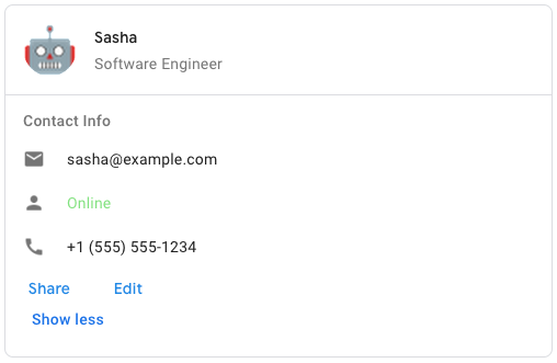
To create the sample card message in Google Chat, use the following JSON:
{
"cardsV2": [
{
"cardId": "unique-card-id",
"card": {
"header": {
"title": "Sasha",
"subtitle": "Software Engineer",
"imageUrl":
"https://developers.google.com/workspace/chat/images/quickstart-app-avatar.png",
"imageType": "CIRCLE",
"imageAltText": "Avatar for Sasha"
},
"sections": [
{
"header": "Contact Info",
"collapsible": true,
"uncollapsibleWidgetsCount": 1,
"widgets": [
{
"decoratedText": {
"startIcon": {
"knownIcon": "EMAIL"
},
"text": "sasha@example.com"
}
},
{
"decoratedText": {
"startIcon": {
"knownIcon": "PERSON"
},
"text": "Online"
}
},
{
"decoratedText": {
"startIcon": {
"knownIcon": "PHONE"
},
"text": "+1 (555) 555-1234"
}
},
{
"buttonList": {
"buttons": [
{
"text": "Share",
"onClick": {
"openLink": {
"url": "https://example.com/share"
}
}
},
{
"text": "Edit",
"onClick": {
"action": {
"function": "goToView",
"parameters": [
{
"key": "viewType",
"value": "EDIT"
}
]
}
}
}
]
}
}
]
}
]
}
}
]
}
| JSON representation |
|---|
| ``` { "header": { object (`https://developers.google.com/workspace/chat/api/reference/rest/v1/Card#CardHeader`) }, "sections": [ { object (`https://developers.google.com/workspace/chat/api/reference/rest/v1/Card#Section`) } ], "sectionDividerStyle": enum (`https://developers.google.com/workspace/chat/api/reference/rest/v1/Card#DividerStyle`), "cardActions": [ { object (`https://developers.google.com/workspace/chat/api/reference/rest/v1/Card#CardAction`) } ], "name": string, "fixedFooter": { object (`https://developers.google.com/workspace/chat/api/reference/rest/v1/Card#CardFixedFooter`) }, "displayStyle": enum (`https://developers.google.com/workspace/chat/api/reference/rest/v1/Card#DisplayStyle`), "peekCardHeader": { object (`https://developers.google.com/workspace/chat/api/reference/rest/v1/Card#CardHeader`) }, "expressionData": [ { object (`https://developers.google.com/workspace/chat/api/reference/rest/v1/Card#ExpressionData`) } ] } ``` |
| Fields ||
|---|---|
| `header` | ``object (`https://developers.google.com/workspace/chat/api/reference/rest/v1/Card#CardHeader`)`` The header of the card. A header usually contains a leading image and a title. Headers always appear at the top of a card. |
| `sections[]` | ``object (`https://developers.google.com/workspace/chat/api/reference/rest/v1/Card#Section`)`` Contains a collection of widgets. Each section has its own, optional header. Sections are visually separated by a line divider. For an example in Google Chat apps, see [Define a section of a card](https://developers.google.com/workspace/chat/design-components-card-dialog#define_a_section_of_a_card). |
| `sectionDividerStyle` | ``enum (`https://developers.google.com/workspace/chat/api/reference/rest/v1/Card#DividerStyle`)`` The divider style between the header, sections and footer. |
| `cardActions[]` | ``object (`https://developers.google.com/workspace/chat/api/reference/rest/v1/Card#CardAction`)`` The card's actions. Actions are added to the card's toolbar menu. Supports up to 10 `CardAction` items.  Available for Google Workspace add-ons and unavailable for Google Chat apps. For example, the following JSON constructs a card action menu with `Settings` and `Send Feedback` options: "cardActions": [ { "actionLabel": "Settings", "onClick": { "action": { "function": "goToView", "parameters": [ { "key": "viewType", "value": "SETTING" } ], "loadIndicator": "SPINNER" } } }, { "actionLabel": "Send Feedback", "onClick": { "openLink": { "url": "https://example.com/feedback" } } } ] |
| `name` | `string` Name of the card. Used as a card identifier in card navigation.  Available for Google Workspace add-ons and unavailable for Google Chat apps. |
| `fixedFooter` | ``object (`https://developers.google.com/workspace/chat/api/reference/rest/v1/Card#CardFixedFooter`)`` The fixed footer shown at the bottom of this card. Setting `fixedFooter` without specifying a `primaryButton` or a `secondaryButton` causes an error. For Chat apps, you can use fixed footers in [dialogs](https://developers.google.com/workspace/chat/dialogs), but not [card messages](https://developers.google.com/workspace/chat/create-messages#create).   Available for Google Chat apps and Google Workspace add-ons. |
| `displayStyle` | ``enum (`https://developers.google.com/workspace/chat/api/reference/rest/v1/Card#DisplayStyle`)`` In Google Workspace add-ons, sets the display properties of the `peekCardHeader`.  Available for Google Workspace add-ons and unavailable for Google Chat apps. |
| `peekCardHeader` | ``object (`https://developers.google.com/workspace/chat/api/reference/rest/v1/Card#CardHeader`)`` When displaying contextual content, the peek card header acts as a placeholder so that the user can navigate forward between the homepage cards and the contextual cards.  Available for Google Workspace add-ons and unavailable for Google Chat apps. |
| `expressionData[]` | ``object (`https://developers.google.com/workspace/chat/api/reference/rest/v1/Card#ExpressionData`)`` The expression data for the card. Available for Google Workspace add-ons that extend Google Workspace Studio. Unavailable for Google Chat apps. |
## CardHeader
Represents a card header. For an example in Google Chat apps, see [Add a header](https://developers.google.com/workspace/chat/design-components-card-dialog#add_a_header).
  Available for Google Chat apps and Google Workspace add-ons.
| JSON representation |
|---|
| ``` { "title": string, "subtitle": string, "imageType": enum (`https://developers.google.com/workspace/chat/api/reference/rest/v1/ImageType`), "imageUrl": string, "imageAltText": string } ``` |
| Fields ||
|---|---|
| `title` | `string` Required. The title of the card header. The header has a fixed height: if both a title and subtitle are specified, each takes up one line. If only the title is specified, it takes up both lines. |
| `subtitle` | `string` The subtitle of the card header. If specified, appears on its own line below the `title`. |
| `imageType` | ``enum (`https://developers.google.com/workspace/chat/api/reference/rest/v1/ImageType`)`` The shape used to crop the image.   Available for Google Chat apps and Google Workspace add-ons. |
| `imageUrl` | `string` The HTTPS URL of the image in the card header. |
| `imageAltText` | `string` The alternative text of this image that's used for accessibility. |
## Section
A section contains a collection of widgets that are rendered vertically in the order that they're specified.
  Available for Google Chat apps and Google Workspace add-ons.
| JSON representation |
|---|
| ``` { "header": string, "widgets": [ { object (`https://developers.google.com/workspace/chat/api/reference/rest/v1/Card#Widget`) } ], "collapsible": boolean, "uncollapsibleWidgetsCount": integer, "id": string, "collapseControl": { object (`https://developers.google.com/workspace/chat/api/reference/rest/v1/Card#CollapseControl`) } } ``` |
| Fields ||
|---|---|
| `header` | `string` Text that appears at the top of a section. Supports simple HTML formatted text. For more information about formatting text, see [Formatting text in Google Chat apps](https://developers.google.com/workspace/chat/format-messages#card-formatting) and [Formatting text in Google Workspace add-ons](https://developers.google.com/apps-script/add-ons/concepts/widgets#text_formatting). |
| `widgets[]` | ``object (`https://developers.google.com/workspace/chat/api/reference/rest/v1/Card#Widget`)`` All the widgets in the section. Must contain at least one widget. A card supports up to 100 widgets across all sections. |
| `collapsible` | `boolean` Indicates whether this section is collapsible. Collapsible sections hide some or all widgets, but users can expand the section to reveal the hidden widgets by clicking **Show more** . Users can hide the widgets again by clicking **Show less**. To determine which widgets are hidden, specify `uncollapsibleWidgetsCount`. |
| `uncollapsibleWidgetsCount` | `integer` The number of uncollapsible widgets which remain visible even when a section is collapsed. For example, when a section contains five widgets and the `uncollapsibleWidgetsCount` is set to `2`, the first two widgets are always shown and the last three are collapsed by default. The `uncollapsibleWidgetsCount` is taken into account only when `collapsible` is `true`. |
| `id` | `string` A unique ID assigned to the section that's used to identify the section to be mutated. The ID has a character limit of 64 characters and should be in the format of `[a-zA-Z0-9-]+`. Available for Google Workspace add-ons that extend Google Workspace Studio. Unavailable for Google Chat apps. |
| `collapseControl` | ``object (`https://developers.google.com/workspace/chat/api/reference/rest/v1/Card#CollapseControl`)`` Optional. Define the expand and collapse button of the section. This button will be shown only if the section is collapsible. If this field isn't set, the default button is used. |
## Widget
Each card is made up of widgets.
A widget is a composite object that can represent one of text, images, buttons, and other object types.
| JSON representation |
|---|
| ``` { "horizontalAlignment": enum (`https://developers.google.com/workspace/chat/api/reference/rest/v1/Card#HorizontalAlignment`), "id": string, "visibility": enum (`https://developers.google.com/workspace/chat/api/reference/rest/v1/Card#Visibility`), "eventActions": [ { object (`https://developers.google.com/workspace/chat/api/reference/rest/v1/Card#EventAction`) } ], "textParagraph": { object (`https://developers.google.com/workspace/chat/api/reference/rest/v1/Card#TextParagraph`) }, "image": { object (`https://developers.google.com/workspace/chat/api/reference/rest/v1/Card#Image`) }, "decoratedText": { object (`https://developers.google.com/workspace/chat/api/reference/rest/v1/Card#DecoratedText`) }, "buttonList": { object (`https://developers.google.com/workspace/chat/api/reference/rest/v1/ButtonList`) }, "textInput": { object (`https://developers.google.com/workspace/chat/api/reference/rest/v1/Card#TextInput`) }, "selectionInput": { object (`https://developers.google.com/workspace/chat/api/reference/rest/v1/Card#SelectionInput`) }, "dateTimePicker": { object (`https://developers.google.com/workspace/chat/api/reference/rest/v1/Card#DateTimePicker`) }, "divider": { object (`https://developers.google.com/workspace/chat/api/reference/rest/v1/Card#Divider`) }, "grid": { object (`https://developers.google.com/workspace/chat/api/reference/rest/v1/Card#Grid`) }, "columns": { object (`https://developers.google.com/workspace/chat/api/reference/rest/v1/Card#Columns`) }, "carousel": { object (`https://developers.google.com/workspace/chat/api/reference/rest/v1/Card#Carousel`) }, "chipList": { object (`https://developers.google.com/workspace/chat/api/reference/rest/v1/Card#ChipList`) } } ``` |
| Fields ||
|---|---|
| `horizontalAlignment` | ``enum (`https://developers.google.com/workspace/chat/api/reference/rest/v1/Card#HorizontalAlignment`)`` Specifies whether widgets align to the left, right, or center of a column. |
| `id` | `string` A unique ID assigned to the widget that's used to identify the widget to be mutated. The ID has a character limit of 64 characters and should be in the format of `[a-zA-Z0-9-]+`. Available for Google Workspace add-ons that extend Google Workspace Studio. Unavailable for Google Chat apps. |
| `visibility` | ``enum (`https://developers.google.com/workspace/chat/api/reference/rest/v1/Card#Visibility`)`` Specifies whether the widget is visible or hidden. The default value is `VISIBLE`. Available for Google Workspace add-ons that extend Google Workspace Studio. Unavailable for Google Chat apps. |
| `eventActions[]` | ``object (`https://developers.google.com/workspace/chat/api/reference/rest/v1/Card#EventAction`)`` Specifies the event actions that can be performed on the widget. Available for Google Workspace add-ons that extend Google Workspace Studio. Unavailable for Google Chat apps. |
| A widget can only have one of the following items. You can use multiple widget fields to display more items. The following is a list of mutually exclusive fields. At most one of the fields will be set in a response: ||
| `textParagraph` | ``object (`https://developers.google.com/workspace/chat/api/reference/rest/v1/Card#TextParagraph`)`` Displays a text paragraph. Supports simple HTML formatted text. For more information about formatting text, see [Formatting text in Google Chat apps](https://developers.google.com/workspace/chat/format-messages#card-formatting) and [Formatting text in Google Workspace add-ons](https://developers.google.com/apps-script/add-ons/concepts/widgets#text_formatting). For example, the following JSON creates a bolded text: "textParagraph": { "text": " bold text" } |
| `image` | ``object (`https://developers.google.com/workspace/chat/api/reference/rest/v1/Card#Image`)`` Displays an image. For example, the following JSON creates an image with alternative text: "image": { "imageUrl": "https://developers.google.com/workspace/chat/images/quickstart-app-avatar.png", "altText": "Chat app avatar" } |
| `decoratedText` | ``object (`https://developers.google.com/workspace/chat/api/reference/rest/v1/Card#DecoratedText`)`` Displays a decorated text item. For example, the following JSON creates a decorated text widget showing email address: "decoratedText": { "startIcon": { "knownIcon": "EMAIL" }, "topLabel": "Email Address", "text": "sasha@example.com", "bottomLabel": "This is a new Email address!", "switchControl": { "name": "has_send_welcome_email_to_sasha", "selected": false, "controlType": "CHECK_BOX" } } |
| `buttonList` | ``object (`https://developers.google.com/workspace/chat/api/reference/rest/v1/ButtonList`)`` A list of buttons. For example, the following JSON creates two buttons. The first is a blue text button and the second is an image button that opens a link: "buttonList": { "buttons": [ { "text": "Edit", "color": { "red": 0, "green": 0, "blue": 1 }, "disabled": true }, { "icon": { "knownIcon": "INVITE", "altText": "check calendar" }, "onClick": { "openLink": { "url": "https://example.com/calendar" } } } ] } |
| `textInput` | ``object (`https://developers.google.com/workspace/chat/api/reference/rest/v1/Card#TextInput`)`` Displays a text box that users can type into. For example, the following JSON creates a text input for an email address: "textInput": { "name": "mailing_address", "label": "Mailing Address" } As another example, the following JSON creates a text input for a programming language with static suggestions: "textInput": { "name": "preferred_programing_language", "label": "Preferred Language", "initialSuggestions": { "items": [ { "text": "C++" }, { "text": "Java" }, { "text": "JavaScript" }, { "text": "Python" } ] } } |
| `selectionInput` | ``object (`https://developers.google.com/workspace/chat/api/reference/rest/v1/Card#SelectionInput`)`` Displays a selection control that lets users select items. Selection controls can be checkboxes, radio buttons, switches, or dropdown menus. For example, the following JSON creates a dropdown menu that lets users choose a size: "selectionInput": { "name": "size", "label": "Size", "type": "DROPDOWN", "items": [ { "text": "S", "value": "small", "selected": false }, { "text": "M", "value": "medium", "selected": true }, { "text": "L", "value": "large", "selected": false }, { "text": "XL", "value": "extra_large", "selected": false } ] } |
| `dateTimePicker` | ``object (`https://developers.google.com/workspace/chat/api/reference/rest/v1/Card#DateTimePicker`)`` Displays a widget that lets users input a date, time, or date and time. For example, the following JSON creates a date time picker to schedule an appointment: "dateTimePicker": { "name": "appointment_time", "label": "Book your appointment at:", "type": "DATE_AND_TIME", "valueMsEpoch": 796435200000 } |
| `divider` | ``object (`https://developers.google.com/workspace/chat/api/reference/rest/v1/Card#Divider`)`` Displays a horizontal line divider between widgets. For example, the following JSON creates a divider: "divider": { } |
| `grid` | ``object (`https://developers.google.com/workspace/chat/api/reference/rest/v1/Card#Grid`)`` Displays a grid with a collection of items. A grid supports any number of columns and items. The number of rows is determined by the upper bounds of the number items divided by the number of columns. A grid with 10 items and 2 columns has 5 rows. A grid with 11 items and 2 columns has 6 rows.   Available for Google Chat apps and Google Workspace add-ons. For example, the following JSON creates a 2 column grid with a single item: "grid": { "title": "A fine collection of items", "columnCount": 2, "borderStyle": { "type": "STROKE", "cornerRadius": 4 }, "items": [ { "image": { "imageUri": "https://www.example.com/image.png", "cropStyle": { "type": "SQUARE" }, "borderStyle": { "type": "STROKE" } }, "title": "An item", "textAlignment": "CENTER" } ], "onClick": { "openLink": { "url": "https://www.example.com" } } } |
| `columns` | ``object (`https://developers.google.com/workspace/chat/api/reference/rest/v1/Card#Columns`)`` Displays up to 2 columns. To include more than 2 columns, or to use rows, use the `Grid` widget. For example, the following JSON creates 2 columns that each contain text paragraphs: "columns": { "columnItems": [ { "horizontalSizeStyle": "FILL_AVAILABLE_SPACE", "horizontalAlignment": "CENTER", "verticalAlignment": "CENTER", "widgets": [ { "textParagraph": { "text": "First column text paragraph" } } ] }, { "horizontalSizeStyle": "FILL_AVAILABLE_SPACE", "horizontalAlignment": "CENTER", "verticalAlignment": "CENTER", "widgets": [ { "textParagraph": { "text": "Second column text paragraph" } } ] } ] } |
| `carousel` | ``object (`https://developers.google.com/workspace/chat/api/reference/rest/v1/Card#Carousel`)`` Contains a collection of `CarouselCard` items, each of which contains nested widgets. For example, this is a JSON representation of a carousel that contains two carousel cards, each with a text paragraph: { "carouselCards": [ { "widgets": [ { "textParagraph": { "text": "First text paragraph in the carousel." } } ] }, { "widgets": [ { "textParagraph": { "text": "Second text paragraph in the carousel." } } ] } ] } |
| `chipList` | ``object (`https://developers.google.com/workspace/chat/api/reference/rest/v1/Card#ChipList`)`` A list of chips. For example, the following JSON creates two chips. The first is a text chip and the second is an icon chip that opens a link: "chipList": { "chips": [ { "label": "Edit", "disabled": true }, { "icon": { "knownIcon": "INVITE", "altText": "check calendar" }, "onClick": { "openLink": { "url": "https://example.com/calendar" } } } ] } |
| End of mutually exclusive fields. ||
## TextParagraph
A paragraph of text that supports formatting. For an example in Google Chat apps, see [Add a paragraph of formatted text](https://developers.google.com/workspace/chat/add-text-image-card-dialog#add_a_paragraph_of_formatted_text). For more information about formatting text, see [Formatting text in Google Chat apps](https://developers.google.com/workspace/chat/format-messages#card-formatting) and [Formatting text in Google Workspace add-ons](https://developers.google.com/apps-script/add-ons/concepts/widgets#text_formatting).
  Available for Google Chat apps and Google Workspace add-ons.
| JSON representation |
|---|
| ``` { "text": string, "maxLines": integer, "textSyntax": enum (`https://developers.google.com/workspace/chat/api/reference/rest/v1/Card#TextSyntax`) } ``` |
| Fields ||
|---|---|
| `text` | `string` The text that's shown in the widget. |
| `maxLines` | `integer` The maximum number of lines of text that are displayed in the widget. If the text exceeds the specified maximum number of lines, the excess content is concealed behind a **show more** button. If the text is equal or shorter than the specified maximum number of lines, a **show more** button isn't displayed. The default value is 0, in which case all context is displayed. Negative values are ignored. |
| `textSyntax` | ``enum (`https://developers.google.com/workspace/chat/api/reference/rest/v1/Card#TextSyntax`)`` The syntax of the text. If not set, the text is rendered as HTML.  Available for Google Chat apps and unavailable for Google Workspace add-ons. |
## TextSyntax
Syntax to use for formatting text.
 Available for Google Chat apps and unavailable for Google Workspace add-ons.
| Enums ||
|---|---|
| `TEXT_SYNTAX_UNSPECIFIED` | The text is rendered as HTML if unspecified. |
| `HTML` | The text is rendered as HTML. This is the default value. |
| `MARKDOWN` | The text is rendered as Markdown. |
## Image
An image that is specified by a URL and can have an `onClick` action. For an example, see [Add an image](https://developers.google.com/workspace/chat/add-text-image-card-dialog#add_an_image).
  Available for Google Chat apps and Google Workspace add-ons.
| JSON representation |
|---|
| ``` { "imageUrl": string, "onClick": { object (`https://developers.google.com/workspace/chat/api/reference/rest/v1/OnClick`) }, "altText": string } ``` |
| Fields ||
|---|---|
| `imageUrl` | `string` The HTTPS URL that hosts the image. For example: https://developers.google.com/workspace/chat/images/quickstart-app-avatar.png |
| `onClick` | ``object (`https://developers.google.com/workspace/chat/api/reference/rest/v1/OnClick`)`` When a user clicks the image, the click triggers this action. |
| `altText` | `string` The alternative text of this image that's used for accessibility. |
## DecoratedText
A widget that displays text with optional decorations such as a label above or below the text, an icon in front of the text, a selection widget, or a button after the text. For an example in Google Chat apps, see [Display text with decorative text](https://developers.google.com/workspace/chat/add-text-image-card-dialog#display_text_with_decorative_elements).
  Available for Google Chat apps and Google Workspace add-ons.
| JSON representation |
|---|
| ``` { "icon": { object (`https://developers.google.com/workspace/chat/api/reference/rest/v1/Icon`) }, "startIcon": { object (`https://developers.google.com/workspace/chat/api/reference/rest/v1/Icon`) }, "startIconVerticalAlignment": enum (`https://developers.google.com/workspace/chat/api/reference/rest/v1/Card#VerticalAlignment`), "topLabel": string, "topLabelText": { object (`https://developers.google.com/workspace/chat/api/reference/rest/v1/Card#TextParagraph`) }, "text": string, "contentText": { object (`https://developers.google.com/workspace/chat/api/reference/rest/v1/Card#TextParagraph`) }, "wrapText": boolean, "bottomLabel": string, "bottomLabelText": { object (`https://developers.google.com/workspace/chat/api/reference/rest/v1/Card#TextParagraph`) }, "onClick": { object (`https://developers.google.com/workspace/chat/api/reference/rest/v1/OnClick`) }, "button": { object (`https://developers.google.com/workspace/chat/api/reference/rest/v1/Button`) }, "switchControl": { object (`https://developers.google.com/workspace/chat/api/reference/rest/v1/Card#SwitchControl`) }, "endIcon": { object (`https://developers.google.com/workspace/chat/api/reference/rest/v1/Icon`) } } ``` |
| Fields ||
|---|---|
| `icon (deprecated)` | ``object (`https://developers.google.com/workspace/chat/api/reference/rest/v1/Icon`)`` > [!WARNING] > This item is deprecated! Deprecated in favor of `startIcon`. |
| `startIcon` | ``object (`https://developers.google.com/workspace/chat/api/reference/rest/v1/Icon`)`` The icon displayed in front of the text. |
| `startIconVerticalAlignment` | ``enum (`https://developers.google.com/workspace/chat/api/reference/rest/v1/Card#VerticalAlignment`)`` Optional. Vertical alignment of the start icon. If not set, the icon will be vertically centered.  Available for Google Chat apps and unavailable for Google Workspace add-ons. |
| `topLabel` | `string` The text that appears above `text`. Always truncates. |
| `topLabelText` | ``object (`https://developers.google.com/workspace/chat/api/reference/rest/v1/Card#TextParagraph`)`` `TextParagraph` equivalent of `topLabel`. Always truncates. Allows for more complex formatting than `topLabel`.  Available for Google Chat apps and unavailable for Google Workspace add-ons. |
| `text` | `string` Required. The primary text. Supports simple formatting. For more information about formatting text, see [Formatting text in Google Chat apps](https://developers.google.com/workspace/chat/format-messages#card-formatting) and [Formatting text in Google Workspace add-ons](https://developers.google.com/apps-script/add-ons/concepts/widgets#text_formatting). |
| `contentText` | ``object (`https://developers.google.com/workspace/chat/api/reference/rest/v1/Card#TextParagraph`)`` `TextParagraph` equivalent of `text`. Allows for more complex formatting than `text`.  Available for Google Chat apps and unavailable for Google Workspace add-ons. |
| `wrapText` | `boolean` The wrap text setting. If `true`, the text wraps and displays on multiple lines. Otherwise, the text is truncated. Only applies to `text`, not `topLabel` and `bottomLabel`. |
| `bottomLabel` | `string` The text that appears below `text`. Always wraps. |
| `bottomLabelText` | ``object (`https://developers.google.com/workspace/chat/api/reference/rest/v1/Card#TextParagraph`)`` `TextParagraph` equivalent of `bottomLabel`. Always wraps. Allows for more complex formatting than `bottomLabel`.  Available for Google Chat apps and unavailable for Google Workspace add-ons. |
| `onClick` | ``object (`https://developers.google.com/workspace/chat/api/reference/rest/v1/OnClick`)`` This action is triggered when users click anywhere on the `DecoratedText` widget (including `text`, `topLabel`, `bottomLabel`, and icons), except when clicking a separate interactive control (`button` or `switchControl`). |
| A button, switch, checkbox, or image that appears to the right-hand side of text in the `decoratedText` widget. The following is a list of mutually exclusive fields. At most one of the fields will be set in a response: ||
| `button` | ``object (`https://developers.google.com/workspace/chat/api/reference/rest/v1/Button`)`` A button that a user can click to trigger an action. |
| `switchControl` | ``object (`https://developers.google.com/workspace/chat/api/reference/rest/v1/Card#SwitchControl`)`` A switch widget that a user can click to change its state and trigger an action. |
| `endIcon` | ``object (`https://developers.google.com/workspace/chat/api/reference/rest/v1/Icon`)`` An icon displayed after the text. Supports [built-in](https://developers.google.com/workspace/chat/format-messages#builtinicons) and [custom](https://developers.google.com/workspace/chat/format-messages#customicons) icons. |
| End of mutually exclusive fields. ||
## VerticalAlignment
Represents vertical alignment attribute.
| Enums ||
|---|---|
| `VERTICAL_ALIGNMENT_UNSPECIFIED` | Unspecified type. Do not use. |
| `TOP` | Alignment to the top position. |
| `MIDDLE` | Alignment to the middle position. |
| `BOTTOM` | Alignment to the bottom position. |
## SwitchControl
Either a toggle-style switch or a checkbox inside a `decoratedText` widget.
  Available for Google Chat apps and Google Workspace add-ons.
Only supported in the `decoratedText` widget.
| JSON representation |
|---|
| ``` { "name": string, "value": string, "selected": boolean, "onChangeAction": { object (`https://developers.google.com/workspace/chat/api/reference/rest/v1/Action`) }, "controlType": enum (`https://developers.google.com/workspace/chat/api/reference/rest/v1/Card#ControlType`) } ``` |
| Fields ||
|---|---|
| `name` | `string` The name by which the switch widget is identified in a form input event (as the key in `CommonEventObject.form_inputs`). For details about working with form inputs, see [Receive form data](https://developers.google.com/workspace/chat/read-form-data). |
| `value` | `string` The value returned in `CommonEventObject.form_inputs[name].string_inputs` when the switch is selected (`selected` is `true`). If `selected` is `true` and `value` is unset, an empty string (`""`) is returned in `stringInputs.value`. When `selected` is `false`, this value is omitted from `stringInputs.value`. For details about working with form inputs, see [Receive form data](https://developers.google.com/workspace/chat/read-form-data). |
| `selected` | `boolean` When `true`, the switch is selected, and its `value` is included in `CommonEventObject.form_inputs[name].string_inputs.value`. |
| `onChangeAction` | ``object (`https://developers.google.com/workspace/chat/api/reference/rest/v1/Action`)`` The action to perform when the switch state is changed, such as what function to run. |
| `controlType` | ``enum (`https://developers.google.com/workspace/chat/api/reference/rest/v1/Card#ControlType`)`` How the switch appears in the user interface.   Available for Google Chat apps and Google Workspace add-ons. |
## ControlType
How the switch appears in the user interface.
  Available for Google Chat apps and Google Workspace add-ons.
| Enums ||
|---|---|
| `SWITCH` | A toggle-style switch. |
| `CHECKBOX` | Deprecated in favor of `CHECK_BOX`. |
| `CHECK_BOX` | A checkbox. |
## TextInput
A field in which users can enter text. Supports suggestions and on-change actions. Supports form submission validation. When `Action.all_widgets_are_required` is set to `true` or this widget is specified in `Action.required_widgets`, the submission action is blocked unless a value is entered. For an example in Google Chat apps, see [Add a field in which a user can enter text](https://developers.google.com/workspace/chat/design-interactive-card-dialog#add_a_field_in_which_a_user_can_enter_text).
Chat apps receive and can process the value of entered text during form input events. For details about working with form inputs, see [Receive form data](https://developers.google.com/workspace/chat/read-form-data).
When you need to collect undefined or abstract data from users, use a text input. To collect defined or enumerated data from users, use the `https://developers.google.com/workspace/chat/api/reference/rest/v1/Card#SelectionInput` widget.
  Available for Google Chat apps and Google Workspace add-ons.
| JSON representation |
|---|
| ``` { "name": string, "label": string, "hintText": string, "value": string, "type": enum (`https://developers.google.com/workspace/chat/api/reference/rest/v1/Card#Type`), "onChangeAction": { object (`https://developers.google.com/workspace/chat/api/reference/rest/v1/Action`) }, "initialSuggestions": { object (`https://developers.google.com/workspace/chat/api/reference/rest/v1/Card#Suggestions`) }, "autoCompleteAction": { object (`https://developers.google.com/workspace/chat/api/reference/rest/v1/Action`) }, "validation": { object (`https://developers.google.com/workspace/chat/api/reference/rest/v1/Card#Validation`) }, "placeholderText": string, "hostAppDataSource": { object (`https://developers.google.com/workspace/chat/api/reference/rest/v1/Card#HostAppDataSourceMarkup`) } } ``` |
| Fields ||
|---|---|
| `name` | `string` The name by which the text input is identified in a form input event. For details about working with form inputs, see [Receive form data](https://developers.google.com/workspace/chat/read-form-data). |
| `label` | `string` The text that appears above the text input field in the user interface. Specify text that helps the user enter the information your app needs. For example, if you are asking someone's name, but specifically need their surname, write `surname` instead of `name`. Required if `hintText` is unspecified. Otherwise, optional. |
| `hintText` | `string` Text that appears below the text input field meant to assist users by prompting them to enter a certain value. This text is always visible. Required if `label` is unspecified. Otherwise, optional. |
| `value` | `string` The value entered by a user, returned as part of a form input event. For details about working with form inputs, see [Receive form data](https://developers.google.com/workspace/chat/read-form-data). |
| `type` | ``enum (`https://developers.google.com/workspace/chat/api/reference/rest/v1/Card#Type`)`` How a text input field appears in the user interface. For example, whether the field is single or multi-line. |
| `onChangeAction` | ``object (`https://developers.google.com/workspace/chat/api/reference/rest/v1/Action`)`` What to do when a change occurs in the text input field. For example, a user adding to the field or deleting text. Examples of actions to take include running a custom function or opening a [dialog](https://developers.google.com/workspace/chat/dialogs) in Google Chat. |
| `initialSuggestions` | ``object (`https://developers.google.com/workspace/chat/api/reference/rest/v1/Card#Suggestions`)`` Suggested values that users can enter. These values appear when users click inside the text input field. As users type, the suggested values dynamically filter to match what the users have typed. For example, a text input field for programming language might suggest Java, JavaScript, Python, and C++. When users start typing `Jav`, the list of suggestions filters to show just `Java` and `JavaScript`. Suggested values help guide users to enter values that your app can make sense of. When referring to JavaScript, some users might enter `javascript` and others `java script`. Suggesting `JavaScript` can standardize how users interact with your app. When specified, `TextInput.type` is always `SINGLE_LINE`, even if it's set to `MULTIPLE_LINE`.   Available for Google Chat apps and Google Workspace add-ons. |
| `autoCompleteAction` | ``object (`https://developers.google.com/workspace/chat/api/reference/rest/v1/Action`)`` Optional. Specify what action to take when the text input field provides suggestions to users who interact with it. If unspecified, the suggestions are set by `initialSuggestions` and are processed by the client. If specified, the app takes the action specified here, such as running a custom function.  Available for Google Workspace add-ons and unavailable for Google Chat apps. |
| `validation` | ``object (`https://developers.google.com/workspace/chat/api/reference/rest/v1/Card#Validation`)`` Specify the input format validation necessary for this text field.   Available for Google Chat apps and Google Workspace add-ons. |
| `placeholderText` | `string` Text that appears in the text input field when the field is empty. Use this text to prompt users to enter a value. For example, `Enter a number from 0 to 100`.  Available for Google Chat apps and unavailable for Google Workspace add-ons. |
| The following is a list of mutually exclusive fields. At most one of the fields will be set in a response: ||
| `hostAppDataSource` | ``object (`https://developers.google.com/workspace/chat/api/reference/rest/v1/Card#HostAppDataSourceMarkup`)`` A data source that's unique to a Google Workspace host application, such as Gmail emails, Google Calendar events, or Google Chat messages. Available for Google Workspace add-ons that extend Google Workspace Studio. Unavailable for Google Chat apps. |
| End of mutually exclusive fields. ||
## Type
How a text input field appears in the user interface. For example, whether it's a single line input field, or a multi-line input. If `initialSuggestions` is specified, `type` is always `SINGLE_LINE`, even if it's set to `MULTIPLE_LINE`.
  Available for Google Chat apps and Google Workspace add-ons.
| Enums ||
|---|---|
| `SINGLE_LINE` | The text input field has a fixed height of one line. |
| `MULTIPLE_LINE` | The text input field has a fixed height of multiple lines. |
## RenderActions
A set of render instructions that tells a card to perform an action, or
tells the add-on host app or the Chat app to perform an app-specific action.
  Available for Google Chat apps and Google Workspace add-ons.
| Fields ||
|---|---|
| `action` | `` `https://developers.google.com/workspace/chat/api/reference/rest/v1/Card#RenderActions.Action` `` |
### Action
| Fields ||
|---|---|
| `navigations[]` | `https://developers.google.com/workspace/chat/api/reference/rest/v1/Card#RenderActions.Action.Navigation` Pushes, pops, or updates a card. [Add-ons in Google Chat](https://developers.google.com/workspace/add-ons/chat). |
### Navigation
Add a new card to the stack (navigate forward). For Chat apps, only available for [app home](https://developers.google.com/workspace/chat/send-app-home-card-message).
  Available for Google Chat apps and Google Workspace add-ons.
navigations: {
pushCard: CARD
}
Replace the top card with a new card. For Chat apps, only available for [app home](https://developers.google.com/workspace/chat/send-app-home-card-message).
  Available for Google Chat apps and Google Workspace add-ons.
navigations: {
updateCard: CARD
}
| Fields ||
|---|---|
| Union field `navigate_action`. `navigate_action` can be only one of the following: ||
| `pushCard` | `https://developers.google.com/workspace/chat/api/reference/rest/v1/Card#card` Pushes a card onto the card stack. For [dialogs in Google Chat](https://developers.google.com/workspace/add-ons/chat/dialogs), opens or updates a dialog. |
| `updateCard` | `https://developers.google.com/workspace/chat/api/reference/rest/v1/Card#card` Updates the top card with a new card and preserves filled form fields values. For a non-equivalent field, the value is dropped. For [dialogs in Google Chat](https://developers.google.com/workspace/add-ons/chat/dialogs), opens or updates a dialog. |
## Suggestions
Suggested values that users can enter. These values appear when users click inside the text input field. As users type, the suggested values dynamically filter to match what the users have typed.
For example, a text input field for programming language might suggest Java, JavaScript, Python, and C++. When users start typing `Jav`, the list of suggestions filters to show `Java` and `JavaScript`.
Suggested values help guide users to enter values that your app can make sense of. When referring to JavaScript, some users might enter `javascript` and others `java script`. Suggesting `JavaScript` can standardize how users interact with your app.
When specified, `TextInput.type` is always `SINGLE_LINE`, even if it's set to `MULTIPLE_LINE`.
  Available for Google Chat apps and Google Workspace add-ons.
| JSON representation |
|---|
| ``` { "items": [ { object (`https://developers.google.com/workspace/chat/api/reference/rest/v1/Card#SuggestionItem`) } ] } ``` |
| Fields ||
|---|---|
| `items[]` | ``object (`https://developers.google.com/workspace/chat/api/reference/rest/v1/Card#SuggestionItem`)`` A list of suggestions used for autocomplete recommendations in text input fields. |
## SuggestionItem
One suggested value that users can enter in a text input field.
  Available for Google Chat apps and Google Workspace add-ons.
| JSON representation |
|---|
| ``` { "text": string } ``` |
| Fields ||
|---|---|
| The following is a list of mutually exclusive fields. At most one of the fields will be set in a response: ||
| `text` | `string` The value of a suggested input to a text input field. This is equivalent to what users enter themselves. |
| End of mutually exclusive fields. ||
## Validation
Represents the necessary data for validating the widget it's attached to.
  Available for Google Chat apps and Google Workspace add-ons.
| JSON representation |
|---|
| ``` { "characterLimit": integer, "inputType": enum (`https://developers.google.com/workspace/chat/api/reference/rest/v1/Card#InputType`) } ``` |
| Fields ||
|---|---|
| `characterLimit` | `integer` Specify the character limit for text input widgets. Note that this is only used for text input and is ignored for other widgets.   Available for Google Chat apps and Google Workspace add-ons. |
| `inputType` | ``enum (`https://developers.google.com/workspace/chat/api/reference/rest/v1/Card#InputType`)`` Specify the type of the input widgets.   Available for Google Chat apps and Google Workspace add-ons. |
## InputType
The type of the input widget.
| Enums ||
|---|---|
| `INPUT_TYPE_UNSPECIFIED` | Unspecified type. Do not use. |
| `TEXT` | Regular text that accepts all characters. |
| `INTEGER` | An integer value. |
| `FLOAT` | A float value. |
| `EMAIL` | An email address. |
| `EMOJI_PICKER` | A emoji selected from system-provided emoji picker. |
## HostAppDataSourceMarkup
A data source from a Google Workspace application. The data source populates available items for a widget.
| JSON representation |
|---|
| ``` { "chatDataSource": { object (`https://developers.google.com/workspace/chat/api/reference/rest/v1/Card#ChatClientDataSourceMarkup`) }, "workflowDataSource": { object (`https://developers.google.com/workspace/chat/api/reference/rest/v1/Card#WorkflowDataSourceMarkup`) } } ``` |
| Fields ||
|---|---|
| The Google Workspace application that populates available items for a widget. The following is a list of mutually exclusive fields. At most one of the fields will be set in a response: ||
| `chatDataSource` | ``object (`https://developers.google.com/workspace/chat/api/reference/rest/v1/Card#ChatClientDataSourceMarkup`)`` A data source from Google Chat. |
| `workflowDataSource` | ``object (`https://developers.google.com/workspace/chat/api/reference/rest/v1/Card#WorkflowDataSourceMarkup`)`` A data source from Google Workflow. |
| End of mutually exclusive fields. ||
## ChatClientDataSourceMarkup
For a `https://developers.google.com/workspace/chat/api/reference/rest/v1/Card#SelectionInput` widget that uses a multiselect menu, a data source from Google Chat. The data source populates selection items for the multiselect menu. For example, a user can select Google Chat spaces that they're a member of.
 Available for Google Chat apps and unavailable for Google Workspace add-ons.
| JSON representation |
|---|
| ``` { "spaceDataSource": { object (`https://developers.google.com/workspace/chat/api/reference/rest/v1/Card#SpaceDataSource`) } } ``` |
| Fields ||
|---|---|
| The Google Chat data source. The following is a list of mutually exclusive fields. At most one of the fields will be set in a response: ||
| `spaceDataSource` | ``object (`https://developers.google.com/workspace/chat/api/reference/rest/v1/Card#SpaceDataSource`)`` Google Chat spaces that the user is a member of. |
| End of mutually exclusive fields. ||
## SpaceDataSource
A data source that populates Google Chat spaces as selection items for a multiselect menu. Only populates spaces that the user is a member of.
 Available for Google Chat apps and unavailable for Google Workspace add-ons.
| JSON representation |
|---|
| ``` { "defaultToCurrentSpace": boolean } ``` |
| Fields ||
|---|---|
| `defaultToCurrentSpace` | `boolean` If set to `true`, the multiselect menu selects the current Google Chat space as an item by default. |
## WorkflowDataSourceMarkup
\* Only supported by Google Workspace Workflow, but not Google Chat apps or Google Workspace add-ons.
In a `https://developers.google.com/workspace/chat/api/reference/rest/v1/Card#TextInput` or `https://developers.google.com/workspace/chat/api/reference/rest/v1/Card#SelectionInput` widget with MULTI_SELECT type or a `https://developers.google.com/workspace/chat/api/reference/rest/v1/Card#DateTimePicker`, provide data source from Google.
| JSON representation |
|---|
| ``` { "includeVariables": boolean, "type": enum (`https://developers.google.com/workspace/chat/api/reference/rest/v1/Card#Type_1`) } ``` |
| Fields ||
|---|---|
| `includeVariables` | `boolean` Whether to include variables from the previous step in the data source. |
| `type` | ``enum (`https://developers.google.com/workspace/chat/api/reference/rest/v1/Card#Type_1`)`` The type of data source. |
## Type
An enum that represents the type of the workflow data source.
| Enums ||
|---|---|
| `UNKNOWN` | Default value. Don't use. |
| `USER` | Google Workspace users. The user can only view and select users from their Google Workspace organization. |
| `SPACE` | Google Chat spaces that the user is a member of. |
| `USER_WITH_FREE_FORM` | Users can choose to view and select existing members from their Google Workspace organization or manually enter an email address or a valid domain. |
## SelectionInput
A widget that creates one or more UI items that users can select. Supports form submission validation for `dropdown` and `multiselect` menus only. When `Action.all_widgets_are_required` is set to `true` or this widget is specified in `Action.required_widgets`, the submission action is blocked unless a value is selected. For example, a dropdown menu or checkboxes. You can use this widget to collect data that can be predicted or enumerated. For an example in Google Chat apps, see [Add selectable UI elements](https://developers.google.com/workspace/chat/design-interactive-card-dialog#add_selectable_ui_elements).
Chat apps can process the value of items that users select or input. For details about working with form inputs, see [Receive form data](https://developers.google.com/workspace/chat/read-form-data).
To collect undefined or abstract data from users, use the `https://developers.google.com/workspace/chat/api/reference/rest/v1/Card#TextInput` widget.
  Available for Google Chat apps and Google Workspace add-ons.
| JSON representation |
|---|
| ``` { "name": string, "label": string, "type": enum (`https://developers.google.com/workspace/chat/api/reference/rest/v1/Card#SelectionType`), "items": [ { object (`https://developers.google.com/workspace/chat/api/reference/rest/v1/SelectionItem`) } ], "onChangeAction": { object (`https://developers.google.com/workspace/chat/api/reference/rest/v1/Action`) }, "multiSelectMinQueryLength": integer, "dataSourceConfigs": [ { object (`https://developers.google.com/workspace/chat/api/reference/rest/v1/Card#DataSourceConfig`) } ], "multiSelectMaxSelectedItems": integer, "hintText": string, "externalDataSource": { object (`https://developers.google.com/workspace/chat/api/reference/rest/v1/Action`) }, "platformDataSource": { object (`https://developers.google.com/workspace/chat/api/reference/rest/v1/Card#PlatformDataSource`) } } ``` |
| Fields ||
|---|---|
| `name` | `string` Required. The name that identifies the selection input in a form input event. For details about working with form inputs, see [Receive form data](https://developers.google.com/workspace/chat/read-form-data). |
| `label` | `string` The text that appears above the selection input field in the user interface. Specify text that helps the user enter the information your app needs. For example, if users are selecting the urgency of a work ticket from a drop-down menu, the label might be "Urgency" or "Select urgency". |
| `type` | ``enum (`https://developers.google.com/workspace/chat/api/reference/rest/v1/Card#SelectionType`)`` The type of items that are displayed to users in a `SelectionInput` widget. Selection types support different types of interactions. For example, users can select one or more checkboxes, but they can only select one value from a dropdown menu. |
| `items[]` | ``object (`https://developers.google.com/workspace/chat/api/reference/rest/v1/SelectionItem`)`` An array of selectable items. For example, an array of radio buttons or checkboxes. Supports up to 100 items. |
| `onChangeAction` | ``object (`https://developers.google.com/workspace/chat/api/reference/rest/v1/Action`)`` If specified, the form is submitted when the selection changes. If not specified, you must specify a separate button that submits the form. For details about working with form inputs, see [Receive form data](https://developers.google.com/workspace/chat/read-form-data). |
| `multiSelectMinQueryLength` | `integer` For multiselect menus, the number of text characters that a user inputs before the menu returns suggested selection items. If unset, the multiselect menu uses the following default values: - If the menu uses a static array of `SelectionInput` items, defaults to 0 characters and immediately populates items from the array. - If the menu uses a dynamic data source (`multi_select_data_source`), defaults to 3 characters before querying the data source to return suggested items. |
| `dataSourceConfigs[]` | ``object (`https://developers.google.com/workspace/chat/api/reference/rest/v1/Card#DataSourceConfig`)`` Optional. The data source configs for the selection control. This field provides more fine-grained control over the data source. If specified, the `multiSelectMaxSelectedItems` field, `multiSelectMinQueryLength` field, `externalDataSource` field and `platformDataSource` field are ignored. Available for Google Workspace add-ons that extend Google Workspace Studio. Available for the `https://developers.google.com/workspace/chat/api/reference/rest/v1/Card#SelectionType.ENUM_VALUES.DROPDOWN` in Google Chat apps. For the `Dropdown` widget in Google Chat apps, only one `DataSourceConfig` is supported. If multiple `DataSourceConfig`s are set, only the first one is used. |
| `multiSelectMaxSelectedItems` | `integer` For multiselect menus, the maximum number of items that a user can select. Minimum value is 1 item. If unspecified, defaults to 3 items. |
| `hintText` | `string` Optional. Text that appears below the selection input field meant to assist users by prompting them to enter a certain value. This text is always visible. Available for Google Workspace add-ons that extend Google Workspace Studio. Unavailable for Google Chat apps. |
| For a multiselect menu, a data source that dynamically populates selection items.  Available for Google Chat apps and unavailable for Google Workspace add-ons. The following is a list of mutually exclusive fields. At most one of the fields will be set in a response: ||
| `externalDataSource` | ``object (`https://developers.google.com/workspace/chat/api/reference/rest/v1/Action`)`` An external data source, such as a relational database. |
| `platformDataSource` | ``object (`https://developers.google.com/workspace/chat/api/reference/rest/v1/Card#PlatformDataSource`)`` A data source from Google Workspace. |
| End of mutually exclusive fields. ||
## SelectionType
The format for the items that users can select. Different options support different types of interactions. For example, users can select multiple checkboxes, but can only select one item from a dropdown menu.
Each selection input supports one type of selection. Mixing checkboxes and switches, for example, isn't supported.
  Available for Google Chat apps and Google Workspace add-ons.
| Enums ||
|---|---|
| `CHECK_BOX` | A set of checkboxes. Users can select one or more checkboxes. |
| `RADIO_BUTTON` | A set of radio buttons. Users can select one radio button. |
| `SWITCH` | A set of switches. Users can turn on one or more switches. |
| `DROPDOWN` | A dropdown menu. Users can select one item from the menu. For Google Chat apps, you can populate items using a dynamic data source and autosuggest items as users type in the menu. For example, users can start typing the name of a Google Chat space and the widget autosuggests the space. To dynamically populate items for a dropdown menu, use one of the following types of data sources: - Google Workspace data: Items are populated using data from Google Workspace, such as Google Workspace users or Google Chat spaces. - External data: Items are populated from an external data source outside of Google Workspace. For examples of how to implement dropdown menus for Chat apps, see [Add a dropdown menu](https://developers.google.com/workspace/chat/design-interactive-card-dialog#dropdown-menu) and [Dynamically populate drop-down menus](https://developers.google.com/workspace/chat/design-interactive-card-dialog#dynamic-dropdown-menu).   Available for Google Chat apps and Google Workspace add-ons. |
| `MULTI_SELECT` | A menu with a text box. Users can type and select one or more items. For Google Workspace add-ons, you must populate items using a static array of `SelectionItem` objects. For Google Chat apps, you can also populate items using a dynamic data source and autosuggest items as users type in the menu. For example, users can start typing the name of a Google Chat space and the widget autosuggests the space. To dynamically populate items for a multiselect menu, use one of the following types of data sources: - Google Workspace data: Items are populated using data from Google Workspace, such as Google Workspace users or Google Chat spaces. - External data: Items are populated from an external data source outside of Google Workspace. For examples of how to implement multiselect menus for Chat apps, see [Add a multiselect menu](https://developers.google.com/workspace/chat/design-interactive-card-dialog#multiselect-menu).   Available for Google Chat apps and Google Workspace add-ons. |
## PlatformDataSource
For a `https://developers.google.com/workspace/chat/api/reference/rest/v1/Card#SelectionInput` widget that uses a multiselect menu, a data source from Google Workspace. Used to populate items in a multiselect menu.
 Available for Google Chat apps and unavailable for Google Workspace add-ons.
| JSON representation |
|---|
| ``` { "commonDataSource": enum (`https://developers.google.com/workspace/chat/api/reference/rest/v1/Card#CommonDataSource`), "hostAppDataSource": { object (`https://developers.google.com/workspace/chat/api/reference/rest/v1/Card#HostAppDataSourceMarkup`) } } ``` |
| Fields ||
|---|---|
| The data source. The following is a list of mutually exclusive fields. At most one of the fields will be set in a response: ||
| `commonDataSource` | ``enum (`https://developers.google.com/workspace/chat/api/reference/rest/v1/Card#CommonDataSource`)`` A data source shared by all Google Workspace applications, such as users in a Google Workspace organization. |
| `hostAppDataSource` | ``object (`https://developers.google.com/workspace/chat/api/reference/rest/v1/Card#HostAppDataSourceMarkup`)`` A data source that's unique to a Google Workspace host application, such spaces in Google Chat. This field supports the Google API Client Libraries but isn't available in the Cloud Client Libraries. To learn more, see [Install the client libraries](https://developers.google.com/workspace/chat/libraries). |
| End of mutually exclusive fields. ||
## CommonDataSource
A data source shared by all [Google Workspace applications](https://developers.google.com/workspace/chat/api/reference/rest/v1/HostApp).
 Available for Google Chat apps and unavailable for Google Workspace add-ons.
| Enums ||
|---|---|
| `UNKNOWN` | Default value. Don't use. |
| `USER` | Google Workspace users. The user can only view and select users from their Google Workspace organization. |
## DataSourceConfig
A configuration object that helps configure the data sources for a widget.
Available for Google Chat apps and Google Workspace add-ons that extend Google Workspace Studio.
| JSON representation |
|---|
| ``` { "remoteDataSource": { object (`https://developers.google.com/workspace/chat/api/reference/rest/v1/Action`) }, "platformDataSource": { object (`https://developers.google.com/workspace/chat/api/reference/rest/v1/Card#PlatformDataSource`) } "minCharactersTrigger": integer } ``` |
| Fields ||
|---|---|
| The data source. The following is a list of mutually exclusive fields. At most one of the fields will be set in a response: ||
| `remoteDataSource` | ``object (`https://developers.google.com/workspace/chat/api/reference/rest/v1/Action`)`` The data is from a remote data provider. |
| `platformDataSource` | ``object (`https://developers.google.com/workspace/chat/api/reference/rest/v1/Card#PlatformDataSource`)`` The data is from a Google Workspace application. |
| End of mutually exclusive fields. ||
| `minCharactersTrigger` | `integer` The minimum number of characters the user must enter before this data provider is triggered (i.e., before it starts returning results). |
## DateTimePicker
Lets users input a date, a time, or both a date and a time. Supports form submission validation. When `Action.all_widgets_are_required` is set to `true` or this widget is specified in `Action.required_widgets`, the submission action is blocked unless a value is selected. For an example in Google Chat apps, see [Let a user pick a date and time](https://developers.google.com/workspace/chat/design-interactive-card-dialog#let_a_user_pick_a_date_and_time).
Users can input text or use the picker to select dates and times. If users input an invalid date or time, the picker shows an error that prompts users to input the information correctly.
  Available for Google Chat apps and Google Workspace add-ons.
| JSON representation |
|---|
| ``` { "name": string, "label": string, "type": enum (`https://developers.google.com/workspace/chat/api/reference/rest/v1/Card#DateTimePickerType`), "valueMsEpoch": string, "timezoneOffsetDate": integer, "onChangeAction": { object (`https://developers.google.com/workspace/chat/api/reference/rest/v1/Action`) }, "hostAppDataSource": { object (`https://developers.google.com/workspace/chat/api/reference/rest/v1/Card#HostAppDataSourceMarkup`) } } ``` |
| Fields ||
|---|---|
| `name` | `string` The name by which the `DateTimePicker` is identified in a form input event. For details about working with form inputs, see [Receive form data](https://developers.google.com/workspace/chat/read-form-data). |
| `label` | `string` The text that prompts users to input a date, a time, or a date and time. For example, if users are scheduling an appointment, use a label such as `Appointment date` or `Appointment date and time`. |
| `type` | ``enum (`https://developers.google.com/workspace/chat/api/reference/rest/v1/Card#DateTimePickerType`)`` Whether the widget supports inputting a date, a time, or the date and time. |
| `valueMsEpoch` | `string (https://developers.google.com/discovery/v1/type-format format)` The default value displayed in the widget, in milliseconds since [Unix epoch time](https://en.wikipedia.org/wiki/Unix_time). Specify the value based on the type of picker (`DateTimePickerType`): - `DATE_AND_TIME`: a calendar date and time in UTC. For example, to represent January 1, 2023 at 12:00 PM UTC, use `1672574400000`. - `DATE_ONLY`: a calendar date at 00:00:00 UTC. For example, to represent January 1, 2023, use `1672531200000`. - `TIME_ONLY`: a time in UTC. For example, to represent 12:00 PM, use `43200000` (or `12 * 60 * 60 * 1000`). |
| `timezoneOffsetDate` | `integer` The number representing the time zone offset from UTC, in minutes. If set, the `valueMsEpoch` is displayed in the specified time zone. If unset, the value defaults to the user's time zone setting. Note: This field is in minutes, whereas user interaction event payloads typically provide time zone offsets in milliseconds (divide by `60000` to convert). |
| `onChangeAction` | ``object (`https://developers.google.com/workspace/chat/api/reference/rest/v1/Action`)`` Triggered when the user clicks **Save** or **Clear** from the `DateTimePicker` interface. |
| The data source specified to represent a date and time. The following is a list of mutually exclusive fields. At most one of the fields will be set in a response: ||
| `hostAppDataSource` | ``object (`https://developers.google.com/workspace/chat/api/reference/rest/v1/Card#HostAppDataSourceMarkup`)`` A data source that's unique to a Google Workspace host application, such as Gmail emails, Google Calendar events, or Google Chat messages. Available for Google Workspace add-ons that extend Google Workspace Studio. Unavailable for Google Chat apps. |
| End of mutually exclusive fields. ||
## DateTimePickerType
The format for the date and time in the `DateTimePicker` widget. Determines whether users can input a date, a time, or both a date and time.
  Available for Google Chat apps and Google Workspace add-ons.
| Enums ||
|---|---|
| `DATE_AND_TIME` | Users input a date and time. |
| `DATE_ONLY` | Users input a date. |
| `TIME_ONLY` | Users input a time. |
## Divider
This type has no fields.
Displays a divider between widgets as a horizontal line. For an example in Google Chat apps, see [Add a horizontal divider between widgets](https://developers.google.com/workspace/chat/format-structure-card-dialog#add_a_horizontal_divider_between_widgets).
  Available for Google Chat apps and Google Workspace add-ons.
For example, the following JSON creates a divider:
"divider": {}
## Grid
Displays a grid with a collection of items. Items can only include text or images. For responsive columns, or to include more than text or images, use `https://developers.google.com/workspace/chat/api/reference/rest/v1/Card#Columns`. For an example in Google Chat apps, see [Display a Grid with a collection of items](https://developers.google.com/workspace/chat/format-structure-card-dialog#display_a_grid_with_a_collection_of_items).
A grid supports any number of columns and items. The number of rows is determined by items divided by columns. A grid with 10 items and 2 columns has 5 rows. A grid with 11 items and 2 columns has 6 rows.
  Available for Google Chat apps and Google Workspace add-ons.
For example, the following JSON creates a 2 column grid with a single item:
"grid": {
"title": "A fine collection of items",
"columnCount": 2,
"borderStyle": {
"type": "STROKE",
"cornerRadius": 4
},
"items": [
{
"image": {
"imageUri": "https://www.example.com/image.png",
"cropStyle": {
"type": "SQUARE"
},
"borderStyle": {
"type": "STROKE"
}
},
"title": "An item",
"textAlignment": "CENTER"
}
],
"onClick": {
"openLink": {
"url": "https://www.example.com"
}
}
}
| JSON representation |
|---|
| ``` { "title": string, "items": [ { object (`https://developers.google.com/workspace/chat/api/reference/rest/v1/Card#GridItem`) } ], "borderStyle": { object (`https://developers.google.com/workspace/chat/api/reference/rest/v1/Card#BorderStyle`) }, "columnCount": integer, "onClick": { object (`https://developers.google.com/workspace/chat/api/reference/rest/v1/OnClick`) } } ``` |
| Fields ||
|---|---|
| `title` | `string` The text that displays in the grid header. |
| `items[]` | ``object (`https://developers.google.com/workspace/chat/api/reference/rest/v1/Card#GridItem`)`` The items to display in the grid. |
| `borderStyle` | ``object (`https://developers.google.com/workspace/chat/api/reference/rest/v1/Card#BorderStyle`)`` The border style to apply to each grid item. |
| `columnCount` | `integer` The number of columns to display in the grid. A default value is used if this field isn't specified, and that default value is different depending on where the grid is shown (dialog versus companion). |
| `onClick` | ``object (`https://developers.google.com/workspace/chat/api/reference/rest/v1/OnClick`)`` This callback is reused by each individual grid item, but with the item's identifier added to the callback's parameters (under the key `"grid_item_identifier"`). |
## GridItem
Represents an item in a grid layout. Items can contain text, an image, or both text and an image.
  Available for Google Chat apps and Google Workspace add-ons.
| JSON representation |
|---|
| ``` { "id": string, "image": { object (`https://developers.google.com/workspace/chat/api/reference/rest/v1/Card#ImageComponent`) }, "title": string, "subtitle": string, "layout": enum (`https://developers.google.com/workspace/chat/api/reference/rest/v1/Card#GridItemLayout`) } ``` |
| Fields ||
|---|---|
| `id` | `string` A user-specified identifier for this grid item. This identifier is returned in the parent grid's `onClick` callback parameters. |
| `image` | ``object (`https://developers.google.com/workspace/chat/api/reference/rest/v1/Card#ImageComponent`)`` The image that displays in the grid item. |
| `title` | `string` The grid item's title. |
| `subtitle` | `string` The grid item's subtitle. |
| `layout` | ``enum (`https://developers.google.com/workspace/chat/api/reference/rest/v1/Card#GridItemLayout`)`` The layout to use for the grid item. |
## ImageComponent
Represents an image.
  Available for Google Chat apps and Google Workspace add-ons.
| JSON representation |
|---|
| ``` { "imageUri": string, "altText": string, "cropStyle": { object (`https://developers.google.com/workspace/chat/api/reference/rest/v1/Card#ImageCropStyle`) }, "borderStyle": { object (`https://developers.google.com/workspace/chat/api/reference/rest/v1/Card#BorderStyle`) } } ``` |
| Fields ||
|---|---|
| `imageUri` | `string` The image URL. |
| `altText` | `string` The accessibility label for the image. |
| `cropStyle` | ``object (`https://developers.google.com/workspace/chat/api/reference/rest/v1/Card#ImageCropStyle`)`` The crop style to apply to the image. |
| `borderStyle` | ``object (`https://developers.google.com/workspace/chat/api/reference/rest/v1/Card#BorderStyle`)`` The border style to apply to the image. |
## ImageCropStyle
Represents the crop style applied to an image.
  Available for Google Chat apps and Google Workspace add-ons.
For example, here's how to apply a 16:9 aspect ratio:
cropStyle {
"type": "RECTANGLE_CUSTOM",
"aspectRatio": 16/9
}
| JSON representation |
|---|
| ``` { "type": enum (`https://developers.google.com/workspace/chat/api/reference/rest/v1/Card#ImageCropType`), "aspectRatio": number } ``` |
| Fields ||
|---|---|
| `type` | ``enum (`https://developers.google.com/workspace/chat/api/reference/rest/v1/Card#ImageCropType`)`` The crop type. |
| `aspectRatio` | `number` The aspect ratio to use if the crop type is `RECTANGLE_CUSTOM`. For example, here's how to apply a 16:9 aspect ratio: cropStyle { "type": "RECTANGLE_CUSTOM", "aspectRatio": 16/9 } |
## ImageCropType
Represents the crop style applied to an image.
  Available for Google Chat apps and Google Workspace add-ons.
| Enums ||
|---|---|
| `IMAGE_CROP_TYPE_UNSPECIFIED` | Don't use. Unspecified. |
| `SQUARE` | Default value. Applies a square crop. |
| `CIRCLE` | Applies a circular crop. |
| `RECTANGLE_CUSTOM` | Applies a rectangular crop with a custom aspect ratio. Set the custom aspect ratio with `aspectRatio`. |
| `RECTANGLE_4_3` | Applies a rectangular crop with a 4:3 aspect ratio. |
## BorderStyle
The style options for the border of a card or widget, including the border type and color.
  Available for Google Chat apps and Google Workspace add-ons.
| JSON representation |
|---|
| ``` { "type": enum (`https://developers.google.com/workspace/chat/api/reference/rest/v1/Card#BorderType`), "strokeColor": { object (`https://developers.google.com/workspace/chat/api/reference/rest/v1/Color`) }, "cornerRadius": integer } ``` |
| Fields ||
|---|---|
| `type` | ``enum (`https://developers.google.com/workspace/chat/api/reference/rest/v1/Card#BorderType`)`` The border type. |
| `strokeColor` | ``object (`https://developers.google.com/workspace/chat/api/reference/rest/v1/Color`)`` The colors to use when the type is `BORDER_TYPE_STROKE`. To set the stroke color, specify a value for the `red`, `green`, and `blue` fields. The value must be a float number between 0 and 1 based on the RGB color value, where `0` (0/255) represents the absence of color and `1` (255/255) represents the maximum intensity of the color. For example, the following sets the color to red at its maximum intensity: "color": { "red": 1, "green": 0, "blue": 0 } The `alpha` field is unavailable for stroke color. If specified, this field is ignored. |
| `cornerRadius` | `integer` The corner radius for the border. |
## BorderType
Represents the border types applied to widgets.
  Available for Google Chat apps and Google Workspace add-ons.
| Enums ||
|---|---|
| `BORDER_TYPE_UNSPECIFIED` | Don't use. Unspecified. |
| `NO_BORDER` | No border. |
| `STROKE` | Default value. Outline. |
## GridItemLayout
Represents the various layout options available for a grid item.
  Available for Google Chat apps and Google Workspace add-ons.
| Enums ||
|---|---|
| `GRID_ITEM_LAYOUT_UNSPECIFIED` | Don't use. Unspecified. |
| `TEXT_BELOW` | The title and subtitle are shown below the grid item's image. |
| `TEXT_ABOVE` | The title and subtitle are shown above the grid item's image. |
## Columns
The `Columns` widget displays up to 2 columns in a card or dialog. You can add widgets to each column; the widgets appear in the order that they are specified. For an example in Google Chat apps, see [Display cards and dialogs in columns](https://developers.google.com/workspace/chat/format-structure-card-dialog#display_cards_and_dialogs_in_columns).
The height of each column is determined by the taller column. For example, if the first column is taller than the second column, both columns have the height of the first column. Because each column can contain a different number of widgets, you can't define rows or align widgets between the columns.
Columns are displayed side-by-side. You can customize the width of each column using the `HorizontalSizeStyle` field. If the user's screen width is too narrow, the second column wraps below the first:
- On web, the second column wraps if the screen width is less than or equal to 480 pixels.
- On iOS devices, the second column wraps if the screen width is less than or equal to 300 pt.
- On Android devices, the second column wraps if the screen width is less than or equal to 320 dp.
To include more than two columns, or to use rows, use the `https://developers.google.com/workspace/chat/api/reference/rest/v1/Card#Grid` widget.
  Available for Google Chat apps and Google Workspace add-ons. The add-on UIs that support columns include:
- The dialog displayed when users open the add-on from an email draft.
- The dialog displayed when users open the add-on from the **Add attachment** menu in a Google Calendar event.
| JSON representation |
|---|
| ``` { "columnItems": [ { object (`https://developers.google.com/workspace/chat/api/reference/rest/v1/Card#Column`) } ] } ``` |
| Fields ||
|---|---|
| `columnItems[]` | ``object (`https://developers.google.com/workspace/chat/api/reference/rest/v1/Card#Column`)`` An array of columns. You can include up to 2 columns in a card or dialog. |
## Column
A column.
[Google Workspace add-ons and Chat apps](https://developers.google.com/workspace/extend)
| JSON representation |
|---|
| ``` { "horizontalSizeStyle": enum (`https://developers.google.com/workspace/chat/api/reference/rest/v1/Card#HorizontalSizeStyle`), "horizontalAlignment": enum (`https://developers.google.com/workspace/chat/api/reference/rest/v1/Card#HorizontalAlignment`), "verticalAlignment": enum (`https://developers.google.com/workspace/chat/api/reference/rest/v1/Card#VerticalAlignment_1`), "widgets": [ { object (`https://developers.google.com/workspace/chat/api/reference/rest/v1/Card#Widgets`) } ] } ``` |
| Fields ||
|---|---|
| `horizontalSizeStyle` | ``enum (`https://developers.google.com/workspace/chat/api/reference/rest/v1/Card#HorizontalSizeStyle`)`` Specifies how a column fills the width of the card. |
| `horizontalAlignment` | ``enum (`https://developers.google.com/workspace/chat/api/reference/rest/v1/Card#HorizontalAlignment`)`` Specifies whether widgets align to the left, right, or center of a column. |
| `verticalAlignment` | ``enum (`https://developers.google.com/workspace/chat/api/reference/rest/v1/Card#VerticalAlignment_1`)`` Specifies whether widgets align to the top, bottom, or center of a column. |
| `widgets[]` | ``object (`https://developers.google.com/workspace/chat/api/reference/rest/v1/Card#Widgets`)`` An array of widgets included in a column. Widgets appear in the order that they are specified. |
## HorizontalSizeStyle
Specifies how a column fills the width of the card. The width of each column depends on both the `HorizontalSizeStyle` and the width of the widgets within the column.
[Google Workspace add-ons and Chat apps](https://developers.google.com/workspace/extend)
| Enums ||
|---|---|
| `HORIZONTAL_SIZE_STYLE_UNSPECIFIED` | Don't use. Unspecified. |
| `FILL_AVAILABLE_SPACE` | Default value. Column fills the available space, up to 70% of the card's width. If both columns are set to `FILL_AVAILABLE_SPACE`, each column fills 50% of the space. |
| `FILL_MINIMUM_SPACE` | Column fills the least amount of space possible and no more than 30% of the card's width. |
## HorizontalAlignment
Specifies whether widgets align to the left, right, or center of a column.
 Available for Google Chat apps and unavailable for Google Workspace add-ons.
| Enums ||
|---|---|
| `HORIZONTAL_ALIGNMENT_UNSPECIFIED` | Don't use. Unspecified. |
| `START` | Default value. Aligns widgets to the start position of the column. For left-to-right layouts, aligns to the left. For right-to-left layouts, aligns to the right. |
| `CENTER` | Aligns widgets to the center of the column. |
| `END` | Aligns widgets to the end position of the column. For left-to-right layouts, aligns widgets to the right. For right-to-left layouts, aligns widgets to the left. |
## VerticalAlignment
Specifies whether widgets align to the top, bottom, or center of a column.
[Google Workspace add-ons and Chat apps](https://developers.google.com/workspace/extend)
| Enums ||
|---|---|
| `VERTICAL_ALIGNMENT_UNSPECIFIED` | Don't use. Unspecified. |
| `CENTER` | Default value. Aligns widgets to the center of a column. |
| `TOP` | Aligns widgets to the top of a column. |
| `BOTTOM` | Aligns widgets to the bottom of a column. |
## Widgets
The supported widgets that you can include in a column.
[Google Workspace add-ons and Chat apps](https://developers.google.com/workspace/extend)
| JSON representation |
|---|
| ``` { "textParagraph": { object (`https://developers.google.com/workspace/chat/api/reference/rest/v1/Card#TextParagraph`) }, "image": { object (`https://developers.google.com/workspace/chat/api/reference/rest/v1/Card#Image`) }, "decoratedText": { object (`https://developers.google.com/workspace/chat/api/reference/rest/v1/Card#DecoratedText`) }, "buttonList": { object (`https://developers.google.com/workspace/chat/api/reference/rest/v1/ButtonList`) }, "textInput": { object (`https://developers.google.com/workspace/chat/api/reference/rest/v1/Card#TextInput`) }, "selectionInput": { object (`https://developers.google.com/workspace/chat/api/reference/rest/v1/Card#SelectionInput`) }, "dateTimePicker": { object (`https://developers.google.com/workspace/chat/api/reference/rest/v1/Card#DateTimePicker`) }, "chipList": { object (`https://developers.google.com/workspace/chat/api/reference/rest/v1/Card#ChipList`) } } ``` |
| Fields ||
|---|---|
| The following is a list of mutually exclusive fields. At most one of the fields will be set in a response: ||
| `textParagraph` | ``object (`https://developers.google.com/workspace/chat/api/reference/rest/v1/Card#TextParagraph`)`` `https://developers.google.com/workspace/chat/api/reference/rest/v1/Card#TextParagraph` widget. |
| `image` | ``object (`https://developers.google.com/workspace/chat/api/reference/rest/v1/Card#Image`)`` `https://developers.google.com/workspace/chat/api/reference/rest/v1/Card#Image` widget. |
| `decoratedText` | ``object (`https://developers.google.com/workspace/chat/api/reference/rest/v1/Card#DecoratedText`)`` `https://developers.google.com/workspace/chat/api/reference/rest/v1/Card#DecoratedText` widget. |
| `buttonList` | ``object (`https://developers.google.com/workspace/chat/api/reference/rest/v1/ButtonList`)`` `https://developers.google.com/workspace/chat/api/reference/rest/v1/ButtonList` widget. |
| `textInput` | ``object (`https://developers.google.com/workspace/chat/api/reference/rest/v1/Card#TextInput`)`` `https://developers.google.com/workspace/chat/api/reference/rest/v1/Card#TextInput` widget. |
| `selectionInput` | ``object (`https://developers.google.com/workspace/chat/api/reference/rest/v1/Card#SelectionInput`)`` `https://developers.google.com/workspace/chat/api/reference/rest/v1/Card#SelectionInput` widget. |
| `dateTimePicker` | ``object (`https://developers.google.com/workspace/chat/api/reference/rest/v1/Card#DateTimePicker`)`` `https://developers.google.com/workspace/chat/api/reference/rest/v1/Card#DateTimePicker` widget. |
| `chipList` | ``object (`https://developers.google.com/workspace/chat/api/reference/rest/v1/Card#ChipList`)`` `https://developers.google.com/workspace/chat/api/reference/rest/v1/Card#ChipList` widget. |
| End of mutually exclusive fields. ||
## ChipList
A list of chips layed out horizontally, which can either scroll horizontally or wrap to the next line.
  Available for Google Chat apps and Google Workspace add-ons.
| JSON representation |
|---|
| ``` { "layout": enum (`https://developers.google.com/workspace/chat/api/reference/rest/v1/Card#Layout`), "chips": [ { object (`https://developers.google.com/workspace/chat/api/reference/rest/v1/Card#Chip`) } ] } ``` |
| Fields ||
|---|---|
| `layout` | ``enum (`https://developers.google.com/workspace/chat/api/reference/rest/v1/Card#Layout`)`` Specified chip list layout. |
| `chips[]` | ``object (`https://developers.google.com/workspace/chat/api/reference/rest/v1/Card#Chip`)`` An array of chips. |
## Layout
The chip list layout.
| Enums ||
|---|---|
| `LAYOUT_UNSPECIFIED` | Don't use. Unspecified. |
| `WRAPPED` | Default value. The chip list wraps to the next line if there isn't enough horizontal space. |
| `HORIZONTAL_SCROLLABLE` | The chips scroll horizontally if they don't fit in the available space. |
## Chip
A text, icon, or text and icon chip that users can click.
  Available for Google Chat apps and Google Workspace add-ons.
| JSON representation |
|---|
| ``` { "icon": { object (`https://developers.google.com/workspace/chat/api/reference/rest/v1/Icon`) }, "label": string, "onClick": { object (`https://developers.google.com/workspace/chat/api/reference/rest/v1/OnClick`) }, "enabled": boolean, "disabled": boolean, "altText": string } ``` |
| Fields ||
|---|---|
| `icon` | ``object (`https://developers.google.com/workspace/chat/api/reference/rest/v1/Icon`)`` The icon image. If both `icon` and `label` are set, then the icon appears before the label. |
| `label` | `string` The text displayed inside the chip. |
| `onClick` | ``object (`https://developers.google.com/workspace/chat/api/reference/rest/v1/OnClick`)`` Optional. The action to perform when a user clicks the chip, such as opening a hyperlink or running a custom function. |
| `enabled (deprecated)` | `boolean` > [!WARNING] > This item is deprecated! Deprecated: Use `disabled` instead. Whether the chip is in an active state and responds to user actions. |
| `disabled` | `boolean` Whether the chip is in an inactive state and ignores user actions. Defaults to `false`. |
| `altText` | `string` The alternative text that's used for accessibility. Set descriptive text that lets users know what the chip does. For example, if a chip opens a hyperlink, write: "Opens a new browser tab and navigates to the Google Chat developer documentation at [https://developers.google.com/workspace/chat"](https://developers.google.com/workspace/chat). |
## Carousel
Rotates and displays a list of carousel cards in a slideshow format, with buttons navigating to the previous or next card.
For example, this is a JSON representation of a carousel that contains three text paragraph widgets.
{
"carouselCards": [
{
"widgets": [
{
"textParagraph": {
"text": "First text paragraph in carousel"
}
}
]
},
{
"widgets": [
{
"textParagraph": {
"text": "Second text paragraph in carousel"
}
}
]
},
{
"widgets": [
{
"textParagraph": {
"text": "Third text paragraph in carousel"
}
}
]
}
]
}
 Available for Google Chat apps and unavailable for Google Workspace add-ons.
| JSON representation |
|---|
| ``` { "carouselCards": [ { object (`https://developers.google.com/workspace/chat/api/reference/rest/v1/Card#CarouselCard`) } ] } ``` |
| Fields ||
|---|---|
| `carouselCards[]` | ``object (`https://developers.google.com/workspace/chat/api/reference/rest/v1/Card#CarouselCard`)`` A list of cards included in the carousel. |
## CarouselCard
A card that can be displayed as a carousel item.  Available for Google Chat apps and unavailable for Google Workspace add-ons.
| JSON representation |
|---|
| ``` { "widgets": [ { object (`https://developers.google.com/workspace/chat/api/reference/rest/v1/Card#NestedWidget`) } ], "footerWidgets": [ { object (`https://developers.google.com/workspace/chat/api/reference/rest/v1/Card#NestedWidget`) } ] } ``` |
| Fields ||
|---|---|
| `widgets[]` | ``object (`https://developers.google.com/workspace/chat/api/reference/rest/v1/Card#NestedWidget`)`` A list of widgets displayed in the carousel card. The widgets are displayed in the order that they are specified. |
| `footerWidgets[]` | ``object (`https://developers.google.com/workspace/chat/api/reference/rest/v1/Card#NestedWidget`)`` A list of widgets displayed at the bottom of the carousel card. The widgets are displayed in the order that they are specified. |
## NestedWidget
A list of widgets that can be displayed in a containing layout, such as a `CarouselCard`.  Available for Google Chat apps and unavailable for Google Workspace add-ons.
| JSON representation |
|---|
| ``` { "textParagraph": { object (`https://developers.google.com/workspace/chat/api/reference/rest/v1/Card#TextParagraph`) }, "buttonList": { object (`https://developers.google.com/workspace/chat/api/reference/rest/v1/ButtonList`) }, "image": { object (`https://developers.google.com/workspace/chat/api/reference/rest/v1/Card#Image`) } } ``` |
| Fields ||
|---|---|
| The following is a list of mutually exclusive fields. At most one of the fields will be set in a response: ||
| `textParagraph` | ``object (`https://developers.google.com/workspace/chat/api/reference/rest/v1/Card#TextParagraph`)`` A text paragraph widget. |
| `buttonList` | ``object (`https://developers.google.com/workspace/chat/api/reference/rest/v1/ButtonList`)`` A button list widget. |
| `image` | ``object (`https://developers.google.com/workspace/chat/api/reference/rest/v1/Card#Image`)`` An image widget. |
| End of mutually exclusive fields. ||
## Visibility
Specifies whether an UI element is visible or hidden.
Available for Google Workspace add-ons that extend Google Workspace Studio. Unavailable for Google Chat apps.
| Enums ||
|---|---|
| `VISIBILITY_UNSPECIFIED` | Unspecified visibility. Do not use. |
| `VISIBLE` | The UI element is visible. |
| `HIDDEN` | The UI element is hidden. |
## EventAction
Represents an actionthat can be performed on an ui element.
Available for Google Workspace add-ons that extend Google Workspace Studio. Unavailable for Google Chat apps.
| JSON representation |
|---|
| ``` { "actionRuleId": string, "postEventTriggers": [ { object (`https://developers.google.com/workspace/chat/api/reference/rest/v1/Card#Trigger`) } ], "commonWidgetAction": { object (`https://developers.google.com/workspace/chat/api/reference/rest/v1/Card#CommonWidgetAction`) } } ``` |
| Fields ||
|---|---|
| `actionRuleId` | `string` The unique identifier of the ActionRule. |
| `postEventTriggers[]` | ``object (`https://developers.google.com/workspace/chat/api/reference/rest/v1/Card#Trigger`)`` The list of triggers that will be triggered after the EventAction is executed. |
| The action to perform. The following is a list of mutually exclusive fields. At most one of the fields will be set in a response: ||
| `commonWidgetAction` | ``object (`https://developers.google.com/workspace/chat/api/reference/rest/v1/Card#CommonWidgetAction`)`` Common widget action. |
| End of mutually exclusive fields. ||
## Trigger
Represents a trigger.
Available for Google Workspace add-ons that extend Google Workspace Studio. Unavailable for Google Chat apps.
| JSON representation |
|---|
| ``` { "actionRuleId": string } ``` |
| Fields ||
|---|---|
| `actionRuleId` | `string` The unique identifier of the ActionRule. |
## CommonWidgetAction
Represents an action that is not specific to a widget.
Available for Google Workspace add-ons that extend Google Workspace Studio. Unavailable for Google Chat apps.
| JSON representation |
|---|
| ``` { "updateVisibilityAction": { object (`https://developers.google.com/workspace/chat/api/reference/rest/v1/Card#UpdateVisibilityAction`) } } ``` |
| Fields ||
|---|---|
| The action to perform. The following is a list of mutually exclusive fields. At most one of the fields will be set in a response: ||
| `updateVisibilityAction` | ``object (`https://developers.google.com/workspace/chat/api/reference/rest/v1/Card#UpdateVisibilityAction`)`` The action to update the visibility of a widget. |
| End of mutually exclusive fields. ||
## UpdateVisibilityAction
Represents an action that updates the visibility of a widget.
Available for Google Workspace add-ons that extend Google Workspace Studio. Unavailable for Google Chat apps.
| JSON representation |
|---|
| ``` { "visibility": enum (`https://developers.google.com/workspace/chat/api/reference/rest/v1/Card#Visibility`) } ``` |
| Fields ||
|---|---|
| `visibility` | ``enum (`https://developers.google.com/workspace/chat/api/reference/rest/v1/Card#Visibility`)`` The new visibility. |
## CollapseControl
Represent an expand and collapse control.
  Available for Google Chat apps and Google Workspace add-ons.
| JSON representation |
|---|
| ``` { "horizontalAlignment": enum (`https://developers.google.com/workspace/chat/api/reference/rest/v1/Card#HorizontalAlignment`), "expandButton": { object (`https://developers.google.com/workspace/chat/api/reference/rest/v1/Button`) }, "collapseButton": { object (`https://developers.google.com/workspace/chat/api/reference/rest/v1/Button`) } } ``` |
| Fields ||
|---|---|
| `horizontalAlignment` | ``enum (`https://developers.google.com/workspace/chat/api/reference/rest/v1/Card#HorizontalAlignment`)`` The horizontal alignment of the expand and collapse button. |
| `expandButton` | ``object (`https://developers.google.com/workspace/chat/api/reference/rest/v1/Button`)`` Optional. Define a customizable button to expand the section. Both expandButton and collapseButton field must be set. Only one field set will not take into effect. If this field isn't set, the default button is used. |
| `collapseButton` | ``object (`https://developers.google.com/workspace/chat/api/reference/rest/v1/Button`)`` Optional. Define a customizable button to collapse the section. Both expandButton and collapseButton field must be set. Only one field set will not take into effect. If this field isn't set, the default button is used. |
## DividerStyle
The divider style of a card. Currently only used for dividers betweens card sections.
  Available for Google Chat apps and Google Workspace add-ons.
| Enums ||
|---|---|
| `DIVIDER_STYLE_UNSPECIFIED` | Don't use. Unspecified. |
| `SOLID_DIVIDER` | Default option. Render a solid divider. |
| `NO_DIVIDER` | If set, no divider is rendered. This style completely removes the divider from the layout. The result is equivalent to not adding a divider at all. |
## CardAction
A card action is the action associated with the card. For example, an invoice card might include actions such as delete invoice, email invoice, or open the invoice in a browser.
 Available for Google Workspace add-ons and unavailable for Google Chat apps.
| JSON representation |
|---|
| ``` { "actionLabel": string, "onClick": { object (`https://developers.google.com/workspace/chat/api/reference/rest/v1/OnClick`) } } ``` |
| Fields ||
|---|---|
| `actionLabel` | `string` The label that displays as the action menu item. |
| `onClick` | ``object (`https://developers.google.com/workspace/chat/api/reference/rest/v1/OnClick`)`` The `onClick` action for this action item. |
## CardFixedFooter
A persistent (sticky) footer that that appears at the bottom of the card.
Setting `fixedFooter` without specifying a `primaryButton` or a `secondaryButton` causes an error.
For Chat apps, you can use fixed footers in [dialogs](https://developers.google.com/workspace/chat/dialogs), but not [card messages](https://developers.google.com/workspace/chat/create-messages#create). For an example in Google Chat apps, see [Add a persistent footer](https://developers.google.com/workspace/chat/design-components-card-dialog#add_a_persistent_footer).
  Available for Google Chat apps and Google Workspace add-ons.
| JSON representation |
|---|
| ``` { "primaryButton": { object (`https://developers.google.com/workspace/chat/api/reference/rest/v1/Button`) }, "secondaryButton": { object (`https://developers.google.com/workspace/chat/api/reference/rest/v1/Button`) } } ``` |
| Fields ||
|---|---|
| `primaryButton` | ``object (`https://developers.google.com/workspace/chat/api/reference/rest/v1/Button`)`` The primary button of the fixed footer. The button must be a text button with text and color set. |
| `secondaryButton` | ``object (`https://developers.google.com/workspace/chat/api/reference/rest/v1/Button`)`` The secondary button of the fixed footer. The button must be a text button with text and color set. If `secondaryButton` is set, you must also set `primaryButton`. |
## DisplayStyle
In Google Workspace add-ons, determines how a card is displayed.
 Available for Google Workspace add-ons and unavailable for Google Chat apps.
| Enums ||
|---|---|
| `DISPLAY_STYLE_UNSPECIFIED` | Don't use. Unspecified. |
| `PEEK` | The header of the card appears at the bottom of the sidebar, partially covering the current top card of the stack. Clicking the header pops the card into the card stack. If the card has no header, a generated header is used instead. |
| `REPLACE` | Default value. The card is shown by replacing the view of the top card in the card stack. |
## ExpressionData
Represents the data that is used to evaluate an expression.
Available for Google Workspace add-ons that extend Google Workspace Studio. Unavailable for Google Chat apps.
| JSON representation |
|---|
| ``` { "id": string, "expression": string, "conditions": [ { object (`https://developers.google.com/workspace/chat/api/reference/rest/v1/Card#Condition`) } ], "eventActions": [ { object (`https://developers.google.com/workspace/chat/api/reference/rest/v1/Card#EventAction`) } ] } ``` |
| Fields ||
|---|---|
| `id` | `string` The unique identifier of the ExpressionData. |
| `expression` | `string` The uncompiled expression. |
| `conditions[]` | ``object (`https://developers.google.com/workspace/chat/api/reference/rest/v1/Card#Condition`)`` The list of conditions that are determined by the expression evaluation result. |
| `eventActions[]` | ``object (`https://developers.google.com/workspace/chat/api/reference/rest/v1/Card#EventAction`)`` The list of actions that the ExpressionData can be used. |
## Condition
Represents a condition that can be used to trigger an action.
Available for Google Workspace add-ons that extend Google Workspace Studio. Unavailable for Google Chat apps.
| JSON representation |
|---|
| ``` { "actionRuleId": string, "expressionDataCondition": { object (`https://developers.google.com/workspace/chat/api/reference/rest/v1/Card#ExpressionDataCondition`) } } ``` |
| Fields ||
|---|---|
| `actionRuleId` | `string` The unique identifier of the ActionRule. |
| The condition. The following is a list of mutually exclusive fields. At most one of the fields will be set in a response: ||
| `expressionDataCondition` | ``object (`https://developers.google.com/workspace/chat/api/reference/rest/v1/Card#ExpressionDataCondition`)`` The condition that is determined by the expression data. |
| End of mutually exclusive fields. ||
## ExpressionDataCondition
Represents a condition that is evaluated using CEL.
Available for Google Workspace add-ons that extend Google Workspace Studio. Unavailable for Google Chat apps.
| JSON representation |
|---|
| ``` { "conditionType": enum (`https://developers.google.com/workspace/chat/api/reference/rest/v1/Card#ConditionType`) } ``` |
| Fields ||
|---|---|
| `conditionType` | ``enum (`https://developers.google.com/workspace/chat/api/reference/rest/v1/Card#ConditionType`)`` The type of the condition. |
## ConditionType
The type of the condition.
| Enums ||
|---|---|
| `CONDITION_TYPE_UNSPECIFIED` | Unspecified condition type. |
| `EXPRESSION_EVALUATION_SUCCESS` | The expression evaluation was successful. |
| `EXPRESSION_EVALUATION_FAILURE` | The expression evaluation was unsuccessful. |