AI-generated Key Takeaways
-
Users browse media content through grids or lists, navigating to more detailed views by selecting browsable items.
-
More detailed views of content are also presented as grids or lists on lower levels, from which users can navigate back up using a Back affordance.
-
Content can be displayed in grids, lists, or a combination, organized by categories with subheaders.
-
An app header remains fixed while users scroll through content, appearing with a Back affordance when navigating to deeper content levels.
This section describes how content browsing works in media apps, including how users navigate to lower-level views with more detail.
The process of browsing content in a media app involves:
- Viewing grids or lists of content
- Selecting browsable content items (that is, items that represent a collection of items, as opposed to being playable) to navigate to more detailed views of those items
The detailed view of a content item exists on a lower level of the content space, also formatted as a grid or list. Users can navigate upward from lower levels using a Back affordance in the app header.
Grid and list views of content
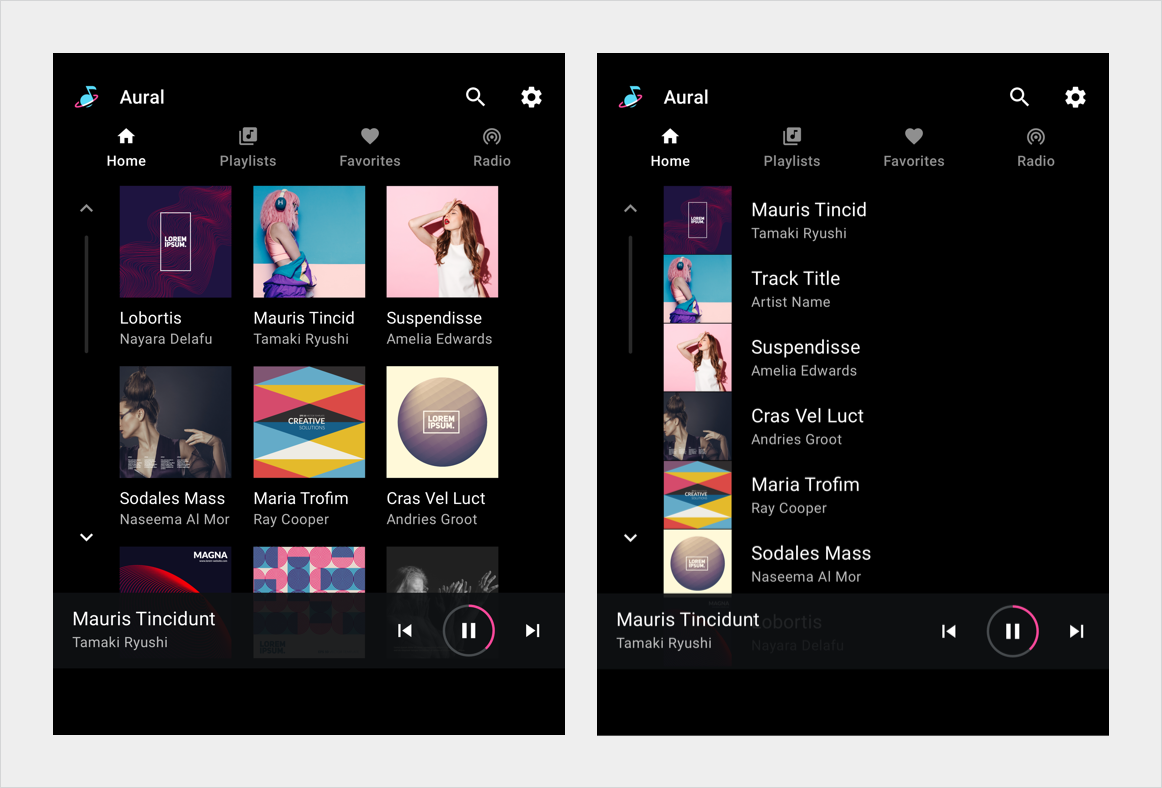
Media content can be presented in a grid view, a list view, or a combination of both in the same content space. Content can be organized into categories separated by subheaders. Users browse through the grids or lists by scrolling vertically.

Navigation to levels with more detail
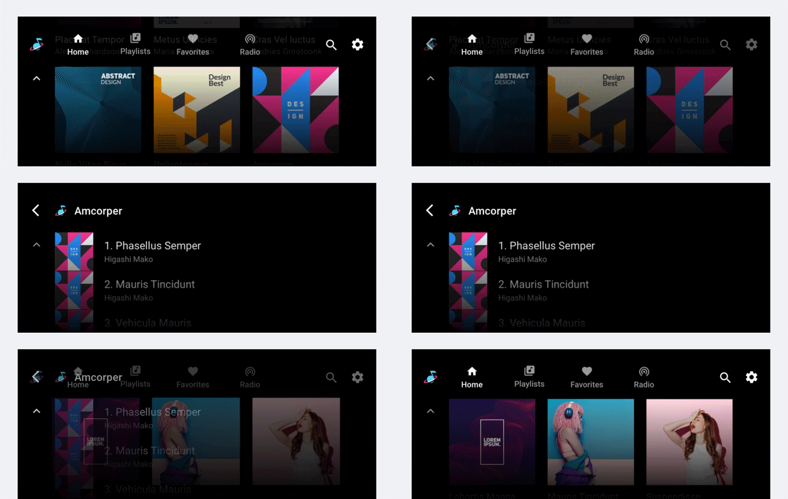
As users browse within the content space, they can select a browsable content item (such as an album or playlist) to navigate to a more detailed view of that item (songs on the album, or individual items on the playlist). When a user begins to move deeper into the content space in this way, an app header appears at the top of the screen, including an affordance that allows the user to return to the previous level.

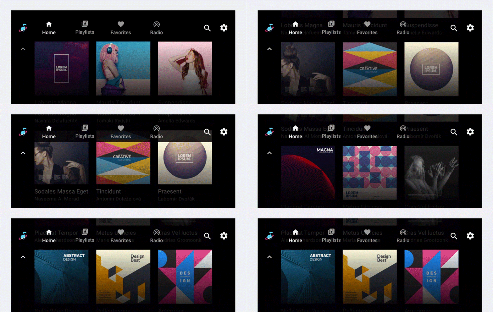
As users scroll through a grid or list of content, an app bar (or app header) at the top of the screen remains fixed in place, with the content scrolling behind it.
