AI-generated Key Takeaways
-
Users navigate media app top-level content views using the app bar, which includes primary navigation tabs and an optional app selector.
-
Primary navigation usually consists of up to 4 tabs in the app bar, allowing users to move laterally between content views and retaining the user's previous interaction state.
-
Car makers may use alternative primary navigation strategies like labels only, a drawer, or no tabs in specific screen size situations.
-
The app selector, an optional element car makers can include, provides quick access to switch between different media apps.
-
The app bar location is determined by the car maker but must remain consistent across the infotainment system to minimize cognitive load.
This section describes how a media app’s top-level app navigation works.
Users navigate among top-level content views in a media app using the app bar, which can include the following navigational elements:
- Primary navigation tabs (or variants)
- App selector (optional for OEMs)
The app bar can also include an app icon and app controls, which are discussed in App branding and Sign-in, settings & search.
Primary navigation tabs
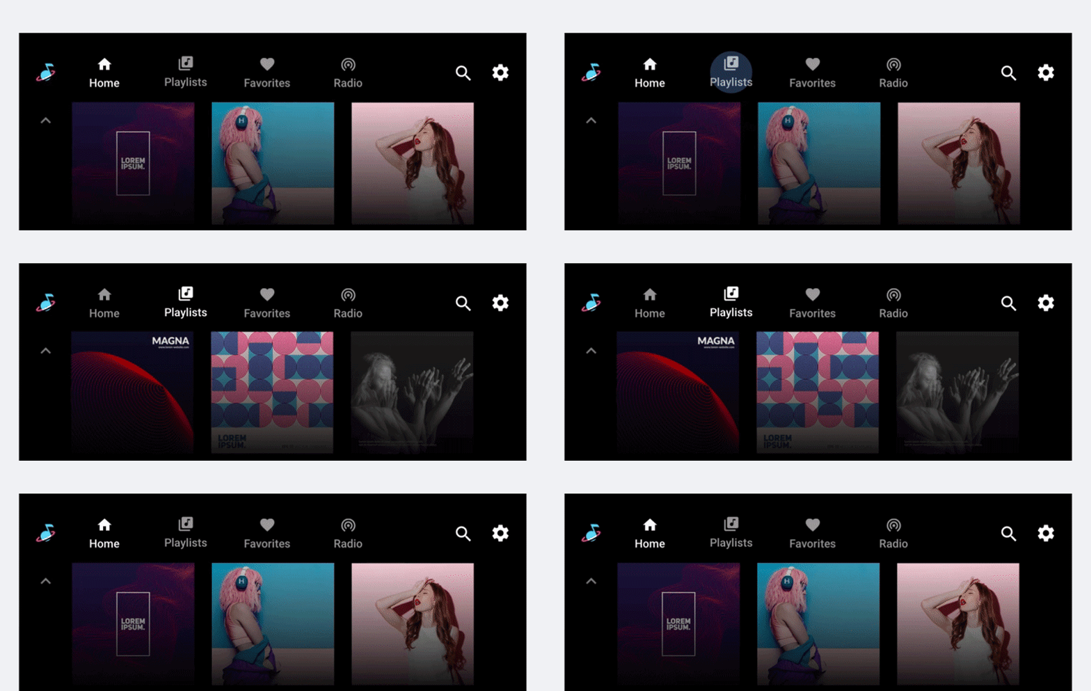
Primary navigation for content views within a media app generally consists of up to 4 tabs in an app bar (unless the screen is extremely small and lacks room to display tabs). These tabs let users move laterally between content views at the top level of the app hierarchy.
When a user selects a tab, the destination reflects the user's previous interaction with that view of the content. For example, if a tab’s content was previously scrolled during the same media app session, the scroll position will be retained when the user returns to that tab.
Primary navigation variants
Each primary navigation item is typically represented with tabs that include both an icon and label. Including both reduces the cognitive load for drivers, because icons improve glanceability and labels clarify the meaning.

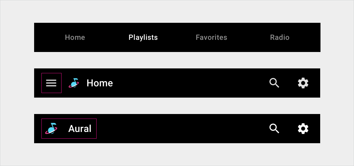
However, car makers may use alternate navigation strategies in some situations:
- Labels only: If the screen is not tall enough to accommodate a reasonable amount of content as well as tabs that include both icons and labels
- Drawer: If the screen is not wide enough for tabs
- No tabs: If there is only one primary navigation option
App selector
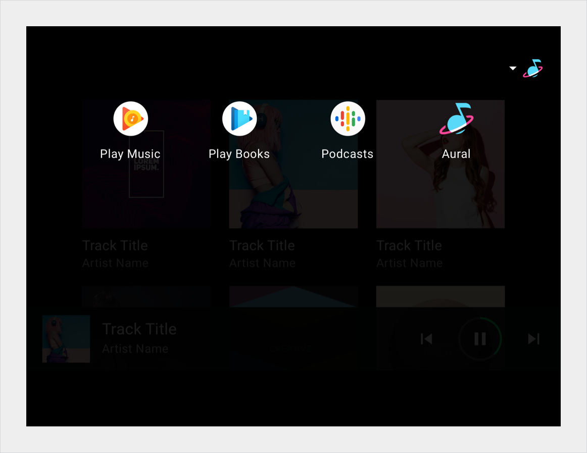
The app selector provides quick access to other media apps. car makers can decide whether to provide an app selector. For example, some car makers may prefer to rely solely on a list of all available apps as the mechanism for switching media apps.
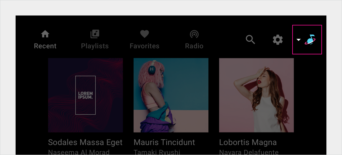
When invoked, the app selector provides access to other media apps. When a user selects a different app, that app is displayed.
App bar positioning
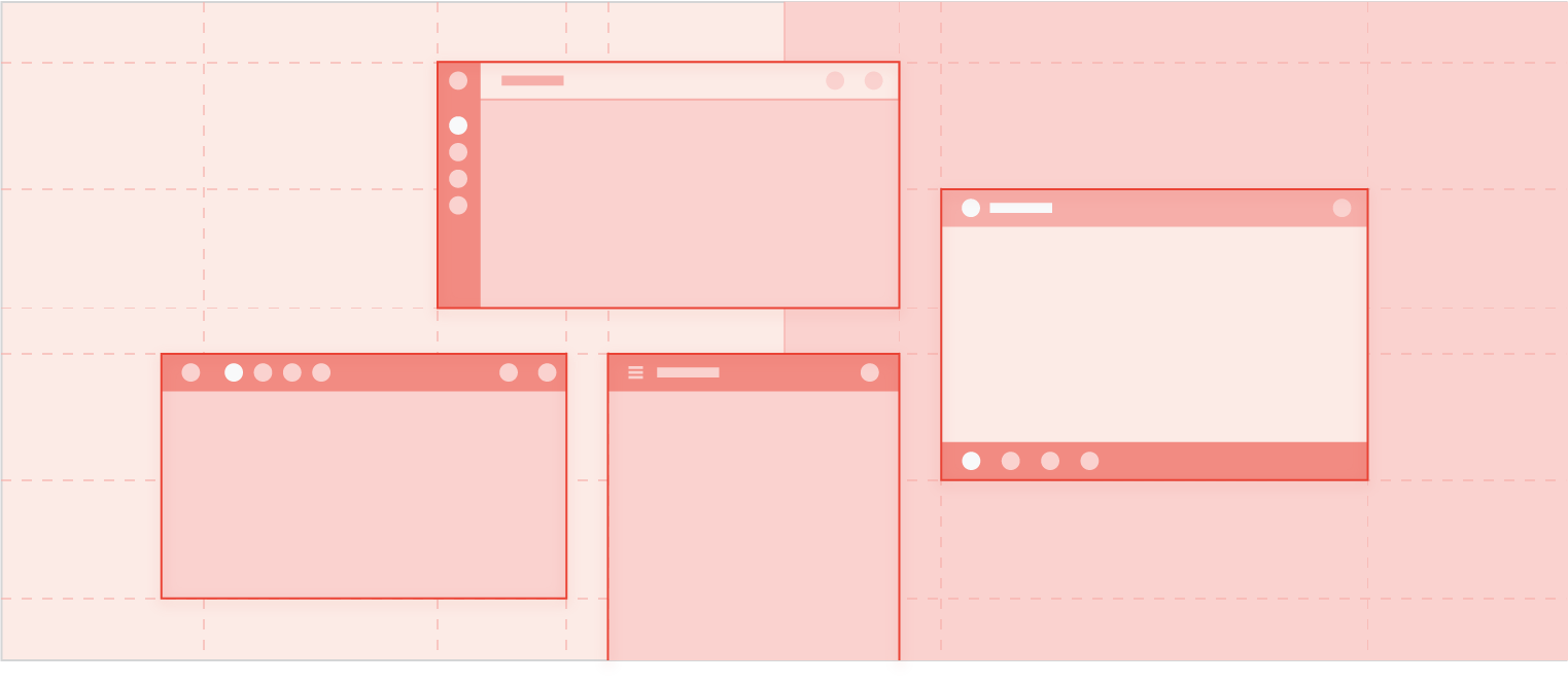
Car makers determine the location for the app bar across all Android Automotive OS templates, including the media template. As long as it's always in the same place, the app bar can appear at the top or bottom of the screen or on one side. It's also possible to stack the tabs and app controls within the app bar.
To minimize cognitive load and ensure a reliable user experience, the app bar and its affordances must always appear in the same location across the entire infotainment system.
