按钮用于传达用户触摸时将要执行的操作。
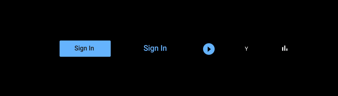
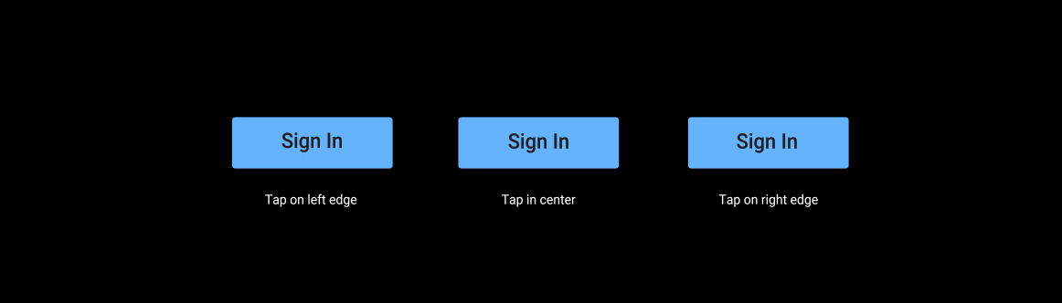
按钮是标准的 Android 开源项目 (AOSP) 组件。它们可以是纯色背景,也可以是未填充(透明背景)。实心按钮表示主要操作或首选操作。按钮可以单独显示,也可以成组显示,这与标签页不同,后者始终分组显示。
解剖学
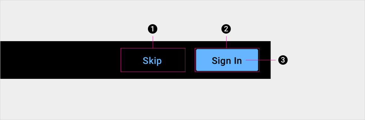
2. 已填充按钮容器,表示主要操作或首选操作
3. 按钮标签
规格
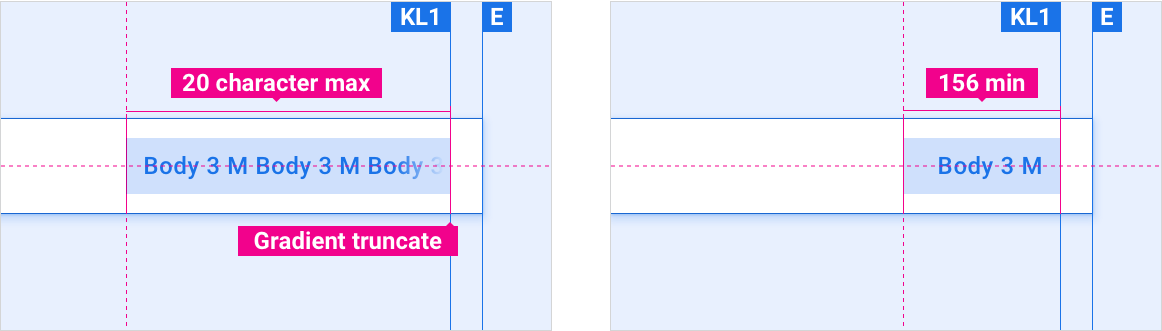
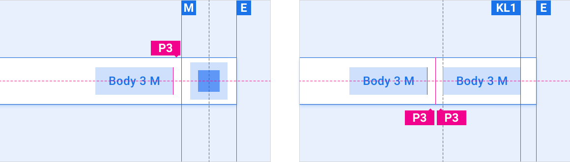
按钮长度下限和上限
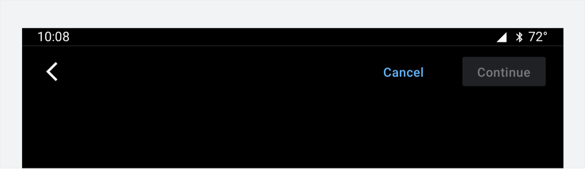
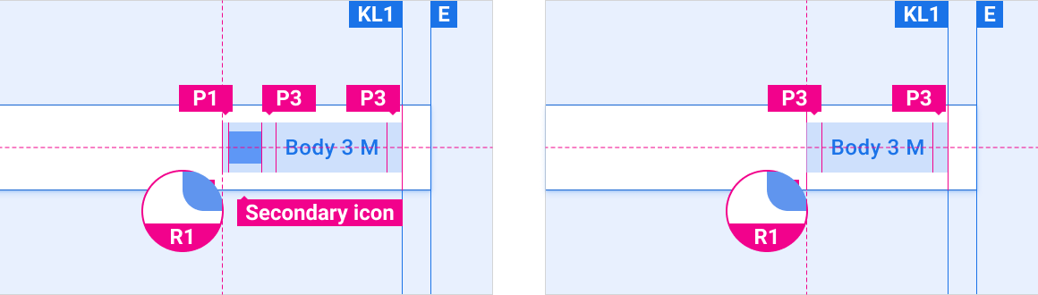
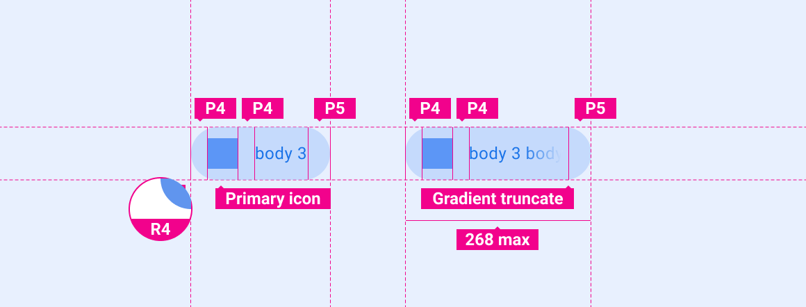
带有图标的按钮与默认按钮
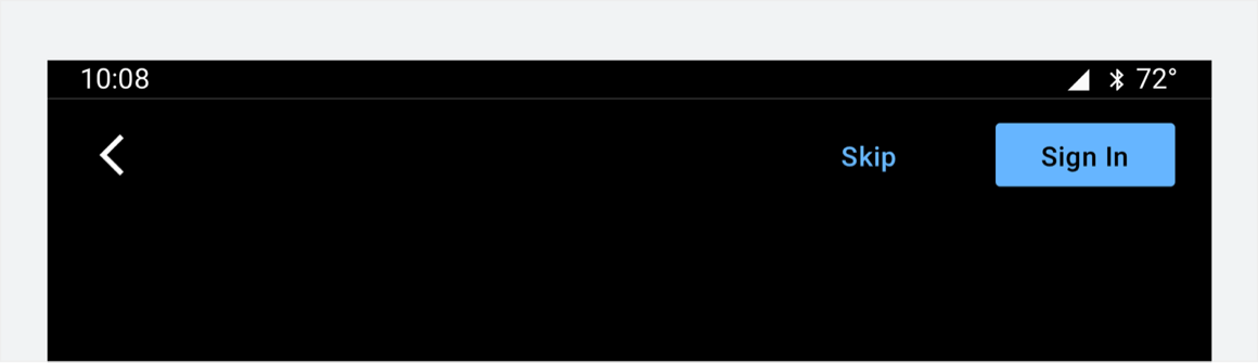
按钮在应用栏中的位置
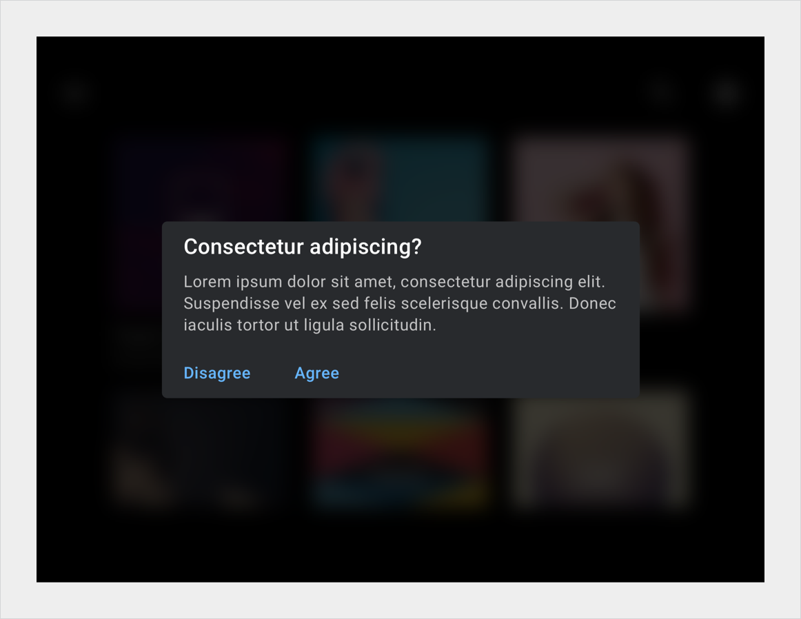
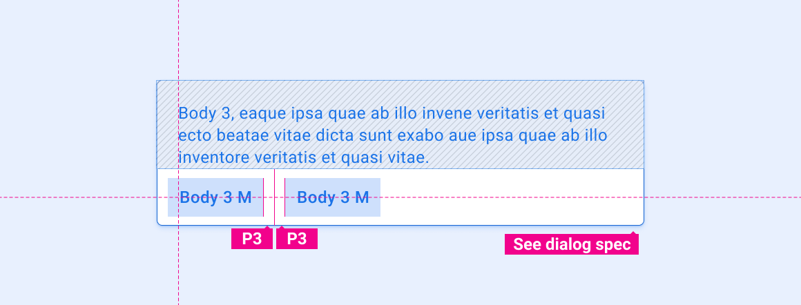
对话框中的按钮
主打按钮
自定义
OEM 可以通过修改按钮的视觉外观来体现其品牌,例如:
- 指定强调色
- 提供自定义图标
- 添加自定义字体
- 更改活动按钮、非活动按钮和已停用按钮的外观
- 设置按钮尺寸、边角形状和展示位置
- 使用动作为用户提供反馈
车载设备界面库集成指南提供了有关自定义组件的 OEM 指南。
设计系统就如何使用布局、颜色、排版、大小调整、形状和运动来自定义组件提供了具体指导。
示例