控件栏提供与特定视图相关联的控件。展开后的版本最多可显示 5 个控件,展开后最多可显示 5 个附加控件。
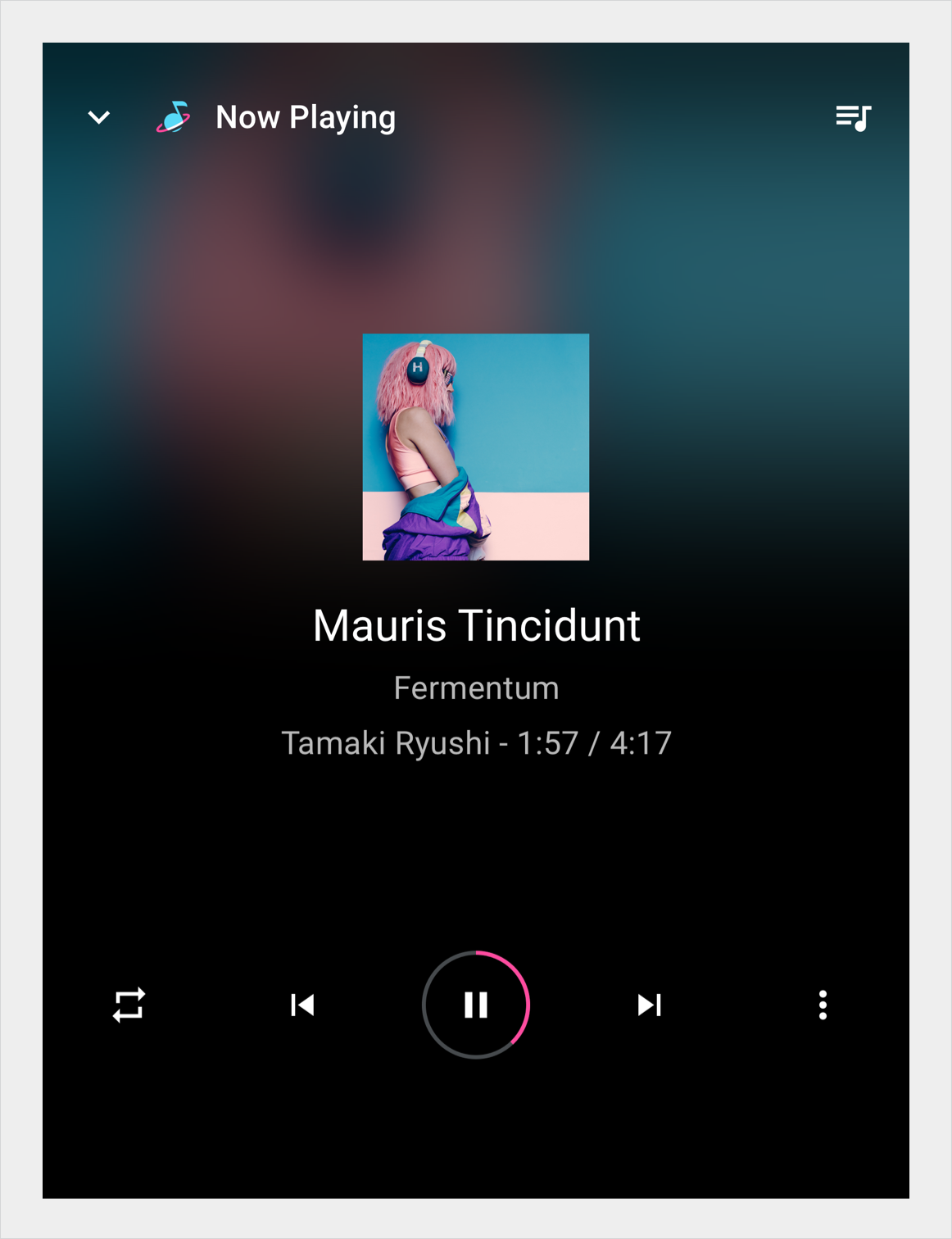
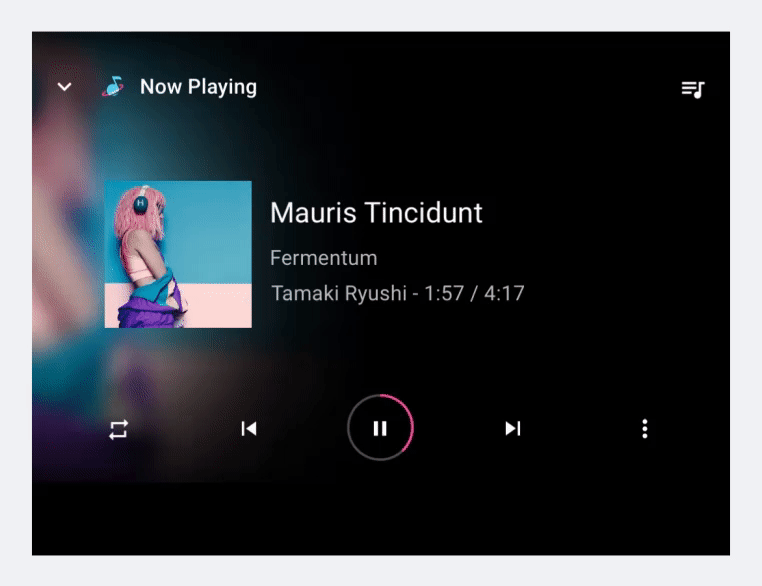
在媒体应用中,控制栏用于播放/暂停、上一个、下一个和其他控件的播放视图中,包括用于自定义第三方操作的控件。

解剖学
控件栏有两种格式:未展开和展开。展开版本最多可包含 5 个控件。在媒体应用中,其中之一是“播放/暂停”。
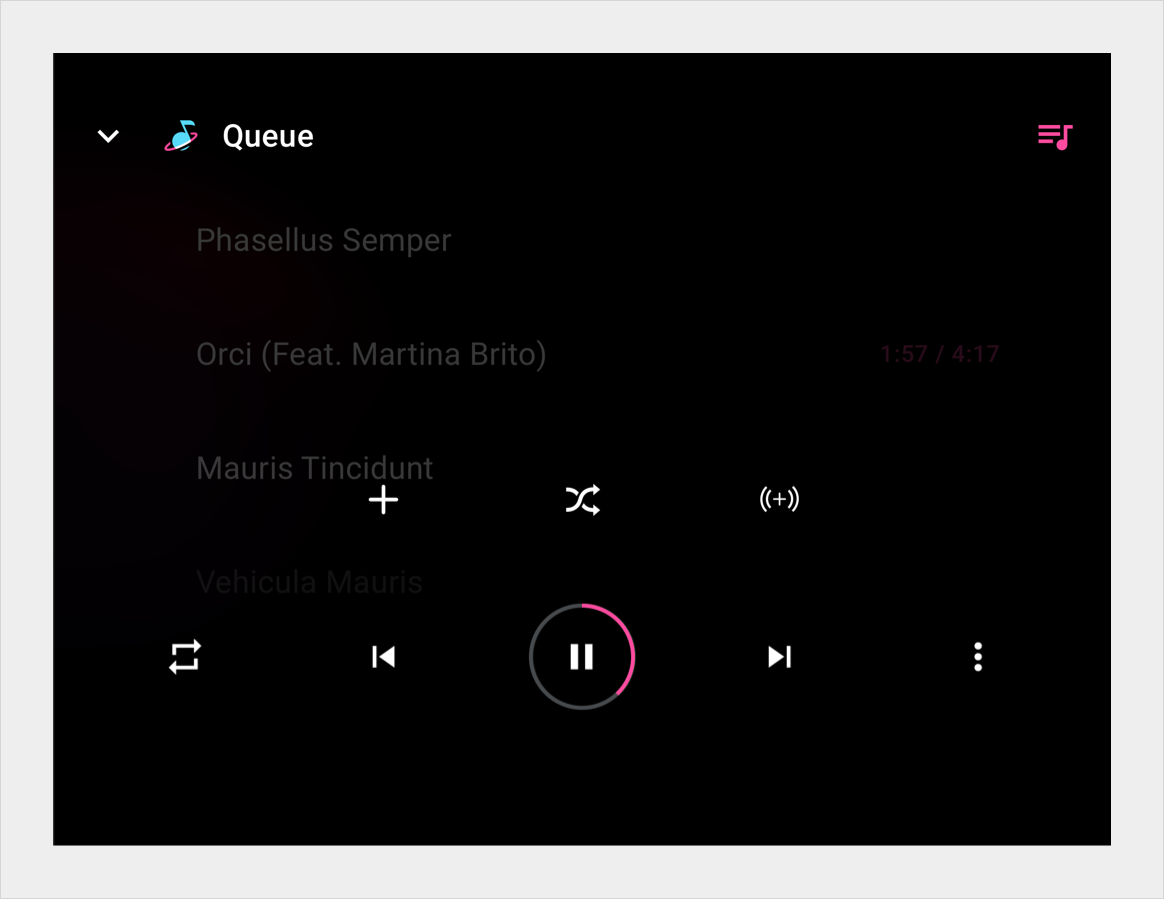
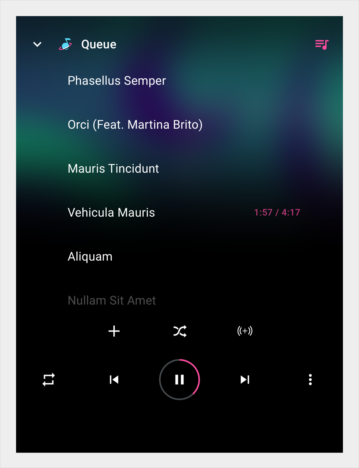
展开时,控件栏的第二行最多可包含 5 个其他控件。用户可以通过选择溢出按钮来展开或收起控制栏。
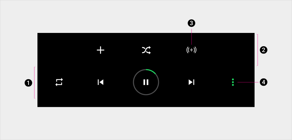
2. 操作栏的展开部分
3. 其中一个控件
4. 溢出按钮(展开和收起控件栏)
规格
控制栏
展开的控件栏
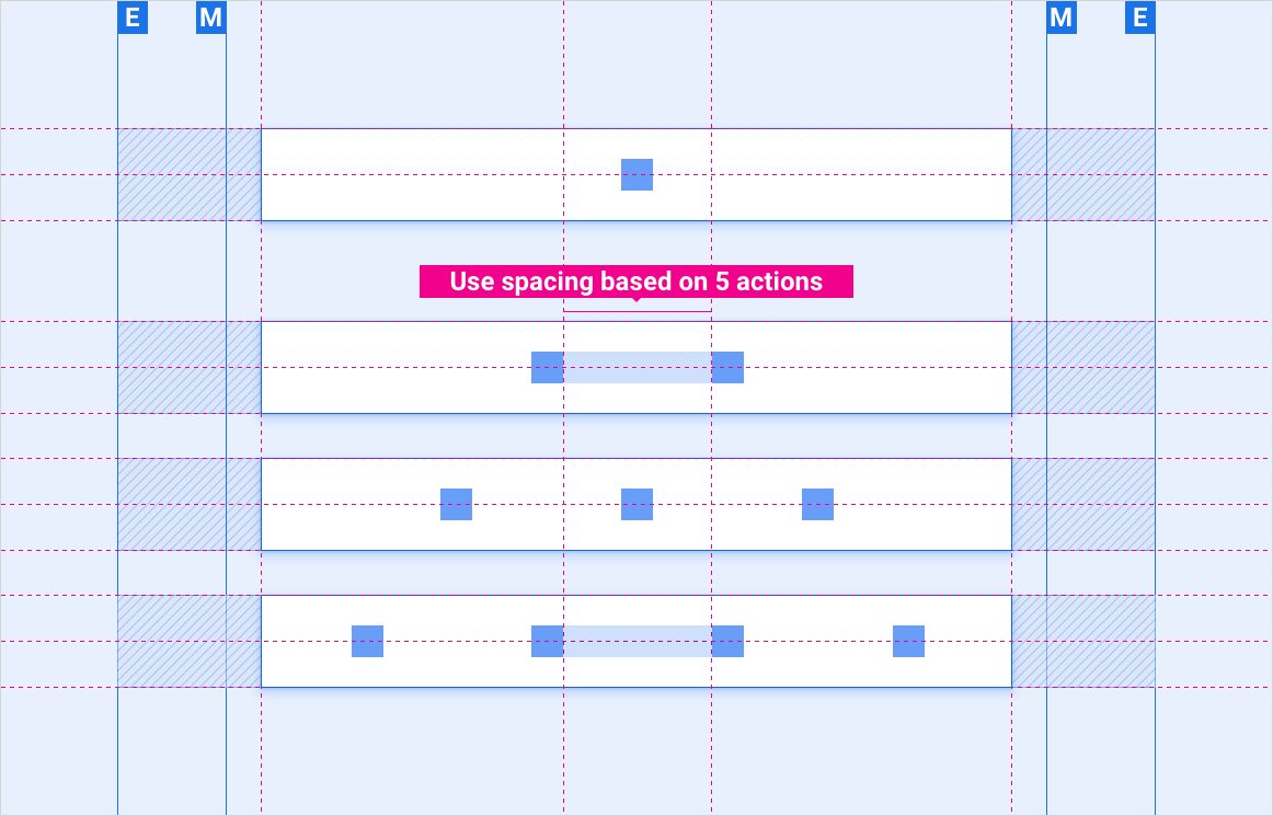
在带有锚定中心控件的控件栏上放置 1-4 个控件
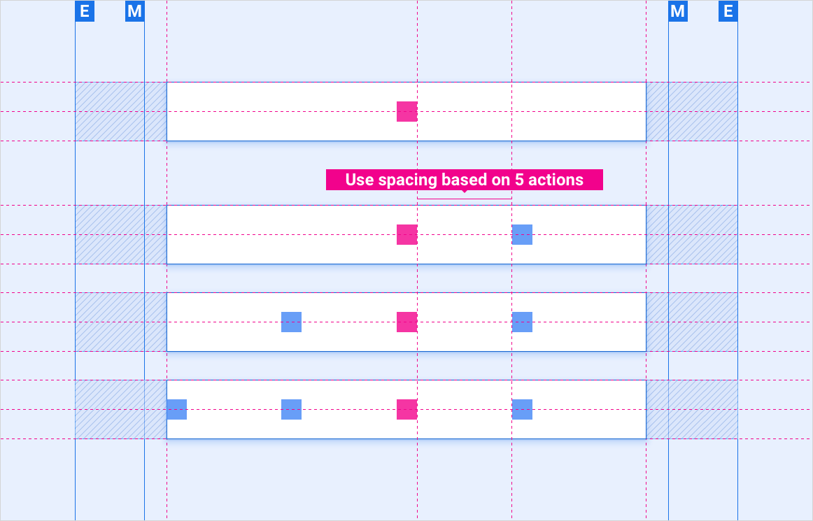
在无锚定控件的控件栏上放置 1-4 个控件
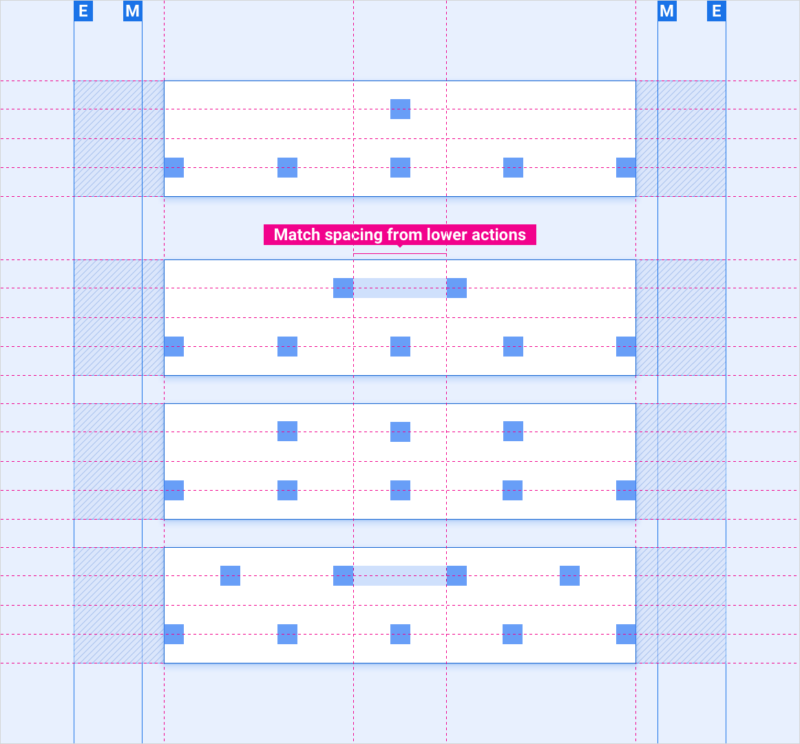
在控件栏中放置 6-9 个控件
缩放布局
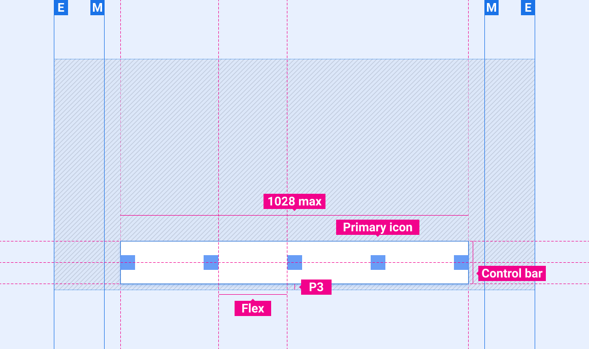
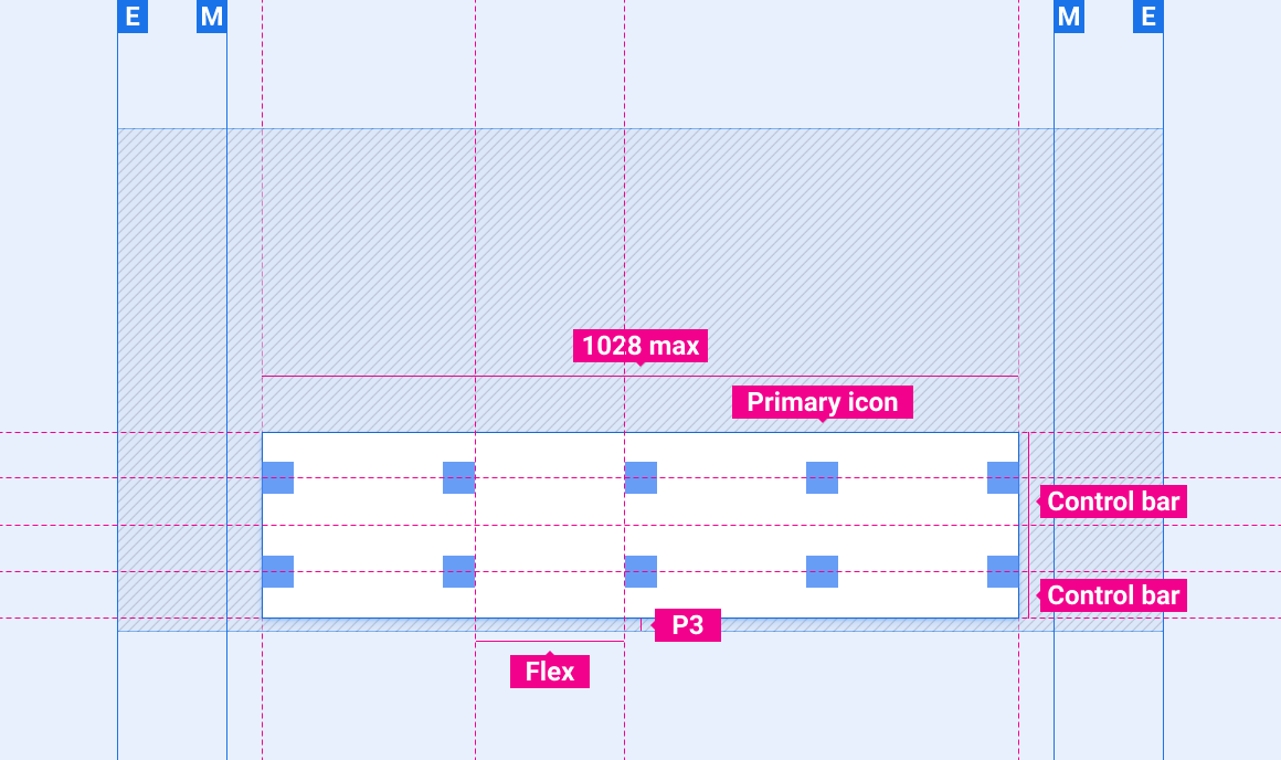
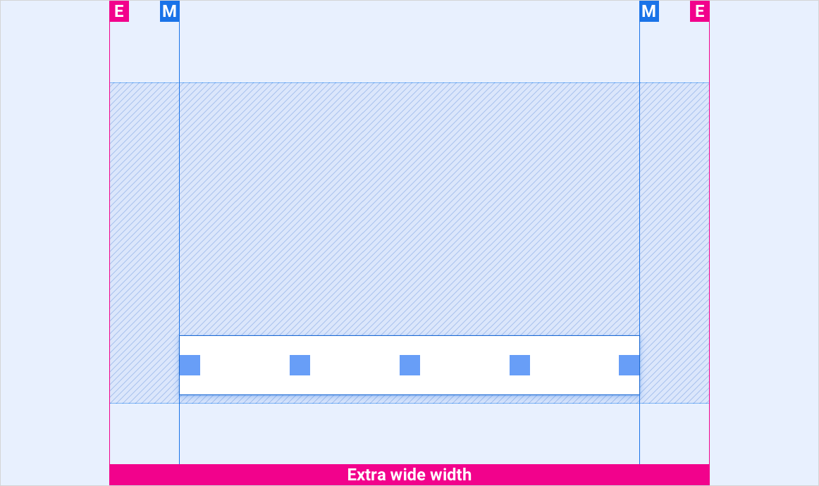
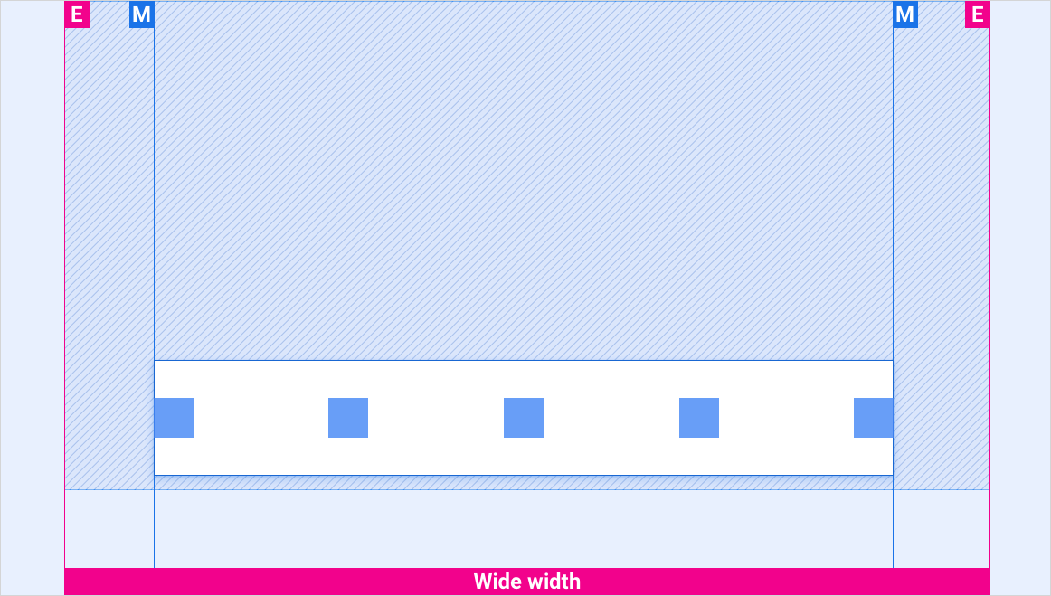
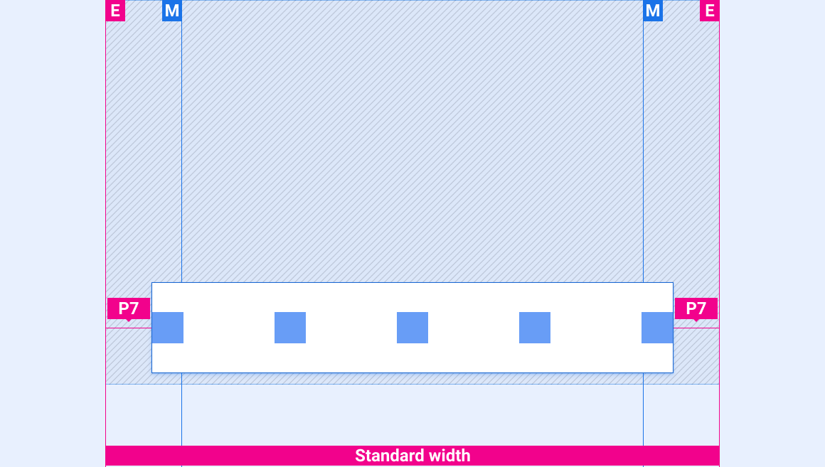
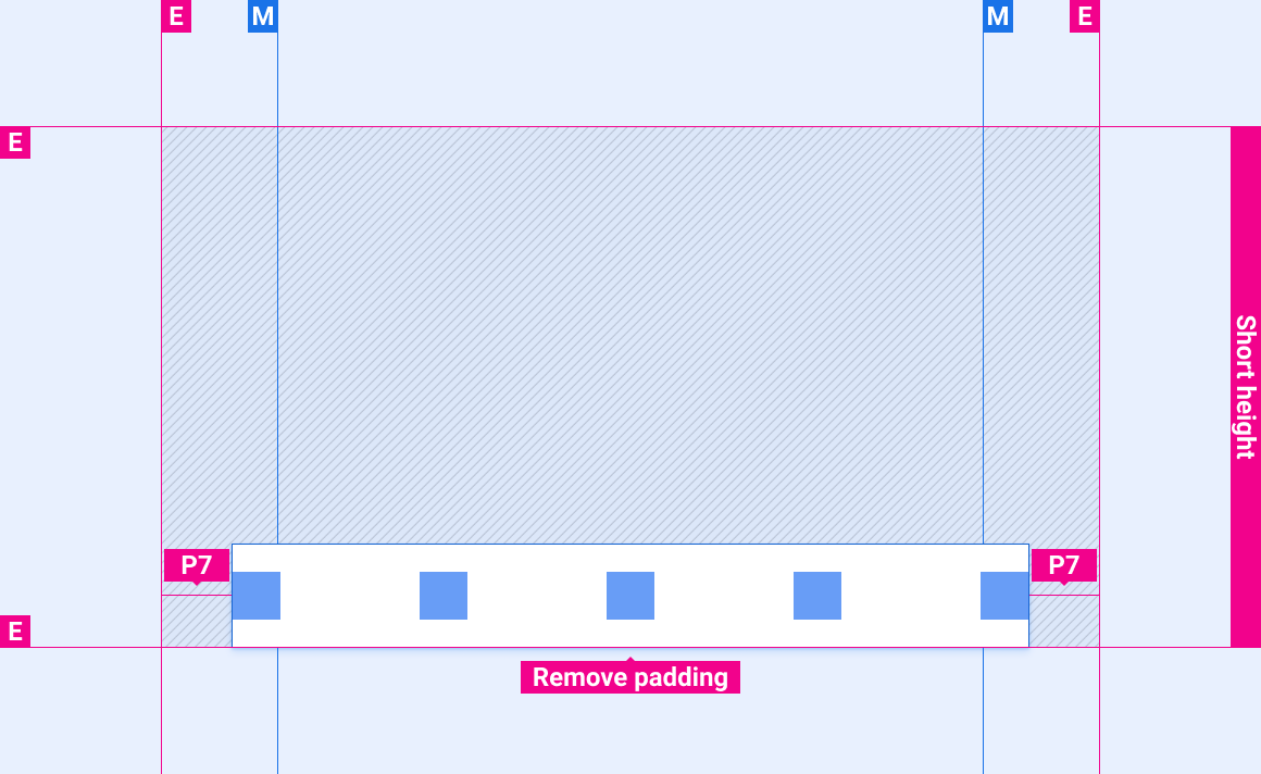
这些参考布局展示了如何调整控件栏以适应各种宽度和高度的屏幕。(宽度和高度类别在布局部分进行定义。)请注意,在发生任何下采样或上采样之前,所有像素值都位于渲染的像素中。
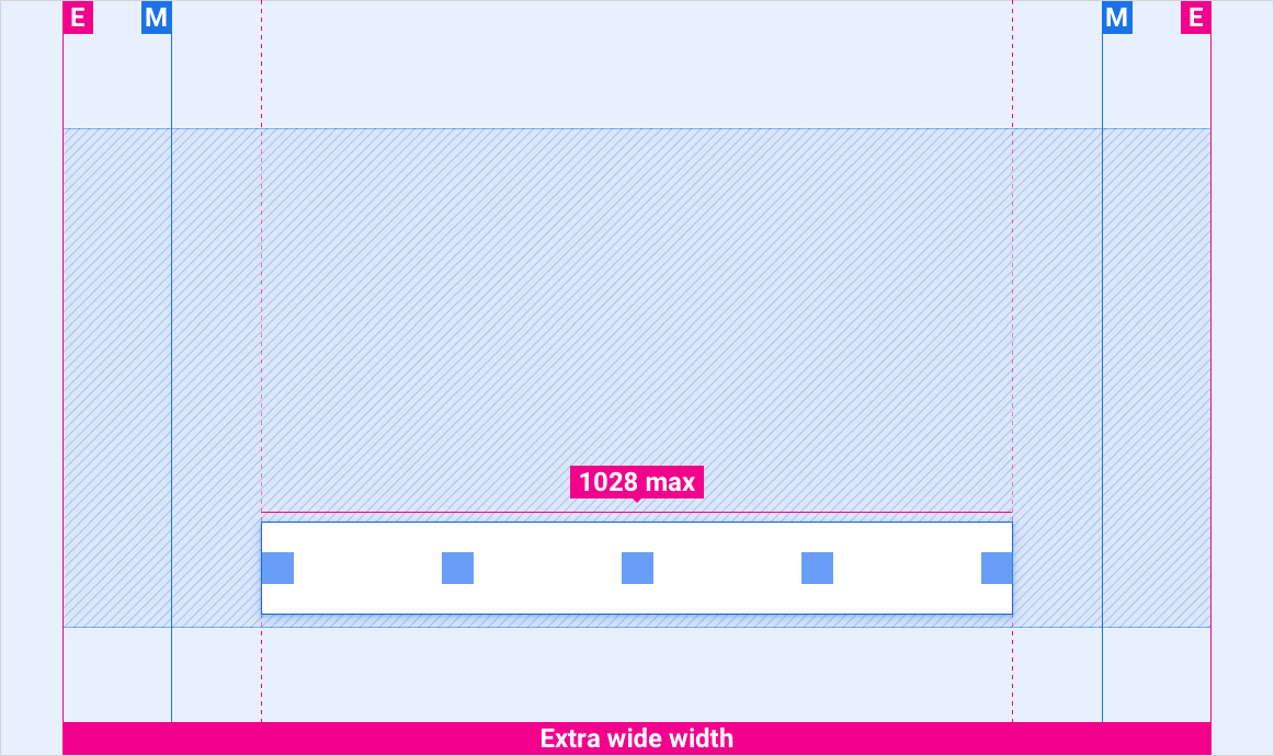
外边距大于 1028dp 的超宽屏幕
外边距小于 1028dp 的超宽屏幕
宽屏
标准宽度屏幕
短屏幕
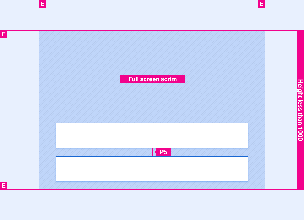
在小于 1000dp 的屏幕上展开的控制栏
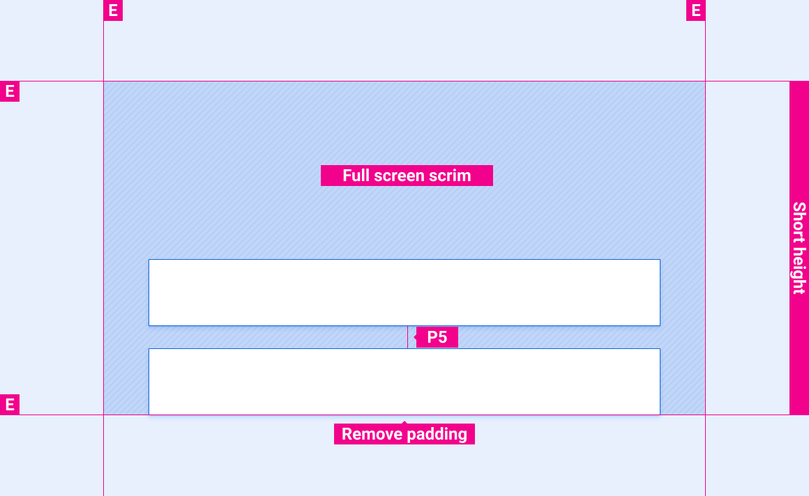
在短屏幕上展开的控制栏
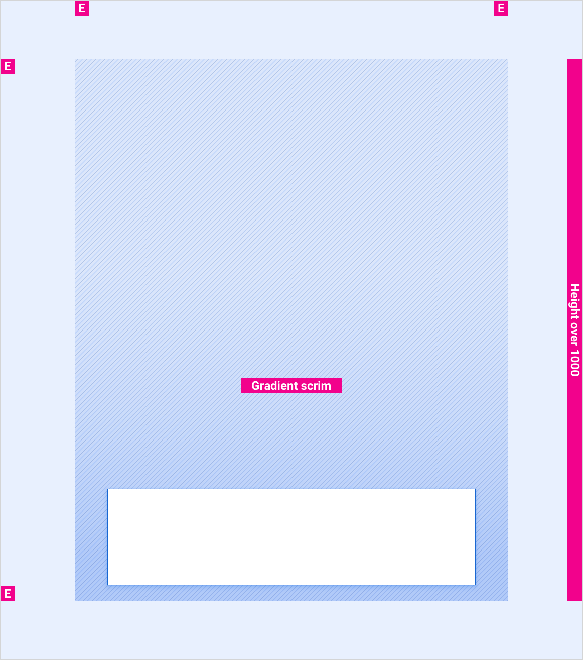
在高度超过 1000dp 的屏幕上展开的控制栏
风格
颜色
| 元素 | 颜色(日间模式) | 颜色(夜间模式) |
|---|---|---|
| 主图标 | White | 白色 @ 88% |
| 全屏纱罩 | 黑色 @ 78% | 黑色 @ 84% |
| 渐变纱罩 | 待定 | 待定 |
大小
| 元素 | 尺寸 (dp) |
|---|---|
| 控制栏 | 96(短屏幕)/128(标准高度及以上) |
| 主图标 | 44 |
示例