সেভ করা পৃষ্ঠা গুছিয়ে রাখতে 'সংগ্রহ' ব্যবহার করুন
আপনার পছন্দ অনুযায়ী কন্টেন্ট সেভ করুন ও সঠিক বিভাগে রাখুন।
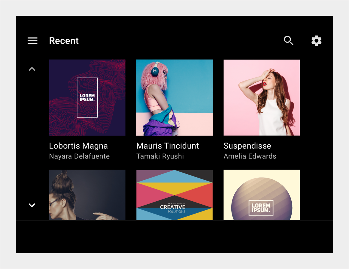
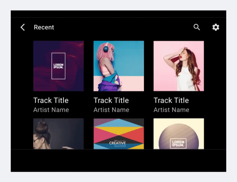
একটি গ্রিড ভিউ প্রতিটি ছবির নিচে সংক্ষিপ্ত টেক্সট সহ বিষয়বস্তু আইটেম প্রতিনিধিত্বকারী চিত্রগুলির দুই বা ততোধিক কলাম প্রদর্শন করে। এই দৃশ্যটি সর্বোত্তম হয় যখন ব্যবহারকারীরা তাদের নির্বাচন করতে প্রাথমিকভাবে ছবির উপর নির্ভর করে।
গ্রিডগুলি উল্লম্বভাবে স্ক্রোলযোগ্য এবং আকার, ব্যবধান এবং কলামের সংখ্যায় পরিবর্তিত হতে পারে। গ্রিডে থাকা বিষয়বস্তুকেও শ্রেণীতে ভাগ করা যায়।
তালিকা আইটেম উপাদান
তালিকাগুলি আরও ব্যাখ্যামূলক পাঠ্যের প্রয়োজন এমন বিষয়বস্তু প্রদর্শনের একটি বিকল্প উপায় প্রদান করে৷
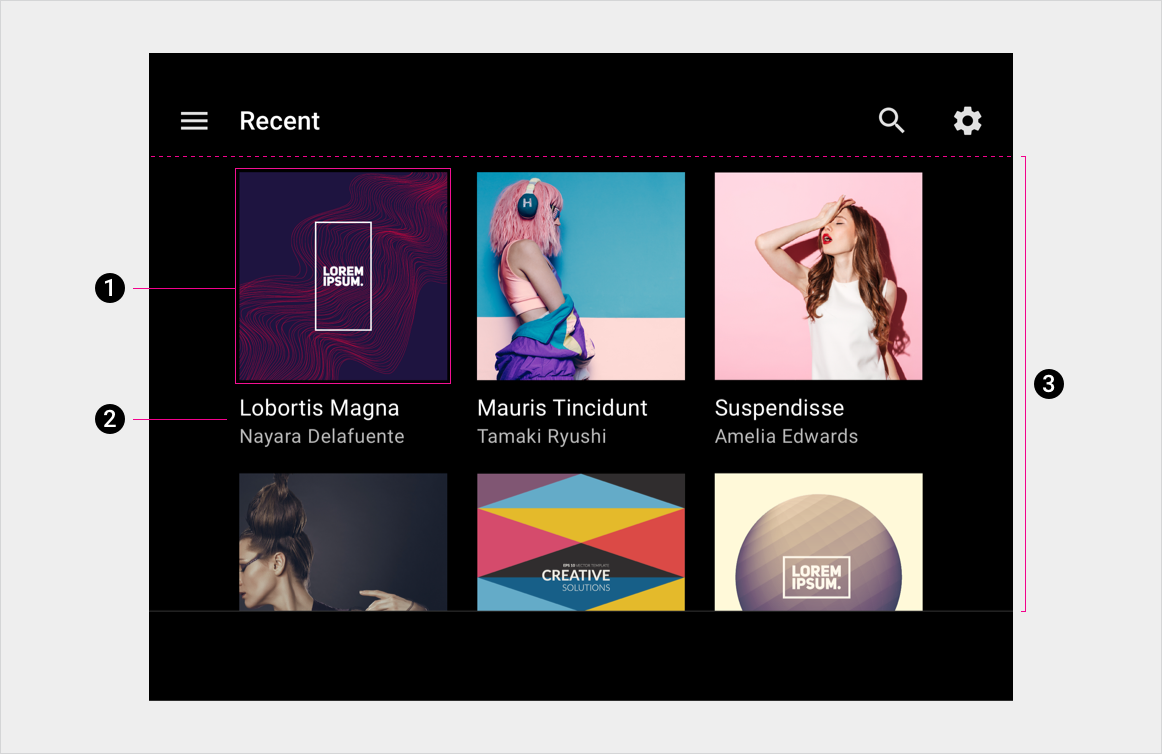
অ্যানাটমি
গ্রিডে পাঠ্য এবং UI নিয়ন্ত্রণ রয়েছে। যেহেতু ব্যবহারকারীদের অবশ্যই তাদের প্রতিক্রিয়া জানাতে হবে, সেগুলিকে কখনই অস্পষ্ট করা উচিত নয়, অন্য উপাদান দ্বারা বা পর্দার প্রান্ত দ্বারা।
গ্রিড আইটেম
প্রাথমিক এবং মাধ্যমিক পাঠ্য
গ্রিড পটভূমি
চশমা
লেআউট লেবেল
E, M, KL, P, Flex এর সংজ্ঞা
তালিকা আইটেম উপাদান
চশমা, শৈলী নির্দেশিকা, এবং আরো
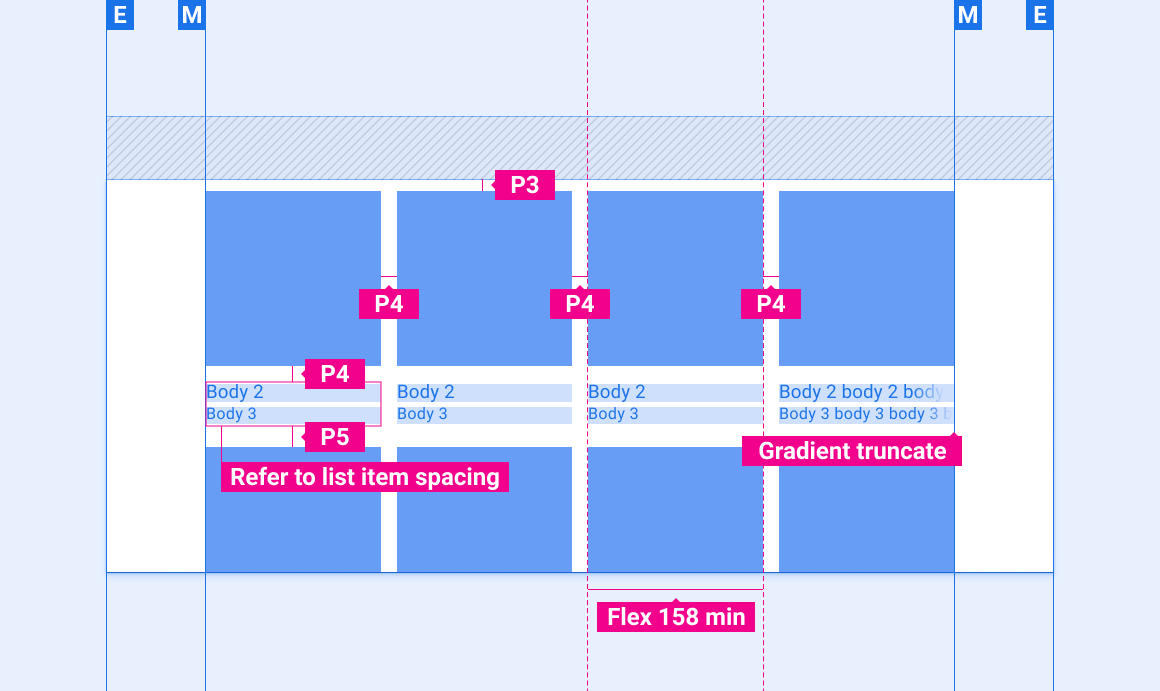
সামগ্রী গ্রিড (3 বা 4 কলাম)
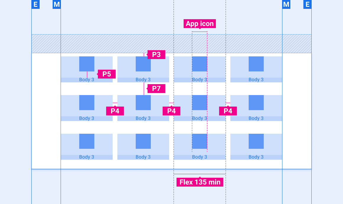
অ্যাপ গ্রিড (4 কলাম)
উপরের সারিতে প্রায়শই ব্যবহৃত আইটেম সহ অ্যাপ গ্রিড
গ্রিড লেআউটে সূচক আইকন বসানো
স্কেলিং লেআউট
এই রেফারেন্স লেআউটগুলি দেখায় কিভাবে গ্রিডগুলিকে বিভিন্ন প্রস্থ এবং উচ্চতার স্ক্রিনগুলিকে মিটমাট করার জন্য মানিয়ে নেওয়া যায়। (প্রস্থ এবং উচ্চতা বিভাগগুলি লেআউট বিভাগে সংজ্ঞায়িত করা হয়েছে।) নোট করুন যে কোনও ডাউন-স্যাম্পলিং বা আপ-স্যাম্পলিং হওয়ার আগে সমস্ত পিক্সেল মান রেন্ডার করা পিক্সেলে রয়েছে।
লেআউট
মার্জিন, কীলাইন এবং বিভিন্ন স্ক্রিনের মাপের জন্য প্যাডিং
লেআউট লেবেল
E, M, KL, P, Flex এর সংজ্ঞা
স্ট্যান্ডার্ড-প্রস্থ স্ক্রীন
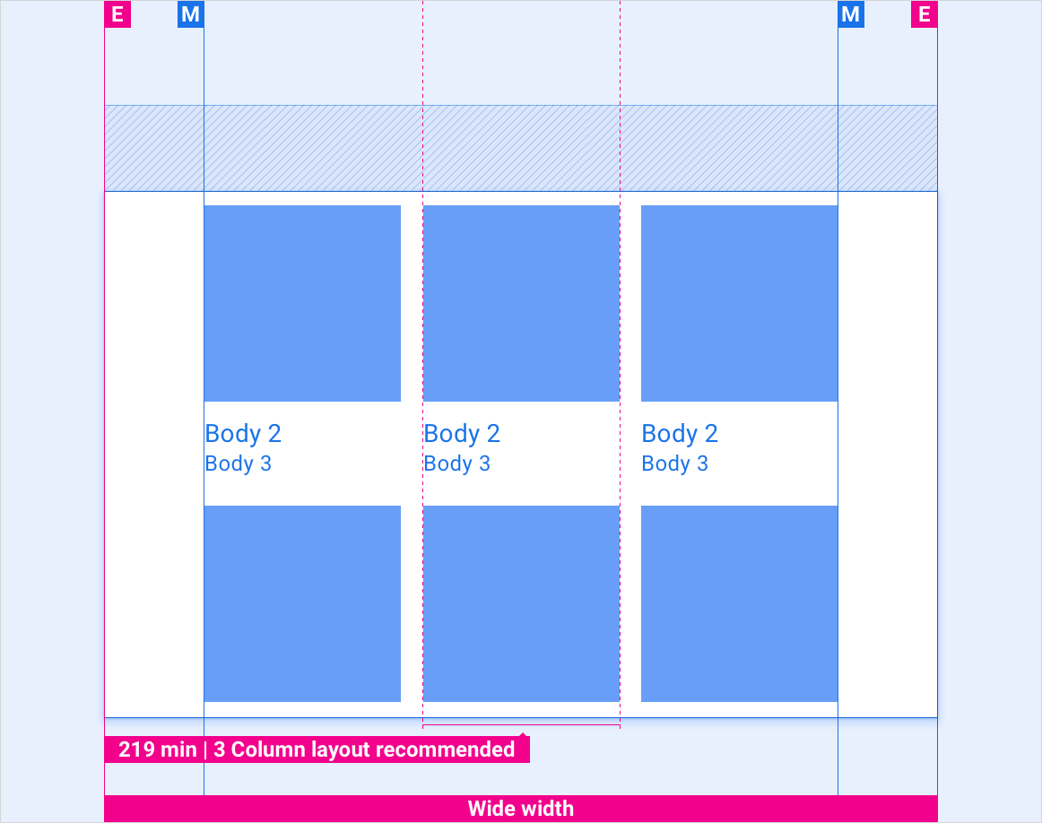
প্রশস্ত পর্দা
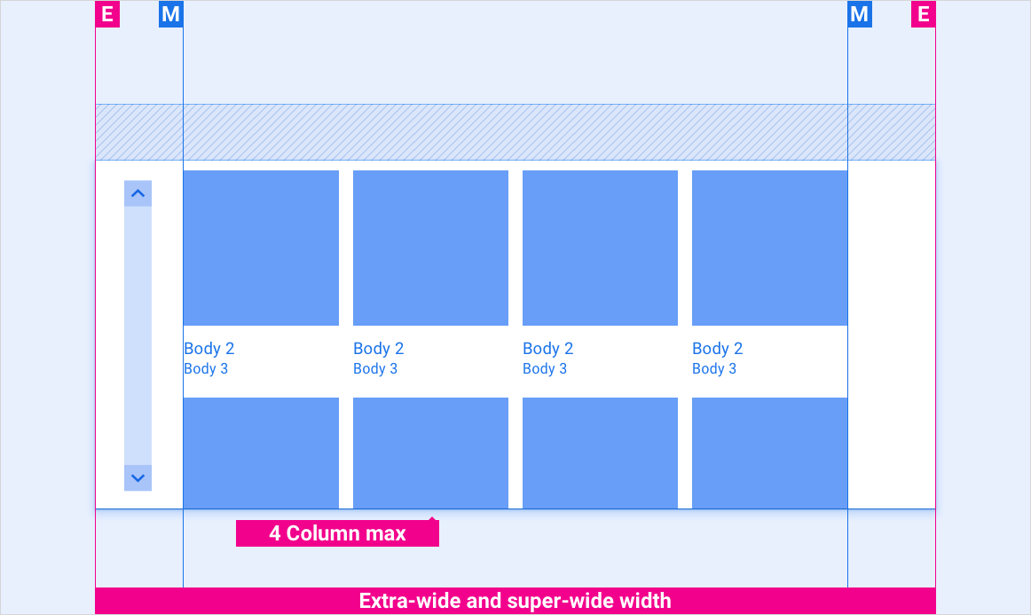
প্রশস্ত পর্দার জন্য, একটি 3-কলাম বিন্যাস সুপারিশ করা হয়। 4-কলামের লেআউট ব্যবহার করলে, ন্যূনতম 219dp টাইলের আকার বজায় রাখুন।
অতিরিক্ত-প্রশস্ত এবং সুপার-ওয়াইড স্ক্রিন
বিভিন্ন উচ্চতার স্ক্রিনে অ্যাপ গ্রিডের উল্লম্ব ব্যবধান
ছোট স্ক্রিনের জন্য, গ্রিড সামগ্রীর আইটেম এবং অ্যাপ আইকন এবং শিরোনামের মধ্যে উল্লম্ব ব্যবধান হ্রাস করা উচিত।
শৈলী
টাইপোগ্রাফি নির্দেশিকা
স্কেল এবং গ্রিড রেফারেন্স, টাইপোগ্রাফিক উদাহরণ, এবং আরও অনেক কিছু
রঙ নির্দেশিকা
প্যালেট, উচ্চতা এবং অস্বচ্ছতার মান এবং আরও অনেক কিছু
টাইপোগ্রাফি
টাইপ স্টাইল
টাইপফেস
ওজন
আকার (dp)
শরীর ঘ
রোবোটো
নিয়মিত
32
শরীর 2
রোবোটো
নিয়মিত
28
শরীর 3
রোবোটো
নিয়মিত
24
রঙ
উপাদান
রঙ (দিন মোড)
রঙ (নাইট মোড)
প্রাথমিক প্রকার / আইকন
সাদা
সাদা @ 88%
সেকেন্ডারি টাইপ/আইকন
সাদা @ 72%
সাদা @ 60%
বিভাজক লাইন
সাদা @ 22%
সাদা @ 12%
গ্রিড পটভূমি
কালো
কালো
বিষয়বস্তু scrim
N/A
কালো @ 22%
গ্রেডিয়েন্ট ট্রাঙ্কেট
টেক্সটের 10% জায়গায় কালো @ 0-100%
সাইজিং
উপাদান
আকার (dp)
অ্যাপ আইকন
76
মিন অ্যাপ সেল
135
মিন কন্টেন্ট সেল
158
উচ্চতা
উপাদান
রঙ
Y অক্ষ
ঝাপসা
গ্রিড টালি
কালো @ 22%
2
2
উদাহরণ
অ্যাপ গ্রিড - দিন অ্যাপ গ্রিড - রাত
বিষয়বস্তু গ্রিড - দিন বিষয়বস্তু গ্রিড - রাত
ব্যবহারকারী বিষয়বস্তু স্ক্রোল করতে উপরের দিকে বা নিচের দিকে টেনে আনে
[null,null,["2025-07-24 UTC-তে শেষবার আপডেট করা হয়েছে।"],[[["\u003cp\u003eGrid view displays content items as images with brief text, best for image-based selections, and can be vertically scrolled, categorized, and varied in size and spacing.\u003c/p\u003e\n"],["\u003cp\u003eGrids contain text and UI controls which should remain visible; they include a grid item, primary and secondary text, and a background.\u003c/p\u003e\n"],["\u003cp\u003eLayouts scale for various screen sizes, recommending a 3-column layout for wide screens or a 4-column layout with minimum tile size of 219dp, and adjusting vertical spacing for short screens.\u003c/p\u003e\n"],["\u003cp\u003eGrids have specific styles for typography, color (with day and night modes), sizing, and elevation, ensuring visual consistency and usability.\u003c/p\u003e\n"],["\u003cp\u003eExamples are provided for both app and content grids, demonstrating their appearance in day and night modes, and showcasing user interaction with scrolling.\u003c/p\u003e\n"]]],[],null,["# Grids\n\n\u003cbr /\u003e\n\nA grid view displays two or more columns of images representing content items, with brief text beneath each image. This view is best when users rely primarily on images to make their selections.\n\nGrids are vertically scrollable and can vary in size, spacing, and number of columns. The content in the grid can also be grouped into categories. \n[List items component\nLists provide an alternative way to display content that requires more explanatory text](/cars/design/automotive-os/components/list-items)\n\n*** ** * ** ***\n\nAnatomy\n-------\n\nGrids contain text and UI controls. Because users must respond to them, they should never be obscured, either by other elements or by the screen edge.\n1. Grid item\n2. Primary and secondary text\n3. Grid background\n\n*** ** * ** ***\n\nSpecs\n-----\n\n[Layout labels\nDefinitions of E, M, KL, P, Flex](/cars/design/intro-terms#layout_labels) \n[List items component\nSpecs, style guidelines, and more](/cars/design/automotive-os/components/list-items)\n\n### Content grid (3 or 4 columns)\n\n### App grid (4 columns)\n\n### App grid with frequently used items in top row\n\n### Indicator icon placement in grid layout\n\n*** ** * ** ***\n\nScaling layouts\n---------------\n\nThese reference layouts show how to adapt grids to accommodate screens of various widths and heights. (Width and height categories are defined in the [Layout](/cars/design/automotive-os/design-system/layout) section.) Note that all pixel values are in rendered pixels, before any down-sampling or up-sampling occurs. \n[Layout\nMargins, keylines, and padding for various screen sizes](/cars/design/automotive-os/design-system/layout) \n[Layout labels\nDefinitions of E, M, KL, P, Flex](/cars/design/intro-terms#layout_labels)\n\n### Standard-width screens\n\n### Wide screens\n\nFor wide screens, a 3-column layout is recommended. If using a 4-column layout, maintain a minimum tile size of 219dp.\n\n### Extra-wide and super-wide screens\n\n### Vertical spacing of app grids on screens of various heights\n\nFor short screens, vertical spacing should be reduced between grid content items and between app icons and titles.\n\n*** ** * ** ***\n\nStyles\n------\n\n[Typography guidelines\nScale and grid references, typographic examples, and more](/cars/design/automotive-os/design-system/typography) \n[Color guidelines\nPalettes, elevation and opacity values, and more](/cars/design/automotive-os/design-system/color)\n\n### Typography\n\n| Type style | Typeface | Weight | Size (dp) |\n|------------|----------|---------|-----------|\n| Body 1 | Roboto | Regular | 32 |\n| Body 2 | Roboto | Regular | 28 |\n| Body 3 | Roboto | Regular | 24 |\n\n### Color\n\n| Element | Color(day mode) | Color (night mode) |\n|------------------------|-------------------------------------|-------------------------------------|\n| Primary type / icons | White | White @ 88% |\n| Secondary type / icons | White @ 72% | White @ 60% |\n| Divider line | White @ 22% | White @ 12% |\n| Grid background | Black | Black |\n| Content scrim | N/A | Black @ 22% |\n| Gradient truncate | Black @ 0-100% in 10% of text space | Black @ 0-100% in 10% of text space |\n\n### Sizing\n\n| Element | Size (dp) |\n|------------------|-----------|\n| App icon | 76 |\n| Min app cell | 135 |\n| Min content cell | 158 |\n\n### Elevation\n\n| Element | Color | Y axis | Blur |\n|-----------|-------------|--------|------|\n| Grid tile | Black @ 22% | 2 | 2 |\n\n*** ** * ** ***\n\nExamples\n--------\n\nApp grid - day App grid - night \nContent grid - day Content grid - night\nUser drags upward or downward to scroll content"]]