সেভ করা পৃষ্ঠা গুছিয়ে রাখতে 'সংগ্রহ' ব্যবহার করুন
আপনার পছন্দ অনুযায়ী কন্টেন্ট সেভ করুন ও সঠিক বিভাগে রাখুন।
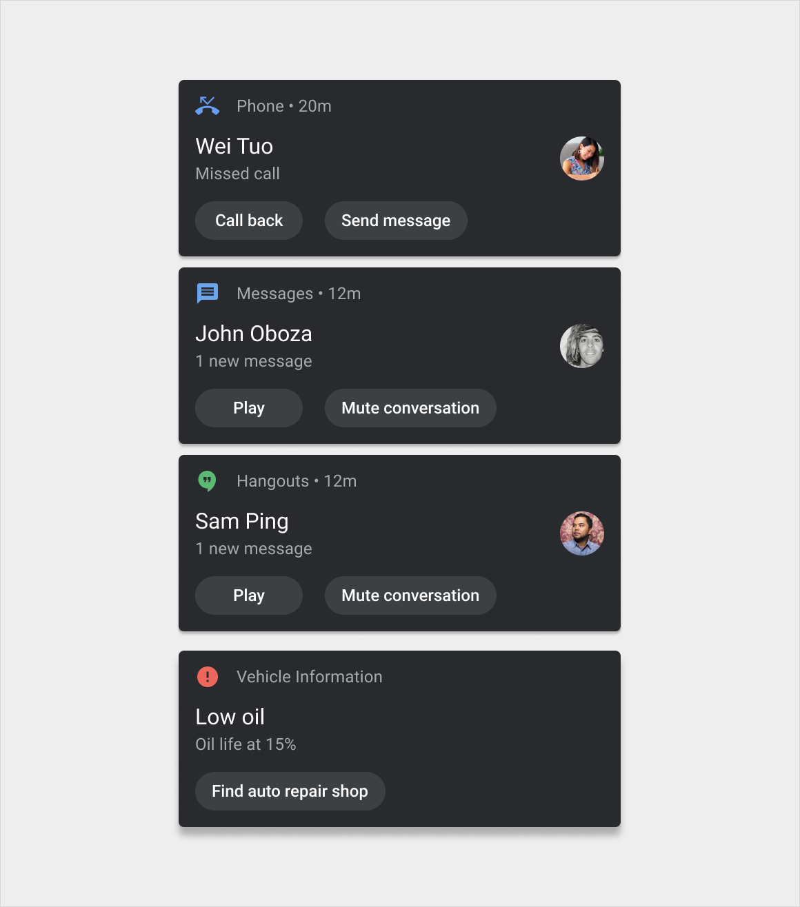
নোটিফিকেশন কার্ড সিস্টেম বা অ্যাপ থেকে অল্প পরিমাণে সময়মত তথ্য যোগাযোগ করে।
অ্যান্ড্রয়েড অটোমোটিভ ওএস-এর জন্য এই কার্ডগুলির ডিজাইন চালকদের বিভ্রান্তি কমানোর উদ্দেশ্যে। কার্ডগুলি তিনটি মৌলিক সংস্করণে আসে:
হেড-আপ নোটিফিকেশন (HUN) কার্ড: বর্তমান স্ক্রিনে সংক্ষিপ্তভাবে প্রদর্শিত একটি বিজ্ঞপ্তির জন্য ব্যবহৃত হয়
বিজ্ঞপ্তি কেন্দ্র কার্ড: বিজ্ঞপ্তি কেন্দ্রে তালিকাভুক্ত বিজ্ঞপ্তিগুলির জন্য ব্যবহৃত হয়
গোষ্ঠীবদ্ধ-বিজ্ঞপ্তি কার্ড: একটি কার্ডে একাধিক বিজ্ঞপ্তি কেন্দ্র কার্ড একত্রিত করে
এই সংস্করণগুলির মধ্যে, বার্তার বিভাগের উপর নির্ভর করে ডিজাইনগুলিও সামান্য পরিবর্তিত হতে পারে। উদাহরণস্বরূপ, কল বিজ্ঞপ্তিগুলিতে নেভিগেশন বিজ্ঞপ্তিগুলির চেয়ে আলাদা বোতাম এবং আইকন থাকে৷
বিজ্ঞপ্তি কেন্দ্র চশমা
চশমা, শৈলী নির্দেশিকা, এবং আরো
অ্যানাটমি
বিজ্ঞপ্তি কার্ড একটি নমনীয় উপাদান যা বিভিন্ন উপাদান অন্তর্ভুক্ত করতে পারে। এটির তিনটি প্রধান সংস্করণ রয়েছে:
HUN কার্ড: এই সংস্করণটি বিজ্ঞপ্তি কেন্দ্রের কার্ডের চেয়ে চওড়া এবং খারিজ না হওয়া পর্যন্ত বর্তমান স্ক্রিনের উপরে প্রদর্শিত হয়
বিজ্ঞপ্তি কেন্দ্র কার্ড: এই সংস্করণটি HUN কার্ডের চেয়ে সংকীর্ণ এবং বিজ্ঞপ্তি কেন্দ্রে একটি উল্লম্ব তালিকায় এই জাতীয় কার্ডের সাথে উপস্থিত হয়
গোষ্ঠীবদ্ধ-বিজ্ঞপ্তি কার্ড: বিজ্ঞপ্তি কেন্দ্র কার্ডের এই সংস্করণটি একটি কার্ডে একাধিক সম্পর্কিত বিজ্ঞপ্তিগুলিকে একত্রিত করে, পৃথক বিজ্ঞপ্তিগুলি দেখানোর জন্য প্রসারিত করার নিয়ন্ত্রণ সহ
বার্তার ধরন অনুসারে এই সংস্করণগুলির রূপগুলি শৈলীতে দেখানো হয়েছে।
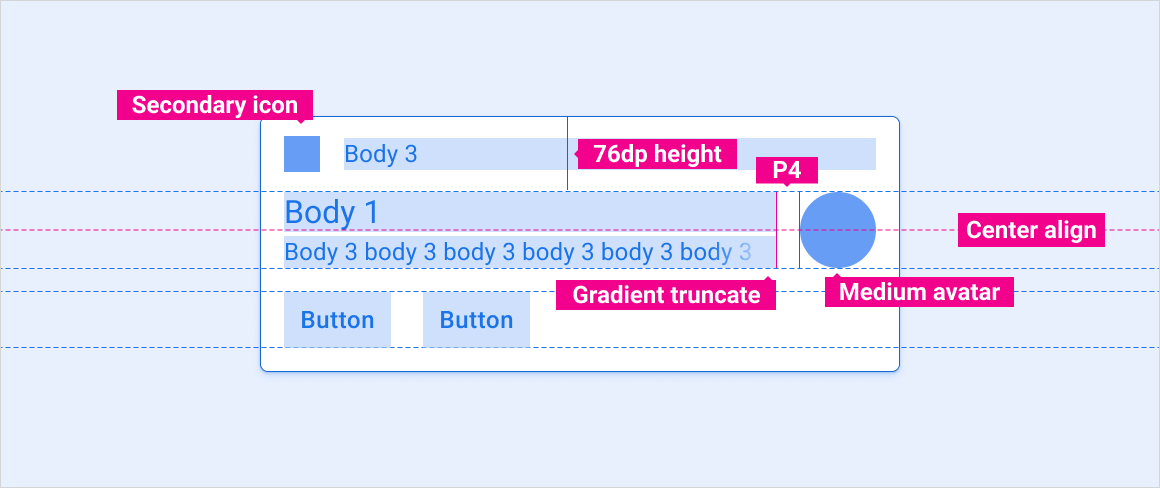
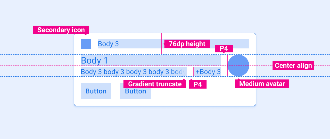
এখানে একই বিজ্ঞপ্তি কার্ডের HUN এবং নোটিফিকেশন সেন্টার সংস্করণ দেখানো হয়েছে, নিম্নলিখিত উপাদানগুলি সমন্বিত: 1. হেডার 2. বিষয়বস্তু (ঐচ্ছিক বার্তা পূর্বরূপ সহ এবং ছাড়া, যা গাড়ি চালানোর সময় লুকানো যেতে পারে) 3. কর্ম 4. বড় আইকন এখানে একটি গোষ্ঠীবদ্ধ-বিজ্ঞপ্তি কার্ড দেখানো হয়েছে এর ভেঙে যাওয়া এবং প্রসারিত উভয় সংস্করণে, নিম্নলিখিত উপাদানগুলি সমন্বিত: 1. হেডার 2. বিষয়বস্তু 3. প্রসারিত/সংকোচন ক্রিয়া 4. প্রসারিত/পতন সূচক
চশমা - HUN কার্ড
লেআউট লেবেল
E, M, KL, P, Flex এর সংজ্ঞা
স্ট্যান্ডার্ড HUN
HUN অবতার সহ
প্রিভিউ সহ HUN কে মেসেজ করুন
একাধিক বার্তা সহ HUN কে বার্তা পাঠান
বড়-ইমেজ HUN
চশমা - বিজ্ঞপ্তি কেন্দ্র কার্ড
লেআউট লেবেল
E, M, KL, P, Flex এর সংজ্ঞা
স্ট্যান্ডার্ড বিজ্ঞপ্তি
পূর্বরূপ সহ বার্তা বিজ্ঞপ্তি
একাধিক বার্তা সহ বার্তা বিজ্ঞপ্তি
একক কর্ম বিজ্ঞপ্তি
চশমা - গোষ্ঠীবদ্ধ-বিজ্ঞপ্তি কার্ড
লেআউট লেবেল
E, M, KL, P, Flex এর সংজ্ঞা
গোষ্ঠীবদ্ধ বিজ্ঞপ্তি – সঙ্কুচিত হয়েছে৷
গোষ্ঠীবদ্ধ বিজ্ঞপ্তি - প্রসারিত
স্কেলিং লেআউট
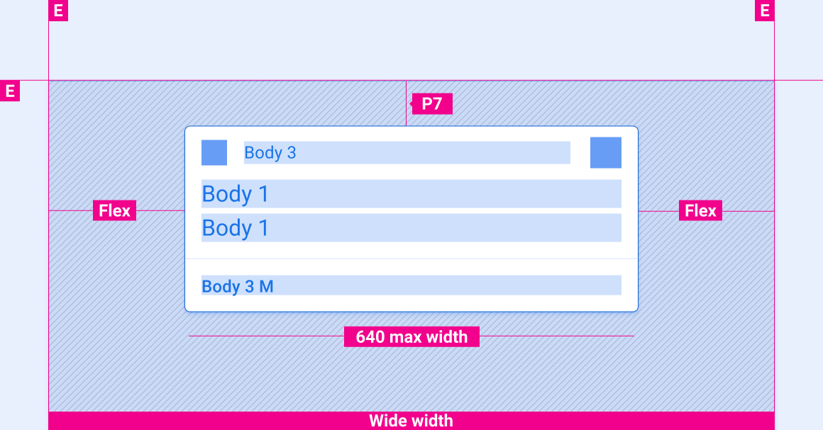
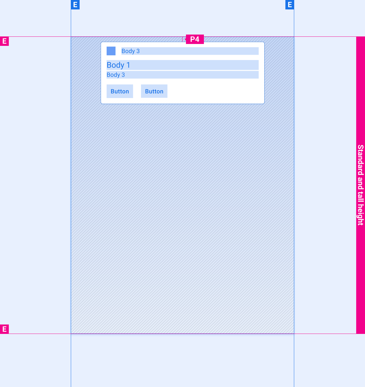
এই রেফারেন্স লেআউটগুলি বিভিন্ন প্রস্থ এবং উচ্চতার স্ক্রীনগুলিকে মিটমাট করার জন্য বিজ্ঞপ্তিগুলিকে কীভাবে মানিয়ে নিতে হয় তা দেখায়। (প্রস্থ এবং উচ্চতা বিভাগগুলি লেআউট বিভাগে সংজ্ঞায়িত করা হয়েছে।) নোট করুন যে কোনও ডাউন-স্যাম্পলিং বা আপ-স্যাম্পলিং হওয়ার আগে সমস্ত পিক্সেল মান রেন্ডার করা পিক্সেলে রয়েছে।
লেআউট
মার্জিন, কীলাইন এবং বিভিন্ন স্ক্রিনের মাপের জন্য প্যাডিং
লেআউট লেবেল
E, M, KL, P, Flex এর সংজ্ঞা
স্ট্যান্ডার্ড-প্রস্থ স্ক্রীন
HUN কার্ড বিজ্ঞপ্তি কেন্দ্র কার্ড গোষ্ঠীবদ্ধ-বিজ্ঞপ্তি কার্ড (সঙ্কুচিত) দলবদ্ধ-বিজ্ঞপ্তি কার্ড (প্রসারিত)
প্রশস্ত পর্দা
HUN কার্ড বিজ্ঞপ্তি কেন্দ্র কার্ড গোষ্ঠীবদ্ধ-বিজ্ঞপ্তি কার্ড (সঙ্কুচিত) দলবদ্ধ-বিজ্ঞপ্তি কার্ড (প্রসারিত)
অতিরিক্ত-প্রশস্ত এবং সুপার-ওয়াইড স্ক্রিন
HUN কার্ড বিজ্ঞপ্তি কেন্দ্র কার্ড গোষ্ঠীবদ্ধ-বিজ্ঞপ্তি কার্ড (সঙ্কুচিত) দলবদ্ধ-বিজ্ঞপ্তি কার্ড (প্রসারিত)
বিভিন্ন উচ্চতার স্ক্রিনে বিজ্ঞপ্তিগুলির উল্লম্ব ব্যবধান
এই বিভাগে উল্লম্ব-স্পেসিং চশমা শুধুমাত্র HUN কার্ডের জন্য। বিজ্ঞপ্তি কেন্দ্রে কার্ডগুলির উল্লম্ব ব্যবধান সম্পর্কে তথ্যের জন্য, বিজ্ঞপ্তি কেন্দ্রের চশমাগুলি দেখুন৷
ছোট পর্দা
HUN কার্ড
লম্বা এবং মান-উচ্চতার পর্দা
HUN কার্ড
শৈলী
টাইপোগ্রাফি নির্দেশিকা
স্কেল এবং গ্রিড রেফারেন্স, টাইপোগ্রাফিক উদাহরণ, এবং আরও অনেক কিছু
রঙ নির্দেশিকা
প্যালেট, উচ্চতা এবং অস্বচ্ছতার মান এবং আরও অনেক কিছু
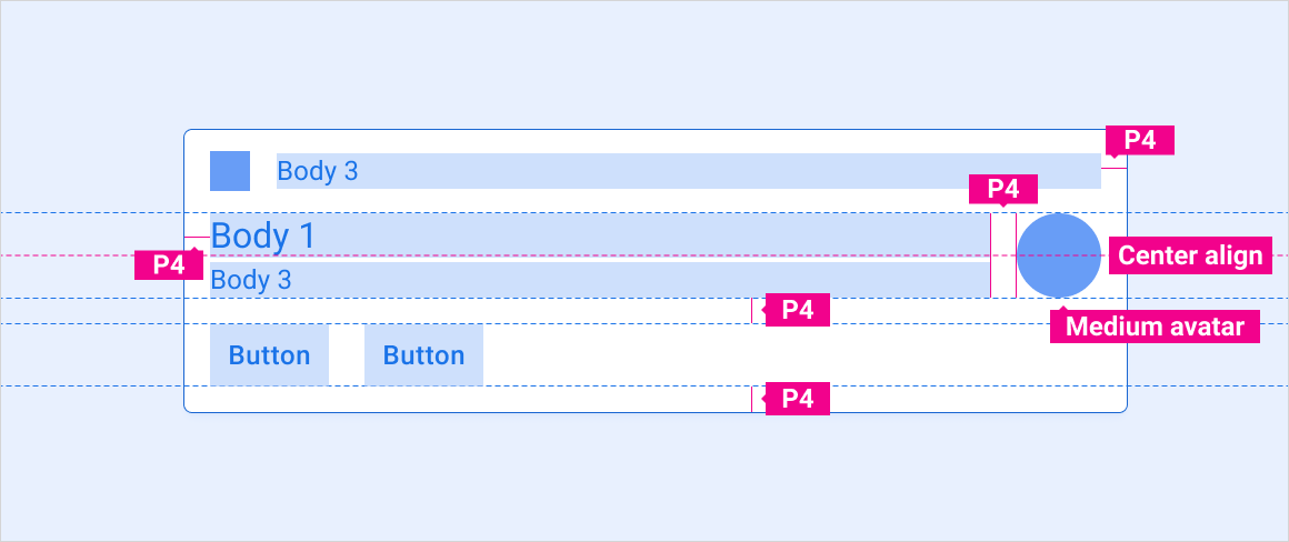
টাইপোগ্রাফি
টাইপ স্টাইল
টাইপফেস
ওজন
আকার (dp)
শরীর ঘ
রোবোটো
নিয়মিত
32
বডি 3 এম
রোবোটো
মধ্যম
24
শরীর 3
রোবোটো
নিয়মিত
24
রঙ
উপাদান
রঙ (দিন মোড)
রঙ (নাইট মোড)
প্রাথমিক প্রকার/আইকন
সাদা
সাদা @ 88%
সেকেন্ডারি টাইপ
সাদা @ 72%
সাদা @ 60%
সেকেন্ডারি আইকন
তৃতীয় পক্ষের উচ্চারণ
বিভাজক হেয়ারলাইন
সাদা 22%
সাদা 12%
কার্ড ব্যাকগ্রাউন্ড
ধূসর 868
ধূসর 900
গ্রেডিয়েন্ট স্ক্রিম
কালো 100% - 0%
কালো 100% - 20%
সাইজিং
উপাদান
আকার (dp)
প্রাথমিক আইকন
44
সেকেন্ডারি আইকন
36
মাঝারি অবতার
76
গোলাকার কোণার ব্যাসার্ধ (R2)
8
উদাহরণ
HUN কার্ড: কল, বার্তা, গাড়ী সতর্কতা, এবং নেভিগেশন বিজ্ঞপ্তি কেন্দ্র কার্ড: কল, বার্তা, এবং গাড়ী সতর্কতা
গোষ্ঠীবদ্ধ-বিজ্ঞপ্তি কার্ড: বার্তা, প্রসারিত এবং সঙ্কুচিত - দিন গোষ্ঠীবদ্ধ-বিজ্ঞপ্তি কার্ড: বার্তা, প্রসারিত এবং সঙ্কুচিত - রাত
গতি
নিম্নলিখিত গতিগুলি বিজ্ঞপ্তি অভিজ্ঞতার একটি গুরুত্বপূর্ণ অংশ:
HUN আগমন গতি
একটি বিজ্ঞপ্তি খারিজ করার জন্য সোয়াইপ গতি
গোষ্ঠীবদ্ধ-বিজ্ঞপ্তি প্রসারিত এবং সঙ্কুচিত গতি
HUN এর আগমন
HUN-এর গতি স্ক্রিনের উপরে থেকে নিচের দিকে সরে যাওয়া ব্যবহারকারীদের তার আগমন লক্ষ্য করতে সাহায্য করে - এবং এটি যদি বিজ্ঞপ্তি কেন্দ্রটি পুল-ডাউন শেড হিসাবে প্রয়োগ করা হয় তবে নিচের দিকে সোয়াইপের মাধ্যমে বিজ্ঞপ্তিগুলি অ্যাক্সেস করার বিষয়ে একটি ইঙ্গিতও প্রদান করে।
সোয়াইপ-টু-খারিজ
টেনে আনার গতি যখন একজন ব্যবহারকারী একটি বিজ্ঞপ্তির পাশে সোয়াইপ করে সেটিকে বরখাস্ত করা হচ্ছে এমন ভিজ্যুয়াল নিশ্চিতকরণ প্রদান করে, তারপর পরবর্তী বিজ্ঞপ্তির ঊর্ধ্বগামী গতি তালিকার গর্তটি পূরণ করে
গোষ্ঠীবদ্ধ-বিজ্ঞপ্তি প্রসারিত এবং সঙ্কুচিত
একটি গোষ্ঠীবদ্ধ-বিজ্ঞপ্তি কার্ড নিচের দিকে প্রসারিত হলে তা ভেঙে পড়া থেকে প্রসারিত অবস্থায় একটি মসৃণ রূপান্তর প্রদান করে
[null,null,["2025-07-24 UTC-তে শেষবার আপডেট করা হয়েছে।"],[[["\u003cp\u003eNotification cards in Android Automotive OS are designed to minimize driver distraction and come in three versions: Heads-up, Notification Center, and Grouped-notification.\u003c/p\u003e\n"],["\u003cp\u003eThese cards are flexible components with elements like headers, content, actions, and icons, and their layout adapts to different screen sizes for optimal viewing.\u003c/p\u003e\n"],["\u003cp\u003eStyling includes specific typography, color palettes, and sizing for elements like icons and avatars to maintain consistency and readability.\u003c/p\u003e\n"],["\u003cp\u003eMotion design is incorporated for Heads-up arrival, swipe-to-dismiss, and grouped-notification expand/collapse for intuitive user interaction.\u003c/p\u003e\n"],["\u003cp\u003eExamples are provided for various notification types like calls, messages, car warnings, and navigation across different card versions and display modes.\u003c/p\u003e\n"]]],[],null,["# Notification card\n\n\u003cbr /\u003e\n\nNotification cards communicate small amounts of timely information from the system or from an app.\n\nThe design of these cards for Android Automotive OS is intended to minimize distraction for drivers. The cards come in three basic versions:\n\n- **Heads-up notification (HUN) card:** Used for a notification that appears briefly over the current screen\n- **Notification Center card:** Used for notifications listed in the Notification Center\n- **Grouped-notification card:** Combines multiple Notification Center cards in one card\n\nWithin these versions, designs can also vary slightly depending on the category of the message. For example, call notifications have different buttons and icons than navigation notifications. \n[Notification Center specs\nSpecs, style guidelines, and more](/cars/design/gas-customization/specs/notification-center-spec)\n\n*** ** * ** ***\n\nAnatomy\n-------\n\nThe notification card is a flexible component that can include a variety of elements. It has three main versions:\n\n- **HUN card:** This version is wider than the Notification Center card and appears on top of the current screen until dismissed\n- **Notification Center card:** This version is narrower than the HUN card and appears with other such cards in the Notification Center, in a vertical list\n- **Grouped-notification card:** This version of the Notification Center card combines multiple related notifications in one card, with controls for expanding to show the individual notifications\n\nVariants of these versions by message type are shown in [Styles](#styles).\nShown here are HUN and Notification Center versions of the same notification card, featuring the following elements: \n1. Header \n2. Content (with and without optional message preview, which can be hidden when the car is driving) \n3. Actions \n4. Large icon Shown here is a grouped-notification card in both its collapsed and expanded versions, featuring the following elements: \n1. Header \n2. Content \n3. Expand/collapse action \n4. Expand/collapse indicator\n\n*** ** * ** ***\n\nSpecs -- HUN card\n-----------------\n\n[Layout labels\nDefinitions of E, M, KL, P, Flex](/cars/design/intro-terms#layout_labels)\n\n### Standard HUN\n\n### HUN with avatar\n\n### Message HUN with preview\n\n### Message HUN with multiple messages\n\n### Large-image HUN\n\n*** ** * ** ***\n\nSpecs -- Notification Center card\n---------------------------------\n\n[Layout labels\nDefinitions of E, M, KL, P, Flex](/cars/design/intro-terms#layout_labels)\n\n### Standard notification\n\n### Message notification with preview\n\n### Message notification with multiple messages\n\n### Single action notification\n\n*** ** * ** ***\n\nSpecs -- Grouped-notification card\n----------------------------------\n\n[Layout labels\nDefinitions of E, M, KL, P, Flex](/cars/design/intro-terms#layout_labels)\n\n### Grouped notification -- Collapsed\n\n### Grouped notification -- Expanded\n\n*** ** * ** ***\n\nScaling layouts\n---------------\n\nThese reference layouts show how to adapt notifications to accommodate screens of various widths and heights. (Width and height categories are defined in the [Layout](/cars/design/automotive-os/design-system/layout) section.) Note that all pixel values are in rendered pixels, before any down-sampling or up-sampling occurs. \n[Layout\nMargins, keylines, and padding for various screen sizes](/cars/design/automotive-os/design-system/layout) \n[Layout labels\nDefinitions of E, M, KL, P, Flex](/cars/design/intro-terms#layout_labels)\n\n### Standard-width screens\n\nHUN card Notification Center card Grouped-notification card (collapsed) Grouped-notification card (expanded)\n\n### Wide screens\n\nHUN card Notification Center card Grouped-notification card (collapsed) Grouped-notification card (expanded)\n\n### Extra-wide and super-wide screens\n\nHUN card Notification Center card Grouped-notification card (collapsed) Grouped-notification card (expanded)\n\n### Vertical spacing of notifications on screens of various heights\n\nThe vertical-spacing specs in this section are for HUN cards only. For information about vertical spacing of cards in the Notification Center, see the [Notification Center specs](/cars/design/gas-customization/specs/notification-center-spec).\n\n#### Short screens\n\nHUN card\n\n#### Tall and standard-height screens\n\nHUN card\n\n*** ** * ** ***\n\nStyles\n------\n\n[Typography guidelines\nScale and grid references, typographic examples, and more](/cars/design/automotive-os/design-system/typography) \n[Color guidelines\nPalettes, elevation and opacity values, and more](/cars/design/automotive-os/design-system/color)\n\n### Typography\n\n| Type style | Typeface | Weight | Size (dp) |\n|------------|----------|---------|-----------|\n| Body 1 | Roboto | Regular | 32 |\n| Body 3 M | Roboto | Medium | 24 |\n| Body 3 | Roboto | Regular | 24 |\n\n### Color\n\n| Element | Color(day mode) | Color (night mode) |\n|----------------------|------------------|--------------------|\n| Primary type / icons | White | White @ 88% |\n| Secondary type | White @ 72% | White @ 60% |\n| Secondary icon | 3rd-party accent | 3rd-party accent |\n| Divider hairline | White 22% | White 12% |\n| Card background | Grey 868 | Grey 900 |\n| Gradient Scrim | Black 100% - 0% | Black 100% - 20% |\n\n### Sizing\n\n| Element | Size (dp) |\n|----------------------------|-----------|\n| Primary icon | 44 |\n| Secondary icon | 36 |\n| Medium avatar | 76 |\n| Rounded corner radius (R2) | 8 |\n\n*** ** * ** ***\n\nExamples\n--------\n\nHUN cards: Call, Message, Car warning, and Navigation Notification Center cards: Call, Message, and Car warning \nGrouped-notification cards: Messages, expanded and collapsed - day Grouped-notification cards: Messages, expanded and collapsed - night\n\n*** ** * ** ***\n\nMotion\n------\n\nThe following motions are an important part of the notification experience:\n\n- HUN arrival motion\n- Swipe motion for dismissing a notification\n- Grouped-notification expand and collapse motions\n\n### HUN arrival\n\nThe motion of a HUN sliding down from the top of the screen helps users notice its arrival -- and it also provides a hint about accessing notifications via downward swipe if the Notification Center is implemented as a pull-down shade\n\n### Swipe-to-dismiss\n\nThe dragging motion when a user swipes sideways on a notification provides visual confirmation that it is being dismissed, then the upward motion of the next notification fills in the hole in the list\n\n### Grouped-notification expand and collapse\n\nHaving a grouped-notification card stretch downward provides a smooth transition from the collapsed to the expanded state"]]