Page Summary
-
Components are fundamental building blocks for the visual design of the Android Automotive OS interface.
-
AAOS components can be implemented in the car UI library, be standard AOSP components, or require building from scratch.
-
This section provides details on the anatomy, visual specifications, and styles for various AAOS components.
-
The content describes a range of components such as app bars, buttons, dialogs, lists, and indicators.
Components are the building blocks for the visual design of the Android Automotive OS (AAOS) interface. Some AAOS components and their customizable properties are implemented in the car UI library, while others are standard AOSP components, or need to be built from scratch following the specs provided here.
This section describes the anatomy, visual specs, and styles for AAOS components.
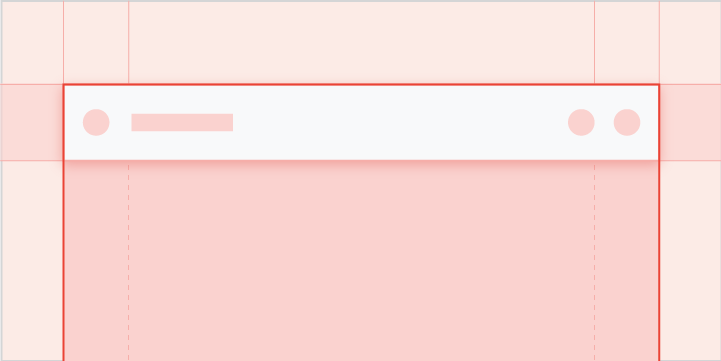
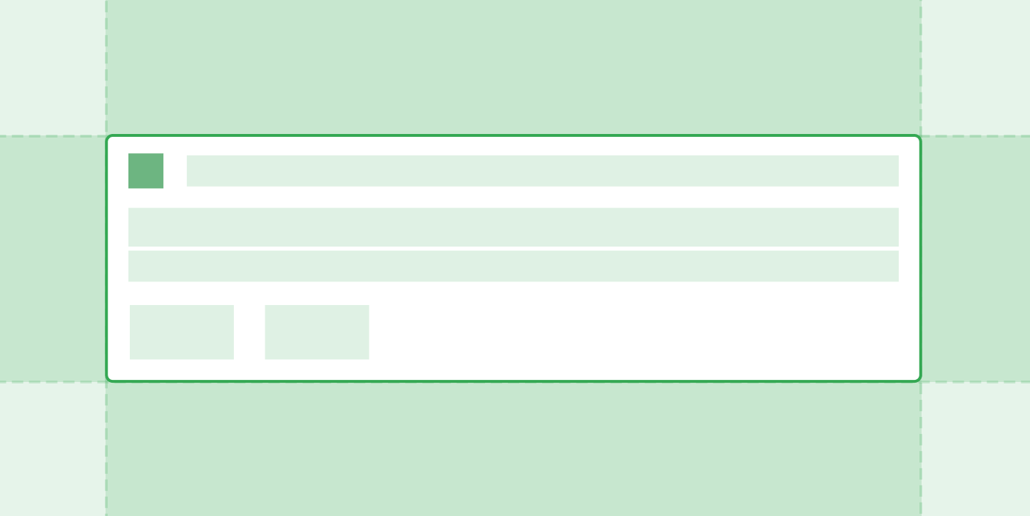
App bar & header
A dedicated space for important app-related functions
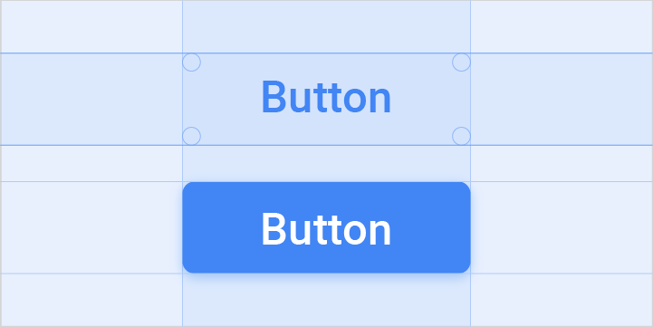
Buttons
Action affordances that communicate their purpose to the user
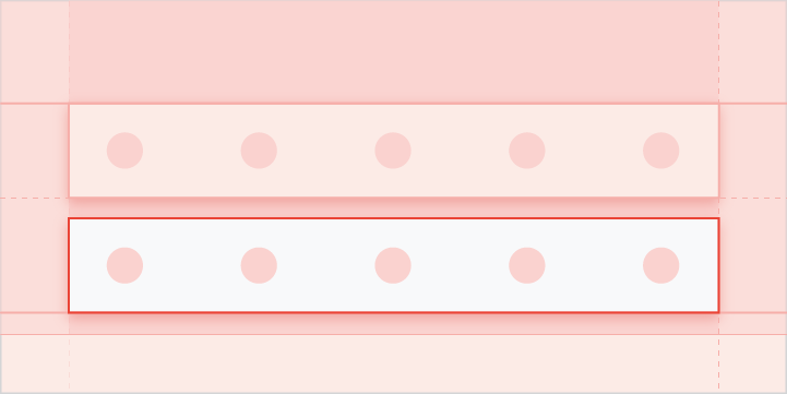
Control bar
An expandable set of controls associated with a particular view
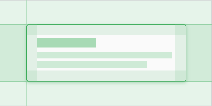
Dialogs
Cards featuring messages to users about timely or urgent information, sometimes with action options for responding

Grids
Scrollable arrays of images representing content items, with brief text beneath each image
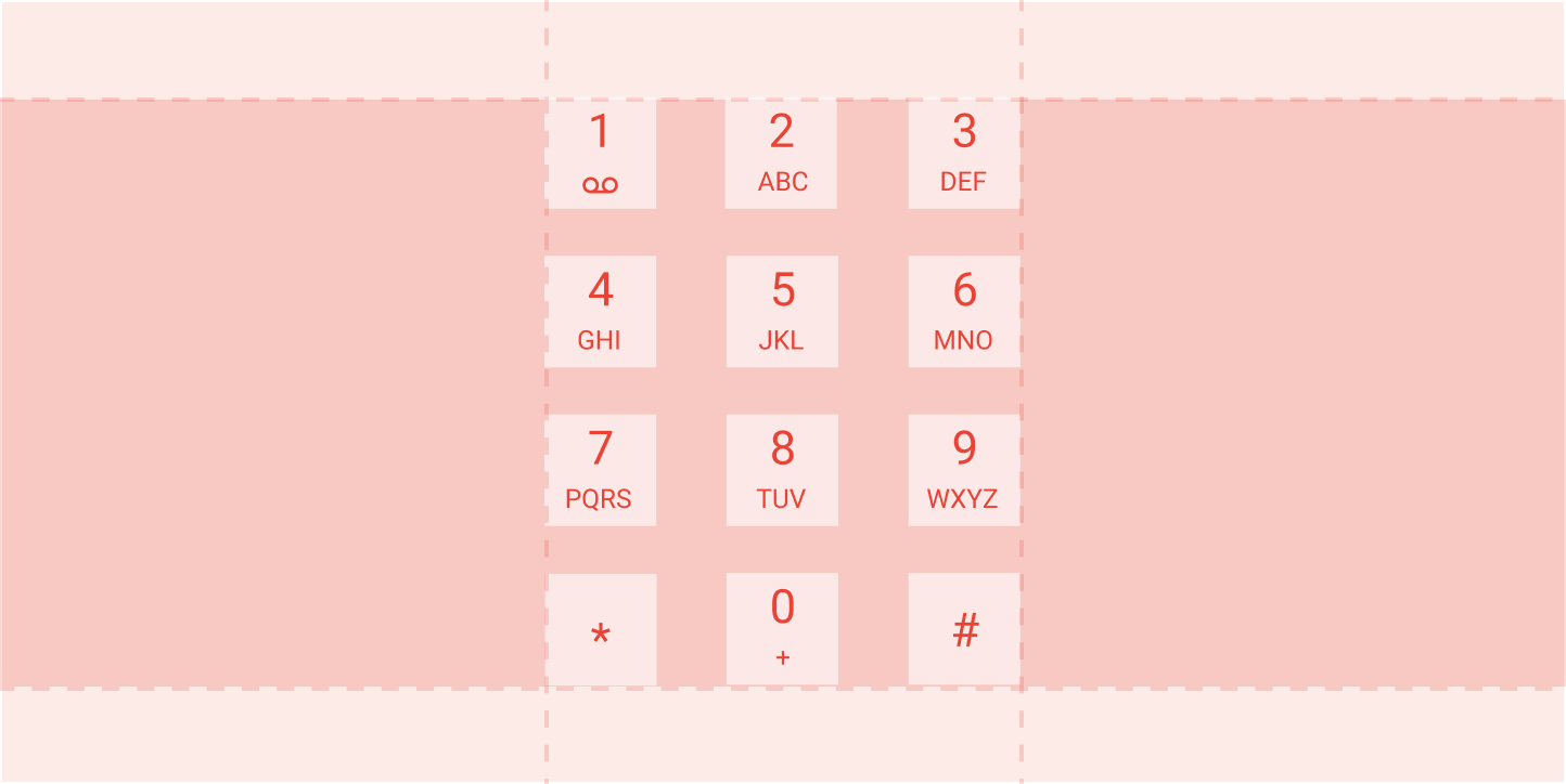
Keypad
Allows users to enter phone numbers in Dialer
List items
Content displayed as lines of text (with optional small images or icons) in a single, scrollable column
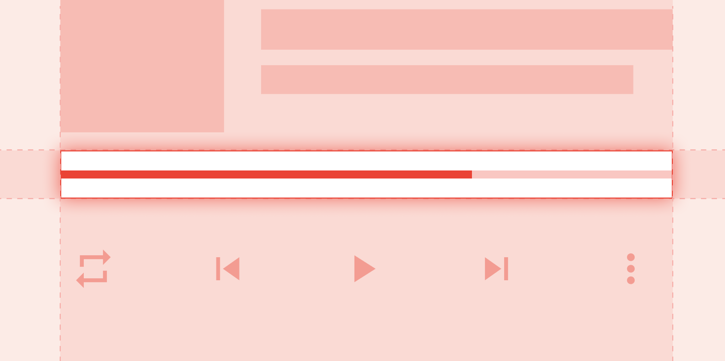
Media progress indicator
A visual representation of the duration and elapsed playing time for a media source in a media app
Minimized control bar
A smaller version of the control bar available across multiple views, with minimal controls and metadata
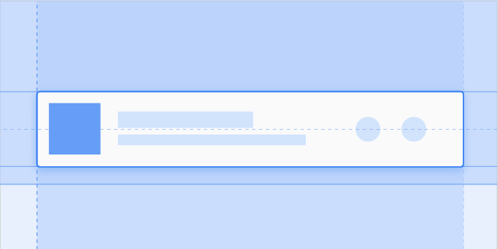
Notification card
Communicate small amounts of timely information from the system or from an app
Subheader
A list tile that identifies a section of content in a grid or list view
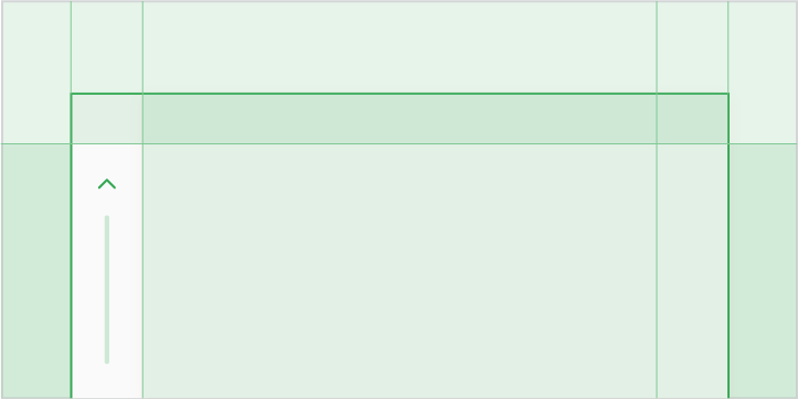
Scrollbar
A position indicator and navigational aid for situations where the document is larger than the window in which it's displayed
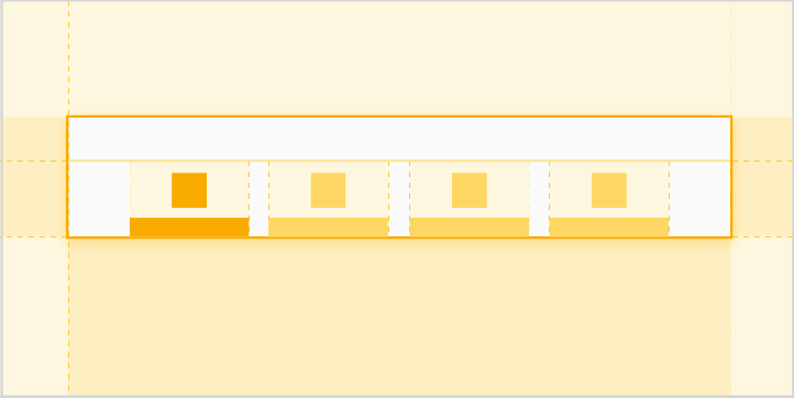
Tabs
Buttons that always occur in groups and are dependent on each other’s state
Toasts
Informational messages briefly displayed near the bottom of the screen about an action an app has taken or will take