滚动条用于指示用户在文档中所处位置大于查看空间。这些控件可让用户通过向上或向下移动窗口查看区域导航到文档的其余部分。
用户使用触摸、旋转轮或触控板与滚动条互动。点按滚动条中的箭头会按“页数”移动内容,也就是与屏幕高度等同的增量。不过,如果用户通过快速滑动来滚动(具体取决于触摸屏的灵敏度),快速滑动就可能产生惯性动量,滚动幅度会远远超过 1 页。无论滚动是如何启动的,滚动运动都应始终与项目对应。
解剖学
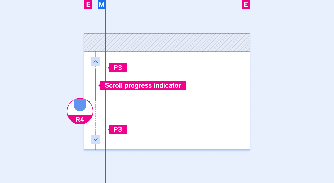
滚动条由向上滚动和向下滚动功能以及滚动进度指示器组成。V 形在滚动功能中用来指示滚动方向。滚动进度指示器是一个可选元素,用于指示可见内容和滚动位置相对于页面上内容总量的比例。
注意:滚动进度指示器未设计为可拖动。
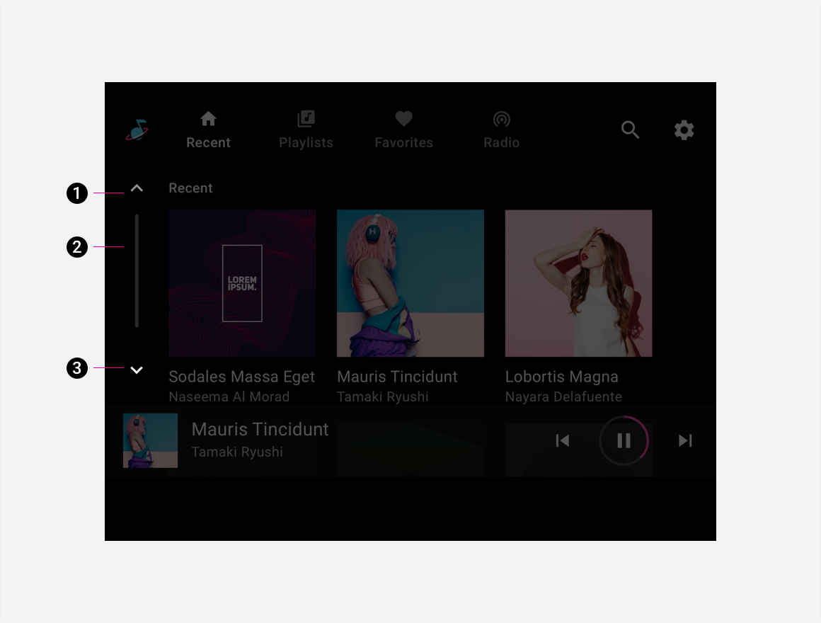
2. 滚动进度指示器
3. 向下滚动功能
规格

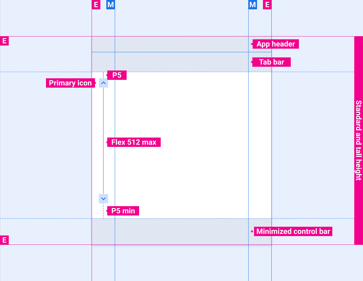
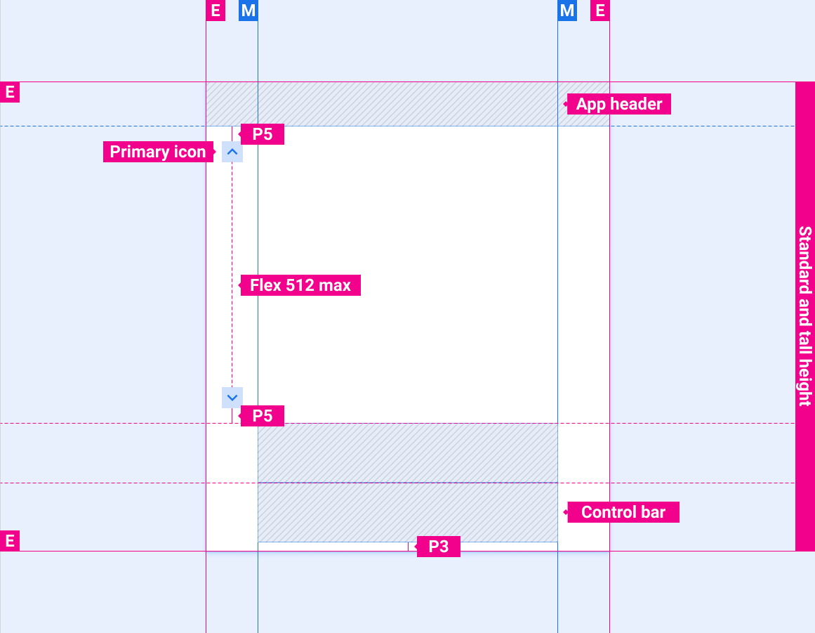
滚动条位置,包含堆叠的主要导航栏和最小化的控件栏
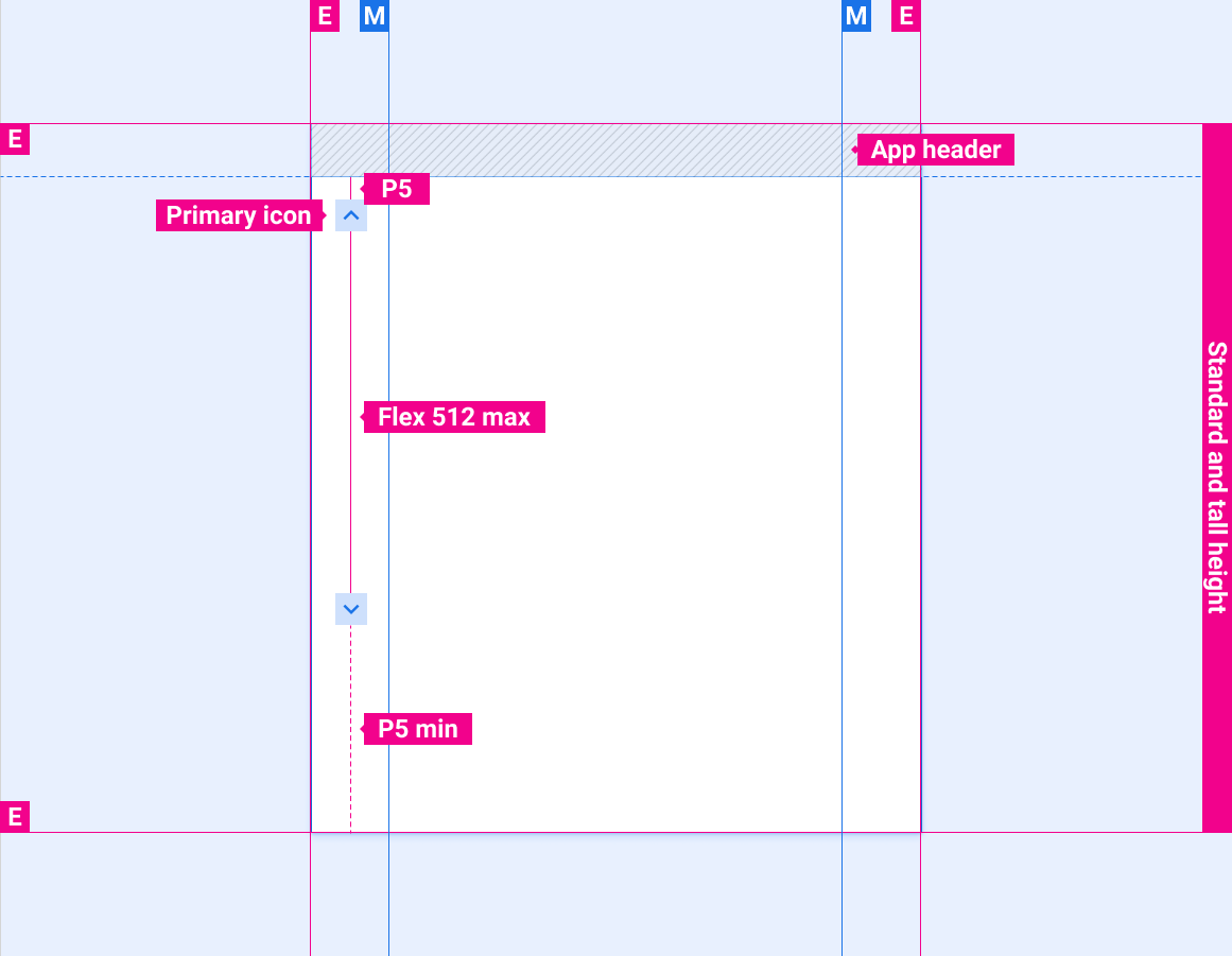
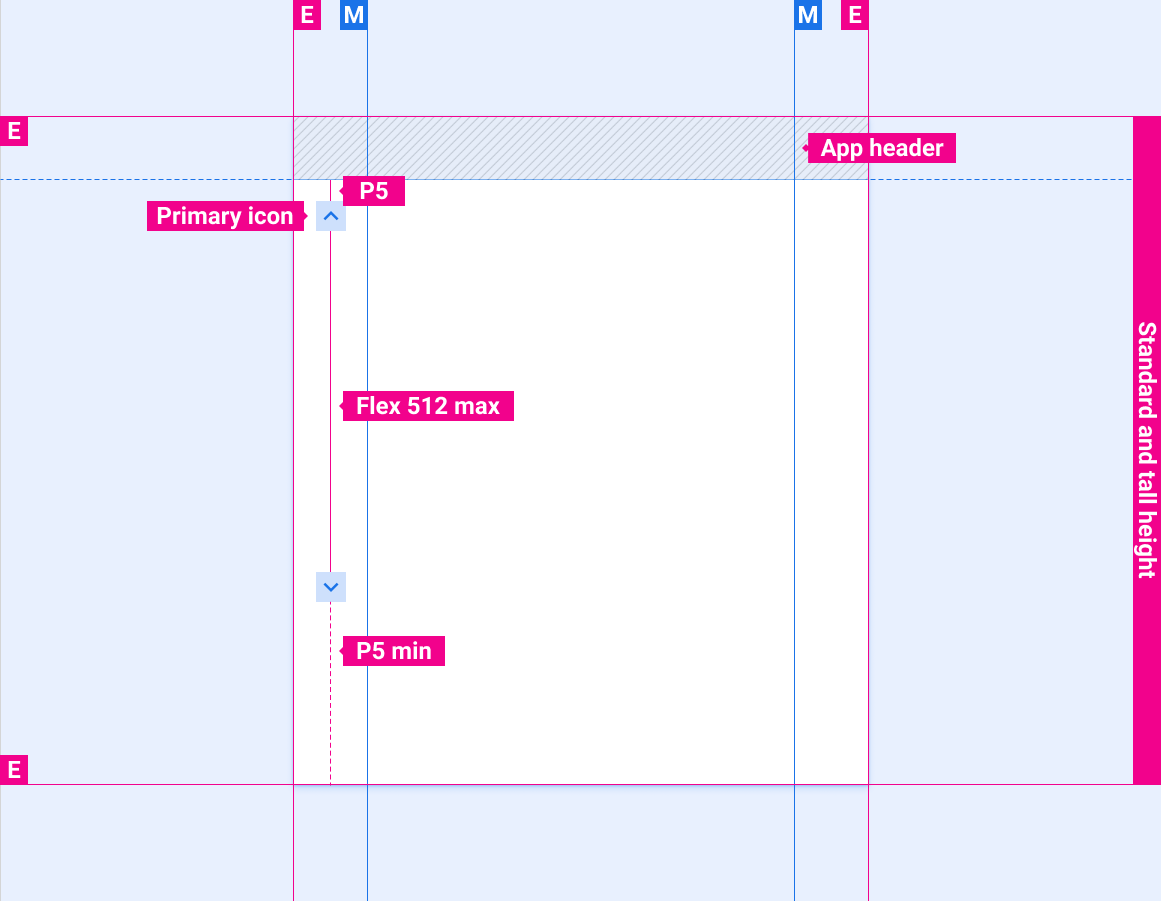
仅含应用标题的滚动条位置
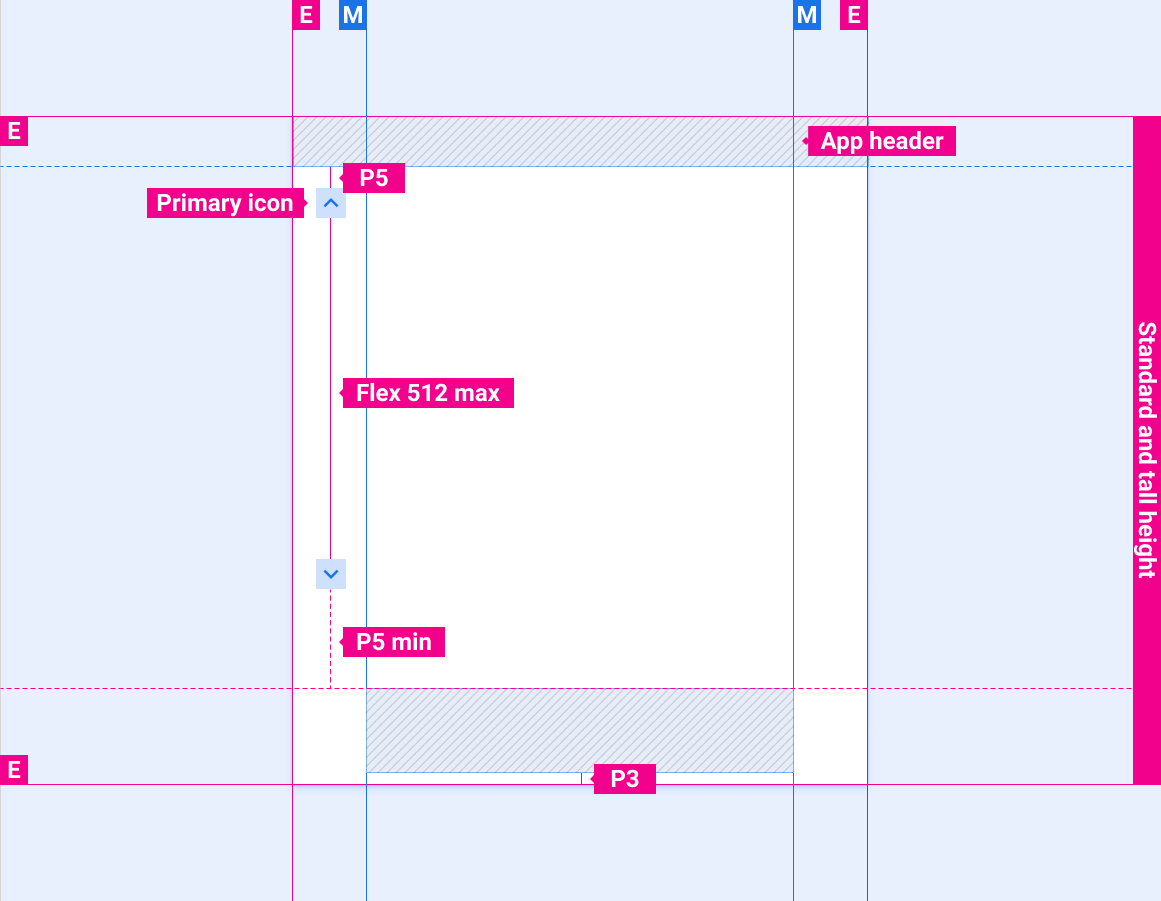
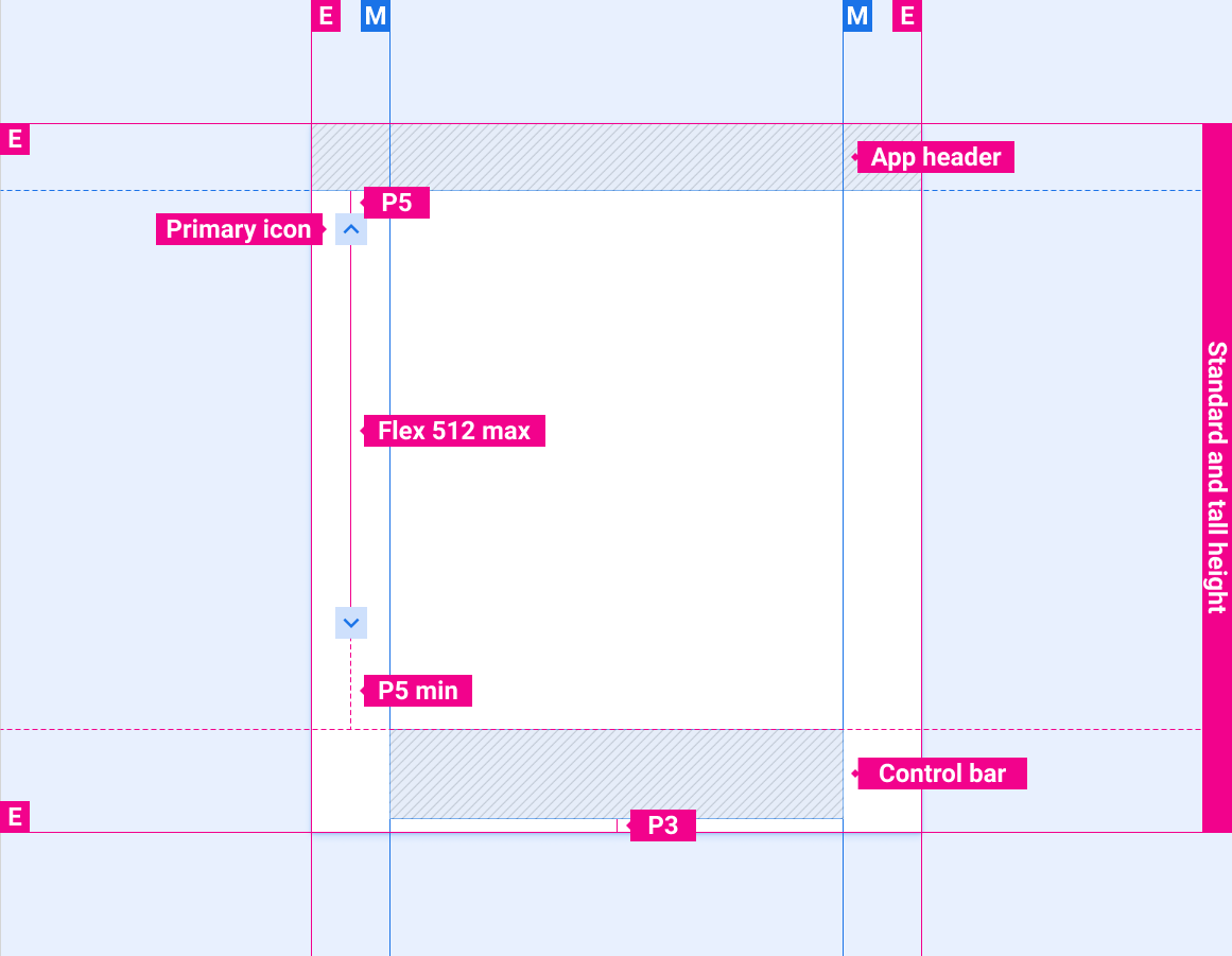
包含应用标题和控制栏的滚动条位置
包含应用标题和展开控制栏的滚动条位置
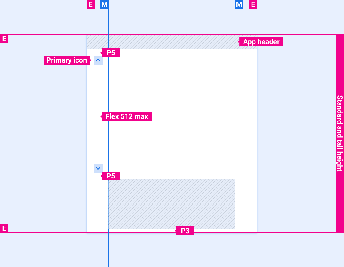
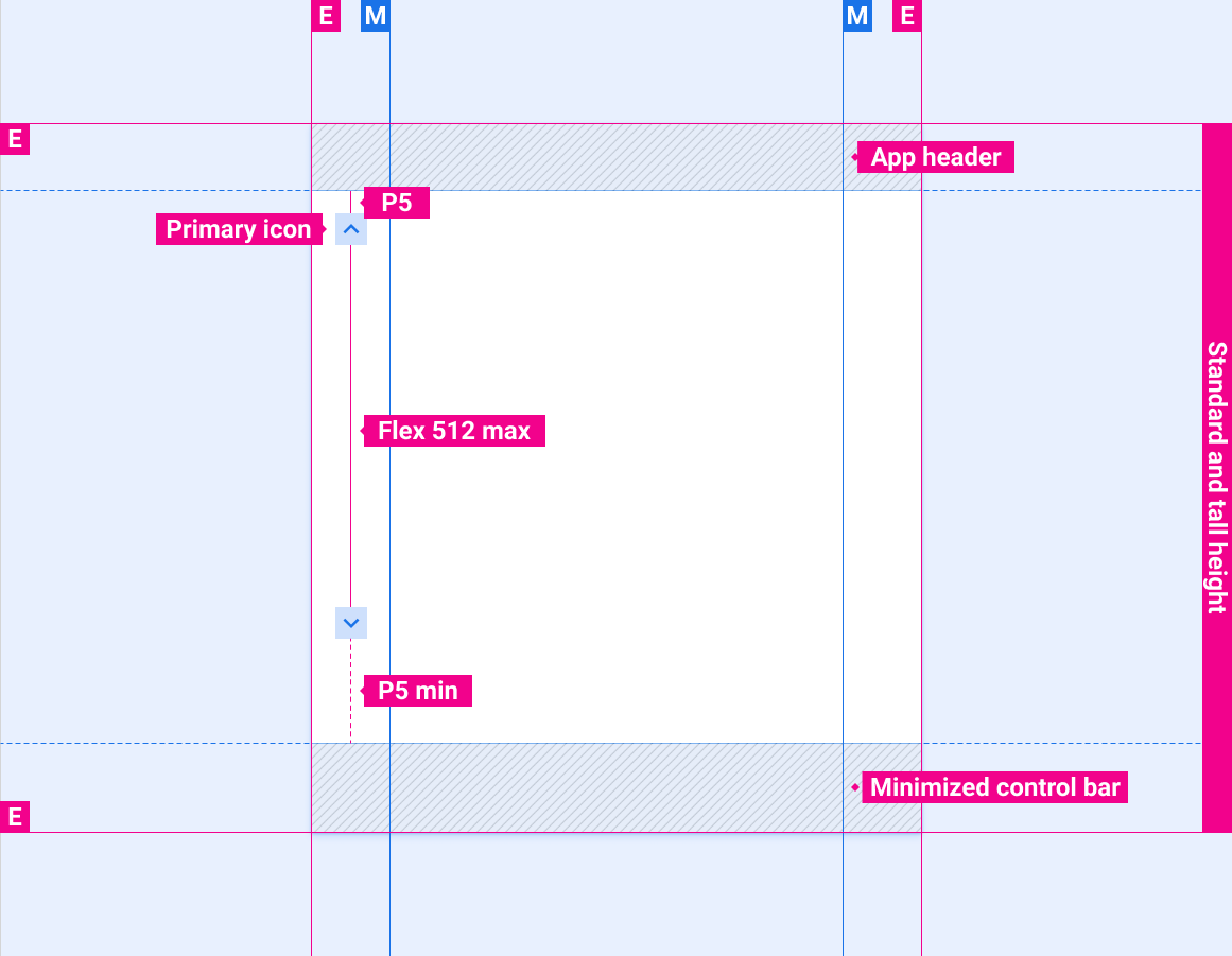
带有应用栏/标题和最小化控件栏的滚动条位置
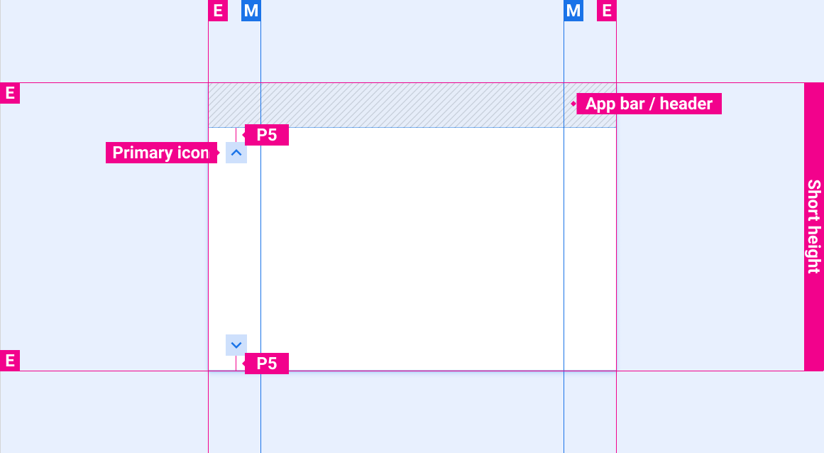
仅含应用栏/标题的滚动条位置
包含应用标题和控制栏的滚动条位置
包含应用标题和展开控制栏的滚动条位置
滚动条在屏幕高度上的位置较短
可选的滚动进度指示器
风格
颜色
| 元素 | 颜色(日间模式) | 颜色(夜间模式) |
|---|---|---|
| 主图标 - 活动状态 | White | 白色 @ 88% |
| 主图标 - 非活动状态 | 白色 @ 56% | 白色 @ 50% |
| 滚动进度指示器 | 白色 @ 16% | 白色 @ 12% |
大小
| 元素 | 尺寸 (dp) |
|---|---|
| 主图标 | 44 |
| 触摸目标 | 76 |
| 滚动进度指示器宽度 | 6 |
| 圆角半径 (R4) | 完整 |
示例