AI-generated Key Takeaways
-
Subheaders identify sections of content in lists or grids, often for filtered or sorted subsections.
-
When content below a subheader is scrolled, the subheader stays pinned until the next subheader pushes it off-screen.
-
Subheaders are composed of a background and a text label.
-
Specifications are provided for subheaders in both grid and list views, including layout labels.
-
Style details include typography, color, and sizing for the subheader element.
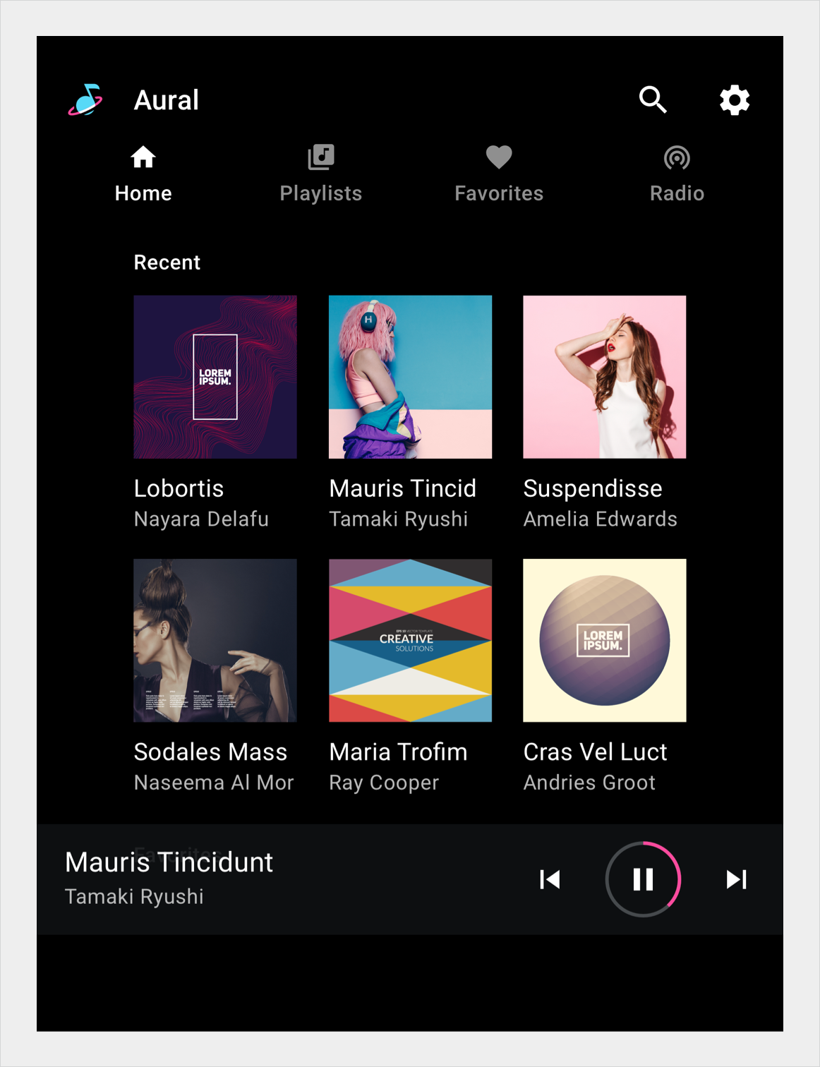
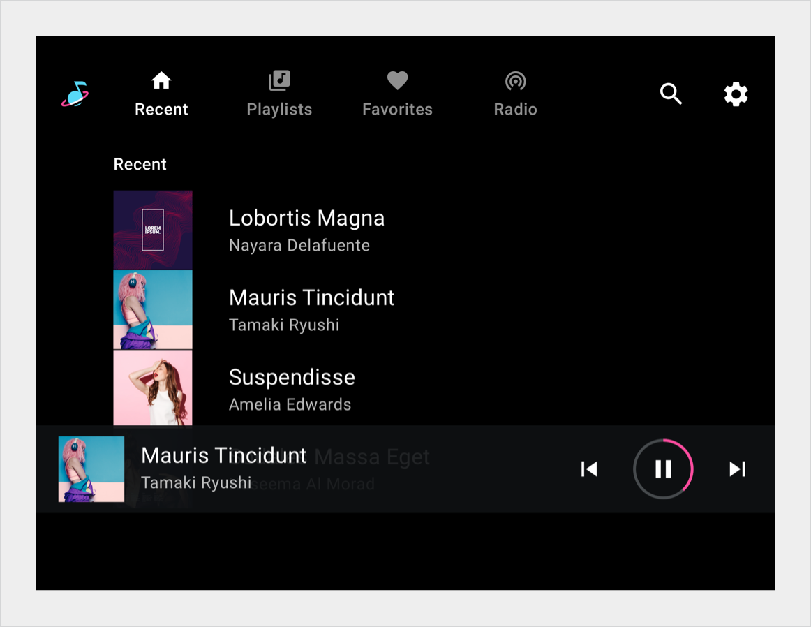
Subheaders are list tiles that identify sections of content in a list or grid view. They are typically used for subsections of content produced by a filter or sort.
When content below a subheader is scrolled, the subheader remains pinned to the top of the screen until it is pushed off the screen by the next subheader.
Anatomy
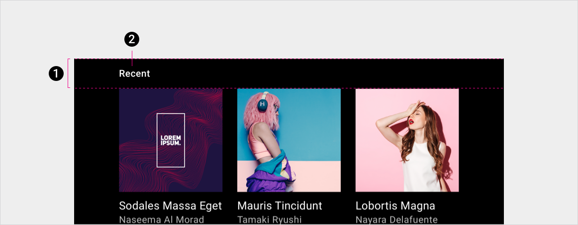
2. Text label
Specs

Subheader in grid
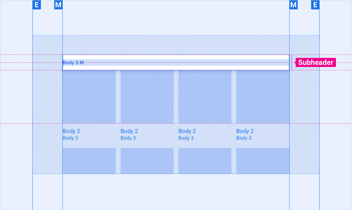
Subheader in list

Styles
Typography
| Type style | Typeface | Weight | Size (dp) |
|---|---|---|---|
| Body 3 M | Roboto | Medium | 24 |
Color
| Element | Color(day mode) | Color (night mode) |
|---|---|---|
| Primary type | White | White @ 88% |
| Subheader background | Black | Black |
Sizing
| Element | Size (dp) |
|---|---|
| Subheader height | 76 |
Examples