Stay organized with collections
Save and categorize content based on your preferences.
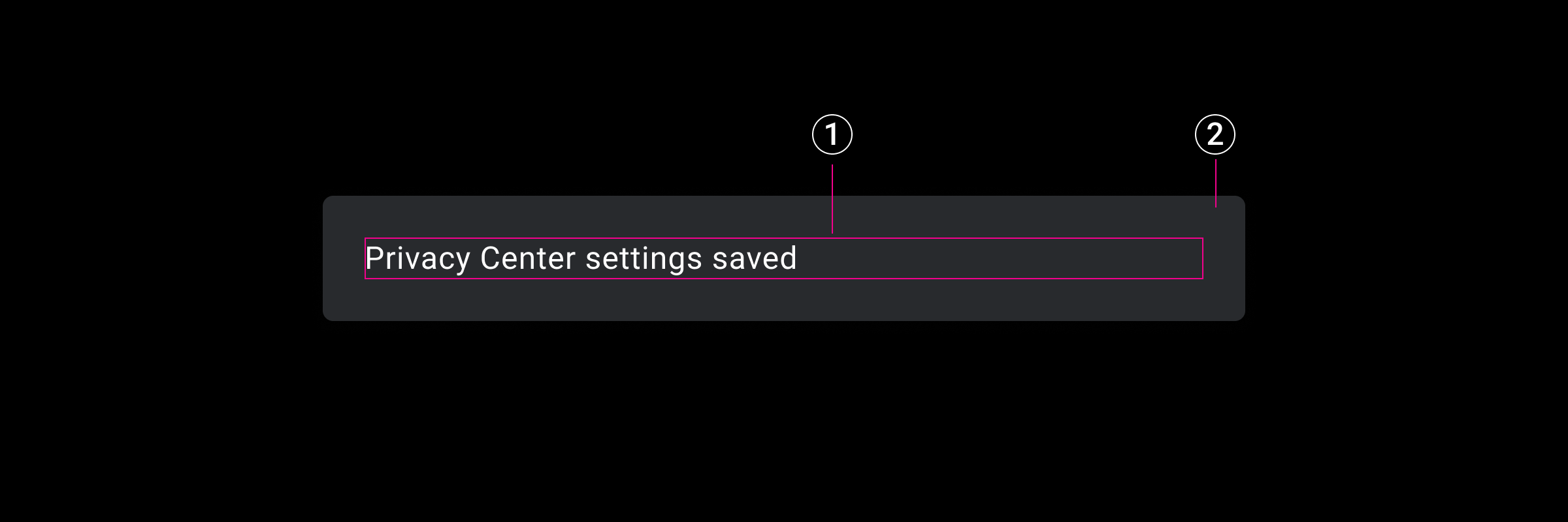
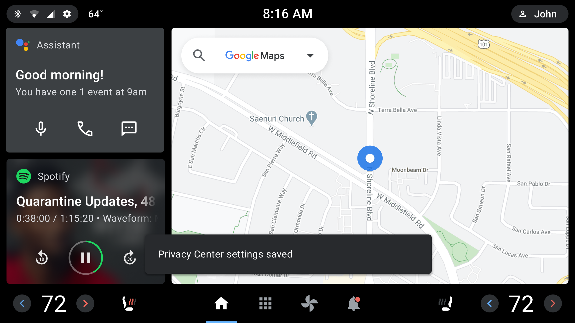
A toast is a short, informational message that an app displays briefly near the bottom of the screen.
Only one toast can be displayed at a time. The toast tells a user about an action the app has taken or will take. It does not require any user action or response. After 8 seconds, the toast disappears automatically.
Toasts are related to dialogs (and are in the Dialog family of components), but they differ in purpose and priority, as shown below.
Component
Purpose
Priority
Toast
Displays an informative message. Doesn’t require user interaction. Disappears after 8 seconds.
[null,null,["Last updated 2024-07-23 UTC."],[[["\u003cp\u003eToasts are short, informational messages displayed briefly at the bottom of the screen, informing users about an app's actions without requiring interaction.\u003c/p\u003e\n"],["\u003cp\u003eToasts automatically disappear after 8 seconds and have lower priority than dialogs which require user interaction.\u003c/p\u003e\n"],["\u003cp\u003eToasts consist of a background and a text message area, and their appearance (fonts, dimensions, placement) can be customized by OEMs.\u003c/p\u003e\n"],["\u003cp\u003eOEMs can customize toasts using runtime overlays, following guidance from the design system for layout, typography, and sizing.\u003c/p\u003e\n"]]],[],null,["# Toasts\n\n\u003cbr /\u003e\n\nA toast is a short, informational message that an app displays briefly near the bottom of the screen.\n\nOnly one toast can be displayed at a time. The toast tells a user about an action the app has taken or will take. It does not require any user action or response. After 8 seconds, the toast disappears automatically.\n\nToasts are related to dialogs (and are in the Dialog family of components), but they differ in purpose and priority, as shown below.\n\n|---------------------------------------------------------|--------------------------------------------------------------------------------------------------------------------|--------------|\n| **Component** | **Purpose** | **Priority** |\n| Toast | Displays an informative message. Doesn't require user interaction. Disappears after 8 seconds. | Low |\n| [Dialog](/cars/design/automotive-os/components/dialogs) | Displays information and task options that require user interaction. A dialog retains focus until a user responds. | High |\n\n| **Note:** Toasts are based on the Toast component in the Car UI Library. To use the Toast component, you must [add the Car UI Library as a dependency](https://source.android.com/devices/automotive/hmi/car_ui/integrate) to your app.\n\nAnatomy\n-------\n\nA toast appears briefly in front of other screen content. It consists of a background and a text message.\n1. Toast background \n2. Toast message area \n\nSpecs\n-----\n\n### Toast -- padding around message text\n\n### Toast -- bottom placement on screen\n\nCustomization\n-------------\n\nOEMs can modify the appearance of toasts to reflect their brand by:\n\n- Providing custom fonts\n- Changing toast dimensions and placement\n\n| **Note:** To customize toasts, OEMs must use runtime overlays, explained in the [Car UI Library Integration Guide](https://source.android.com/devices/automotive/hmi/car_ui).\n\n[Design system](/cars/design/automotive-os/design-system/overview) provides guidance for customizing components using layout, typography, and sizing.\n\nExamples\n--------\n\n### Toast message format\n\n### Toast placement (near bottom of the screen)"]]