AI-generated Key Takeaways
-
Avoid using unnecessary motion that can distract drivers.
-
Use motion to help users understand and become more skilled with the interface.
-
Design a motion language that can adapt to different screen sizes, shapes, and user inputs.
-
Follow recommended motion patterns for specific situations like switching views or expanding actions.
Motion is a powerful tool that should be used sparingly in the driving context. It is appropriate only when it can help inform drivers without distracting their attention from the road.
Guidance at a glance (TL;DR):
- Avoid distracting users with unnecessary motion
- Use motion to increase users’ understanding and build their proficiency
- Make your motion language flexible enough for all relevant hardware
- Use the recommended motion pattern for your situation
Motion principles
When designing motion for Android for Cars interfaces, keep three basic principles in mind: be safe, be informative, and be flexible.
Safe
Driving is the user's primary task – everything else is secondary. Treat the user’s attention as a limited resource, and avoid using motion to create unnecessary distractions.

Informative
Use motion to convey information that helps users. For example, motion can increase users' understanding of the product by demonstrating hierarchical and spatial relationships between elements. Motion can also help to build users' proficiency with the interface by indicating available interactions.

Flexible
Define a motion language that is scalable and flexible enough to adjust to screens of all sizes and shapes, as well as to all types of user input.

Motion patterns
To support a consistent user experience across all apps, Android Automotive provides recommendations for specific motion patterns to use in the following situations:
- Switching between same-level views
- Moving to a detail view
- Extending an existing action
- Minimizing and expanding an action
- Disrupting an action
All of the motion patterns in this section are based on standard easing, as discussed in the Material Design Easing guidelines. That is, the motions speed up quickly and slow down more gradually, to draw focus to the end of the transition.
Switching between same-level views
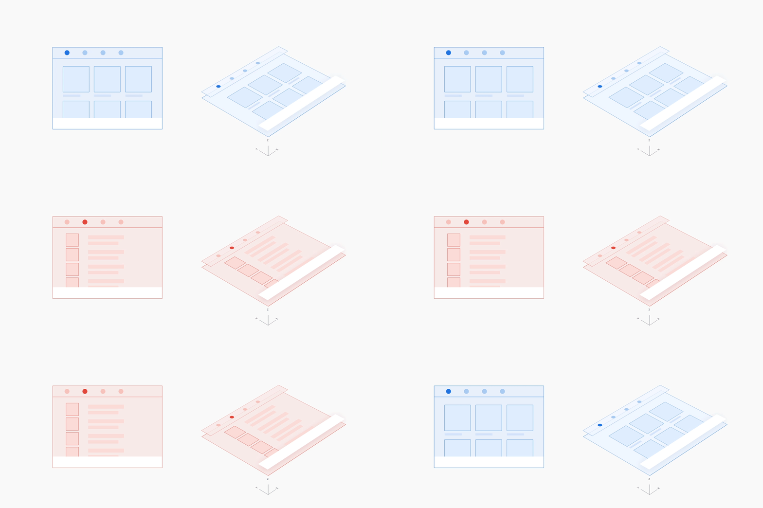
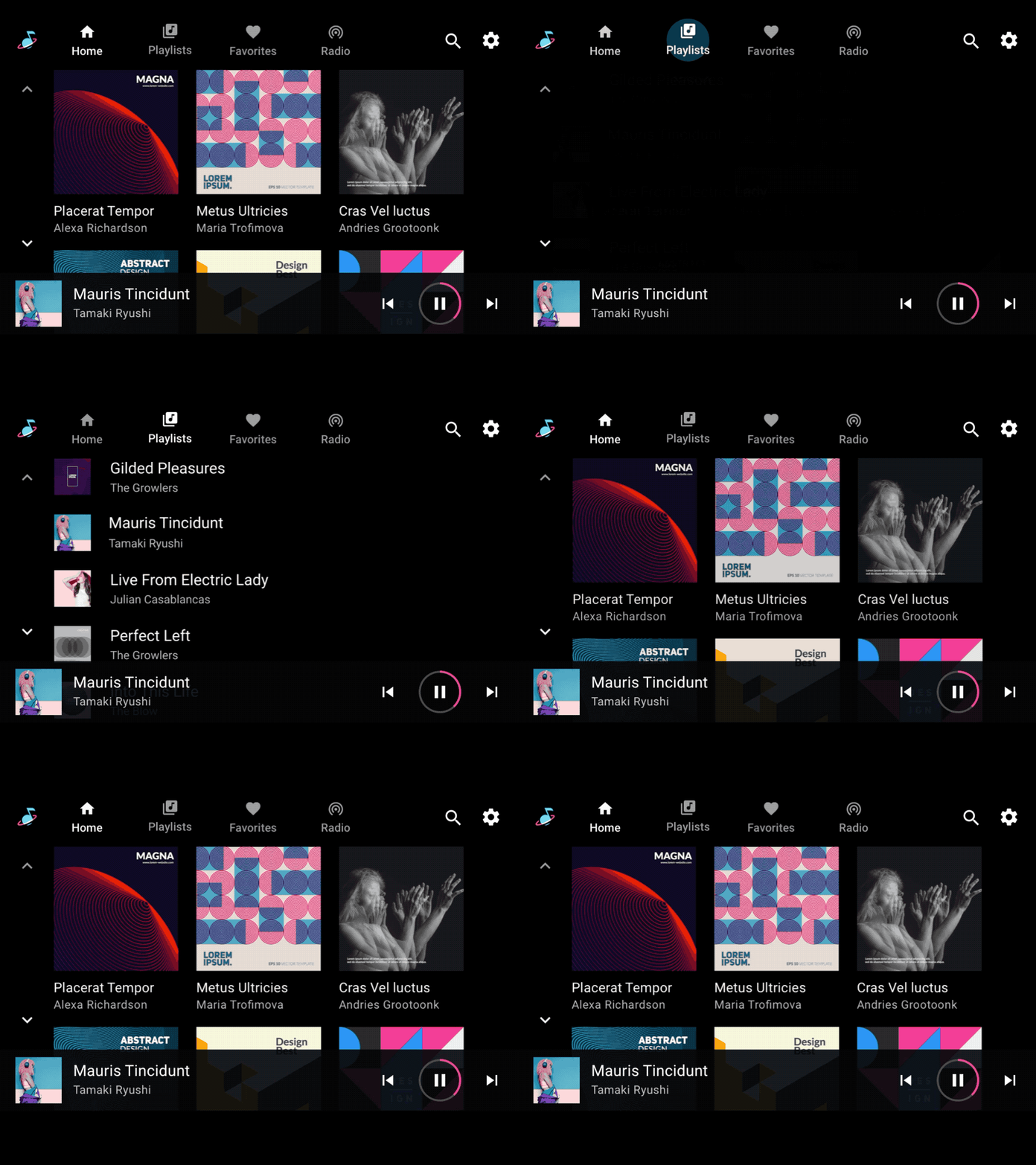
When switching between views at the same level of hierarchy in an app, such as tabs in the app bar or songs in a playlist, use a side-to-side motion. The horizontal movement reinforces the idea of staying at the same level within the app.
Example
Moving to a detail view
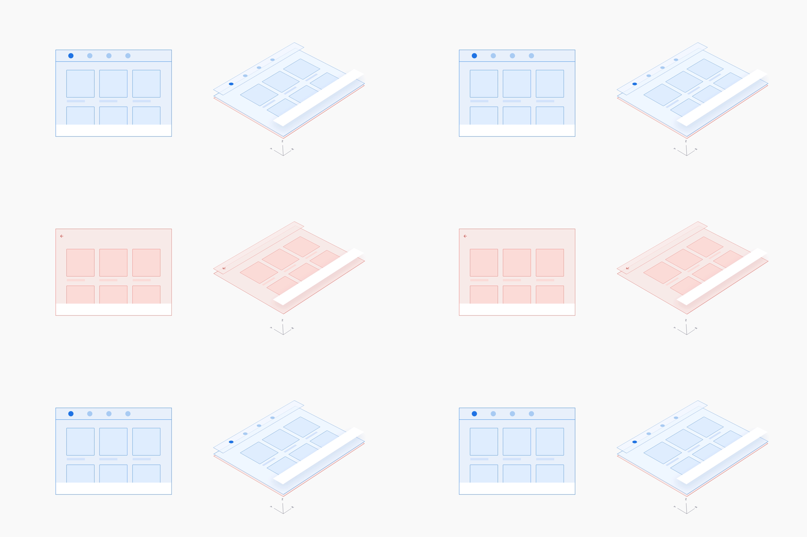
When moving from a higher-level view of content to a detail view, use a z-depth motion that scales up the lower layer and fades it in as the higher layer fades out. This motion reinforces the parent-child relationship between the higher-level view and the detail view, drawing focus to the latter.
Example

Extending an existing action
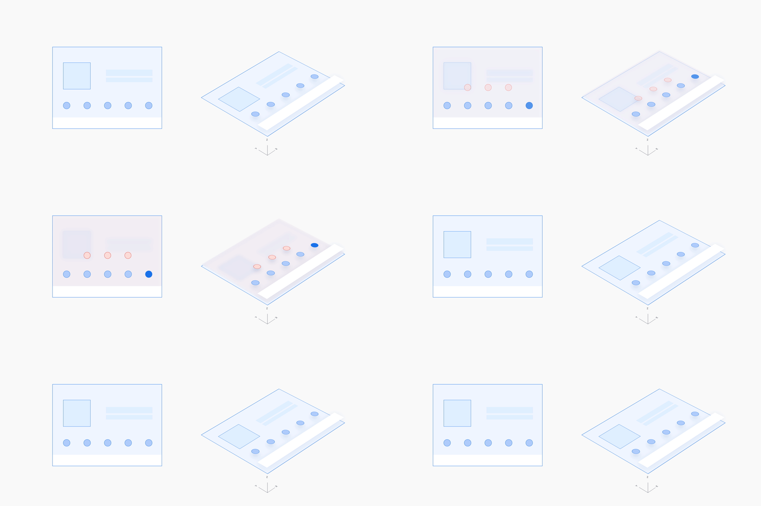
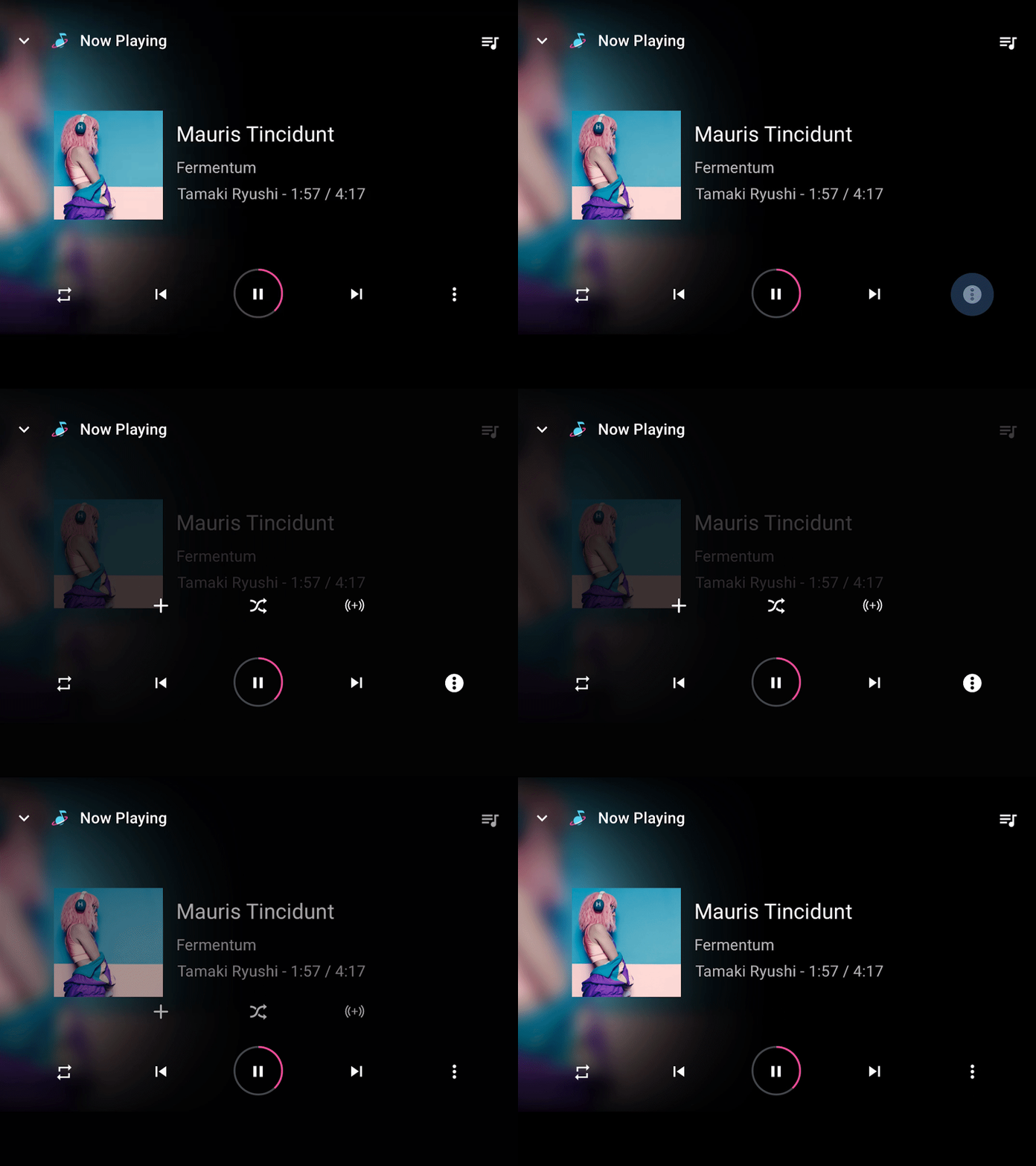
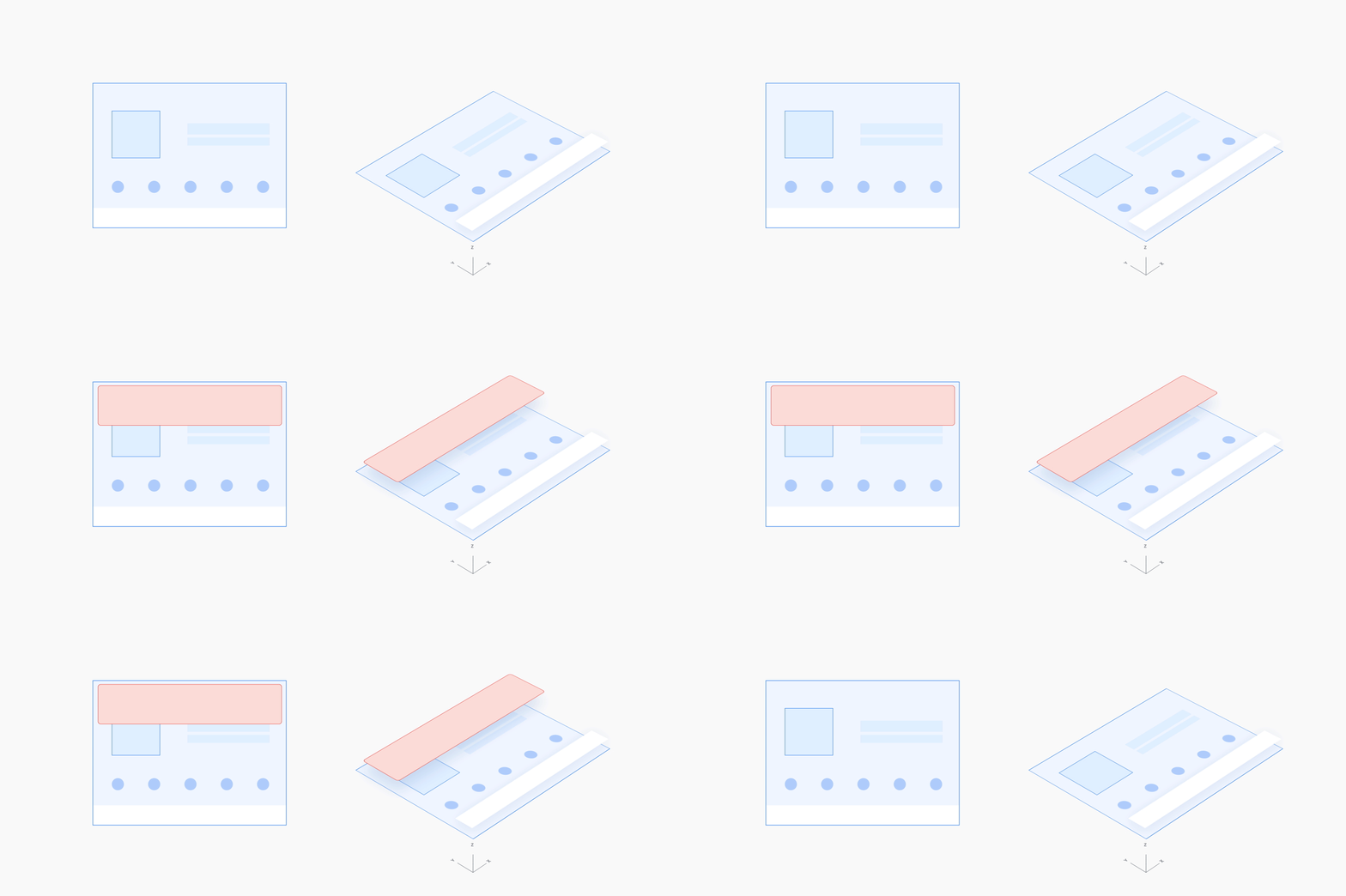
When a user is in an action and takes a related action, use a vertical (up or down) motion to introduce the secondary action on a full-screen overlay, with a scrim background, on top of the primary action. Being able to see the primary action through the scrim reinforces that the user is still in that action.
When closing the secondary action, use the reverse of this motion. The reverse motion should take less time than the original motion, since the user is done with the secondary action and is ready to exit.
Example
Minimizing and expanding an action
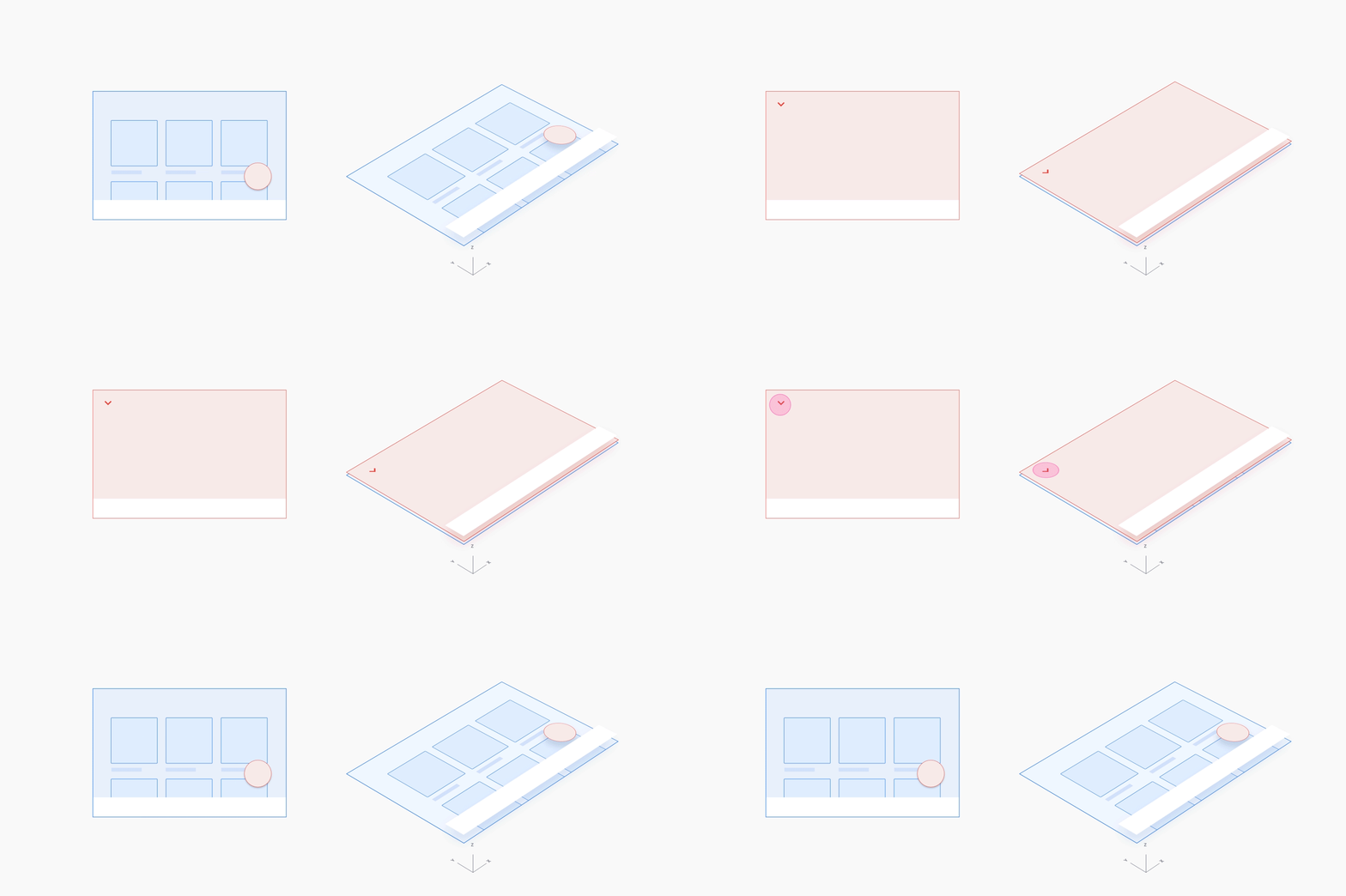
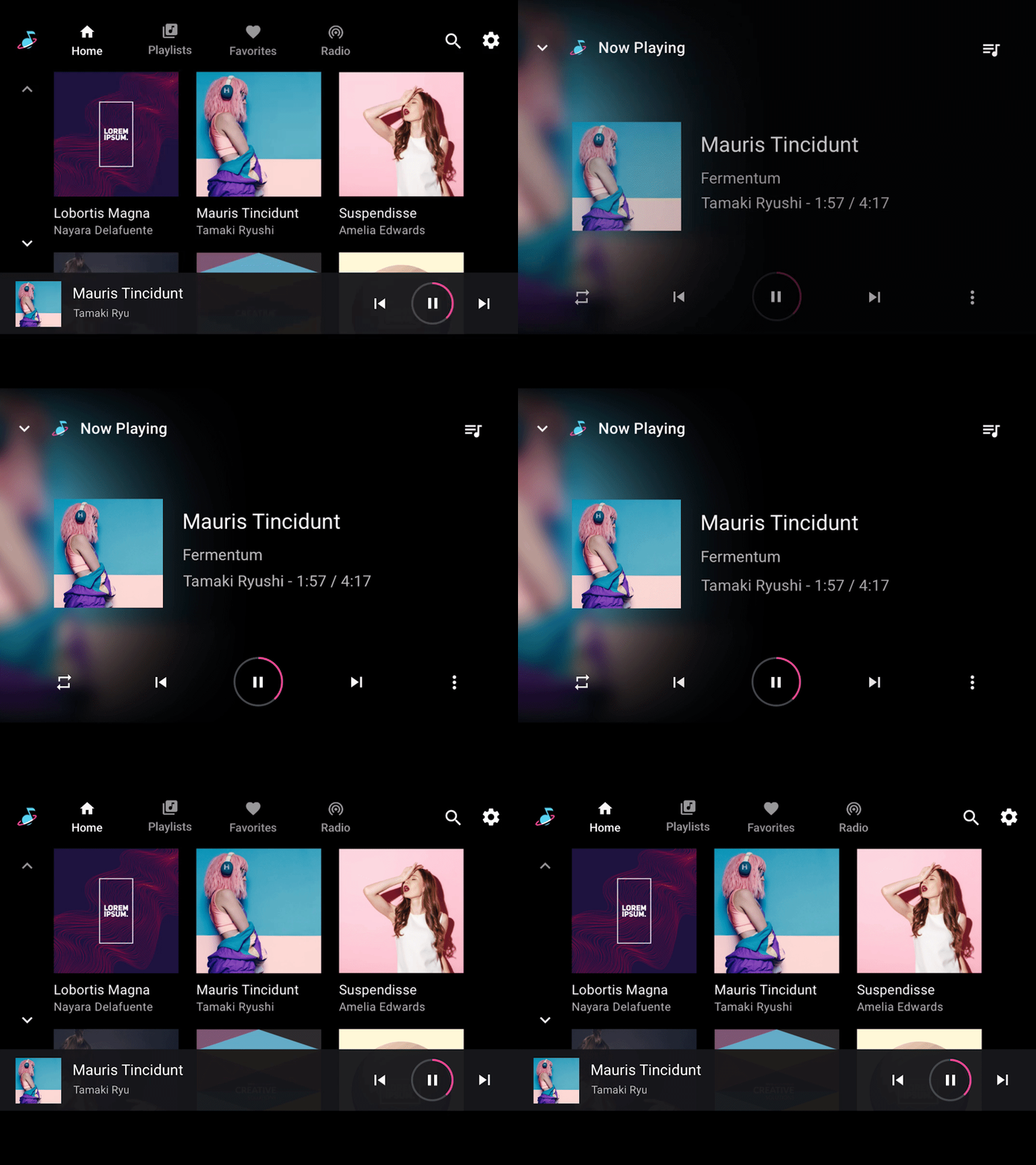
When expanding an ongoing action that has been minimized into a smaller onscreen format to allow multitasking, use an expanding window mask with a full-screen fade-in.
When minimizing an ongoing action, use the reverse of this motion. The minimizing motion should take less time than the expanding motion, since the user is essentially leaving this action and is ready to get it out of the way.
Example
Disrupting an action
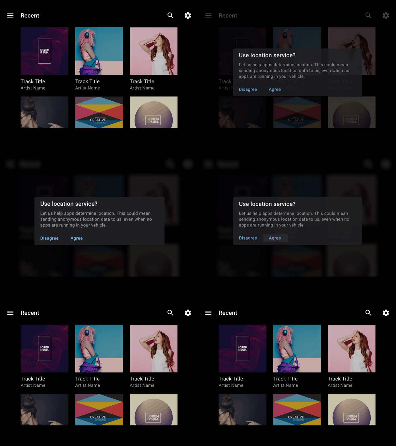
When a short, non-blocking action needs to appear suddenly on top of an ongoing action, slide it down or up from the edge of the screen (with a partial scrim) or fade it into the middle (with a full scrim). Start the motion from the location closest to where you want the new action to appear.
Example
