AI-generated Key Takeaways
-
Car makers can customize UIs for car screens using strategic choices of color, typography, and other visual elements.
-
The content provides guidance on color palettes, layouts for various screen sizes, using motion appropriately, employing shapes and corner radius, and sizing elements for easy driver interaction.
-
Typography guidance includes a scale, grid, and recommendations for type sizes and styles to minimize driver cognitive load.
Car makers can customize their UIs to work well on a car screen through strategic choices of color, typography, and other visual elements.
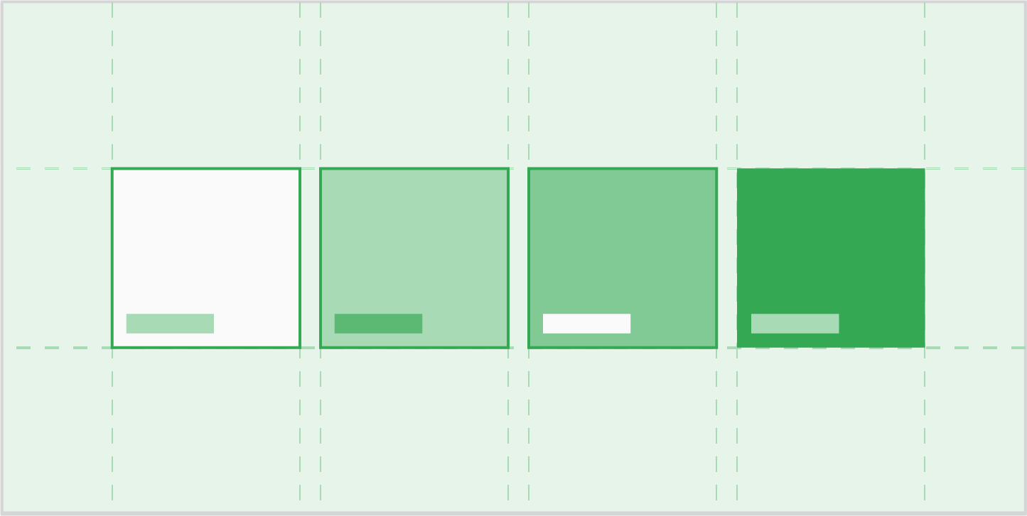
Color
Provides a driving-optimized color palette and gradients, plus guidance about contrast, day and night color modes, and more
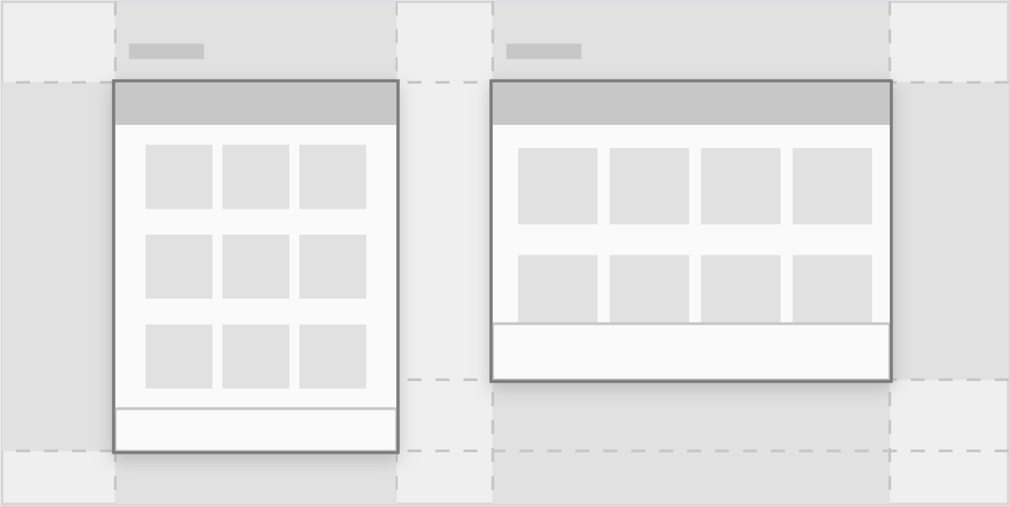
Layout
Discusses the methods used to adjust car makers’ layouts to car screens of various widths and heights

Sizing
Provides guidance for sizing and positioning icons and touch targets to make them easy for drivers to see and touch
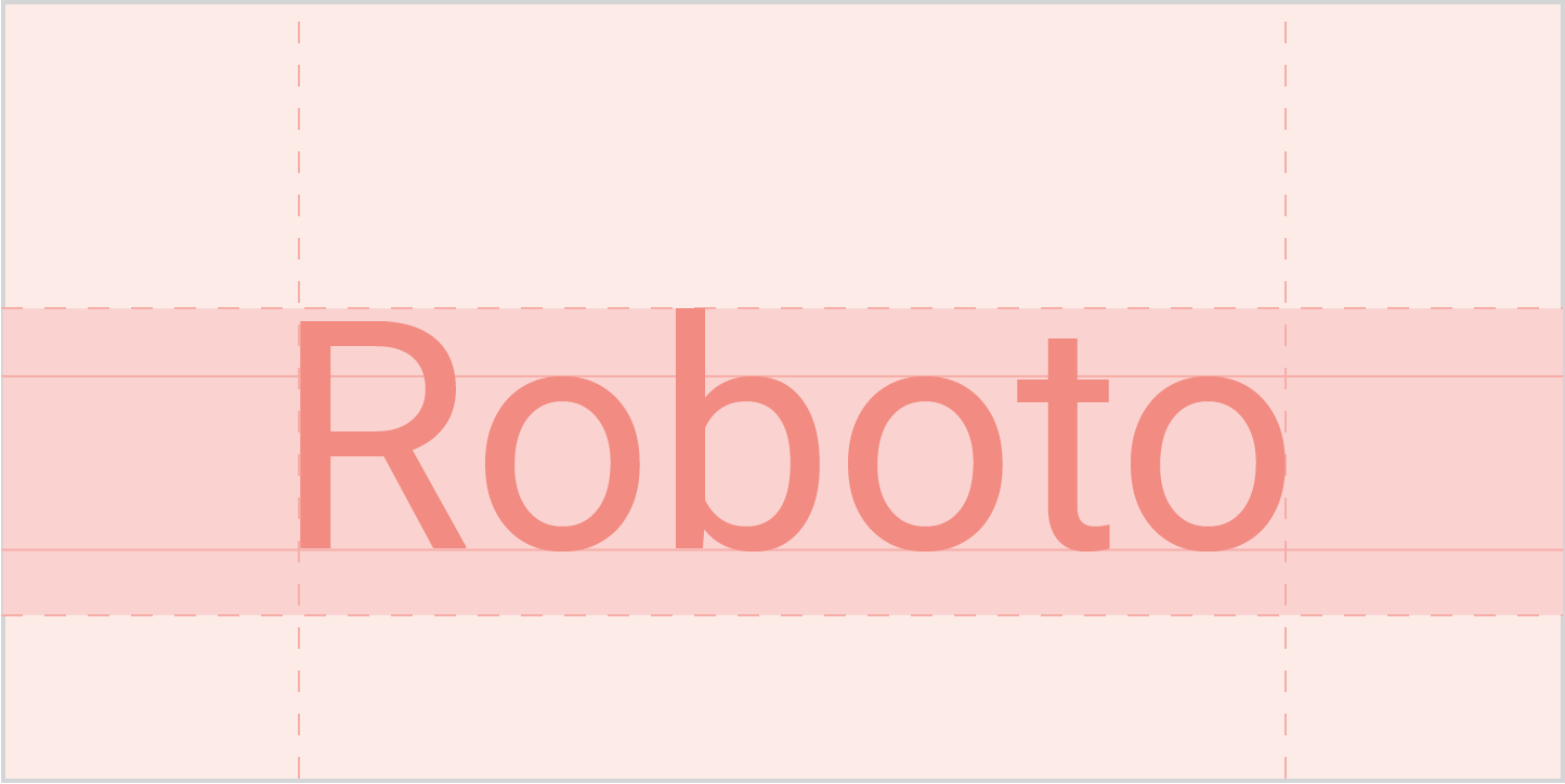
Typography
Provides a typographic scale and reference grid, plus guidance for using type sizes and styles that minimize cognitive load on drivers
