Page Summary
-
The happy path is the shortest and most efficient route for a user to reach their goal.
-
Break down tasks into simple, manageable steps and set user expectations for the process.
-
Provide clear and specific instructions to guide users through the conversation.
-
Utilize rich features like suggestions and cards to define options and make the conversation dynamic.
-
Always offer clear next steps to prevent users from getting stuck, including options to go back or start a new task.
In conversation design, the happy path is the optimal route from the start to the end of the user journey. Define the happy path for your use case. This is the shortest sequence of steps that users can follow directly to their goal, with the least effort on their part.
Proceed with simple steps
A good conversation flows as a quick back-and-forth read. Each message should provide a small chunk of information and prompt the user to take the next step. When a task involves multiple steps, set the user's expectations for how much information they will need to move through.
- "Let's get started. I have three questions for you."
- "We can get that done in three easy steps."
- "Just three steps to go."
The more steps between the user and their end goal, the more likely they are to drop off. However, setting expectations helps people stay engaged.
Be prescriptive
The more direction you give, the smoother the journey will be. Avoid vague or open-ended questions. When asking the user for information, make it clear what you're looking for.
- "I've got your name and email from your account. All I need is your phone number."
- "When is your preferred move-in date? You can give me a day, a time, or both."
Define the options with rich features
Rich features, like suggestions and rich cards, make the conversation more dynamic. They also serve as anchor points. Suggestions and cards keep users on the happy path by providing options the agent supports.
Suggestions
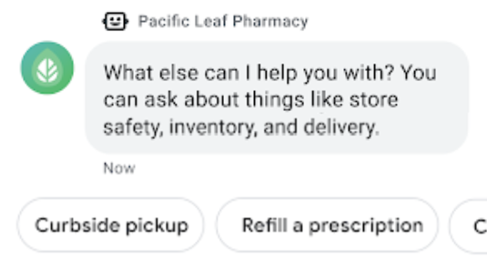
Suggested replies and suggested actions help users move quickly through the conversation. By defining the options, suggestions make it easy to take the next step.
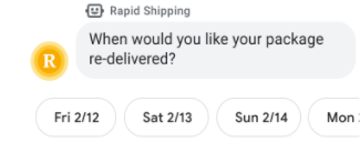
A message can have a maximum of 13 suggestions. If this isn't enough, display up to 12 suggestions in one message and add a suggested reply to show more (for example, "Show other options"). When the user taps this suggested reply, send a message with the other suggestions.
Once the user taps a suggestion, the untapped suggestions disappear. If you want them to remain in the conversation, embed the suggestions in rich cards instead of text messages.
Rich cards and carousels
Use rich cards to combine visual media, text, and suggestions. Don't use images or video alone.
Each standalone rich card should include text or suggestions to keep the conversation going.

A carousel of cards can inspire users with a range of products and allow them to compare options. Frontload the carousel with the items you most want users to see; they may not scroll to the end of the list. Use suggestions below a carousel to extend the journey or pivot to something else.
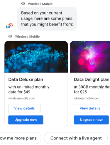
A carousel can have a maximum of ten rich cards. If this isn't enough, display up to ten cards in one carousel and include a suggested reply to see more (for example, "Show me more plans"). When the user taps this suggestion, send them another carousel with the remaining cards.
Fallback for rich features
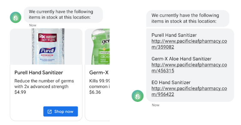
Provide fallback text for rich features that don't display on older devices.
State the suggestion options within the message so users know how to move forward.
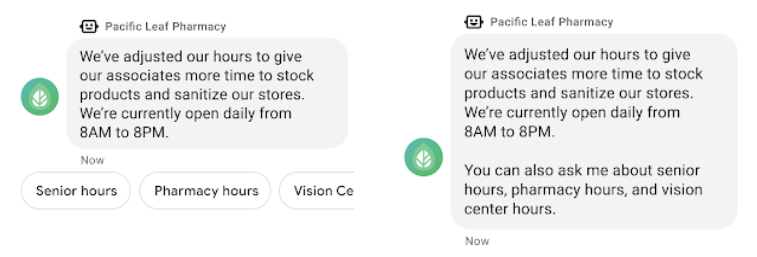
For rich cards and carousels, include the rich card title and URL within the message.
Always offer a next step
Sometimes users follow a path that doesn't meet their needs. To keep them from getting stuck, offer the option to go back. Periodically surface suggested replies that return the user to key decision points. For example,
- "Choose a different date"
- "View other models"
- "Go back to menu"
Make sure every conversation offers a next step and never dead ends. This applies to fallbacks as well as completed tasks. When a user reaches the end of a journey, display the conversation starters again, so the user can start a new task.
