সেভ করা পৃষ্ঠা গুছিয়ে রাখতে 'সংগ্রহ' ব্যবহার করুন
আপনার পছন্দ অনুযায়ী কন্টেন্ট সেভ করুন ও সঠিক বিভাগে রাখুন।
অ্যাপ বার এবং হেডার কম্পোনেন্ট হল অ্যাপ ক্যানভাসের শীর্ষে একটি ডেডিকেটেড বার যা গুরুত্বপূর্ণ অ্যাপ-সম্পর্কিত ফাংশন যেমন ব্র্যান্ডিং, টপ-লেভেল নেভিগেশন এবং অ্যাপ কন্ট্রোলে অ্যাক্সেস দেখানোর জন্য কাস্টমাইজ করা যেতে পারে।
UI জুড়ে একটি আদর্শ অবস্থানে ইন-অ্যাপ অনুসন্ধানের মতো কী নিয়ন্ত্রণগুলি রাখতে সামঞ্জস্যপূর্ণ অ্যাপ বার এবং হেডার লেআউট ব্যবহার করুন।
অ্যানাটমি
অ্যাপ বার এবং হেডারে বিভিন্ন উপাদান অন্তর্ভুক্ত থাকতে পারে। এটি এই যে কোনও উপায়ে কনফিগার করা যেতে পারে:
অ্যাপ শিরোনাম: অ্যাপ শিরোনাম হিসাবে কনফিগার করা হলে, উপাদানটিতে আইকন এবং বোতামগুলির ন্যূনতম ব্যবহার সহ ঐচ্ছিক পাঠ্যের জন্য স্থান থাকে। সাধারণত, এটিতে একটি স্ক্রিন শিরোনাম এবং পিছনের তীর অন্তর্ভুক্ত থাকে।
অ্যাপ বার: অ্যাপ বার হিসেবে কনফিগার করা হলে, এতে আইকন, ট্যাব এবং বোতাম অন্তর্ভুক্ত থাকতে পারে। সাধারণ উপাদানগুলির মধ্যে একটি অ্যাপ আইকন এবং নেভিগেশন বিকল্পগুলি অন্তর্ভুক্ত থাকে।
এই সংস্করণগুলির যেকোনো একটিতে অ্যাপ নিয়ন্ত্রণও অন্তর্ভুক্ত থাকতে পারে, যেমন অ্যাপ-মধ্যস্থ অনুসন্ধান এবং সেটিংস।
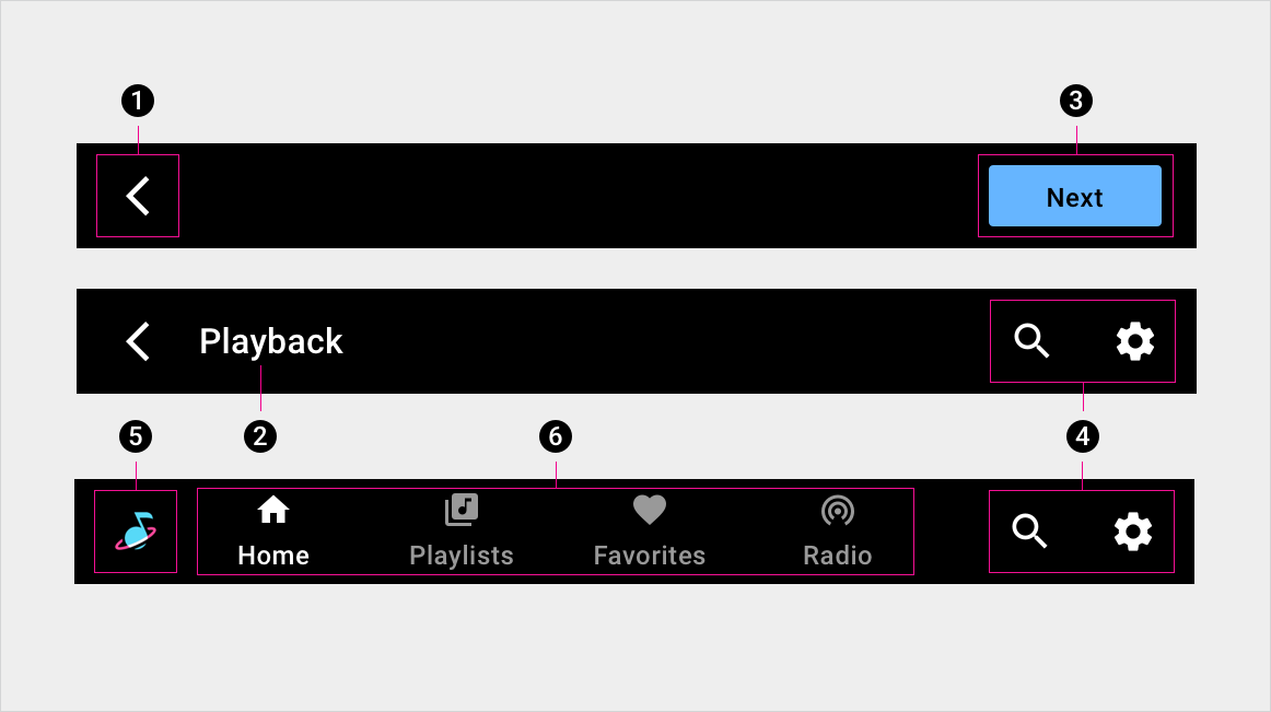
একটি অ্যাপ শিরোনামের দুটি সংস্করণ (শীর্ষ এবং মধ্যম) এবং একটি অ্যাপ বারের একটি সংস্করণ (নীচে), নিম্নলিখিত উপাদানগুলি সমন্বিত: 1. পিছনের তীর 2. পর্দার শিরোনাম 3. বোতাম 4. অ্যাপ নিয়ন্ত্রণ 5. অ্যাপ আইকন 6. প্রাথমিক নেভিগেশন (ট্যাব)
স্পেসিক্স - অ্যাপ বার
প্রাথমিক নেভিগেশন সহ অ্যাপ বার - কেন্দ্র সারিবদ্ধ
প্রাথমিক নেভিগেশন সহ অ্যাপ বার - বাম প্রান্তিককৃত
প্রাইমারি নেভিগেশন সহ অ্যাপ বার - ভেঙে পড়েছে (ট্যাবের পরিবর্তে ড্রয়ার)
স্পেসিক্স - অ্যাপ হেডার
কেন্দ্রীভূত শিরোনাম সহ অ্যাপ শিরোনাম
একক অ্যাপ নিয়ন্ত্রণ সহ অ্যাপ শিরোনাম
একাধিক অ্যাপ নিয়ন্ত্রণ সহ অ্যাপ শিরোনাম
একক বোতাম সহ অ্যাপ হেডার
একাধিক বোতাম সহ অ্যাপ হেডার
টেক্সট ওভারফ্লো সহ অ্যাপ হেডার
স্বতন্ত্র ট্যাব বার সহ অ্যাপ হেডার
কাস্টমাইজেশন
অ্যাপ বার এবং হেডারের ভিজ্যুয়াল চেহারা পরিবর্তন করে OEMগুলি তাদের ব্র্যান্ডকে প্রতিফলিত করতে পারে। পরিবর্তন অন্তর্ভুক্ত হতে পারে:
কাস্টম আইকন
কাস্টম ফন্ট
সক্রিয়, নিষ্ক্রিয় এবং অক্ষম বোতামগুলির উপস্থিতি সেট করা
বোতামের মাত্রা এবং স্থান নির্ধারণ করা
ডিজাইন সিস্টেম লেআউট, রঙ, টাইপোগ্রাফি এবং সাইজিং ব্যবহার করে উপাদানগুলি কাস্টমাইজ করার জন্য নির্দেশিকা প্রদান করে।
[null,null,["2025-07-24 UTC-তে শেষবার আপডেট করা হয়েছে।"],[[["\u003cp\u003eThe app bar & header component, implemented as "toolbar" in the Car UI Library, sits at the top of the app and can be customized to display branding, navigation, and app controls.\u003c/p\u003e\n"],["\u003cp\u003eIt can be configured as an app header, primarily displaying a screen title and back arrow, or as an app bar, which can include icons, tabs, and buttons for navigation and controls.\u003c/p\u003e\n"],["\u003cp\u003eOEMs can customize the app bar & header's visual appearance using runtime overlays to reflect their brand, modifying elements like icons, fonts, and button styles.\u003c/p\u003e\n"],["\u003cp\u003eBoth app header and app bar can include app controls such as in-app search, settings, and other relevant functions for easy access.\u003c/p\u003e\n"]]],[],null,["# App bar & header\n\n\u003cbr /\u003e\n\nThe app bar \\& header component is a dedicated bar at the top of the app canvas that can be customized to display important app-related functions, such as branding, top-level navigation, and access to app controls.\n\nUse consistent app bar \\& header layouts to place key controls, such as in-app search, in a standard location throughout the UI.\n| **Note:** The app bar \\& header component is part of the Car UI Library, where it is implemented as \"toolbar.\" To use the app bar \\& header, you must [add the Car UI Library as a dependency](https://source.android.com/devices/automotive/hmi/car_ui/integrate) to your app.\n\n*** ** * ** ***\n\nAnatomy\n-------\n\nThe app bar \\& header can include a variety of elements. It can be configured in either of these ways:\n\n- **App header:** When configured as an app header, the component contains space for optional text, with minimal use of icons and buttons. Typically, it includes a screen title and back arrow.\n- **App bar:** When configured as an app bar, it can include icons, [tabs](/cars/design/automotive-os/components/tabs), and [buttons](/cars/design/automotive-os/components/buttons). Typical elements include an app icon and navigational options.\n\nEither of these versions may also include app controls, such as in-app search and settings.\nTwo versions of an app header (top and middle) and one version of an app bar (bottom), featuring the following elements: \n1. Back arrow \n2. Screen title \n3. Button \n4. App controls \n5. App icon \n6. Primary navigation (tabs)\n\n*** ** * ** ***\n\nSpecs -- App bar\n----------------\n\n### App bar with primary navigation -- center aligned\n\n### App bar with primary navigation -- left aligned\n\n### App bar with primary navigation -- collapsed (drawer instead of tabs)\n\n*** ** * ** ***\n\nSpecs -- App header\n-------------------\n\n### App header with centered title\n\n### App header with single app control\n\n### App header with multiple app controls\n\n### App header with single button\n\n### App header with multiple buttons\n\n### App header with text overflow\n\n### App header with standalone tab bar\n\n*** ** * ** ***\n\nCustomization\n-------------\n\nOEMs can reflect their brand by modifying the visual appearance of the app bar \\& header. Modifications might include:\n\n- Custom icons\n- Custom fonts\n- Setting the appearance of active, inactive, and disabled buttons\n- Setting button dimensions and placements\n\n| **Note:** To customize the app bar \\& header, which is an implementation of the Car UI library toolbar, OEMs must use runtime overlays. Runtime overlays are explained in the [Car UI Library Integration Guide](https://source.android.com/devices/automotive/hmi/car_ui).\n\n[Design system](/cars/design/automotive-os/design-system/overview) provides guidance for customizing components using layout, color, typography, and sizing.\n\n*** ** * ** ***\n\nExamples\n--------\n\nApp header in sign-in App header in playback \nApp bar App bar when content is scrolled"]]