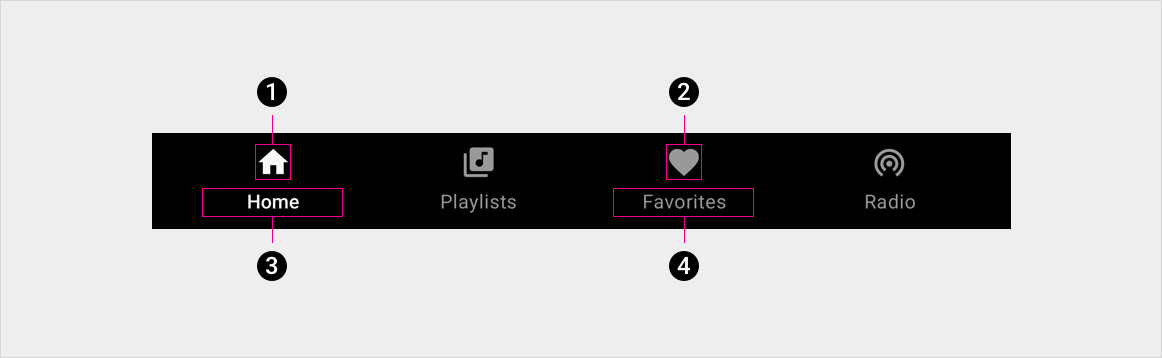
নমনীয় প্রান্তিককরণের সাথে, ট্যাব কনফিগারেশন উপলব্ধ স্থানের সাথে মানানসই করার জন্য প্রসারিত বা সংকুচিত করে।
অ্যাপ বার - ড্রয়ার মেনুতে ট্যাবগুলি ভেঙে গেছে
অ্যাপ বার এবং হেডার কম্পোনেন্ট
চশমা, শৈলী নির্দেশিকা, এবং আরো
স্বতন্ত্র ট্যাব বার – বাম প্রান্তিককৃত
স্বতন্ত্র ট্যাব বার - নমনীয় প্রান্তিককরণ
নমনীয় প্রান্তিককরণের সাথে, ট্যাব কনফিগারেশন উপলব্ধ স্থানের সাথে মানানসই করার জন্য প্রসারিত বা সংকুচিত করে।
ট্যাব লেবেল স্ট্রিং ওভারফ্লো
স্কেলিং লেআউট
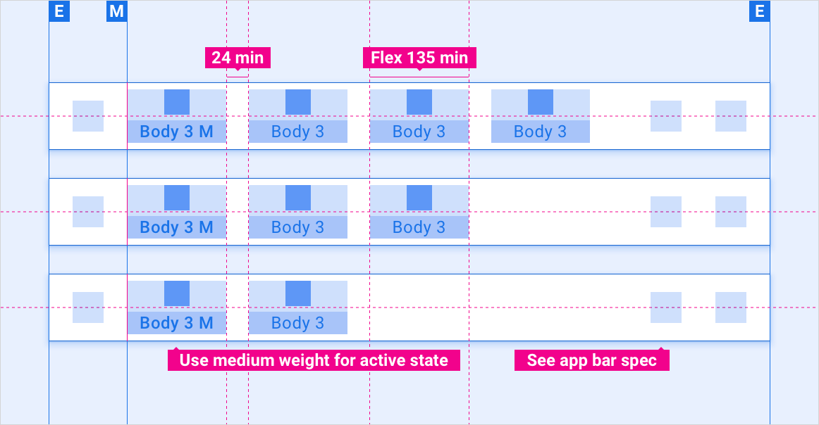
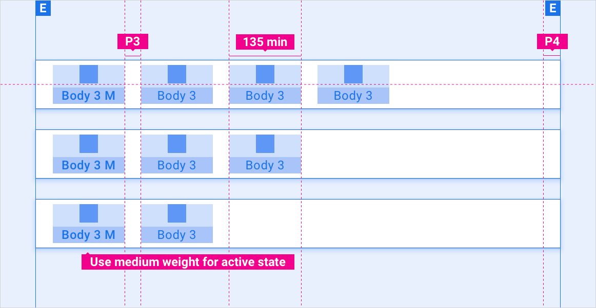
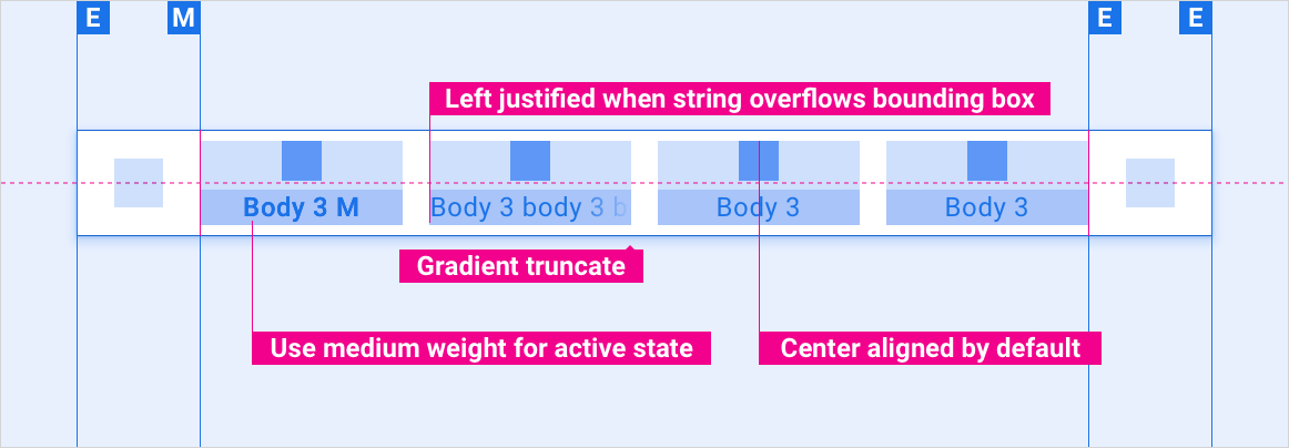
এই রেফারেন্স লেআউটগুলি বিভিন্ন প্রস্থ এবং উচ্চতার স্ক্রিনগুলিকে মিটমাট করার জন্য ট্যাবগুলিকে কীভাবে মানিয়ে নিতে হয় তা দেখায়। (প্রস্থ এবং উচ্চতা বিভাগগুলি লেআউট বিভাগে সংজ্ঞায়িত করা হয়েছে।) নোট করুন যে কোনও ডাউন-স্যাম্পলিং বা আপ-স্যাম্পলিং হওয়ার আগে সমস্ত পিক্সেল মান রেন্ডার করা পিক্সেলে রয়েছে।
লেআউট
মার্জিন, কীলাইন এবং বিভিন্ন স্ক্রিনের মাপের জন্য প্যাডিং
লেআউট লেবেল
E, M, KL, P, Flex এর সংজ্ঞা
স্বল্প উচ্চতা বন্ধনীতে স্ট্যান্ডার্ড বনাম প্রশস্ত স্ক্রীন
স্ট্যান্ডার্ড বনাম প্রশস্ত স্ক্রিন স্ট্যান্ডার্ড উচ্চতা বন্ধনীতে
[null,null,["2025-07-24 UTC-তে শেষবার আপডেট করা হয়েছে।"],[[["\u003cp\u003eTabs are interactive buttons displayed in groups, with only one active at a time, unlike independent buttons.\u003c/p\u003e\n"],["\u003cp\u003eThey can be integrated into app bars with different alignment options or presented as standalone bars, adapting to various screen sizes.\u003c/p\u003e\n"],["\u003cp\u003eTab styling incorporates specific typography, color palettes for different states and elements, and standardized sizing for icons and touch targets.\u003c/p\u003e\n"],["\u003cp\u003eVisual examples demonstrate tab implementations, including collapsed, app bar-nested, and standalone configurations.\u003c/p\u003e\n"]]],[],null,["# Tabs\n\n\u003cbr /\u003e\n\nTabs are buttons that always occur in groups and are dependent on each other's state: only one can be active at any given time. \n[Buttons component\nButtons that are not tabs can operate independently of other buttons](/cars/design/automotive-os/components/buttons)\n\n*** ** * ** ***\n\nAnatomy\n-------\n\n1. Active tab icon \n2. Inactive tab icon \n3. Active tab label \n4. Inactive tab label\n\n*** ** * ** ***\n\nSpecs\n-----\n\n### Tabs nested in app bar -- left aligned\n\n[Layout labels\nDefinitions of E, M, KL, P, Flex](/cars/design/intro-terms#layout_labels) \n[App bar \\& header component\nSpecs, style guidelines, and more](/cars/design/automotive-os/components/app-bar)\n\n### Tabs nested in app bar -- flexible alignment\n\nWith flexible alignment, the tab configuration stretches or compresses to fit the available space.\n\n### Tabs collapsed in app bar -- drawer menu\n\n[App bar \\& header component\nSpecs, style guidelines, and more](/cars/design/automotive-os/components/app-bar)\n\n### Standalone tab bar -- left aligned\n\n### Standalone tab bar -- flexible alignment\n\nWith flexible alignment, the tab configuration stretches or compresses to fit the available space.\n\n### Tab label string overflow\n\n*** ** * ** ***\n\nScaling layouts\n---------------\n\nThese reference layouts show how to adapt tabs to accommodate screens of various widths and heights. (Width and height categories are defined in the [Layout](/cars/design/automotive-os/design-system/layout) section.) Note that all pixel values are in rendered pixels, before any down-sampling or up-sampling occurs. \n[Layout\nMargins, keylines, and padding for various screen sizes](/cars/design/automotive-os/design-system/layout) \n[Layout labels\nDefinitions of E, M, KL, P, Flex](/cars/design/intro-terms#layout_labels)\n\n### Standard vs. wide screens in short height bracket\n\n### Standard vs. wide screens in standard height bracket\n\n### Standard vs. wide screens in tall height bracket\n\n### Extra-wide and super-wide screens in all height brackets\n\n*** ** * ** ***\n\nStyles\n------\n\n[Typography guidelines\nScale and grid references, typographic examples, and more](/cars/design/automotive-os/design-system/typography) \n[Color guidelines\nPalettes, elevation and opacity values, and more](/cars/design/automotive-os/design-system/color)\n\n### Typography\n\n| Type style | Typeface | Weight | Size (dp) |\n|------------|----------|---------|-----------|\n| Body 3 M | Roboto | Medium | 24 |\n| Body 3 | Roboto | Regular | 24 |\n\n### Color\n\n| Element | Color(day mode) | Color (night mode) |\n|------------------------------|-----------------|--------------------|\n| Primary type / icons | White | White @ 88% |\n| Secondary type / icons | White @ 72% | White @ 60% |\n| Tab bar background | Black | Black |\n| Tab bar background on scroll | Black @ 84% | Black @ 88% |\n| Tab icon - active state | White | White @ 88% |\n| Tab icon - inactive state | White @ 56% | White @ 50% |\n\n### Sizing\n\n| Element | Size (dp) |\n|-------------------|-----------|\n| Primary icon | 44 |\n| Secondary icon | 36 |\n| Icon touch target | 76 |\n\n*** ** * ** ***\n\nExamples\n--------\n\nTabs collapsed Tabs nested in app bar\nStandalone tab bar"]]