应用栏和标题组件是应用画布顶部的一个专用栏,可对其进行自定义以显示重要的应用相关功能,例如品牌信息、顶级导航以及对应用控件的访问权限。
使用一致的应用栏和标题布局,将关键控件(例如应用内搜索)放置在整个界面中的标准位置。
解剖学
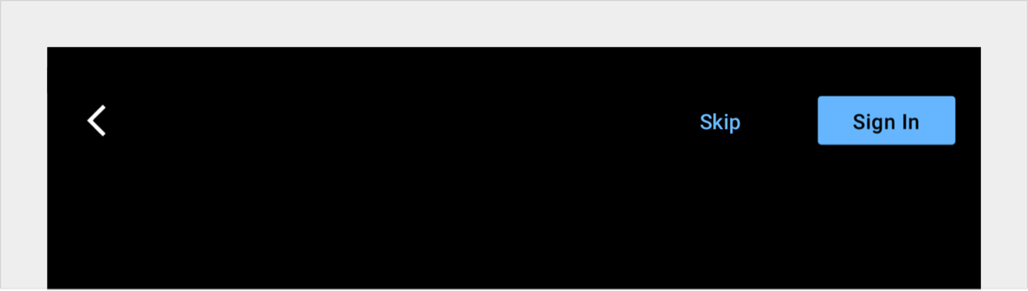
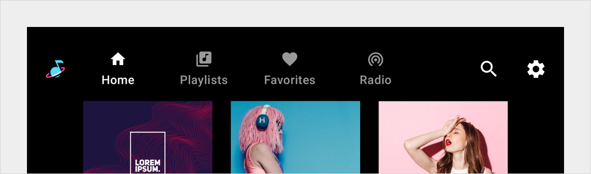
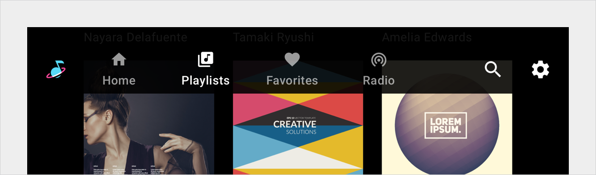
应用栏和标题可包含各种元素。您可以通过以下任一方式对其进行配置:
这两个版本还可能包含应用控件,例如应用内搜索和设置。
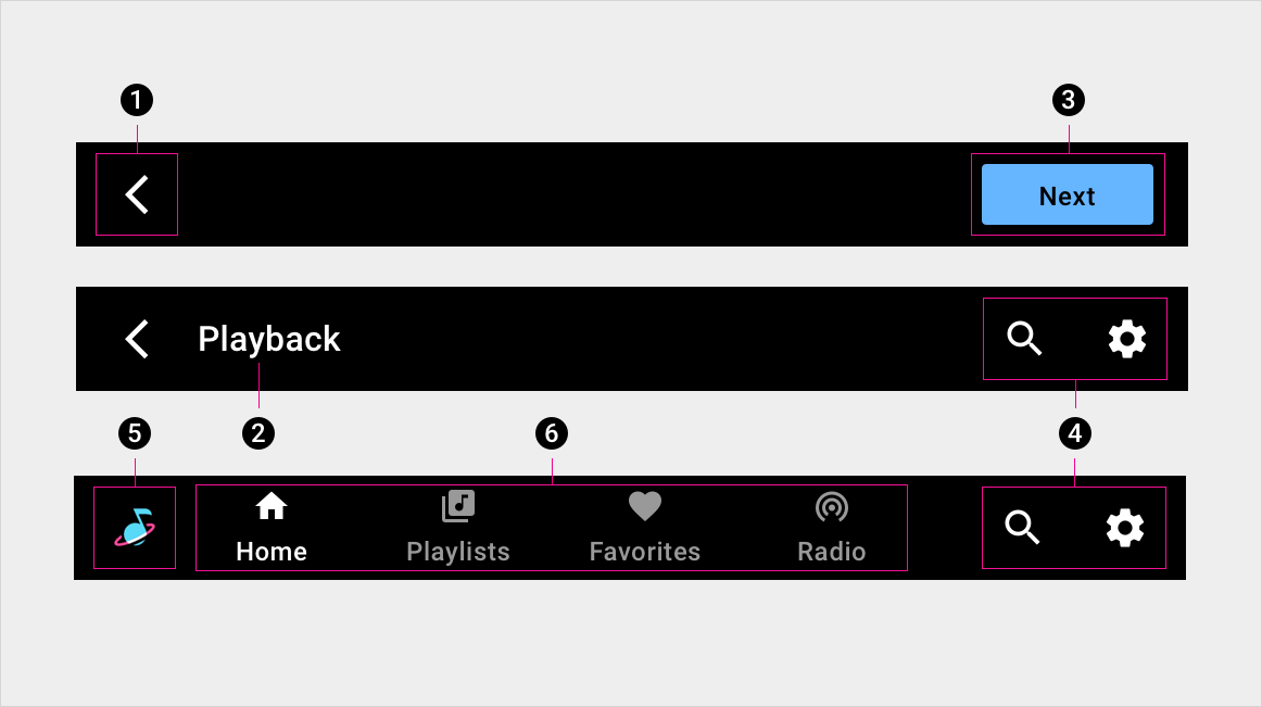
1. 返回箭头
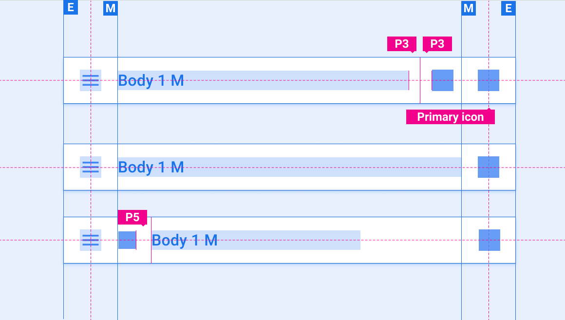
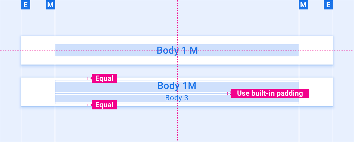
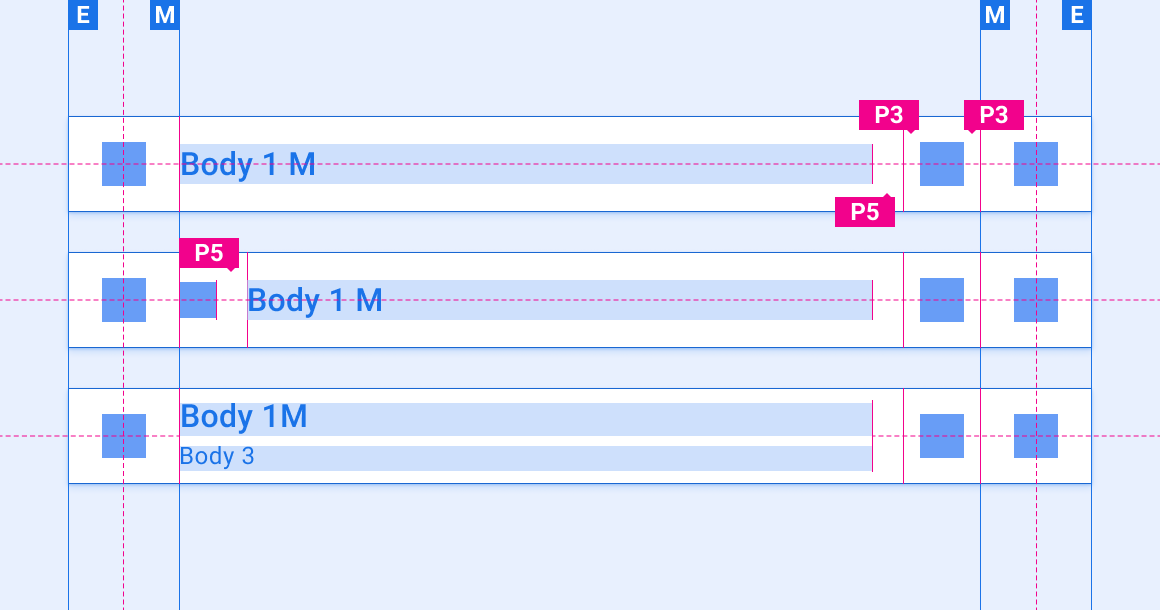
2. 屏幕标题
3. 按钮
4. 应用控件
5. 应用图标
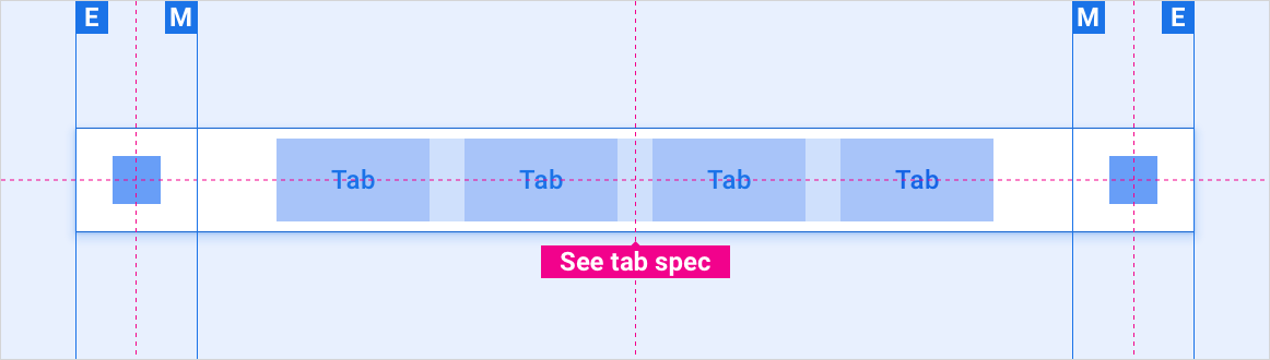
6. 主要导航(标签页)
规范 - 应用栏
包含主要导航的应用栏 - 居中对齐
包含主要导航的应用栏 - 左对齐

包含主导航栏的应用栏 - 收起(抽屉式导航栏而不是标签页)
规范 – 应用标头
应用标题(标题居中)
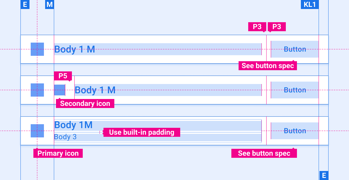
带有单个应用控件的应用标头

具有多个应用控件的应用标头
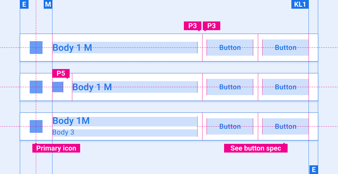
带有单个按钮的应用标头
包含多个按钮的应用标题
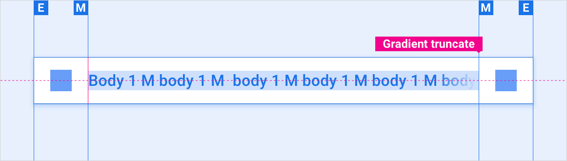
包含文本溢出的应用标题
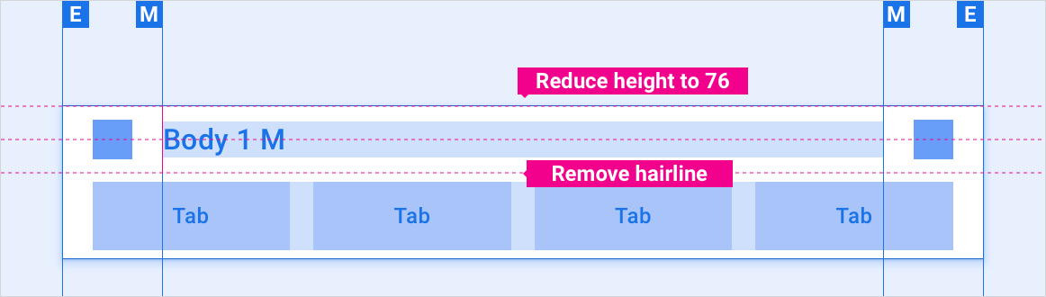
带有独立标签页栏的应用标题
自定义
OEM 可以通过修改应用栏和标题的视觉外观来体现其品牌。这类修改可能包括:
- 自定义图标
- 自定义字体
- 设置活动、非活动状态和已停用的按钮的外观
- 设置按钮尺寸和展示位置
设计系统提供了有关如何使用布局、颜色、排版和尺寸来自定义组件的指南。
示例