标签页是始终按组显示且取决于彼此的状态的按钮:在任何给定时间,只有一个可以处于活动状态。

解剖学
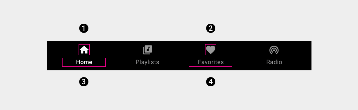
2. 闲置标签页图标
3. 使用中的标签页标签
4. 闲置标签页标签
规格
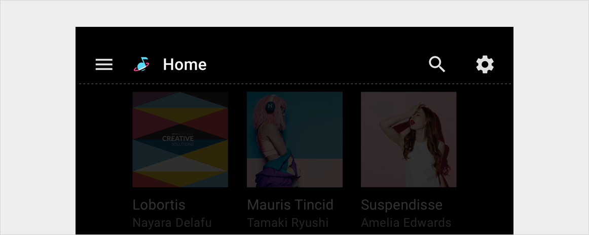
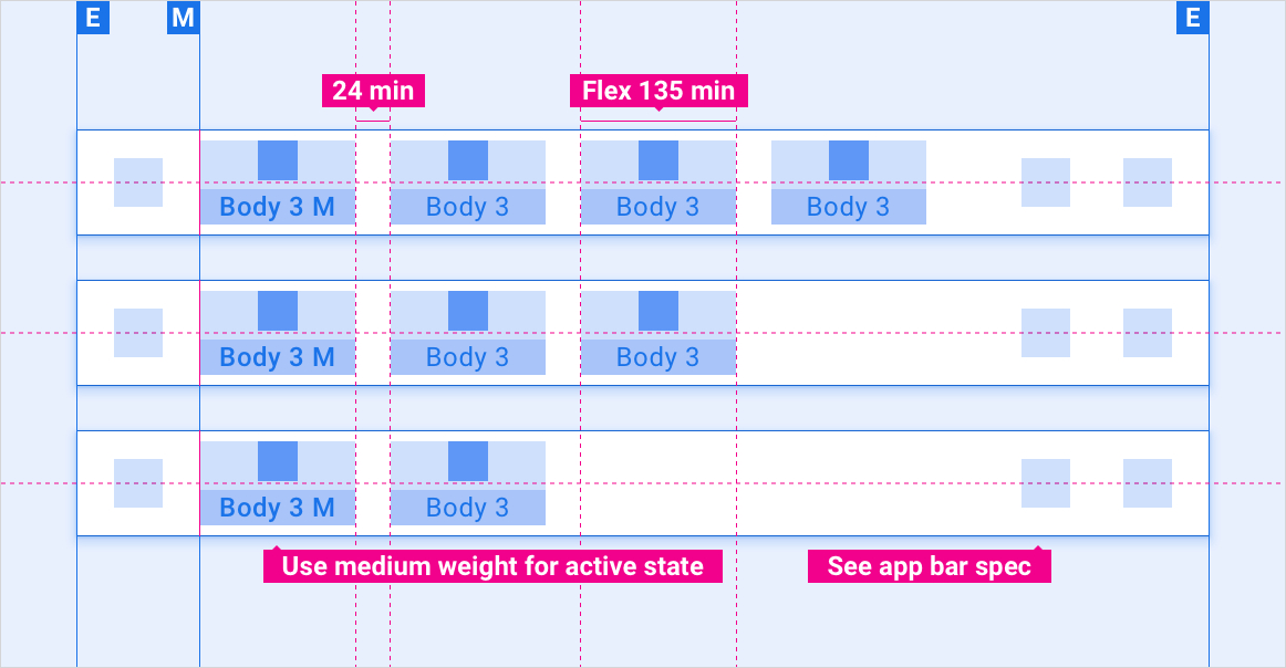
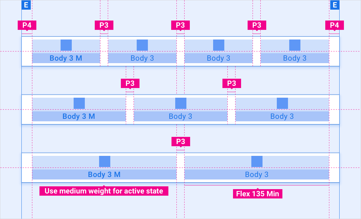
嵌套在应用栏中的标签页 - 左对齐
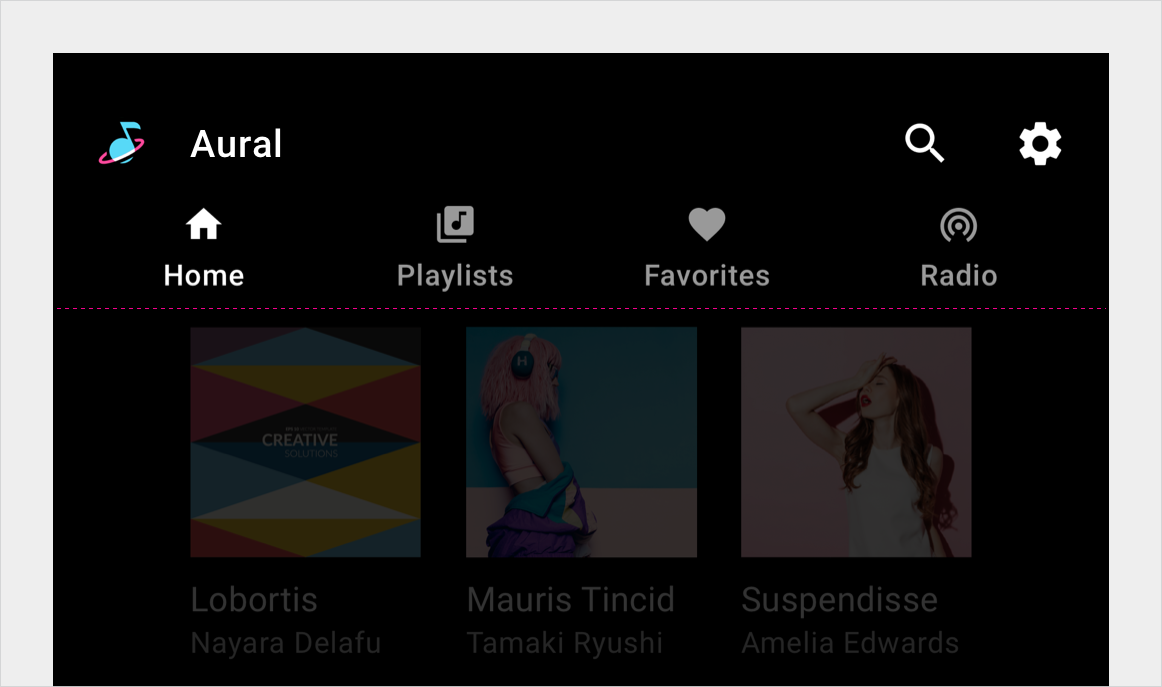
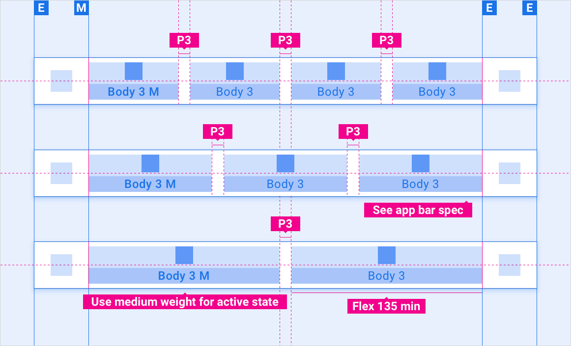
嵌套在应用栏中的标签页 - 灵活对齐
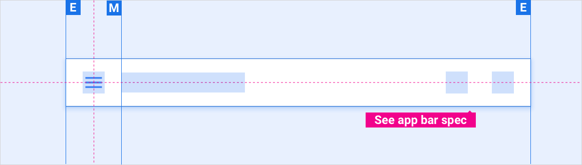
标签页在应用栏中收起 - 抽屉式导航栏菜单
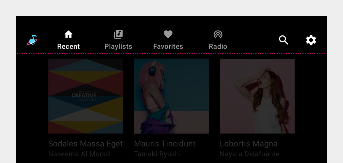
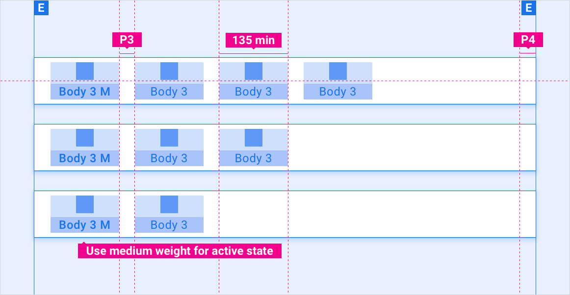
独立标签栏 - 左对齐
独立标签栏 - 灵活对齐
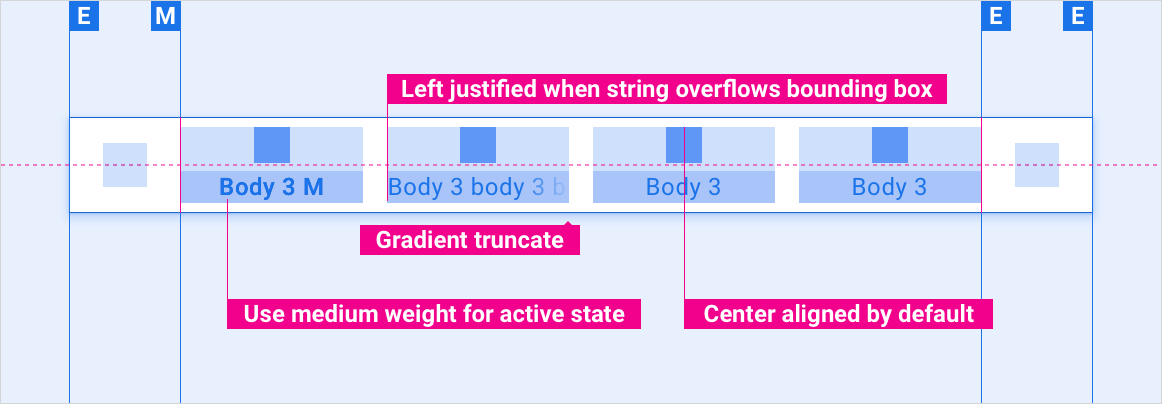
标签页标签字符串溢出
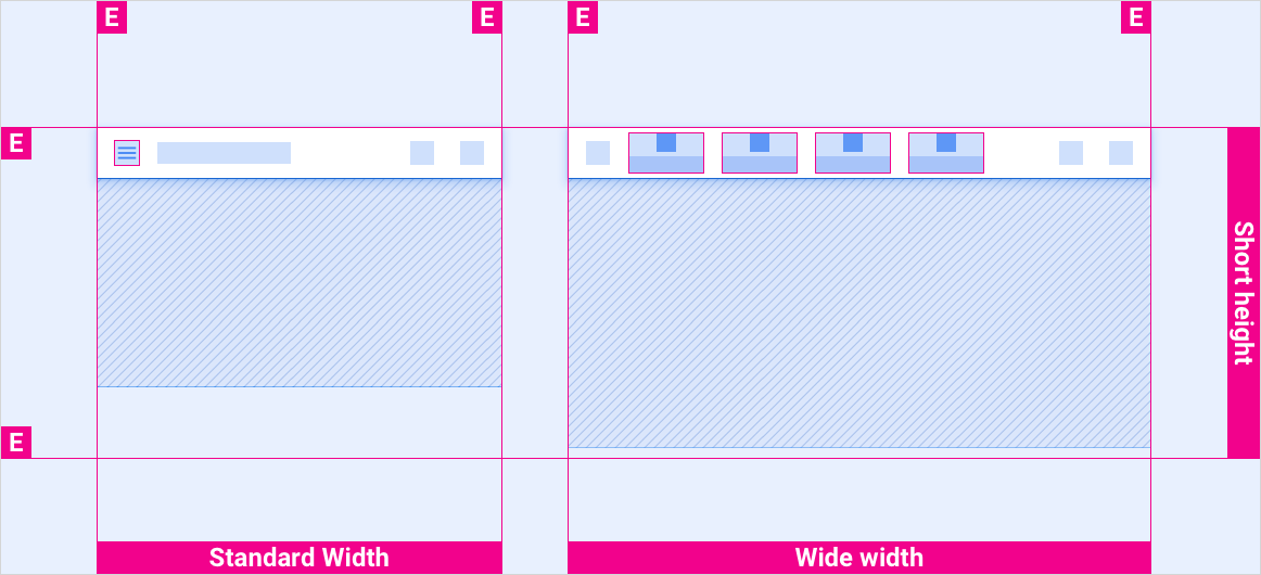
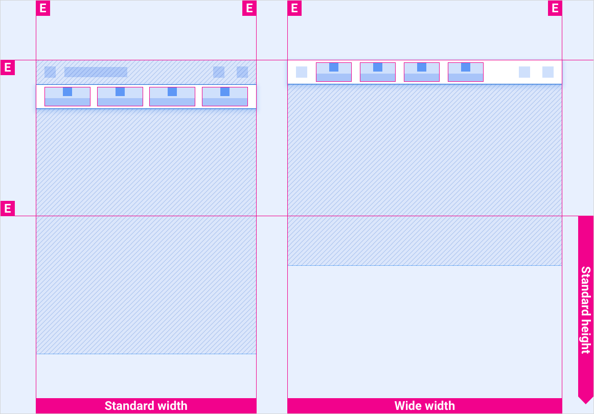
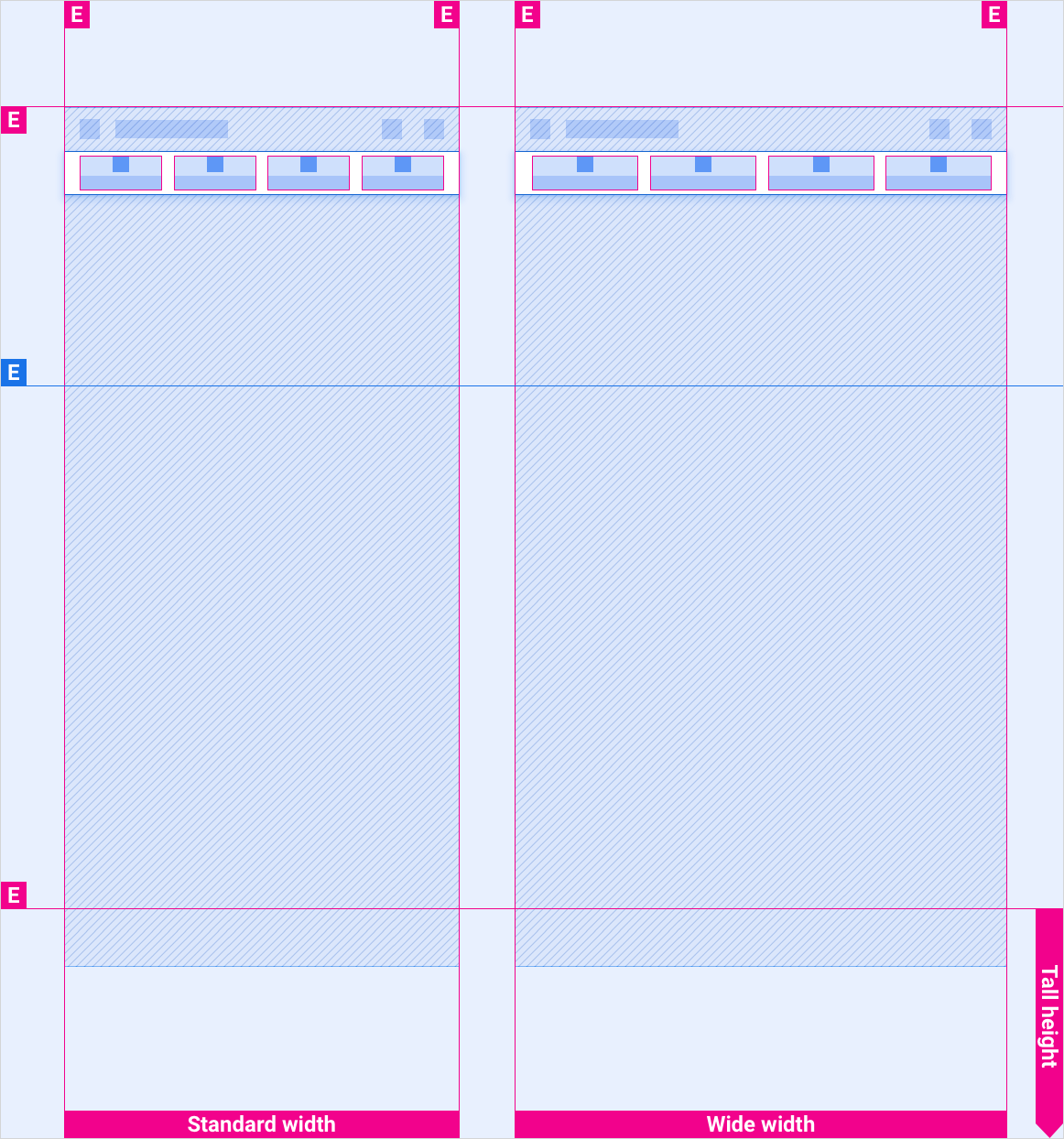
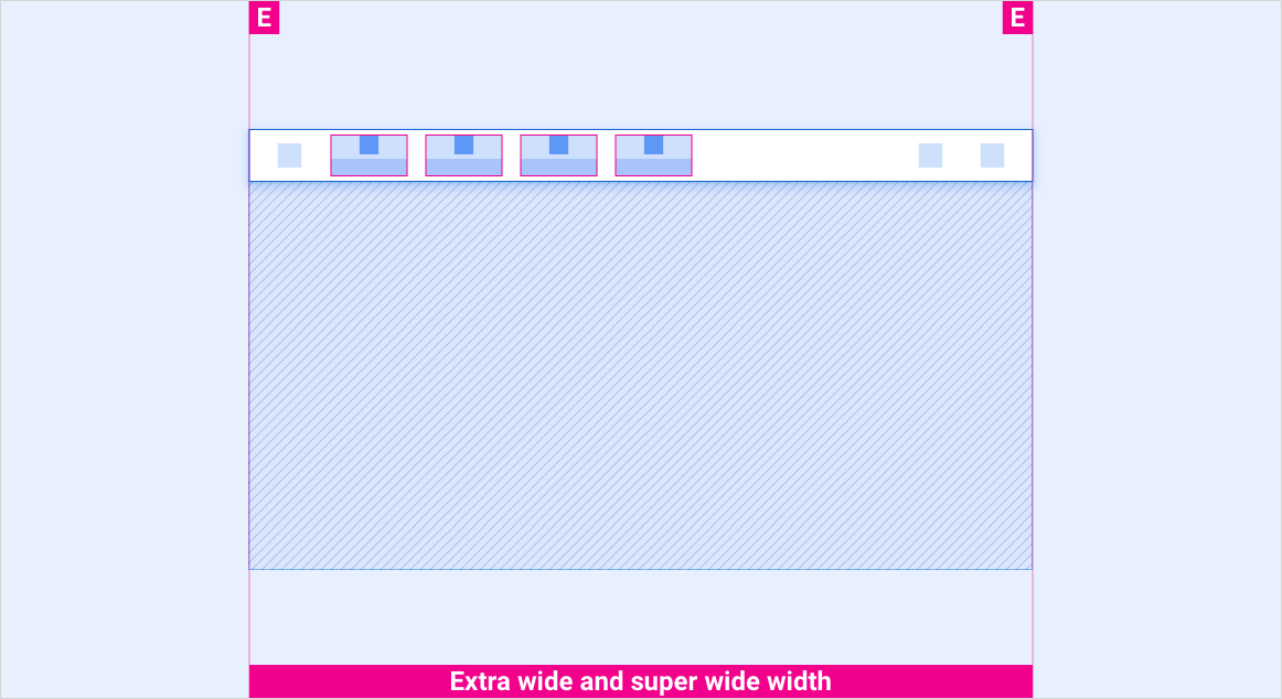
缩放布局
这些参考布局展示了如何调整标签页来适应各种宽度和高度的屏幕。(宽度和高度类别在布局部分进行定义。)请注意,在发生任何下采样或上采样之前,所有像素值都位于渲染的像素中。
短高度括号中的标准屏幕与宽屏幕
标准高度括号中的标准屏幕与宽屏幕
高高度括号中的标准屏幕与宽屏幕
带有所有高度括号的超宽屏幕和超宽屏幕
风格
排版
| 类型样式 | 字体 | 重量 | 尺寸 (dp) |
|---|---|---|---|
| 正文 3 M | Roboto | 媒介 | 24 |
| 正文 3 | Roboto | 普通 | 24 |
颜色
| 元素 | 颜色(日间模式) | 颜色(夜间模式) |
|---|---|---|
| 主要类型 / 图标 | White | 白色 @ 88% |
| 次要类型 / 图标 | 白色 @ 72% | 白色 @ 60% |
| 标签页栏背景 | 黑色 | 黑色 |
| 滚动时的标签页栏背景 | 黑色 @ 84% | 黑色 @ 88% |
| “标签页”图标 - 活动状态 | White | 白色 @ 88% |
| 标签图标 - 非活动状态 | 白色 @ 56% | 白色 @ 50% |
大小
| 元素 | 尺寸 (dp) |
|---|---|
| 主图标 | 44 |
| 次要图标 | 36 |
| 图标触摸目标 | 76 |
示例