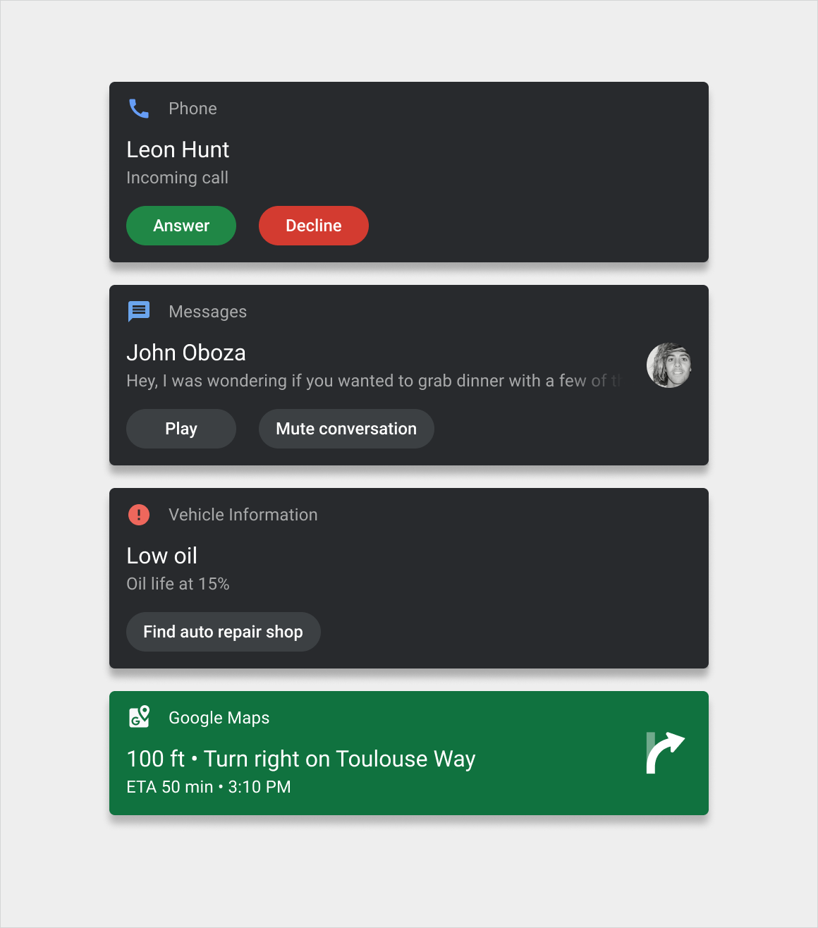
通知卡会及时传达来自系统或应用的少量信息。
这些适用于 Android Automotive OS 的卡片的设计旨在最大限度地减少让驾驶员分心的因素。这些卡片有三种基本版本:
- 浮动通知 (HUN) 卡片:用于在当前屏幕上短暂显示的通知
- 通知中心卡片:用于通知中心内列出的通知
- 分组通知卡片:将多个通知中心卡片合并到一张卡片中
在这些版本中,设计也可能会略有不同,具体取决于消息的类别。例如,来电通知使用的按钮和图标与导航通知不同。

解剖学
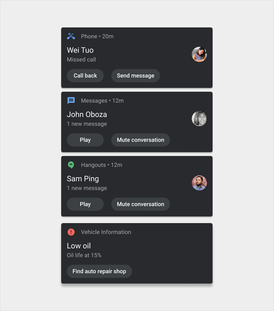
通知卡片是一个灵活的组件,可以包含多种元素。它有三个主要版本:
- HUN 卡片:此版本比通知中心卡片更宽,会显示在当前屏幕顶部,直到将其关闭
- 通知中心卡片:此版本比 HUN 卡片窄,并与其他此类卡片一起显示在通知中心内,以垂直列表的形式显示
- 分组通知卡片:此版本的通知中心卡片将多个相关通知整合到一个卡片中,并提供用于展开即可显示单个通知的控件
这些版本的变体(按消息类型划分)显示在样式中。
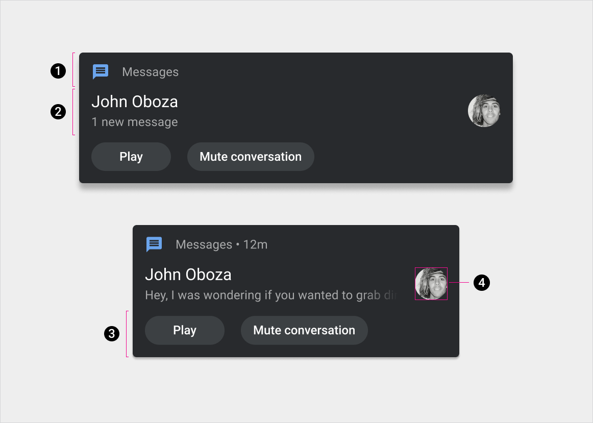
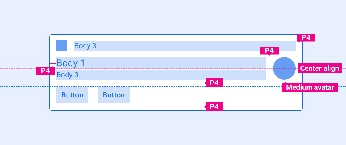
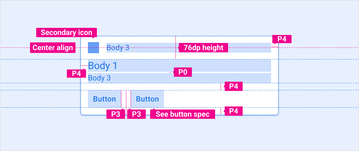
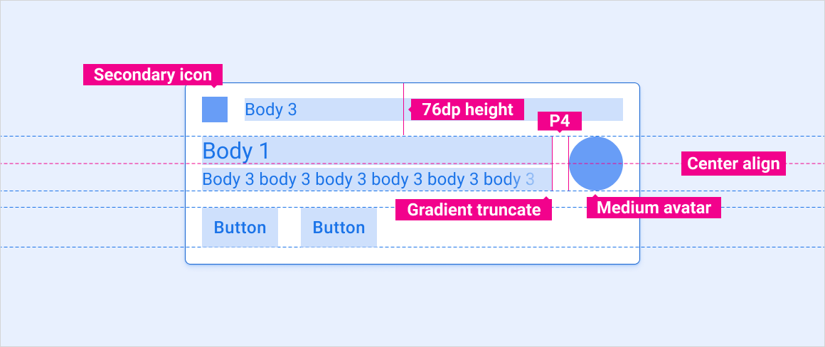
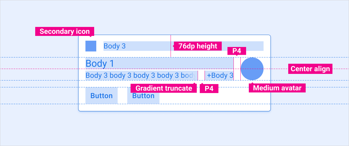
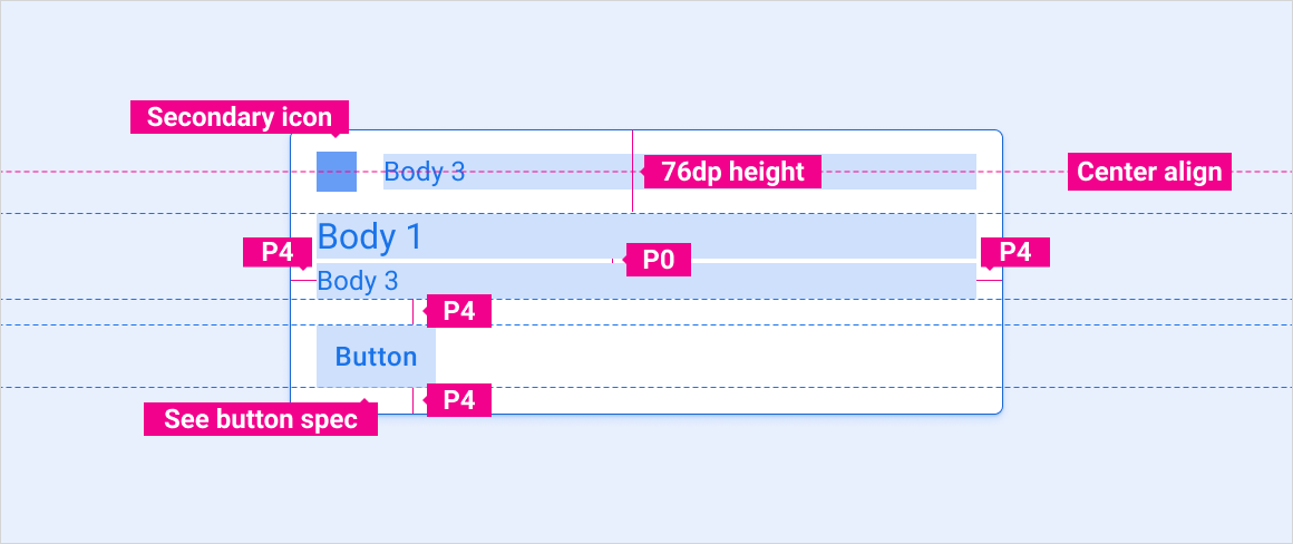
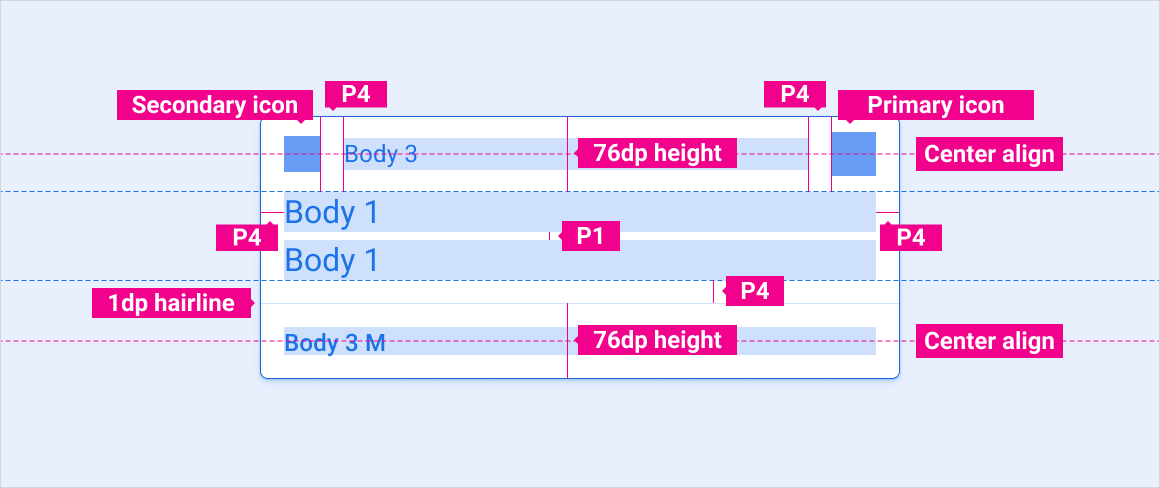
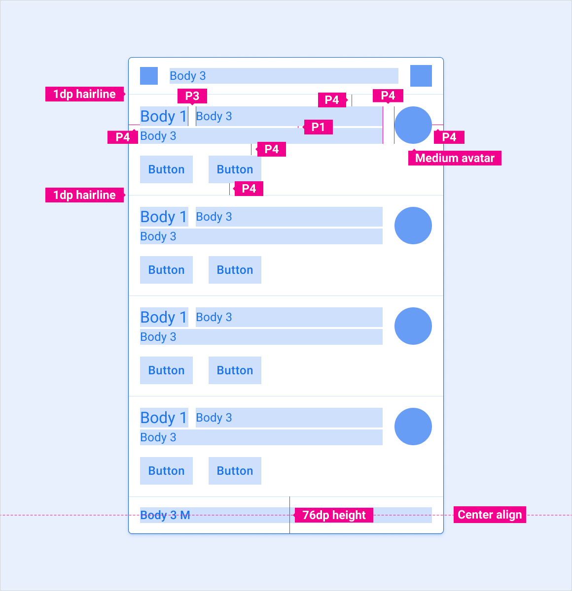
1. 标题
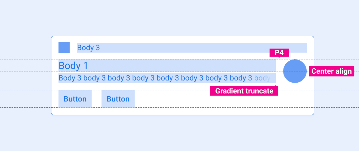
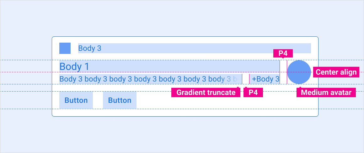
2. 内容(含和不带有可选消息预览,可在汽车行驶时隐藏)
3. 行动
4. 大图标
1. 标题
2. 内容
3. 展开/收起操作
4. 展开/收起指示器
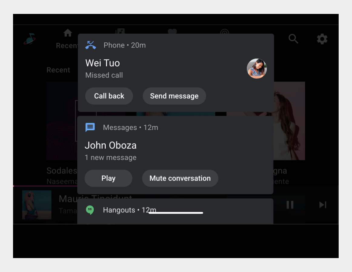
规范 - HUN 卡
标准 HUN
有头像的 HUN
向 HUN 发送消息并进行预览
向 HUN 显示多条消息
大图片 HUN
规范 – 通知中心卡片
标准通知
包含预览的消息通知
包含多条消息的消息通知
单一操作通知
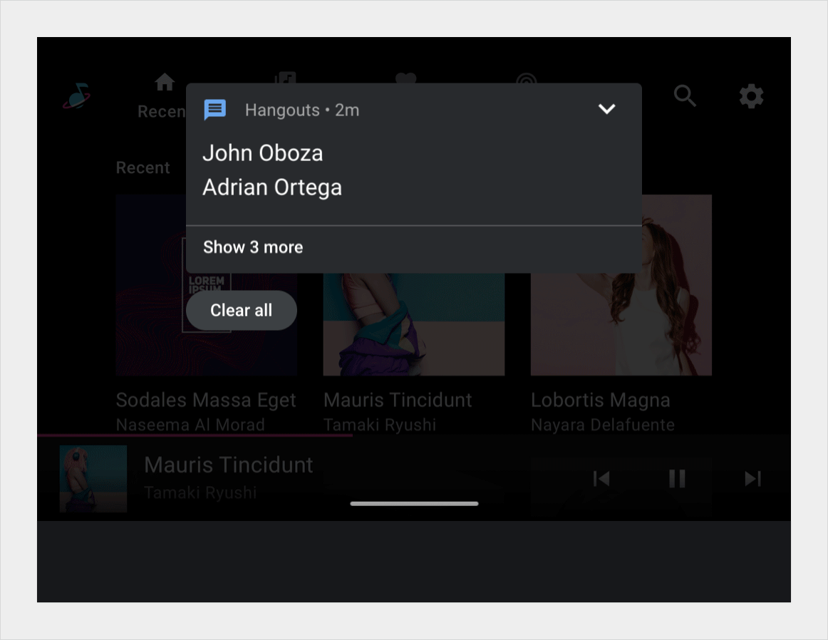
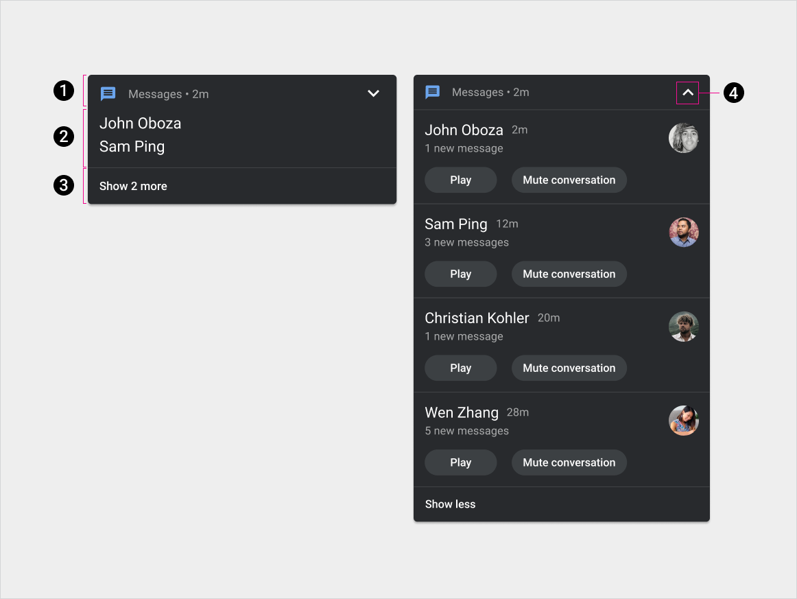
规范 - 分组通知卡片
分组通知 - 已收起
分组通知 - 展开
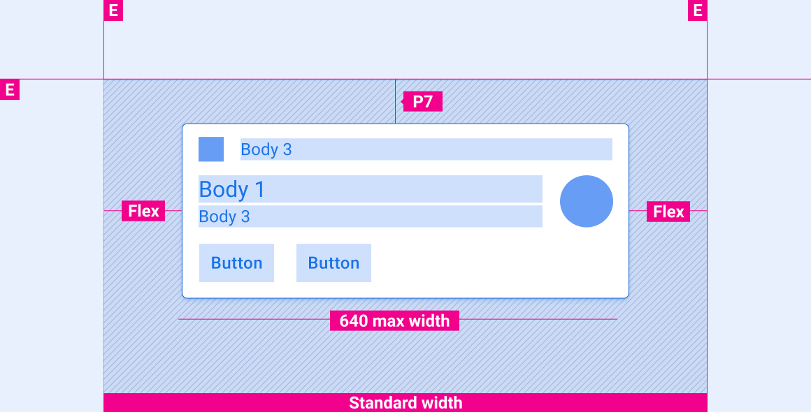
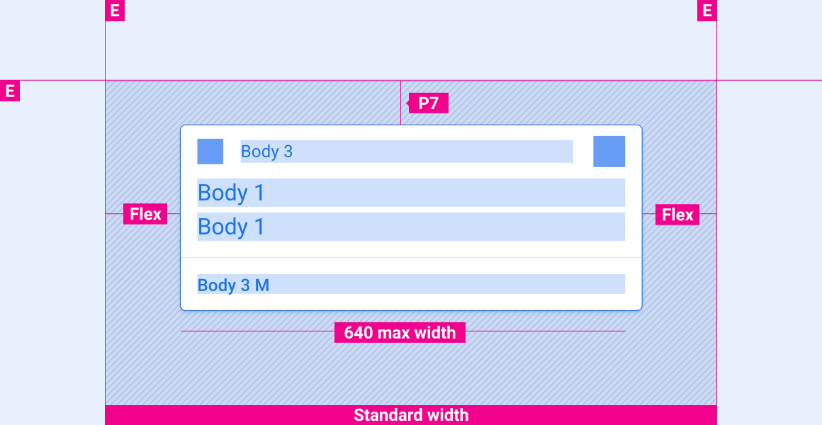
缩放布局
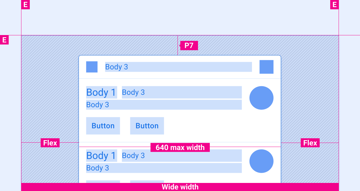
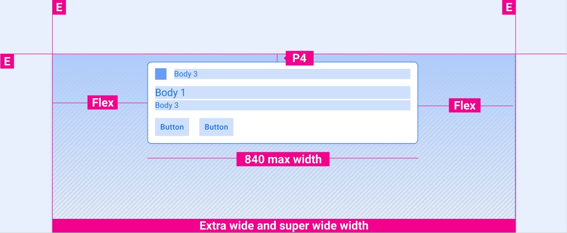
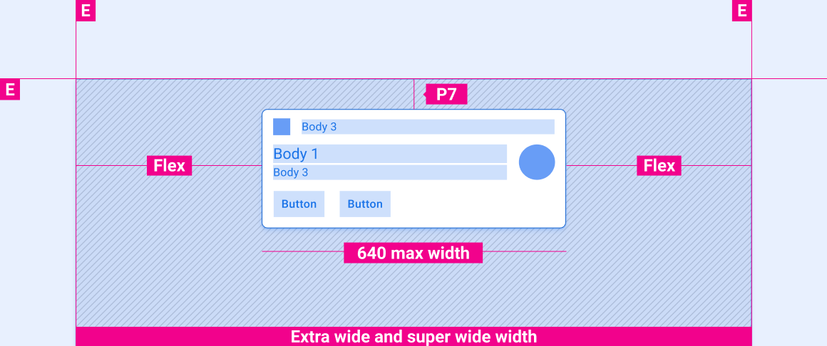
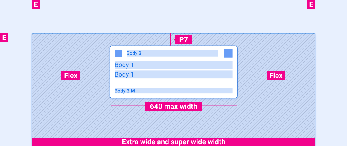
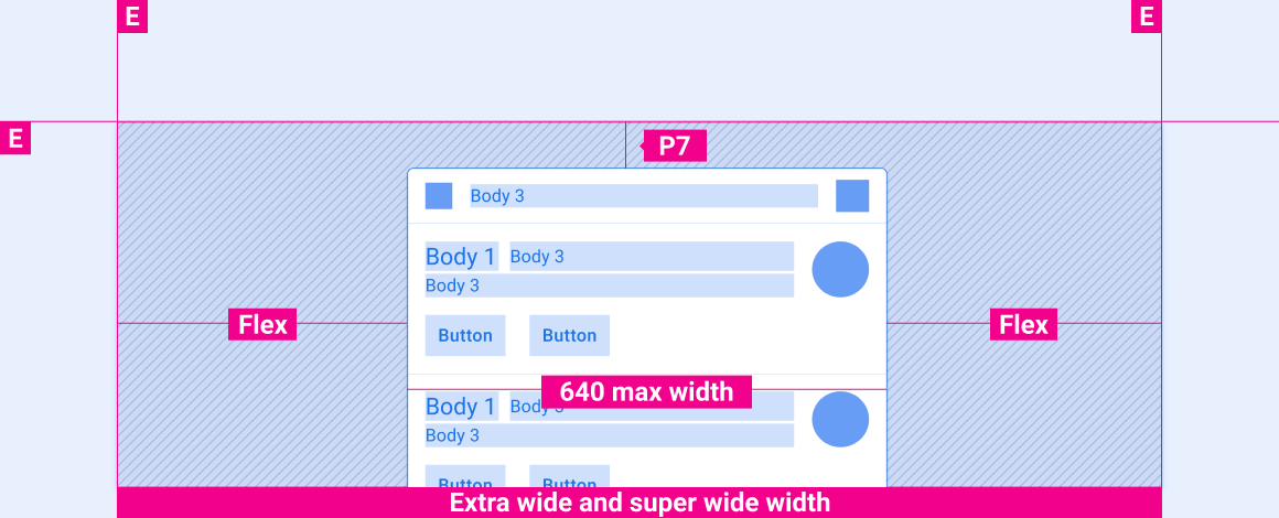
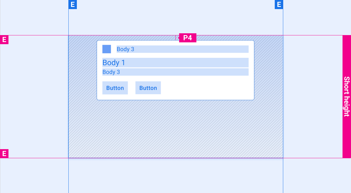
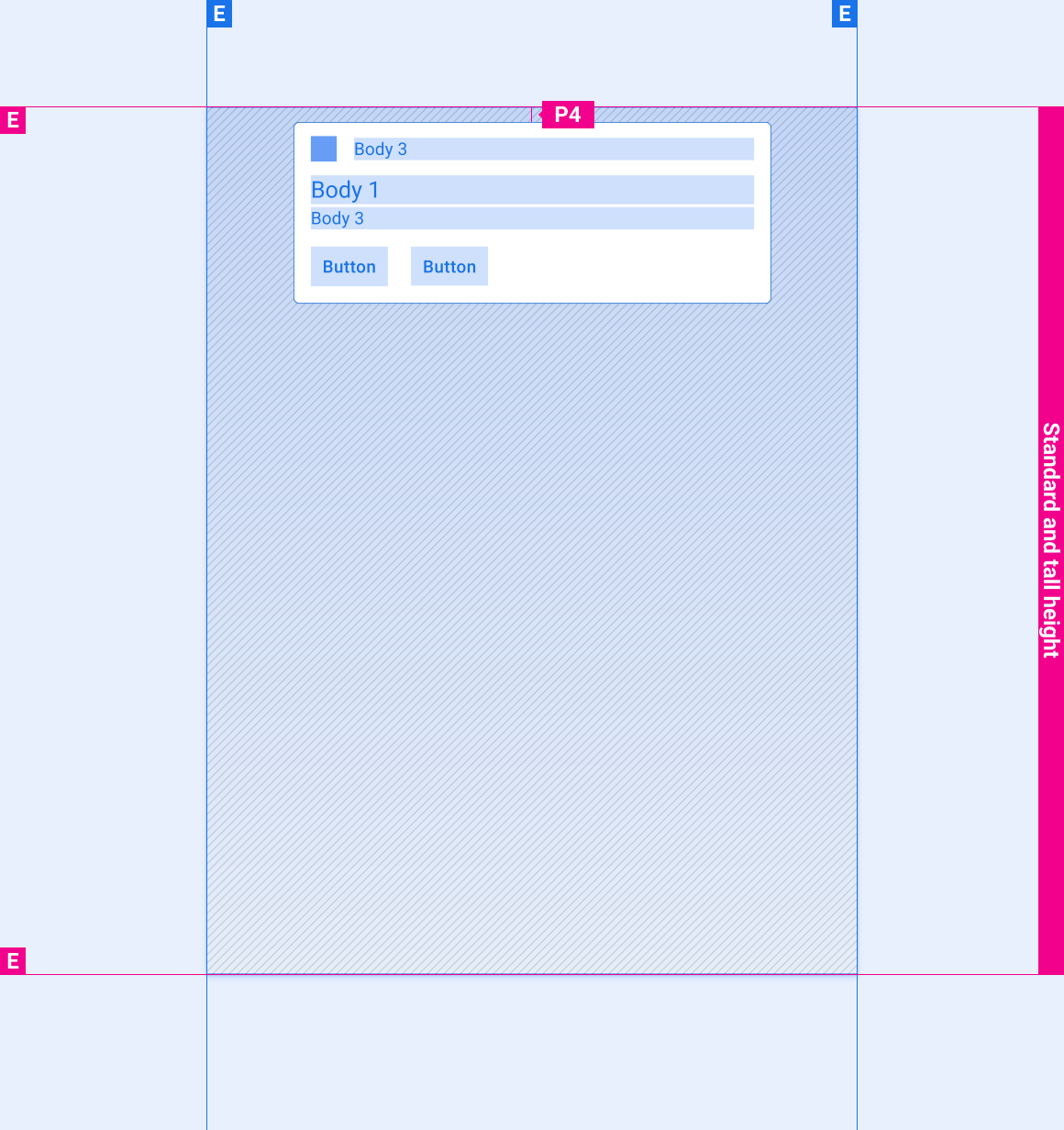
这些参考布局展示了如何调整通知以适应各种宽度和高度的屏幕。(宽度和高度类别在布局部分进行定义。)请注意,在发生任何下采样或上采样之前,所有像素值都位于渲染的像素中。
标准宽度屏幕

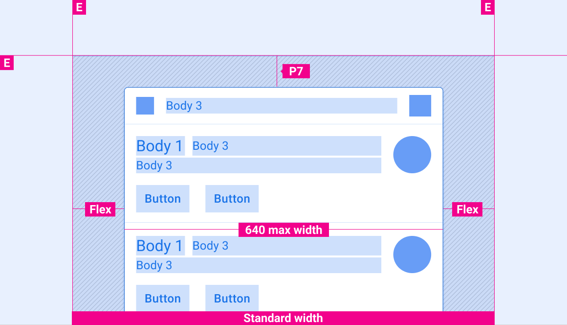
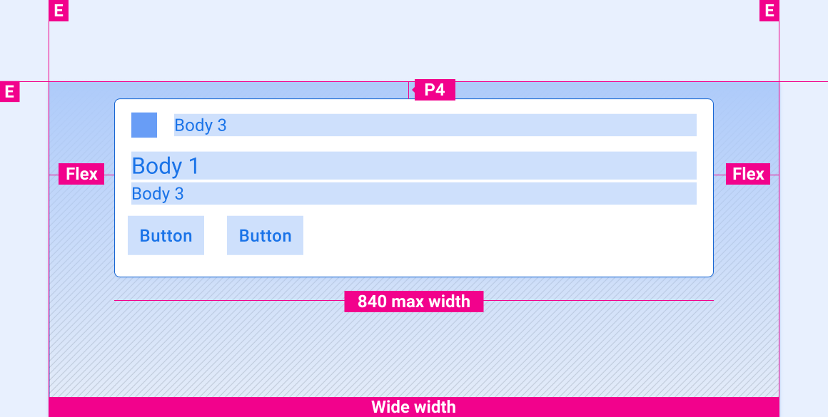
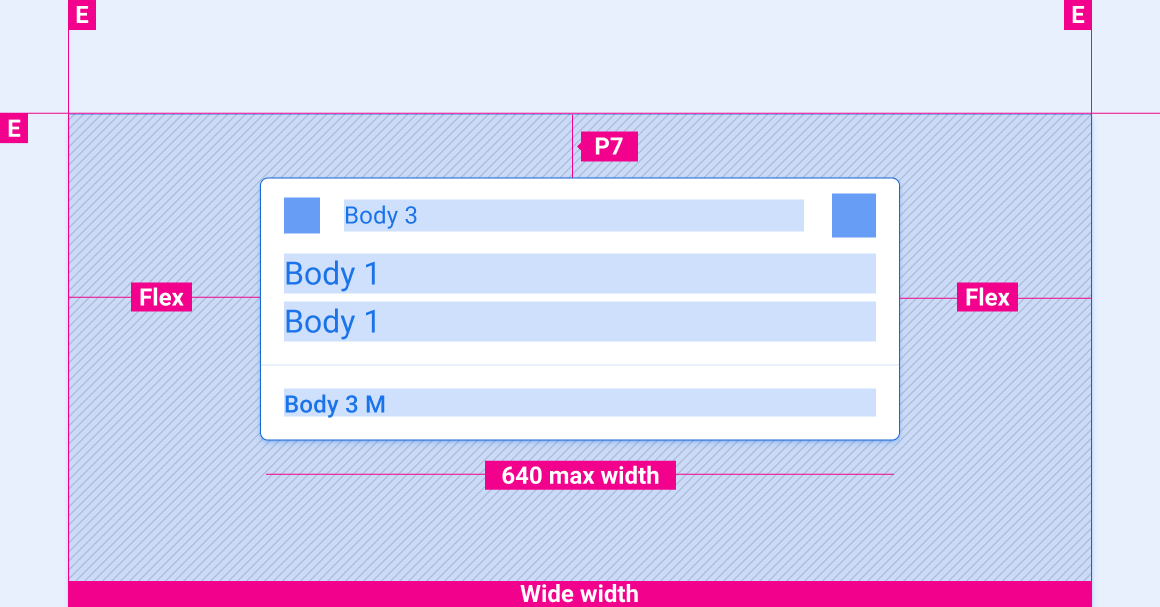
宽屏
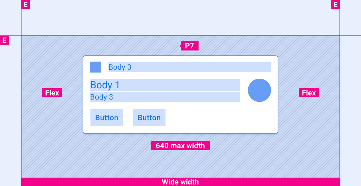
超宽屏幕和超宽屏幕
在各种高度的屏幕上,通知的垂直间距
本部分中的垂直间距规范仅适用于 HUN 卡片。如需了解通知中心卡片的垂直间距,请参阅通知中心规范。
短屏幕
高和标准高度屏幕
风格
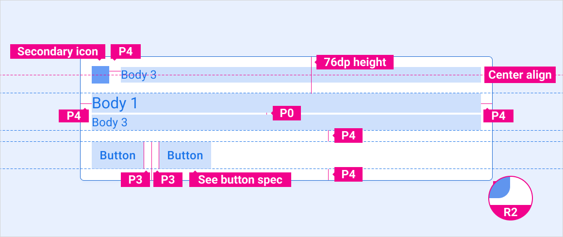
排版
| 类型样式 | 字体 | 重量 | 尺寸 (dp) |
|---|---|---|---|
| 正文 1 | Roboto | 普通 | 32 |
| 正文 3 M | Roboto | 媒介 | 24 |
| 正文 3 | Roboto | 普通 | 24 |
颜色
| 元素 | 颜色(日间模式) | 颜色(夜间模式) |
|---|---|---|
| 主要类型 / 图标 | White | 白色 @ 88% |
| 次要类型 | 白色 @ 72% | 白色 @ 60% |
| 次要图标 | 第三方口音 | 第三方口音 |
| 分隔线 | 白色 22% | 白色 12% |
| 卡片背景 | 灰色 868 | 灰色 900 |
| 渐变纱罩 | 黑色 100% - 0% | 黑色 100% - 20% |
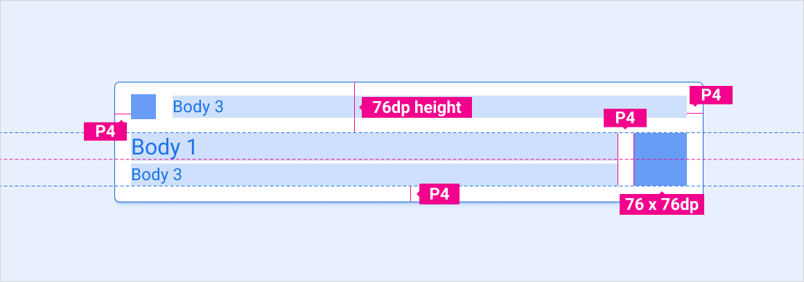
大小
| 元素 | 尺寸 (dp) |
|---|---|
| 主图标 | 44 |
| 次要图标 | 36 |
| 中型头像 | 76 |
| 圆角半径 (R2) | 8 |
示例
动作
以下动作是通知体验的重要组成部分:
- HUN 到达动作
- 关闭通知的滑动动作
- 分组通知展开和收起动作
HUN 抵达
滑动关闭
展开和收起分组通知