AI-generated Key Takeaways
-
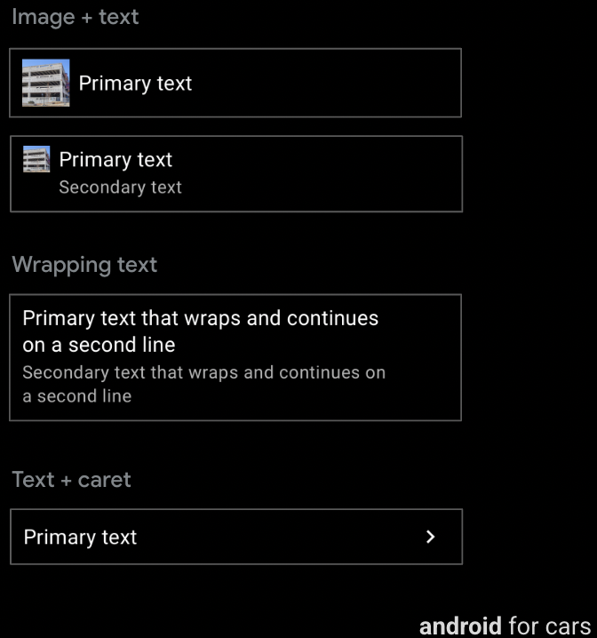
Six templates support the row component, which contains a small amount of text and other options, and can accommodate actionable buttons for most templates.
-
Rows are highly customizable and can include primary text, optional secondary text, an optional inline icon or image, and an optional caret.
-
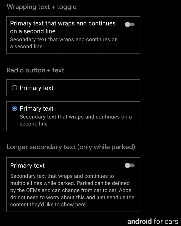
The List template offers additional row options including an optional toggle switch or radio button, and longer secondary text when parked.
-
A row with a toggle switch cannot contain a radio button, and vice versa, and carats are not used on lists with either of these options.
Six templates support the row component, which contains a small amount of text, plus other options.
For most templates, rows can also accommodate actionable buttons.
Can include:
- Primary text (mandatory), up to 2 lines, where the second line either wraps or comes after a line break
- Secondary text (optional), up to 2 lines with customizable text color
- Optional inline icon or image in either primary or secondary text
- Caret (optional), indicating presence of a submenu

Template support
The following templates support rows:
- List
- Place List (map)
- Search
- Route Preview
- Pane template with no line dividers in the Pane template because its rows are not actionable
Guidance
Rows are highly customizable and can be used to create a variety of list types: lists with data, lists with images, and so on.
Row options for List template only
In addition to the typical features available for the Row component (primary and secondary text, and image or icon), a row on the List template can also include any of the following:
- Toggle switch (optional)
- Radio button (optional, used only in selectable lists, which must have radio buttons on all rows)
- Longer secondary text (visible only when parked), to be truncated to 2 lines while driving

Guidance
A row with a toggle switch can’t contain a radio button, and vice versa. Also, carats are not used on lists with either toggle switches or radio buttons. However, a row with either of these options can also contain an image or icon and wrapping text.