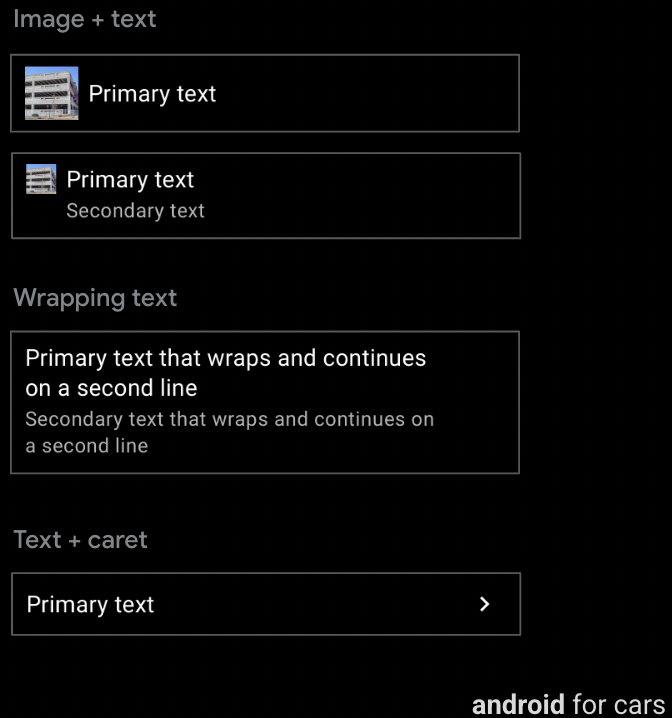
6개의 템플릿은 소량의 텍스트와 기타 옵션을 포함하는 행 구성요소를 지원합니다.
대부분의 템플릿의 경우 행에 실행 가능한 버튼도 포함될 수 있습니다.
포함할 수 있는 항목:
- 기본 텍스트 (필수), 최대 2줄. 두 번째 줄이 줄바꿈되거나 줄바꿈 다음에 옵니다.
- 보조 텍스트(선택사항), 최대 2줄(맞춤설정 가능한 텍스트 색상 포함)
- 기본 텍스트 또는 보조 텍스트에 인라인 아이콘 또는 이미지(선택사항) 사용
- 캐럿 (선택사항): 하위 메뉴의 존재를 나타냅니다.
템플릿 지원
다음 템플릿은 행을 지원합니다.
- 목록
- 장소 목록 (지도)
- 검색
- 경로 미리보기
- 행을 실행할 수 없으므로 창 템플릿에 줄 구분선이 없는 창 템플릿
가이드
행은 세부적인 맞춤설정이 가능하며 데이터가 포함된 목록, 이미지가 포함된 목록 등 다양한 목록 유형을 만드는 데 사용할 수 있습니다.
목록 템플릿 전용 행 옵션
목록 템플릿의 행에는 행 구성요소에 사용할 수 있는 일반적인 기능(기본 및 보조 텍스트, 이미지 또는 아이콘) 외에 다음 항목도 포함될 수 있습니다.
- 전환 스위치 (선택사항)
- 라디오 버튼 (선택사항, 모든 행에 라디오 버튼이 있어야 하는 선택 가능한 목록에서만 사용됨)
- 더 긴 보조 텍스트 (주차 상태일 때만 표시됨), 운전 중에는 두 줄로 잘립니다.
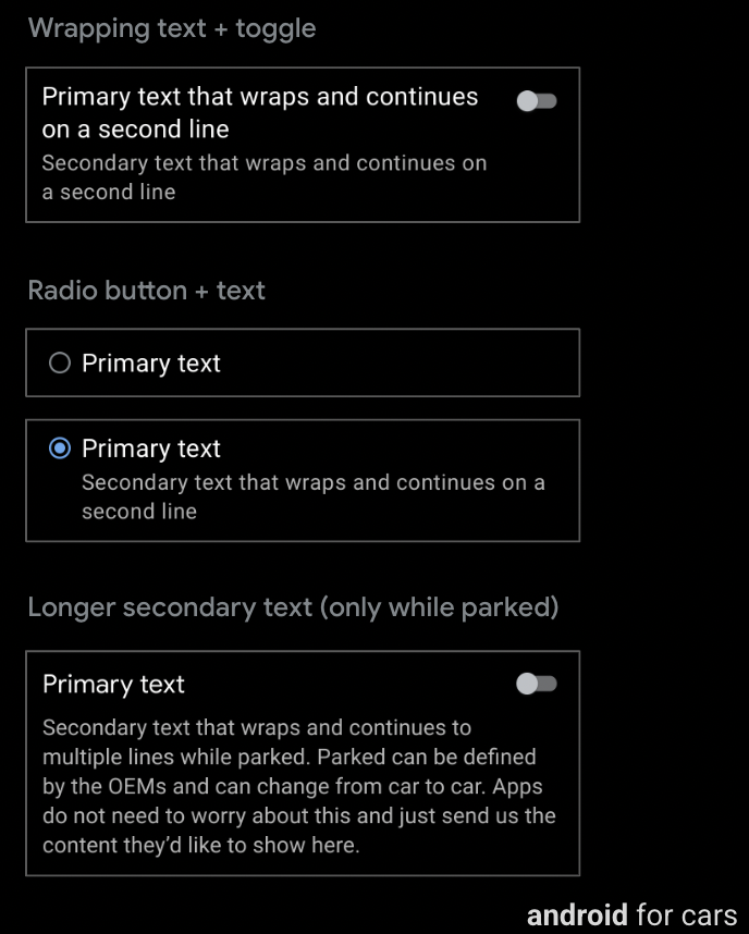
가이드
전환 스위치가 있는 행에는 라디오 버튼을 포함할 수 없으며 그 반대의 경우도 마찬가지입니다. 또한 전환 스위치나 라디오 버튼이 있는 목록에는 캐럿이 사용되지 않습니다. 그러나 이러한 옵션 중 하나가 포함된 행에는 이미지 또는 아이콘과 줄바꿈도 포함될 수 있습니다.