AI-generated Key Takeaways
-
After determining template sequences for your app task, you can customize the content and some styling of each template.
-
While the app library sets default styling and layout, app designers and vehicle OEMs contribute to custom visual design aspects, including images, iconography, layout, sizing, shapes, typography, and color.
-
Apps can customize colors for specific template elements like text color in list rows, button colors, place-list marker colors, and routing-card elements.
-
For color customization, apps can provide up to two custom accent colors or choose from four standard Android for Cars colors.
-
Vehicle OEMs can apply additional style customizations, such as adjusting font, theming, shapes, and button width and color, especially for the AAOS version of an app.
Once you’ve determined the sequences of templates for your app task, you can customize the content of each template and some of the styling for your app.
To learn about which aspects of the overall visual design you can customize, see Visual design customization, which includes App customization examples. For AAOS versions of your app, be aware that vehicle OEMs can adjust the styling to fit their vehicles, as shown in Vehicle OEM customization examples.
To learn about customization options for specific templates, see Templates.
Visual design customization
While the app library determines the template layouts and default styling, app designers and vehicle OEMs both contribute to custom aspects of the visual design.
| Aspect of UI | What the library determines | What apps determine or customize | What vehicle OEMs can customize |
|---|---|---|---|
| Images and iconography | Iconography for standard elements, such as back button and loading spinner | Apps provide all images and iconography (see Material icons and Google Play icon specifications), except as noted at left | |
| Layout, sizing and shapes | Default layout, plus size and shapes of all elements (defaults are standard in Android Auto version of app) |
|
Adjustments to size, shape, button locations and proportions of template elements in AAOS versions of app (or example, the exact sizing for “large” and “small” images and icons in their vehicles) |
| Typography and text length | Font family and size in Android Auto version of app (see Typography) | Longer and shorter variants of text strings, in some cases, to accommodate differing amounts of space on different car screens | Font family and size in AAOS versions of app |
| Color | Default colors in Android Auto version of app (except those supplied by apps, noted at right) | Colors of place-list markers, some text elements, and some background colors (review the next section, Color customization for more information). | Adjustments to default & app-supplied colors to as needed to blend with vehicle UIs in AAOS versions of app |
Color customization
Apps can provide colors for elements of certain templates, as noted in the following list. For AAOS versions of your app, vehicle OEMs can make some adjustments.
Apps can customize:
- Text color in secondary line of list rows (car maker controls color of primary line for AAOS)
- Button text color
- Button background colors (except on action strip and map action strip)
- Place-list marker colors
- Routing-card elements: background color, images, and color of duration value in trip estimate (within Navigation template requirements)
- Turn-by-turn notifications (background color)
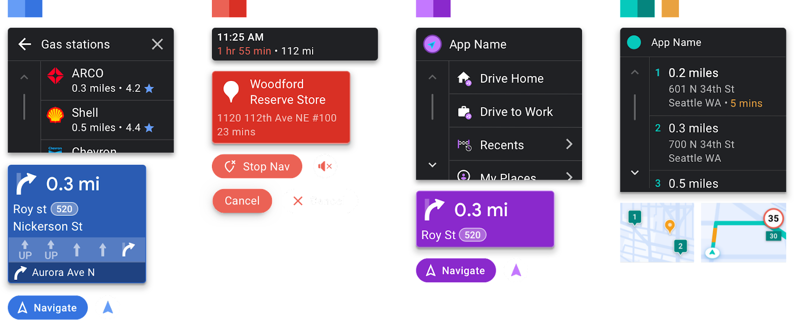
Examples of customized template components are shown in App customization examples and Vehicle OEM customization examples.
Choose colors for your app
For most custom styling (other than the exceptions noted in the previous section), apps have the following color options:
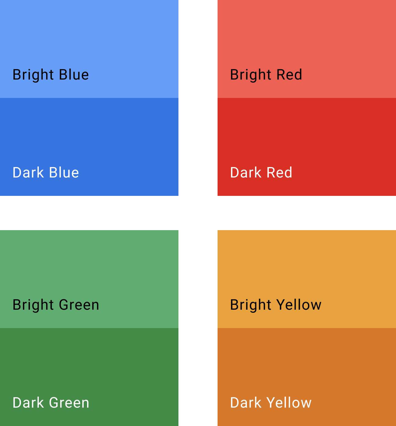
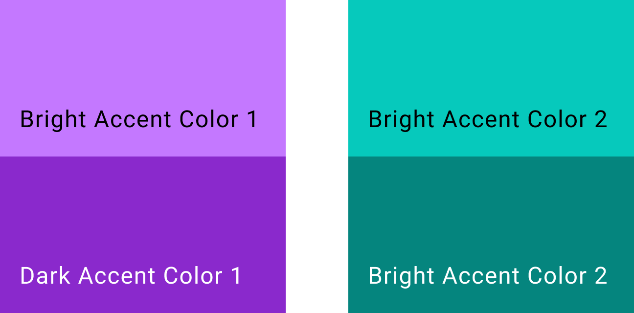
- Provide up to 2 custom accent colors (with light and dark variants, to be applied as appropriate by Android Auto, or by vehicle OEMs for AAOS versions of apps)
- Choose from 4 standard Android for Cars colors (current versions shown at right; these may change in the future)
| Standard colors | Sample accent colors |
|---|---|
|
|
Judicious use of color helps to focus the intent of a design. Be cautious about using colors when they don’t serve a function.
App customization examples
Vehicle OEM customization examples
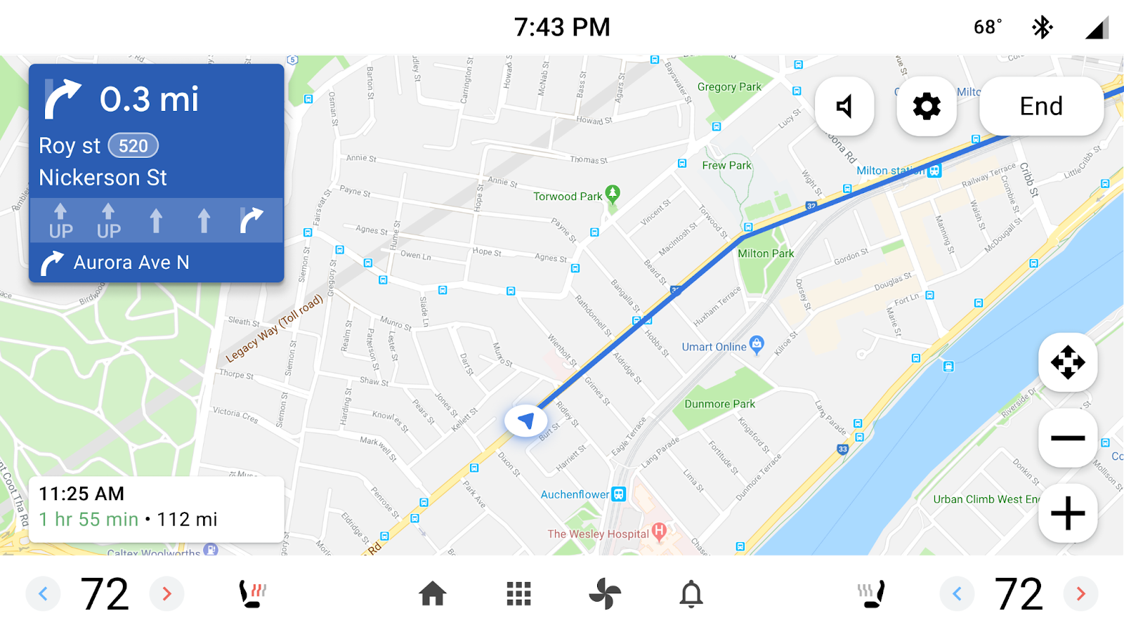
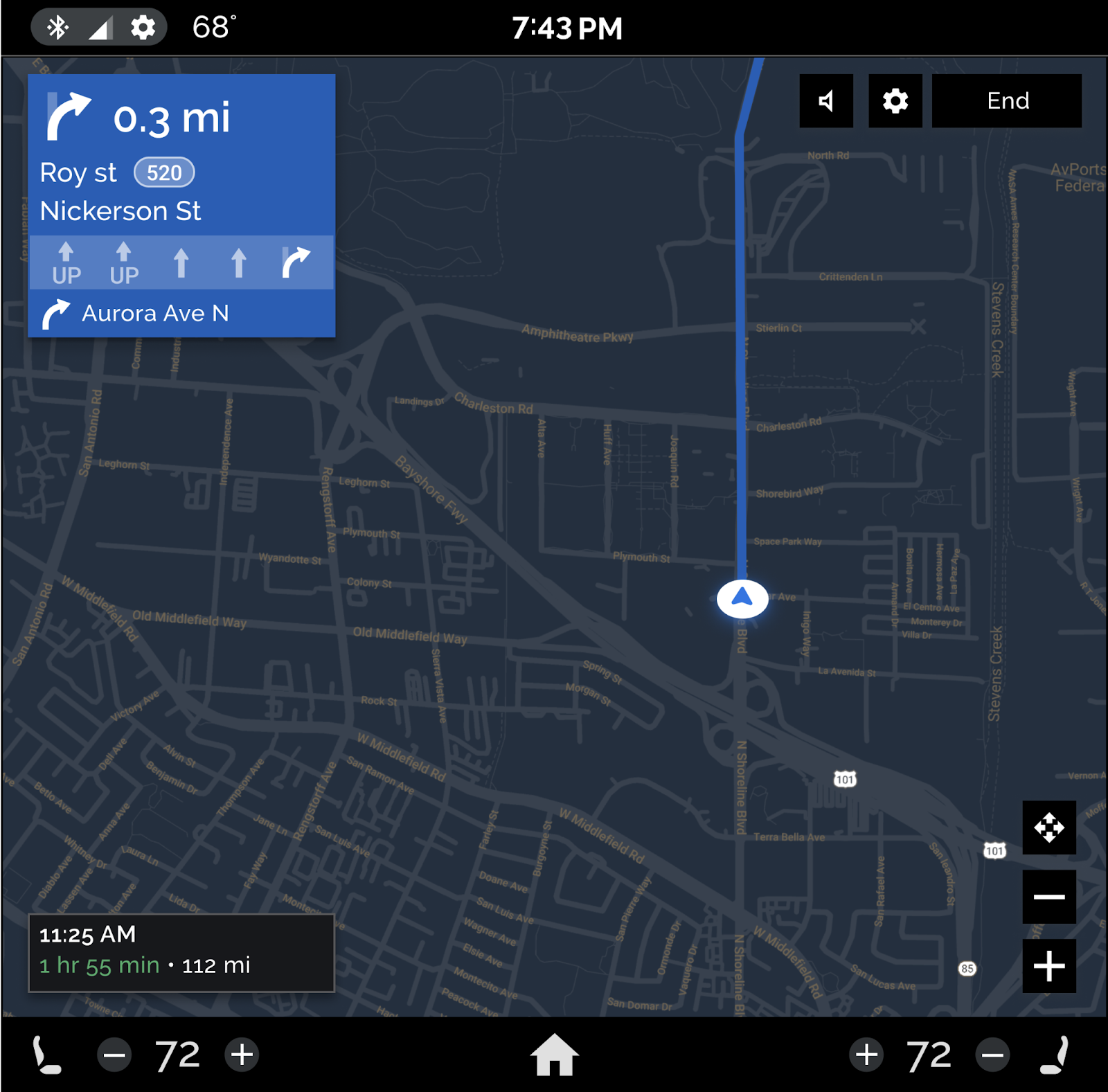
These examples show additional style customizations a vehicle OEM might apply to the AAOS version of an app. While the color of the routing card comes from the app, vehicle OEMs customize the fonts, theming, and shapes for the routing card, buttons, and ETA card. They can also adjust button width, as shown in Customize buttons below.
Daytime navigation view
Nighttime navigation view
Customize button width, color, and shape
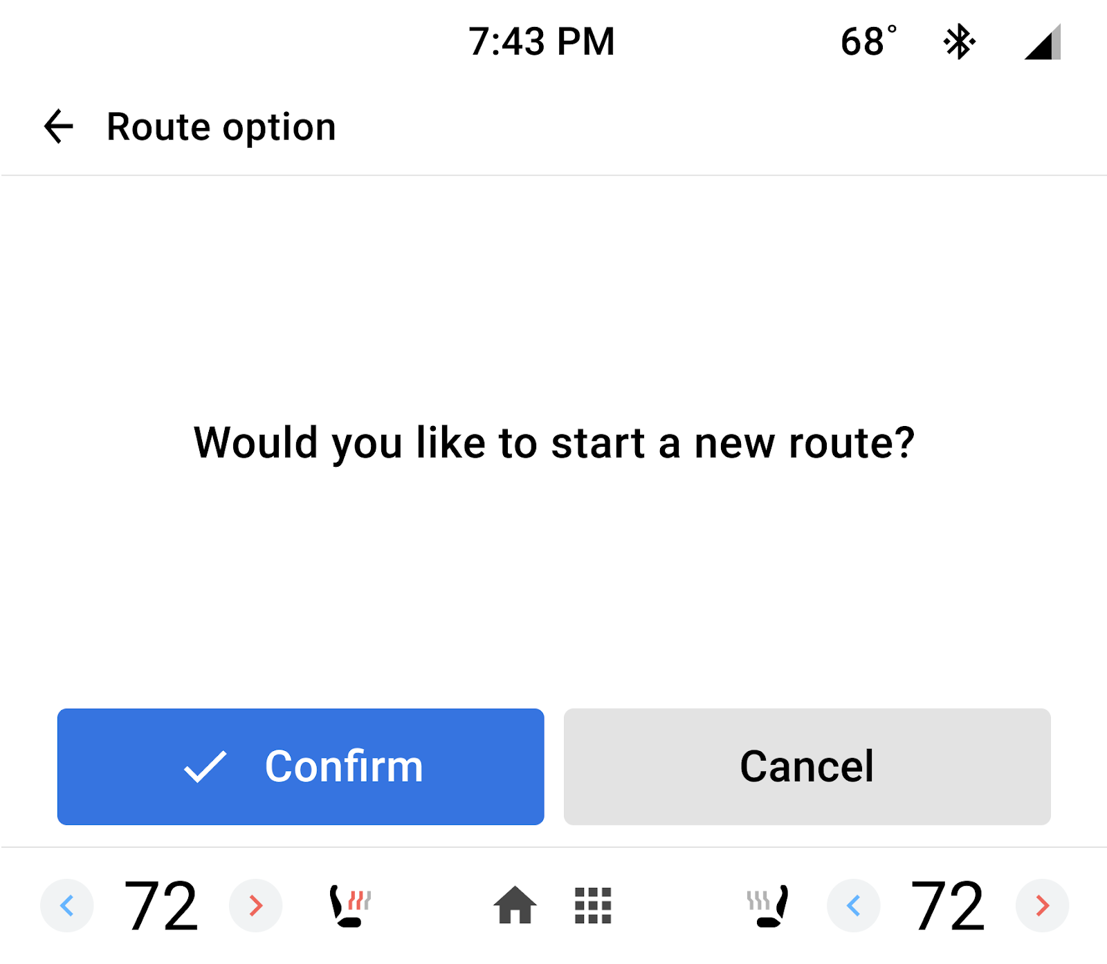
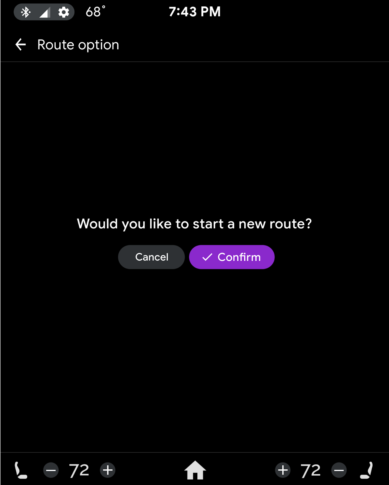
These examples highlight how OEMs can customize button width, color, and shape, in the AAOS version of an app.
For the button the app designated as the primary button, OEMs can decide whether to use an app accent color or their own accent color. They can also choose whether to put the primary button on the left or on the right, to accommodate situations such as vehicles with right-hand drive.
| Primary button on left, standard colors | Primary button on right, custom colors |
|
|
|---|