AI-generated Key Takeaways
-
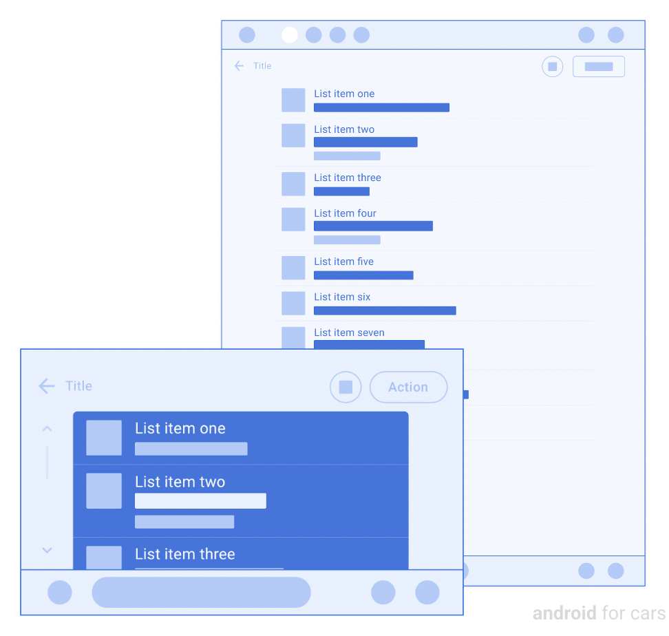
The List template displays information in a list layout and can be divided into sections.
-
This template can be embedded in the Tab template or Map + Content template for different layouts.
-
Key components include an optional header, list items with varying text length and quantity, and an optional floating action button.
-
The amount of secondary text allowed per list item changes based on whether the car is parked or driving.
-
Specific UX requirements should be followed when using the List template, such as including section headers and associating actions with list items.
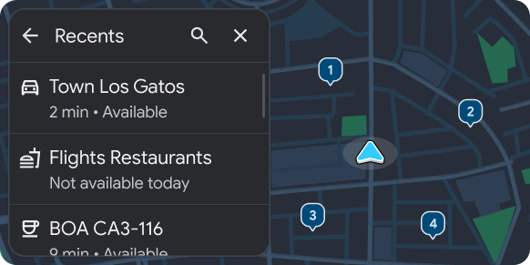
The List template presents information items in a list layout.
Lists may be separated into sections using sublists.
This template can be embedded in the Tab template to provide tabbed navigation.
This template can be included in the Map + Content template to provide a list on a map.
Includes:
- Optional header. When this template is embedded in the Tab template, the header is replaced with tabs.
- List items (where the number of items and the amount of text in a row
can vary):
- Number of list items. The number of items allowed to be shown depends on the vehicle. To retrieve the list row limit for a given vehicle, use the ConstraintManager API.
- Amount of text per item. Secondary text in list rows can be longer than 2 rows when parked. See More list text while parked.
- Optional floating action button
For more about what rows can include in this template, see Row options for List template only and the examples in Sample flows.
More list text when parked
The amount of secondary text allowed in each list row varies depending on whether the car is parked or driving. To minimize distraction, text is truncated to 2 lines while driving. Any content intended to be read while driving should be displayed at the beginning of the secondary text.
List template examples
The following Android Auto and Android Automotive OS (AAOS) examples were built using the List template.
List template UX requirements
App developers:
| MUST | Include a section header when sections are present. |
| MUST NOT | Mix selectable list rows (rows with radio buttons) with other types of rows or separate them with sections. |
| SHOULD | Present default selections on selectable lists. |
| SHOULD | Have an action associated with each list item (information-only rows are not recommended). |
| SHOULD | Place content in secondary text that is intended to be read while driving near the beginning, to avoid truncation. |
| SHOULD | Include a header with an optional title and primary and secondary actions. |
| MAY | Divide list content into sections. |
| MAY | Mix rows that have toggle switches with other rows as needed. |
| MAY | Update row text and image or icon asset when user changes toggle state. |