AI-generated Key Takeaways
-
The Navigation template displays a base map and optional routing information for drivers.
-
Apps can display a full-screen map during active navigation and optionally surface cards with maneuvers and details or navigation alerts.
-
The template can also display a non-interactive map in the instrument cluster, often recommended to be dark-themed.
-
The optional routing card shows current and next steps, lane guidance, or a message about the navigation state.
-
Navigation alerts provide brief, temporary messages with optional actions without blocking the navigation route.
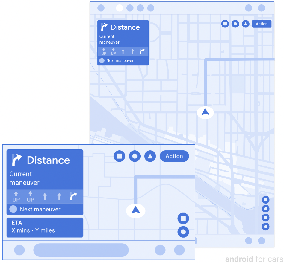
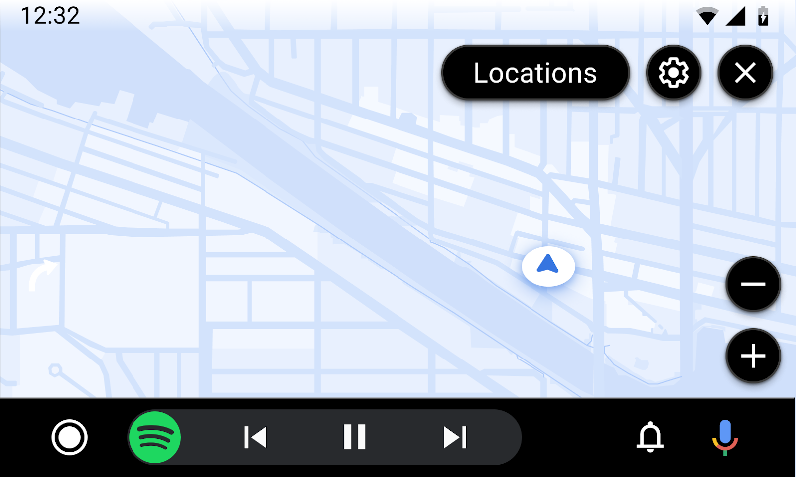
The Navigation template presents a base map and optional routing information.
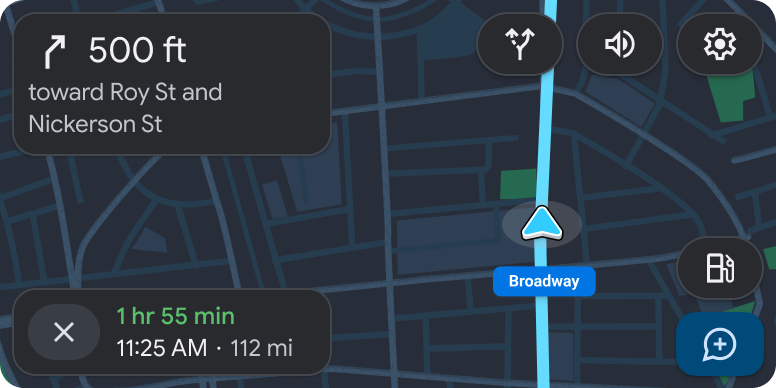
When a user is driving without text-based turn-by-turn directions, apps can show a full-screen map updated in real time. During active navigation, apps can surface optional cards with maneuvers and surface details, as well as navigation alerts.
This template can be embedded in the Tab template to provide tabbed navigation.
Includes:
- Full-screen base map drawn by app
- Routing card (optional) with upcoming maneuvers
- Travel estimate card (optional) with estimated time of arrival (ETA), time to destination, and remaining distance (or an alternate information display with custom text and icon options)
- Action strip with up to 4 app actions, visible only as described in Visibility of action strips
- Optional map action strip with up to 4 buttons for map interactivity
Map display in the cluster
During active navigation, apps can display a map in the instrument cluster using the Navigation template. The cluster is the area of the dashboard behind the steering wheel.
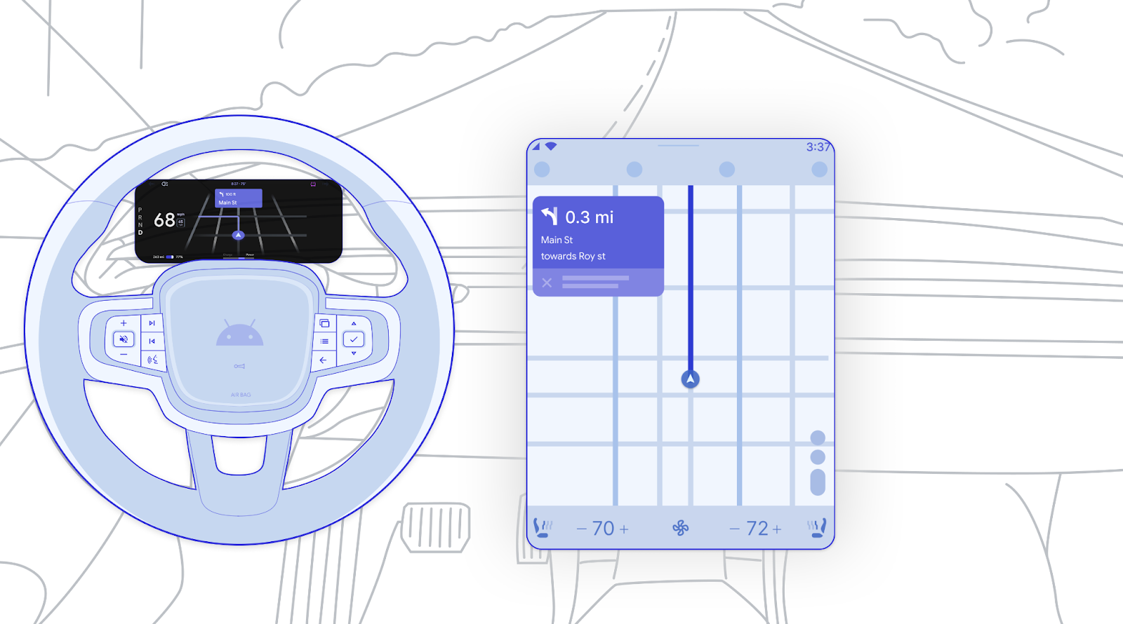
Maps in the cluster are intended to be:
- Independently rendered, but may copy the main display if desired.
- Non-interactive. Interactive elements such as buttons are removed.
- Dark theme. Drawing a dark-themed version of the cluster map is strongly recommended, to reduce the potential for attracting the driver’s attention away from the road.
The app's map in the cluster will display only at certain times, dependent on such factors as navigation state, vehicle OEM preference (in AAOS), and what is showing on the main display (in AAP).
For a sample user flow involving the cluster, see View a map in the cluster.
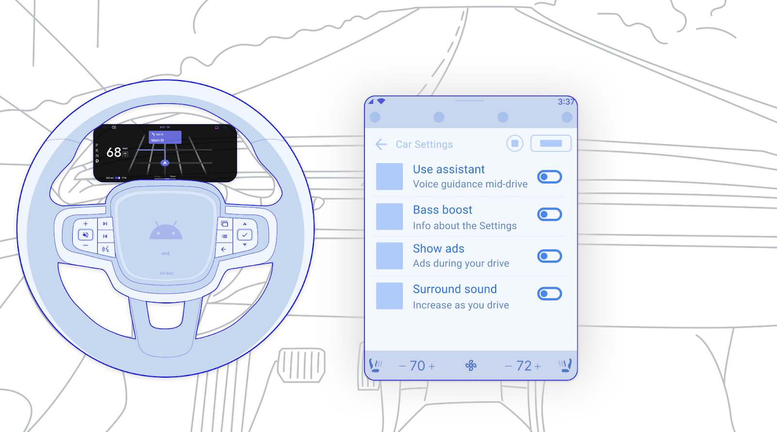
Cluster and center screen examples

Routing card details
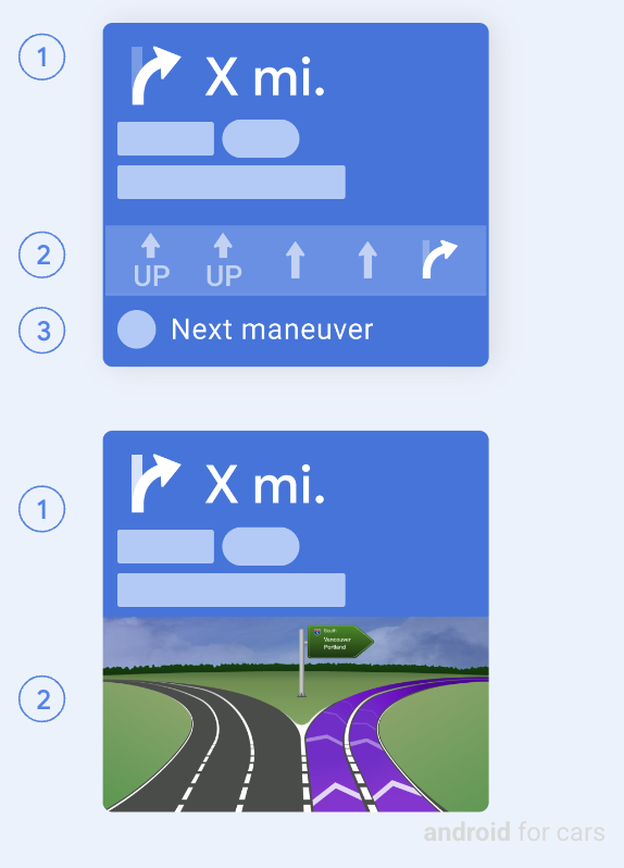
When the routing card is in routing state (as opposed to message state), it shows the following information:
- Current step: includes icon (typically a direction arrow), distance, and cue text (which may include image spans such as route markers)
- Lane guidance (optional): shown either as simple lane-assist images or as a larger junction image (flexible size with maximum height of 200dp)
- Next step (optional): includes icon and cue, and can appear only at the bottom of a routing card that doesn’t include a junction image
Another option in routing state is for the routing card to display a spinner animation (not shown here) to indicate transient states such as loading, calculating, or rerouting.
In some circumstances, routing information can instead be displayed in a floating navigation bar, as shown in Add a stop while driving.
Message state of routing card
When the routing card is in message state, it displays a message instead of routing directions. The message can be used to convey situations such as arrival at a destination or route failures.
In the message state, the routing card can include:
- A non-empty routing-related message up to 2 lines in length
- An image or icon (optional)
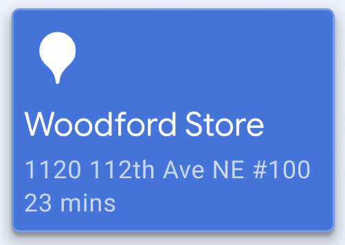
Navigation notifications: Turn-by-turn (TBT) and regular
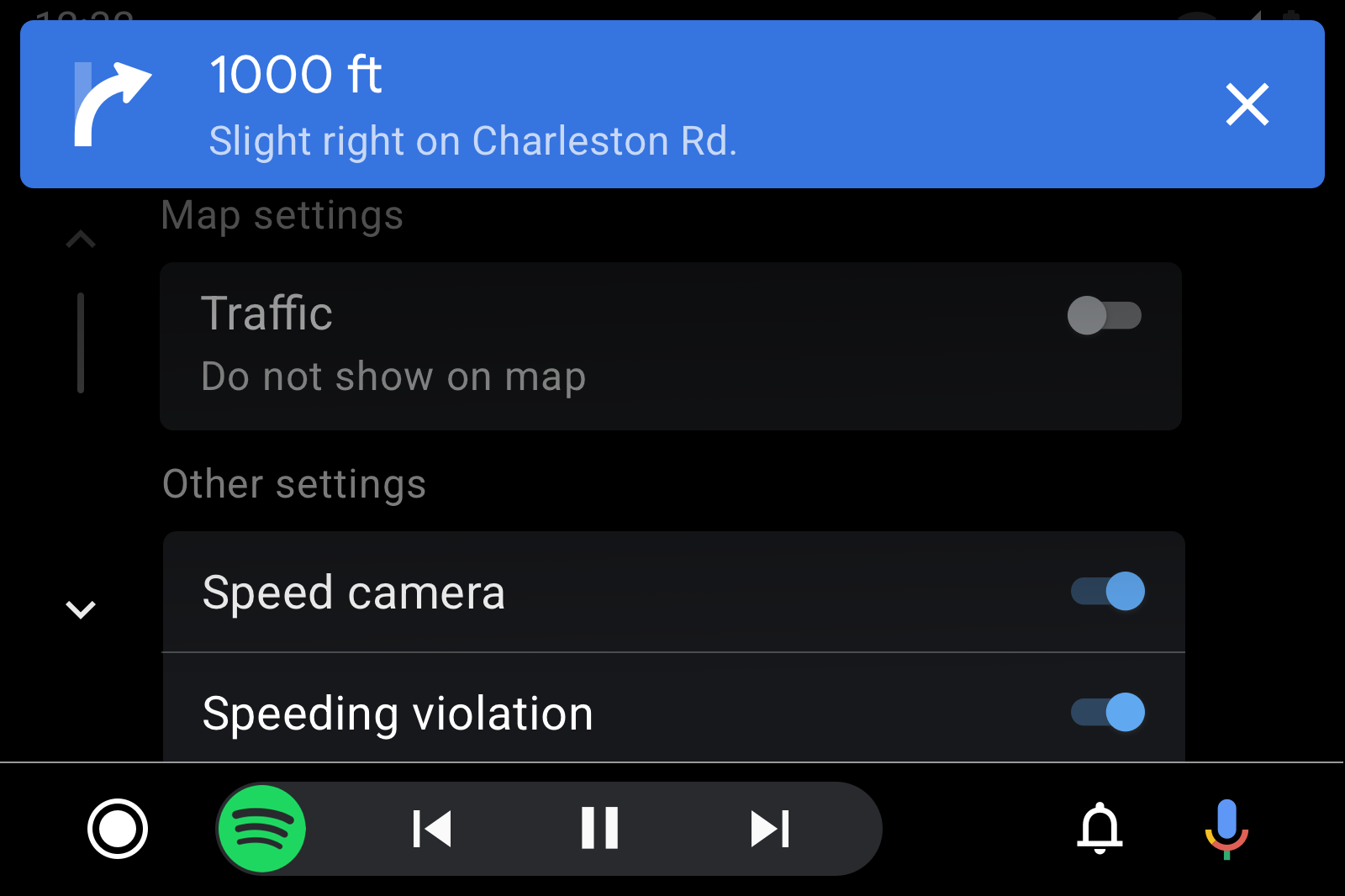
TBT notifications: When an app provides text-based TBT directions, it must also trigger TBT notifications. These notifications are used to expose TBT directions outside of the Navigation template. Apps can customize TBT notification background color for greater visibility.
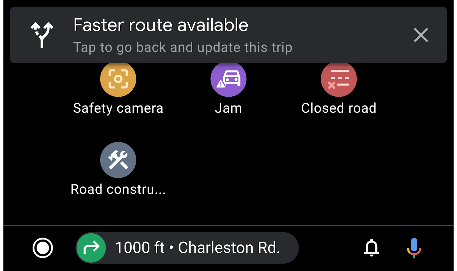
Regular notifications: To communicate other navigation-related messages, such as changes in route settings, navigation apps can also send regular (non-TBT) notifications (as shown here) or use navigation alerts. These can appear even when the routing card is displayed.
Navigation alerts
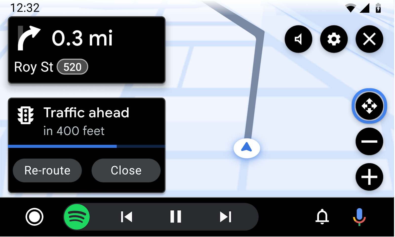
Navigation alerts provide a brief, temporary message and optional actions in a format that doesn't block the navigation route. The content should be simple and relevant to the navigation task. For example, the alert might describe a change in traffic conditions or ask if the driver can pick up a customer.
Each alert includes:
- Title and optional subtitle
- Icon (optional)
- Progress indicator – either a bar or (optionally) built into a timed button
- Up to 2 buttons, where a button can be designated as primary or as a timed button (with a progress indicator, as shown in the previous figure)
Alerts can be dismissed by any of the following:
- User selection of any action
- Time-out after
Xseconds (configurable) - App dismissal without user action
Navigation template examples
Navigation template UX requirements
App developers:
| MUST | Show at least 1 maneuver on a routing card. |
| MUST | Include at least one action button on the action strip to enable user flows. |
| MUST | Include a pan button in the map action strip if the app supports panning gestures. |
| SHOULD | Use a dark theme on maps displayed in the cluster. |
| SHOULD | Include only buttons related to map interactivity on the map action strip (for example, compass, recentering, or 3D mode). |
| SHOULD | Include a button to end navigation when providing turn-by-turn directions. |
| SHOULD | Use symbols that are standardized or consistent with international or country-specific symbols. |
| SHOULD | Use the junction image only to show content relevant to navigation, spanning card width with image. |
| SHOULD | Provide lane images with transparent backgrounds to blend with the routing-card background. |
| SHOULD | Use alerts only for non-distracting information relevant to the current navigation task. |
| MAY | Display short supporting text under a lane (Roboto 24 recommended) and lower contrast ratio for non-highlighted lanes. |
| MAY | Show 2 maneuvers on a routing card when they occur in rapid succession. |
| MAY | Include images such as route markers in routing-card text (current step and next step). |
| MAY | Show a full map when the user is driving without text-based turn-by-turn directions or is in free-drive mode. |
| MAY | Choose to show or the hide routing card and trip estimate components as needed. |
| MAY | Draw driving-related details and alerts on the map, such as current speed, speed limit, and camera ahead. |
| MAY | Customize routing-card background color and change it during the navigation session to reflect road type or other relevant conditions. |